Most donors give once and disappear. The nonprofits that keep them share one habit: they prove, in plain and beautiful terms, what the last gift actually did. A strong impact report is that proof. In this article you will see nonprofit impact report examples that bring donors back, the structure behind them, and how to publish yours as an interactive flipbook with Flipbooks AI so people open it instead of ignoring it.

Why Donors Leave After One Gift
Retention in fundraising is stubbornly low. Many first-time donors never give again, and the usual reason is not dissatisfaction. It is silence. Nobody told them what happened.
A donor who gave $100 and hears nothing for a year has no reason to feel connected. A donor who receives a clear, warm report showing that $100 fed twelve families feels something very different: ownership.
The Silence Problem
Thank-you emails say "thanks." Impact reports say "here is what you did." The second message is the one that earns another gift.
What Donors Actually Want
Surveys of supporters keep returning to the same wishes:
- To know the money was used well
- To see real people and real places, not stock photos
- To read short stories backed by a few honest numbers
- To be thanked by name or by group, without flattery
💡 Pro tip: Write the report for one specific donor you know. Imagine them reading it on a phone at lunch. Cut anything that person would skip.
What Every Strong Impact Report Includes
Before the examples, here is the skeleton. Nearly every report that brings donors back contains these parts, in roughly this order.
| Section | Purpose | Typical Length |
|---|
| Opening letter | Personal thank-you from leadership | 150 to 250 words |
| Headline numbers | 3 to 5 outcomes in large type | One page |
| Story spread | One person or family, with photos | One to two pages |
| Financial snapshot | Where each dollar went | One page |
| Program highlights | Short sections per program | Half page each |
| Donor recognition | Names, groups, milestones | One page |
| Next step | One clear invitation to give or volunteer | Half page |

Five Report Examples Worth Copying
These are composite examples built from patterns seen across community food banks, education charities, animal shelters, health clinics and environmental groups. Borrow the structure, not the wording.
Example 1: The Food Bank Snapshot
A regional food bank opens with one number: 412,000 meals served. The very next line translates it: "That is a meal for every resident of the county, plus leftovers."
The report then breaks the number into who was fed, where the food came from and how volunteers moved it. A single aerial photo of a loading day does more work than three paragraphs.
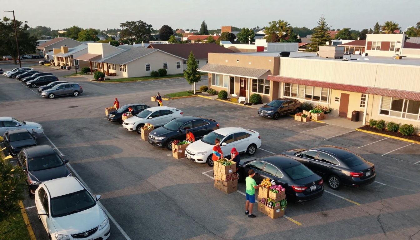
Why donors return: the scale feels real, and the human unit (a meal) is easy to picture.
Example 2: The Single-Story Education Report
A literacy charity builds the whole report around one student, Marisol. The report follows her from a struggling reader in September to reading aloud at a school event in June.
Statistics appear in small sidebars: reading levels, hours of tutoring, volunteer count. The story carries the emotion, and the numbers carry the credibility.
Why donors return: they remember Marisol, and they want to know how her next year goes.
Example 3: The Animal Shelter Scoreboard
Shelters have an advantage: their outcomes are photogenic and countable. One report shows adoptions, vet care and foster placements in a simple scoreboard, then closes with a grid of adopted animals and a line about each family.
Why donors return: the report is joyful to flip through, and donors forward it to friends.
Example 4: The Health Clinic Transparency Report
A free clinic leans on honesty. It shows patient visits, costs per visit and one thing that did not go as planned, with the fix it made. That admission builds more trust than ten polished claims.
Why donors return: they believe the organization will tell them the truth.
Example 5: The Environmental Progress Report
A conservation group uses before and after photos of restored land, a map and a timeline. Each acre restored is tied to a donor tier, so supporters can see their level reflected in the result.
Why donors return: progress is visual, cumulative and tied to their own contribution.
Different organizations need different shapes. Use this table to match your situation to a format.
| Report Style | Best For | Strength | Watch Out For |
|---|
| Numbers first | Large programs with clear counts | Fast credibility | Can feel cold |
| Single story | Small teams, personal causes | Emotional pull | Needs strong photos |
| Scoreboard | Shelters, rescues, youth programs | Easy to share | Light on finances |
| Transparency | Clinics, legal aid, advocacy | Deep trust | Needs careful writing |
| Progress timeline | Environmental, building projects | Shows momentum | Needs regular updates |

How to Write the Numbers Section
Numbers are where reports usually go wrong. Either there are too many, or they have no meaning.
Pick Three to Five Outcomes
Choose results, not activity. "Held 40 workshops" is activity. "62 parents found stable jobs" is an outcome.
Translate Every Figure
Pair each number with a comparison a donor can picture.
- 3,000 pounds of produce becomes "a pickup truck full, every week"
- 180 volunteer hours becomes "almost a month of full-time work"
- $25 becomes "a week of school lunches for one child"
Show the Dollar Split Simply
A simple bar or pie of program, fundraising and administration spending is enough. Avoid a 12-line budget table in the main body. Put the audited detail in an appendix.
⚠️ Warning: Never inflate or round up in your favor. One caught exaggeration undoes the trust a whole report builds.
Stories That Make People Give Again
A donor will not remember a percentage. They will remember a person.
A Simple Story Formula
- Start with the before. Describe the situation in two or three sentences.
- Name the turning point. What did your program do?
- Show the after. Use a quote, a photo and one specific detail.
- Connect it to the donor. One line: "Your gift made this possible."
Get Permission and Respect Dignity
Always get written consent. Show people as capable, not as victims. Photograph them doing something, not just looking at the camera with sad eyes.

Design Choices That Keep People Reading
A report can have excellent content and still lose readers on the first page. Design decides whether they continue.
Keep the Layout Calm
Use one or two fonts, plenty of white space and a consistent color palette drawn from your logo. Large photographs beat small clip-art every time.
Lead With Photography
Real photos of real beneficiaries, volunteers and staff outperform stock images. If budget is tight, ask a volunteer photographer to shoot a single program day.
Use Short Blocks of Text
- Keep paragraphs to three sentences
- Use pull quotes for emotion
- Use captions, because readers scan them first
- Put one idea on each page

Why a Flipbook Beats a Plain PDF
Most reports die as email attachments. A PDF is heavy, awkward on phones and invisible to you once sent. A flipbook solves each of those problems.
| Feature | Plain PDF | Flipbook |
|---|
| Opens on a phone | Pinch and zoom | Mobile-responsive pages |
| Shareable with one link | No | Yes |
| Embed on your site | Difficult | Simple embed code |
| Audio and video | No | Yes |
| Reader tracking | None | Analytics on the Professional plan |
| Page-turn feel | None | Yes, with realistic effects |
| Watermarks | None | None, ever |
With an interactive version you can embed a thank-you video from a beneficiary, add a short audio message from your director and see which pages donors actually read. The Non-Profit Annual Report tool is built for exactly this use.

How to Create an Impact Report With Flipbooks AI
Here is the full process, from design file to donor inbox.
Step 1: Design Your Pages
Build your report in Canva, InDesign, Google Docs or any tool you like, then export it as a PDF. Use landscape or portrait pages consistently.
Step 2: Upload and Convert
Go to Flipbooks AI, create an account and upload your file. The PDF to Flipbook Converter turns each page into a flipping page in seconds.
Step 3: Customize the Look
Add your logo, brand colors and a custom background. Choose a page-turn effect that feels natural. You can also place links, buttons and media directly on the pages.
Step 4: Add Multimedia
Embed a short video of a beneficiary, a founder message or a voice-over. Keep each clip under two minutes.
Step 5: Choose How to Share
- Direct link for emails and social posts
- Embed code for your donation page, using the Embed Flipbook on Website tool
- Password protection for major donor or board versions
- Offline download for supporters who prefer to save a copy
Step 6: Track and Follow Up
On the Professional plan, analytics and lead generation show who opened the report and how far they read. Compare pricing plans to see which tier fits your team.
💡 Pro tip: Send a personal two-line email to donors who read more than half of the report. A thank-you from a real person right after they engage with the report often triggers the next gift.
A Simple Calendar for Report Season
Timing matters as much as content. Here is a workable rhythm.
| Month | Task |
|---|
| Month 1 | Collect outcomes, photos and consent forms |
| Month 2 | Draft stories and the opening letter |
| Month 3 | Design pages and build the flipbook |
| Month 4 | Send to major donors first, then everyone |
| Month 5 | Follow up with readers, plan the next ask |
Send the report before your main appeal, not after. Donors who just saw results are far more willing to give again.

Common Mistakes to Avoid
Even good teams repeat the same errors. Check your draft against this list.
Mistake 1: Talking About Yourself
Reports that say "we" fifty times feel like brochures. Use "you" and "together" so donors see themselves in the work.
Mistake 2: Hiding Bad News
A shortfall explained honestly is forgiven. A shortfall hidden is remembered.
Mistake 3: Burying the Ask
Close with one clear, easy next step. Link directly to your donation page or invite readers to a volunteer day.
Mistake 4: Sending Once a Year Only
A full report is annual, but a one-page mid-year update keeps the relationship warm.
Mistake 5: Ignoring Mobile
Over half of donors will open your report on a phone. Test every page on a small screen before you send.
Your Pre-Send Checklist
✅ Best practice: Run through these items before you hit send.
- The first paragraph thanks the donor and states one result
- Every number has a plain-language comparison
- At least one story features a real, consenting person
- Photos are original, sharp and show action
- Finances are simple and honest
- There is exactly one main call to action
- The report works on a phone
- You have a follow-up plan for people who read it

Turn Your Next Report Into a Reason to Give
Donors do not need more mail. They need proof that giving matters, delivered in a form that respects their time. A clear structure, one honest story, a handful of meaningful numbers and a flipbook that opens beautifully on any device will do more for retention than another appeal letter.
Ready to build yours? Get started for free on Flipbooks AI, browse all flipbook tools for templates that fit your cause, and compare pricing plans when you are ready to add analytics and lead generation. Your next report could be the reason a first-time donor becomes a lifelong one.



