Every fall, HR teams send out the same thick benefits packet and hope for the best. Then the deadline arrives, the inbox fills with questions that the packet already answers, and a chunk of the workforce defaults into last year's plan without comparing a single option. The fix is not a longer document. It is a better one. With a tool like Flipbooks AI, you can turn the PDF you already have into an interactive booklet that people open on a phone, flip through in minutes, and actually finish.
This article walks through what makes open enrollment booklets employees read before the deadline different from the ones that get ignored: structure, tone, delivery, and measurement. You will also get a step by step build, three comparison tables, and a timeline you can copy.
Why Employees Skip Benefits Packets
Before fixing the booklet, it helps to see why the old one fails. The reasons are rarely about laziness. They are about friction and fear.
The Wall of Text Problem
A typical packet runs 40 to 80 pages. Plan names look alike, premium tables sit far from the deductible tables, and legal notices appear before anything useful. An employee who opens page one and sees a regulatory paragraph will close the file. That is a reasonable reaction to a poorly ordered document.
Decision Fatigue Is Real
Choosing a health plan means weighing premiums, deductibles, networks, and family needs, usually on a lunch break. When the choice feels risky and the information feels heavy, people postpone it. Postponing becomes a default, and a default becomes an expensive year.
The Cost of Silence
Here is what a low read rate looks like in practice:
- More late elections and missed windows
- Higher call volume to HR and the benefits broker
- Employees enrolled in plans that do not fit their situation
- Frustration in January when a claim is denied
💡 Pro tip: Count your questions. If the same five questions arrive every year, those answers belong on page two of the booklet, not page forty.
What a Readable Booklet Looks Like
A booklet that gets read is shorter, ordered by employee decisions, and written like a person talks.
Lead With the Deadline
Put the date, the action, and the place to act on the first page. Something like: "Choose your plan by November 15. It takes about 20 minutes." Give a time estimate. People commit to tasks they can size.
Order by Decision, Not by Policy
Insurers organize information by policy section. Employees decide by situation. Reorder the content around the questions people actually ask:
- What changed this year?
- What will I pay each month?
- What will I pay if something goes wrong?
- Are my doctors covered?
- What do I do next?
Write at an Eighth Grade Level
Replace "coinsurance" explanations with a worked example. Instead of defining a deductible, show a $2,000 deductible with a $1,200 clinic bill and what the employee pays. Numbers beat definitions.
Print, PDF, or Flipbook?
Not every format earns attention equally. The table below compares the three formats HR teams usually choose between.
| Format | Mobile Friendly | Trackable | Easy to Update | Cost per Employee |
|---|
| Printed booklet | No | No | No, reprint needed | High |
| Static PDF attachment | Poor, pinch and zoom | Limited to downloads | Resend a new file | Low |
| Interactive flipbook | Yes, responsive | Yes, views and time per page | Yes, same link updates | Low |
The flipbook wins on the two things HR cares about most in November: reaching people on their phones and seeing who has opened it. A single link works in an email, a Slack message, an intranet banner, and a QR code on a break room poster.
✅ Best practice: Keep a short printed version for frontline staff without desk time, and point it to the same flipbook with a QR code.
Structure That Keeps People Reading
Here is a page by page outline that works for most mid-size employers.
Page One: The Deadline Card
One date, one action, one link, and the name of a human to contact. Add a short line on how long the process takes.
Pages Two and Three: What Changed
Employees want to know if anything is different. A short list beats a narrative. Use bold for premium changes and carrier changes, and mark "no change" items clearly so people can relax.
Pages Four to Eight: Plan Comparison
Use a side by side table, never a stack of paragraphs. Here is a simplified example of the comparison layout that tends to work.
| Feature | Basic Plan | Standard Plan | Premium Plan |
|---|
| Monthly cost (employee only) | $85 | $140 | $215 |
| Annual deductible | $3,500 | $1,800 | $500 |
| Primary care visit | $40 copay | $25 copay | $15 copay |
| Best for | Healthy, rarely needs care | Occasional visits | Ongoing conditions or families |
Pages Nine to Twelve: Scenarios
Scenarios are the most read pages in any booklet. Write three short stories:
- A single employee in their twenties who visits a doctor twice a year
- A couple planning a baby next spring
- A parent managing a child's chronic condition
For each, show which plan costs less across the year. This turns abstract numbers into a personal answer.
Final Pages: Next Steps and Contacts
Repeat the deadline, list the enrollment portal link, and add office hours or a booking link. Put the legal notices last, linked from the table of contents so nobody has to scroll through them.
Build It Step by Step
If you already have a PDF from your broker or carrier, you can have an interactive version ready in an afternoon. Here is how to create open enrollment booklets with Flipbooks AI.
Step 1: Upload the PDF
Open the PDF to Flipbook Converter, drop in your file, and wait for the conversion. Pages keep their layout, fonts, and tables, and the result turns like a real booklet.
Step 2: Apply Your Branding
Set your company colors, add your logo, and choose a page turn effect that matches your culture. The platform adds no watermarks, so the booklet looks like it came from your own HR department.
Step 3: Add Short Videos and Audio
Embed a two minute walkthrough from your benefits lead on the plan comparison page. Many employees will watch a short clip before they read three pages of terms. Audio works well for frontline teams who listen while on the move.
Step 4: Protect It With a Password
Benefits information is personal to your company. Turn on password protection so only employees can open it, and share the password in the announcement email. Features like this are listed on the pricing page.
Step 5: Share and Embed
Copy the direct link for emails, or use the Embed Flipbook on Website tool to place the booklet on your intranet benefits page. Add the QR code to posters in break rooms and warehouses.
Step 6: Watch the Analytics
On the Professional plan you can see how many people opened the booklet and which pages held attention. If page six has a steep drop, rewrite it. If nobody reaches the scenarios, move them forward.
Reach Every Employee
A great booklet still fails if half the company never sees it. Delivery matters as much as design.
Meet People on Their Phones
Most employees will open the booklet on a phone, often in the evening. A responsive flipbook loads fast and fits a small screen, while a PDF forces pinching and zooming. If you do nothing else, fix this one thing.

Serve Frontline and Shift Workers
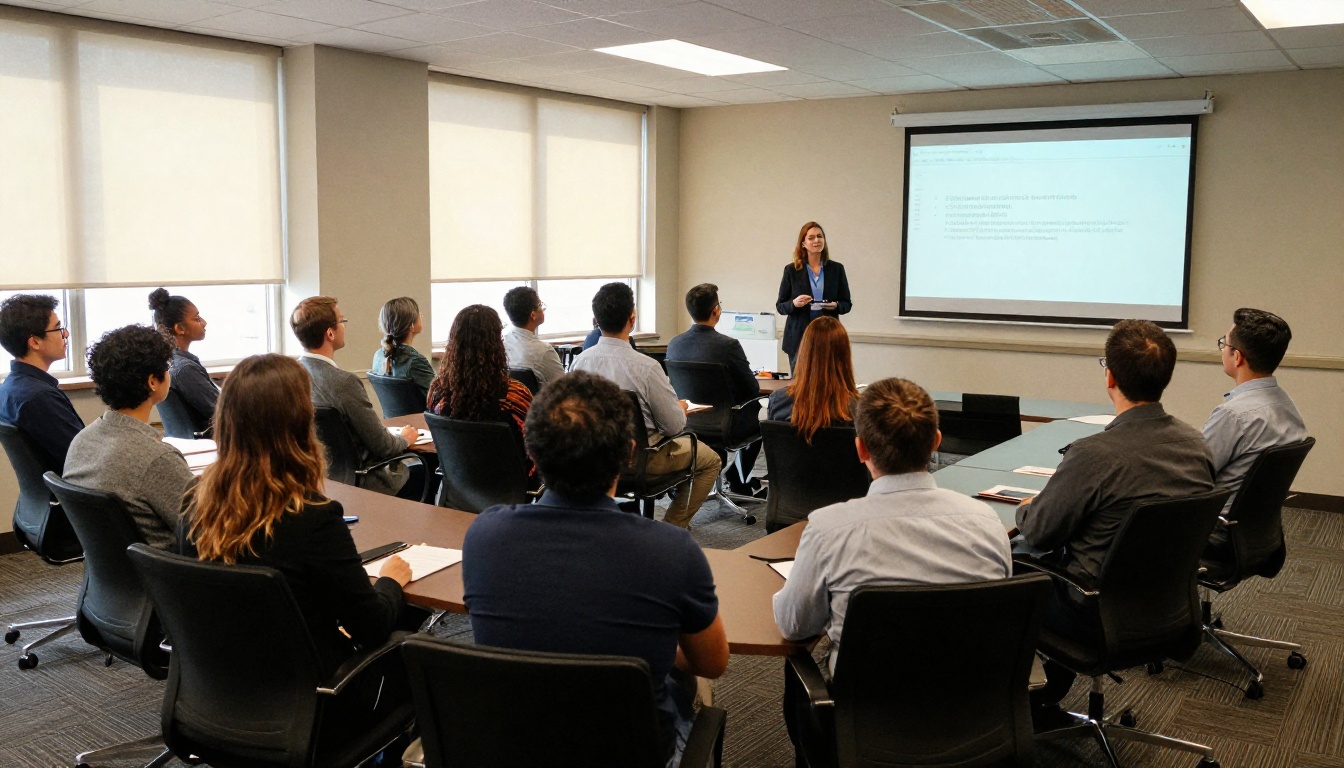
Warehouse, retail, and healthcare staff rarely sit at a desk. Use QR codes at time clocks and break rooms, and offer a short audio summary. Consider a quick huddle where a supervisor shows the booklet on a tablet for five minutes.

Include Spouses and Families
Health decisions are often made at the kitchen table. A shareable link, protected by a password, lets employees show the booklet to a partner without printing anything.

A Timeline That Beats the Deadline
Reading rates climb when messages arrive in a rhythm instead of a single blast. Here is a six week plan.
| Week | Action | Channel |
|---|
| 6 weeks out | Announce dates and what changed | Email and intranet |
| 4 weeks out | Publish the booklet and short video | Email, Slack, QR posters |
| 3 weeks out | Host live Q and A sessions | Video call and on site |
| 2 weeks out | Send a reminder to people who have not opened it | Targeted email |
| 1 week out | Personal nudge from managers | Team meetings |
| Final 48 hours | Last call with one link | Email and text |
⚠️ Warning: Do not send the booklet and the portal link in separate messages weeks apart. Employees read the booklet, forget the link, and miss the window.
Measure What Works
A booklet is a campaign, and campaigns improve when you track them.
Read the Page Data
Look at where attention drops. If most readers leave on the plan comparison, the table is too dense. If the scenarios page has the longest read time, add two more scenarios next year.
Compare Against Last Year
Track these numbers every year:
- Percentage of employees who opened the booklet
- Average time spent in it
- Number of HR questions during the window
- Number of employees who defaulted without choosing

Teams that move from a static PDF to a trackable booklet often see the largest gain in the opened percentage, because reminders can target only the people who have not yet opened it.
Common Mistakes to Avoid
Even good booklets stumble on the same few issues:
- Burying the deadline. It belongs on page one and in every message.
- Using carrier jargon. Write the way employees talk.
- Skipping scenarios. Numbers need stories.
- Forgetting accessibility. Use readable fonts, good contrast, and alt text where possible.
- Changing the link. Update the same booklet instead of sending a new file, so nobody reads an outdated version.
💡 Pro tip: Ask three employees from different departments to read the booklet and tell you what they would do next. Where they hesitate is where you edit.
Start Before the Window Opens
Open enrollment is a yearly chance to help people choose coverage they can use, and to reduce the pile of questions that lands on HR every November. A clear, short, mobile friendly booklet is the cheapest way to do both. If you want a related format for onboarding, the Training Manual Flipbook and Corporate Report Maker follow the same upload and share steps.
Ready to turn your benefits PDF into something people finish? Get started for free on Flipbooks AI, browse all flipbook tools, or compare pricing plans to pick the one with analytics for your next enrollment season.



