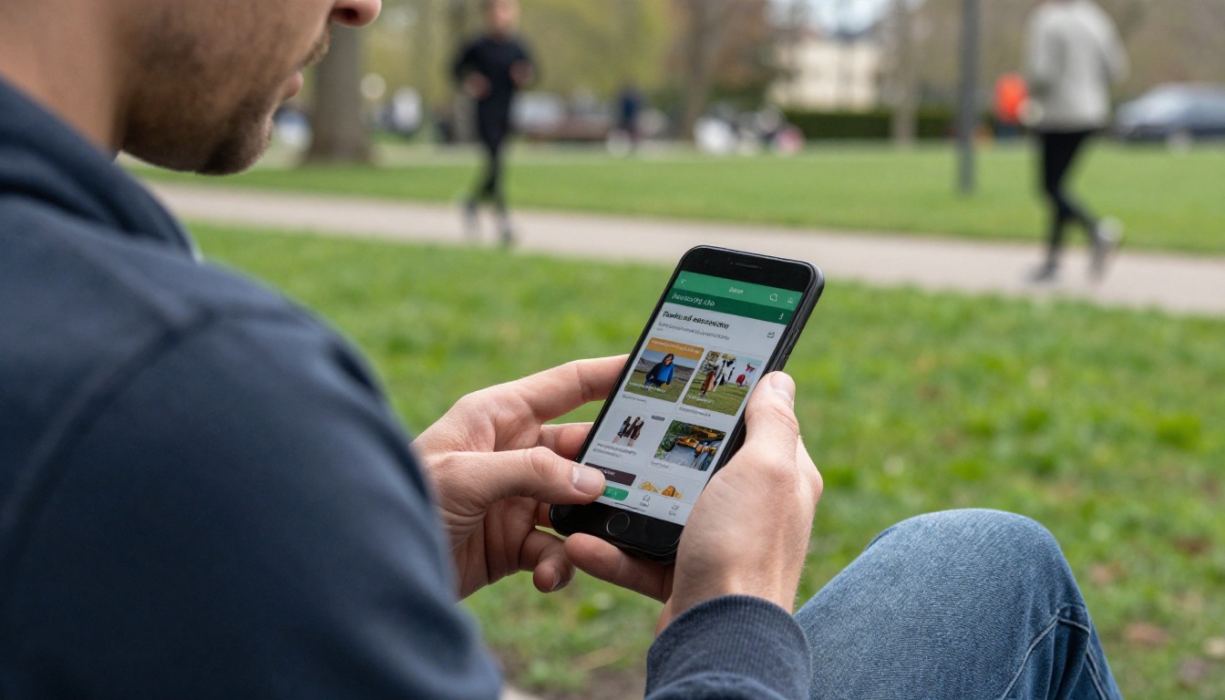
Picture a resident standing at the edge of a playground, thumb scrolling, trying to find out whether the swim lessons they heard about still have open spots. If your seasonal brochure is a 48-page PDF that loads slowly and needs pinching and zooming, they will give up and close the tab. Parks and recreation brochures residents browse on their phones need to load fast, read clearly on a small screen, and lead straight to a registration link. With Flipbooks AI you can convert the PDF you already have into a swipeable, mobile-responsive brochure in a few minutes.
This article walks through why phones now decide whether your programs fill, how to design pages for thumbs instead of desktop monitors, what to put on each page, and how to publish and measure the result.
Why Phones Decide Your Enrollment
Residents rarely sit down with a printed guide anymore. They check programs in line at the grocery store, on a bench at the park, or in the car before pickup. When a department publishes a flat PDF, the phone experience suffers: tiny text, sideways scrolling, and no way to tap a phone number.
A mobile-first brochure fixes those problems because each page reflows to the screen, links are tappable, and the page-turn gesture feels familiar.
💡 Pro tip: Open your current brochure on your own phone before changing anything. Time how long it takes to find the registration deadline for one class. That number is your baseline.
What Residents Actually Look For
Search logs and front-desk questions from most departments point to the same short list:
- Class and camp schedules, with dates and times
- Fees and resident versus non-resident pricing
- Shelter, field, and court rentals
- Trail maps and park amenities
- Special events and free community days
- How to register, and by when
If your brochure answers those six questions in the first few swipes, you have already beaten most printed guides.
The Cost of a Slow PDF
A heavy PDF is a silent barrier. Large embedded images make it slow on a cellular connection, and many residents will not wait. A flipbook streams pages as they are needed, so the first page appears quickly even on a weak signal.
Print Versus Mobile Brochures
Printing will not disappear overnight, and many seniors still prefer paper. The goal is not to replace it but to give everyone else a better option. Here is how the formats compare in practice.
| Factor | Printed Brochure | Plain PDF | Mobile Flipbook |
|---|
| Load speed on cellular | Not applicable | Slow for large files | Fast, pages stream in |
| Readability on a phone | Not applicable | Poor, requires zoom | Responsive, swipeable |
| Tappable links and phone numbers | No | Sometimes | Yes |
| Mid-season updates | Reprint needed | Re-upload, new link | Replace file, same link |
| Usage data | None | Basic downloads | Page views and time on page |
| Cost per update | High | Low | Low |
The pattern is clear. A flipbook keeps the polished brochure look while removing the friction that PDFs create on small screens.
Designing Pages for Thumbs
A page that looks great on a desk monitor can fall apart on a phone. Design for the narrowest screen first and the rest will follow.
Keep One Idea Per Page
Resist the urge to pack six programs onto one spread. On a phone, a page is roughly one screen tall. Give each page a single job: one program family, one park map, or one rental policy.
Use Large, Plain Type
Body text should be readable without zooming. Aim for short lines, generous spacing, and strong contrast between text and background. Avoid placing text over busy photos, because outdoor glare on a phone screen makes it worse.
Lead With the Action
Every page should end with something the resident can do. A button-style link reading "Register for Swim Lessons" works better than a paragraph about the pool's history.
✅ Best practice: Put the registration link in the top third of the page. Many residents never scroll to the bottom.
Choose Photos That Show Real Use
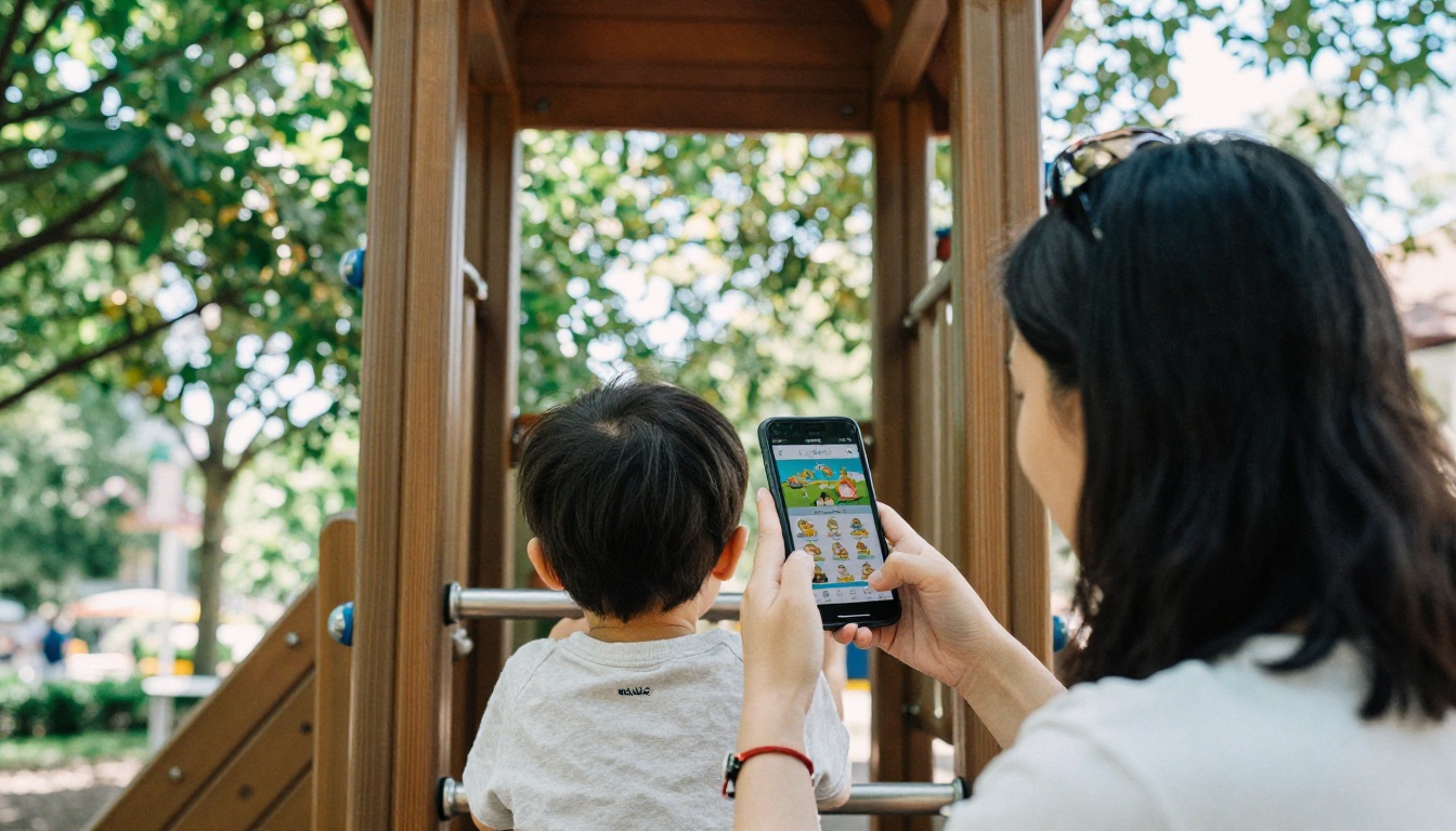
Photos of real neighbors using real facilities build trust. Show kids on the actual playground, seniors in the actual community center, and the actual trail entrance. Residents recognize local places immediately, and recognition drives clicks.
What to Put on Each Page
A well-ordered brochure moves from broad to specific. Residents scan for their own situation, so group content by the question they are asking.
Suggested Page Order
- Cover and welcome: Season name, one clear photo, and a short note from the director.
- Registration at a glance: Dates, deadlines, and a single registration link.
- Youth programs: Camps, sports leagues, after-school offerings.
- Adult and senior programs: Fitness, arts, and social clubs.
- Facilities and rentals: Shelters, fields, courts, and pricing.
- Trails and parks map: Locations, amenities, and accessibility notes.
- Events calendar: Concerts, festivals, and free community days.
- Contact and policies: Phone, email, refunds, and weather rules.
Match Content to the Audience
Different residents need different details. The table below shows what each audience tends to look for and the page element that serves them best.
| Audience | Main Question | Best Page Element |
|---|
| Parents of young children | Which camps fit my work hours? | Schedule table with drop-off times |
| Teens | What can I join with friends? | Short league cards with a sign-up button |
| Seniors | Are classes accessible and affordable? | Large type, clear fee and discount note |
| Event hosts | Can I book a shelter for a party? | Rental rates table and availability link |
| Visitors and walkers | Where are the trails? | Annotated map page with distances |
How to Create Your Brochure With Flipbooks AI
If your department already produces a PDF each season, you are most of the way there. The Brochure Flipbook Maker and PDF to Flipbook Converter handle the conversion. Here is the process.
Step-by-Step Setup
- Create your account. Create an account on Flipbooks AI and open the dashboard.
- Upload the PDF. Drag in your seasonal brochure. Conversion typically finishes in moments, and each PDF page becomes a flipbook page.
- Check every page on a phone preview. Look for text that is too small or links that sit too close together.
- Add branding. Apply your department colors and logo so residents recognize the source. Custom branding and no watermarks are included.
- Add links. Turn registration buttons, phone numbers, and email addresses into tappable links.
- Embed media. Drop in a short video tour of a new splash pad or an audio welcome from the director.
- Choose sharing options. Copy the direct link for social posts and text alerts, or grab the embed code for your city website.
- Publish and test. Open the final link on two different phones before announcing it.
💡 Pro tip: Use the Embed Flipbook on Website option so the brochure lives right on your recreation page instead of sending visitors away.
Sharing Options Compared
| Method | Best For | Notes |
|---|
| Direct link | Social posts, text alerts, email | Fastest to share |
| Embed code | City or department website | Keeps residents on your page |
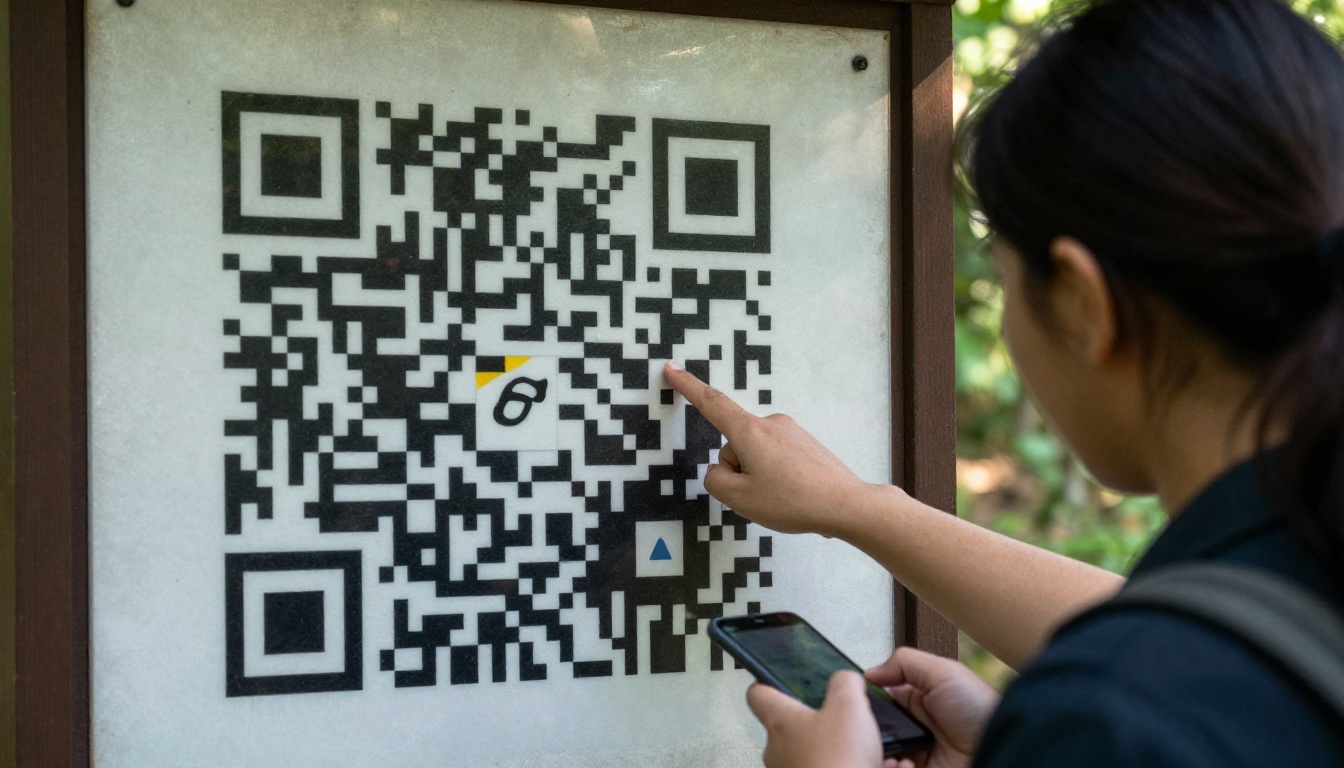
| QR code on signage | Trailheads, rec centers, bulletin boards | Bridges print and mobile |
| Password-protected link | Staff handbooks, volunteer packets | Private content stays private |
A related option is the Online Brochure Designer, which suits teams building a brochure from scratch rather than converting a file.
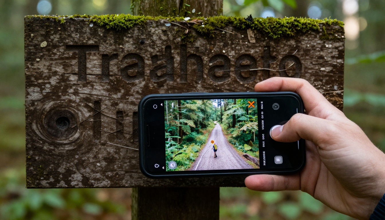
Bringing Paper and Phone Together
Your residents move between the physical park and the digital page all day. Make that handoff easy.
Put QR Codes Where Decisions Happen
A QR code at the trailhead can open the trail map page. One on the pool fence can open the lesson schedule. One at the recreation center front desk can open the full brochure. Each code takes a resident from curiosity to registration in a few taps.
Keep a Printed Edition for Those Who Want It
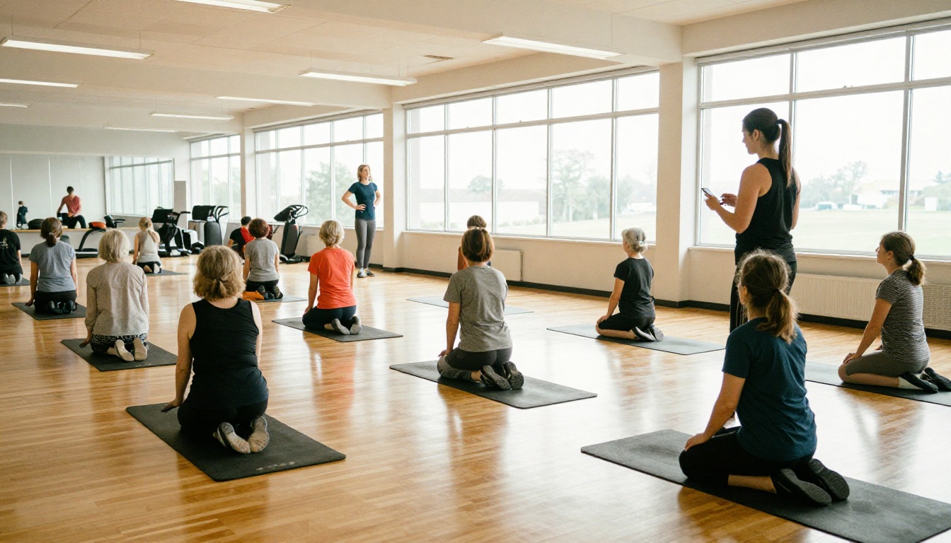
Not everyone has a smartphone, and not everyone wants one. Keep a short print run at libraries and the front desk, and let the same PDF feed both versions. Updating one source file keeps the print and digital editions consistent.
Real-World Examples
These scenarios show how departments of different sizes can apply the same approach.
- A small town with two parks. The recreation coordinator converts a 12-page summer guide, posts the link on the town Facebook page, and adds a QR code to the pool entrance. Staff answer fewer phone calls about hours.
- A mid-size city with a full class catalog. The department publishes separate flipbooks for youth, adult, and senior programs so each audience gets a shorter, more relevant document.
- A county system with many facilities. A single master brochure links to individual facility pages, and a shelter rental page uses a rates table with a booking link.
Event Promotion Works Too
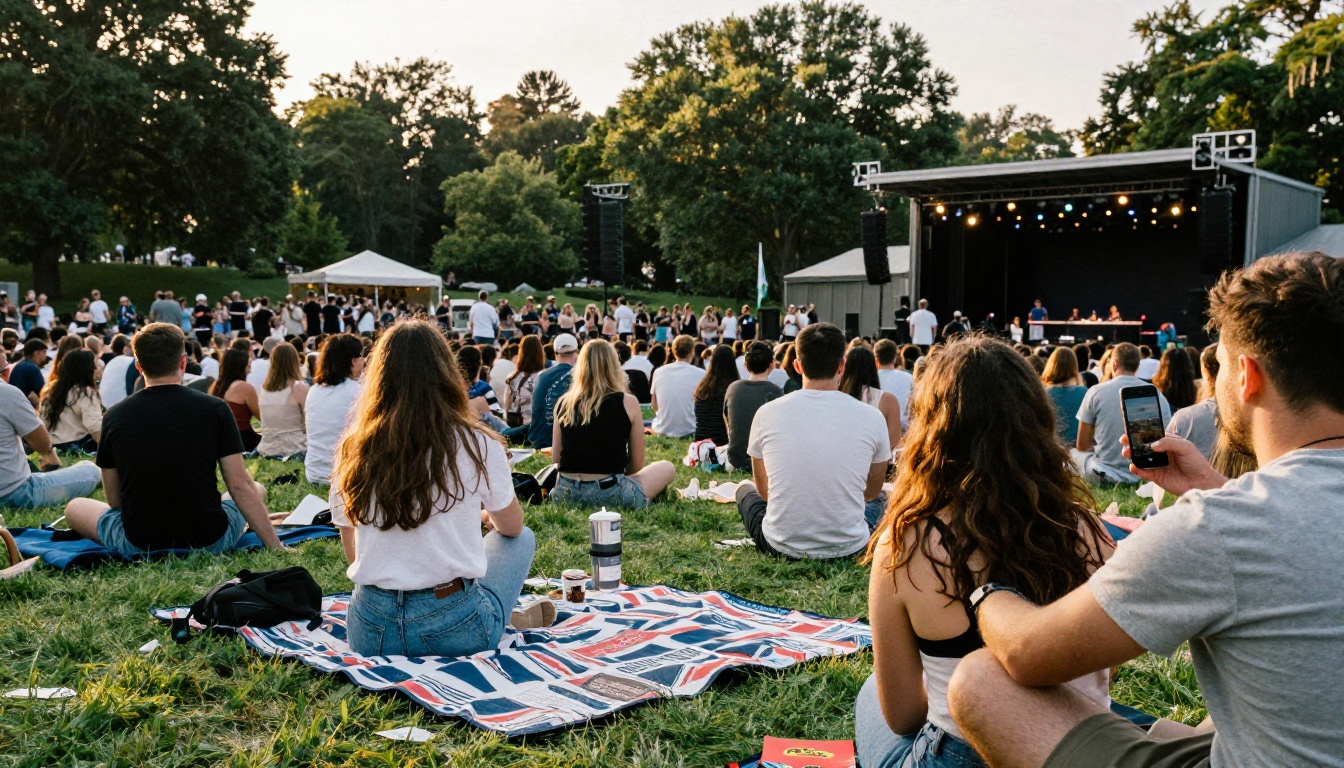
Seasonal events deserve their own pages. A summer concert series, a harvest festival, or a fun run each benefit from one swipeable page with date, location, parking, and a calendar link. The Event Program Maker is a good fit for larger festivals with multiple stages and schedules.
Measuring What Works
Printed brochures are a black box. You hand out 5,000 copies and guess how many were read. A digital brochure gives you a clearer picture, especially with the Professional plan's analytics and lead generation.
Numbers Worth Watching
| Metric | What It Tells You | Action to Take |
|---|
| Total views | Overall reach of the brochure | Compare against print distribution |
| Pages most viewed | Which programs draw attention | Move popular programs earlier |
| Pages with early exits | Where residents lose interest | Simplify or shorten that page |
| Traffic source | QR code, social, or website | Invest more in what works |
| Device type | Share of phone readers | Prioritize mobile layout fixes |
Run a Simple Test
Publish the new mobile brochure alongside the old PDF for one registration period. Track registrations for programs promoted in each. After a season you will know which format to lean on, and you will have real numbers to show your board or council.
Common Mistakes to Avoid
- Uploading a print layout without checking it on a phone. Tiny multi-column pages stay tiny.
- Burying the registration link on the last page. Put it near the front and repeat it.
- Using outdated photos. Residents notice when the playground in the picture was replaced two years ago.
- Forgetting accessibility. Use high contrast, clear alt descriptions where possible, and plain language.
- Never updating. A brochure with last season's dates erodes trust quickly.
⚠️ Warning: Do not include private resident data, such as full registration rosters, in any public flipbook. Use a password-protected link for internal documents.
Youth Sports Deserve Their Own Page
League sign-ups drive a large share of recreation revenue. Give them a dedicated page with age brackets, season dates, fees, and a sign-up link, written in a tone teens and parents both respond to.
Your Next Season Starts With One Upload
Residents already expect to find park information on their phones. A mobile flipbook lets you meet them there without rebuilding your design process: take the PDF you already produce, convert it, add tappable links, and share one link everywhere.
Ready to try it? Get started for free on Flipbooks AI, browse all flipbook tools to find the right template, and compare pricing plans to pick the level that fits your department.



