You spent three weeks polishing your case studies, and then a recruiter gives your work about ninety seconds. So which format earns those seconds: a PDF portfolio or a portfolio website? The honest answer is that it depends on how the recruiter reaches you, what device they hold, and how little friction stands between the click and your best project. This article breaks down both formats with real scenarios, tables, and a simple setup that combines them using Flipbooks AI.
What Recruiters Actually Do
Recruiters rarely read portfolios the way designers imagine. They skim. A typical screening session looks like this: open the application, glance at the resume, click the portfolio link, scroll for a few seconds, and decide whether the candidate goes into the "talk to" pile or the "pass" pile.
That behavior shapes everything. A format that loads slowly, asks for a password they do not have, or hides your best work behind three menus loses the click before it starts.
The 90-Second Rule
Most hiring teams review dozens of candidates in one sitting. Your portfolio is judged on three quick questions:
- Can I open it right now, on this device?
- Do I see strong, relevant work in the first screen?
- Can I tell what this person did, not only what the team did?
Both formats can pass this test. Both can also fail it badly.
Where the Link Gets Opened
The format matters less than the context. Recruiters open portfolio links from:
- Applicant tracking systems on a desktop browser
- Email attachments on a phone, often while commuting
- LinkedIn messages on a mobile app
- Forwarded threads where a hiring manager opens it a day later

PDF Portfolio: Strengths and Limits
A PDF portfolio is a single file with fixed pages. You control the layout, the order, and the pacing, exactly like a printed book.
Why PDFs Still Win Sometimes
A PDF travels well. It can be attached to an email, uploaded to an application form, and saved for later. Nothing breaks if the recruiter is offline on a flight.
Other genuine advantages:
- Total layout control. Every page looks the way you designed it.
- No hosting to maintain. There is no domain to renew and no plugin to update.
- Easy to forward. A hiring manager can pass it to a colleague in one click.
- Print friendly. Some agencies still print shortlisted portfolios for review meetings.
Where PDFs Fall Short
The problems are just as real:
- File size. A portfolio with high-resolution images easily reaches 40 MB or more, which many email systems reject.
- Phone reading. Pinching and zooming a landscape PDF on a small screen is painful.
- No motion. Prototypes, animations, and videos cannot play inside a standard PDF.
- No tracking. You never learn whether anyone opened it, or which pages they read.
- Stale copies. An old version keeps circulating after you update your work.
⚠️ A PDF over 10 MB is a gamble. If the email bounces or the download takes too long, the recruiter will not wait.
Portfolio Website: Strengths and Limits
A portfolio website is a set of pages on your own domain or a builder platform. It is the default advice for designers, developers, and photographers.
Why Websites Feel Professional
A custom site signals effort and technical comfort. For roles in web design, UX, or front-end development, the site itself is part of the evidence.
Real advantages include:
- Interactive work. Prototypes, animations, and embedded video play naturally.
- Searchable. Your name and specialty can rank in search results.
- Always current. Update once and every link shows the newest version.
- Analytics. You can see visits, locations, and popular projects.
The Hidden Costs
Websites also carry friction that candidates underestimate:
- Load speed. Heavy image galleries on cheap hosting can take six seconds or longer to appear.
- Navigation maze. Recruiters do not want to hunt through menus for a case study.
- Maintenance. Broken links, expired domains, and outdated templates quietly hurt you.
- Template sameness. Many student sites look nearly identical, so nothing stands out.
💡 Test your site on a mid-range phone with a normal mobile connection. If the first project is not visible in four seconds, trim your images.
Side-by-Side Comparison
Here is how the two formats compare on the points recruiters care about most.
| Factor | PDF Portfolio | Portfolio Website |
|---|
| Opens in under 3 seconds | Only if the file is small | Only if the site is well optimized |
| Works offline | Yes, once downloaded | No |
| Mobile reading | Poor unless redesigned | Good with responsive design |
| Video and animation | Not supported | Fully supported |
| Layout control | Total | Depends on the template |
| Tracking views | None | Yes, with analytics |
| Easy to forward | Very easy | Easy |
| Maintenance effort | Low | Medium to high |
| Search visibility | None | Strong |
| Best for | Applications, email, print | Showcasing interactive work |
No column wins every row. That is exactly why the "which one" debate never ends.
Here is the practical answer. When a recruiter has both options in front of them, behavior tends to split by situation.
When the PDF Gets Opened First
- The job posting says "attach your portfolio as a PDF."
- The recruiter is reviewing applications inside a system that stores attachments.
- The role is in editorial, print, fashion, or architecture, where page layout is the craft.
- The recruiter is on a phone and the attachment is light and well sized.
When the Website Gets Opened First
- The role involves web, product, UX, or motion work.
- The recruiter found you through LinkedIn or search.
- Your resume shows a clean, short link at the top.
- The company wants to see how you handle interaction and responsiveness.
The Tie-Breaker: Friction
If both are available, recruiters pick whichever takes fewer steps. A short link that opens instantly beats a large attachment. A small, tidy attachment beats a slow site. Friction decides, not format loyalty.
| Situation | Likely First Click | Why |
|---|
| Application form with file upload | PDF | It is already in front of them |
| LinkedIn message with a link | Website | One tap, no download |
| Email with 5 MB attachment | PDF | Opens in the mail app |
| Email with 45 MB attachment | Neither | It may never arrive |
| Resume with a clean short URL | Website | Looks confident and quick |
What Students Should Choose
Students and recent graduates face a special challenge: limited projects and little time. A custom site can feel like a second thesis.
A Realistic Plan for Students
A student with four or five solid projects does not need a sprawling site. Consider this approach:
- Build a tight PDF-style portfolio with five projects, one spread each.
- Keep each project to a clear story: problem, process, result.
- Publish it online so it opens by link, not only by attachment.
- Add a small personal page later, once you have more work.
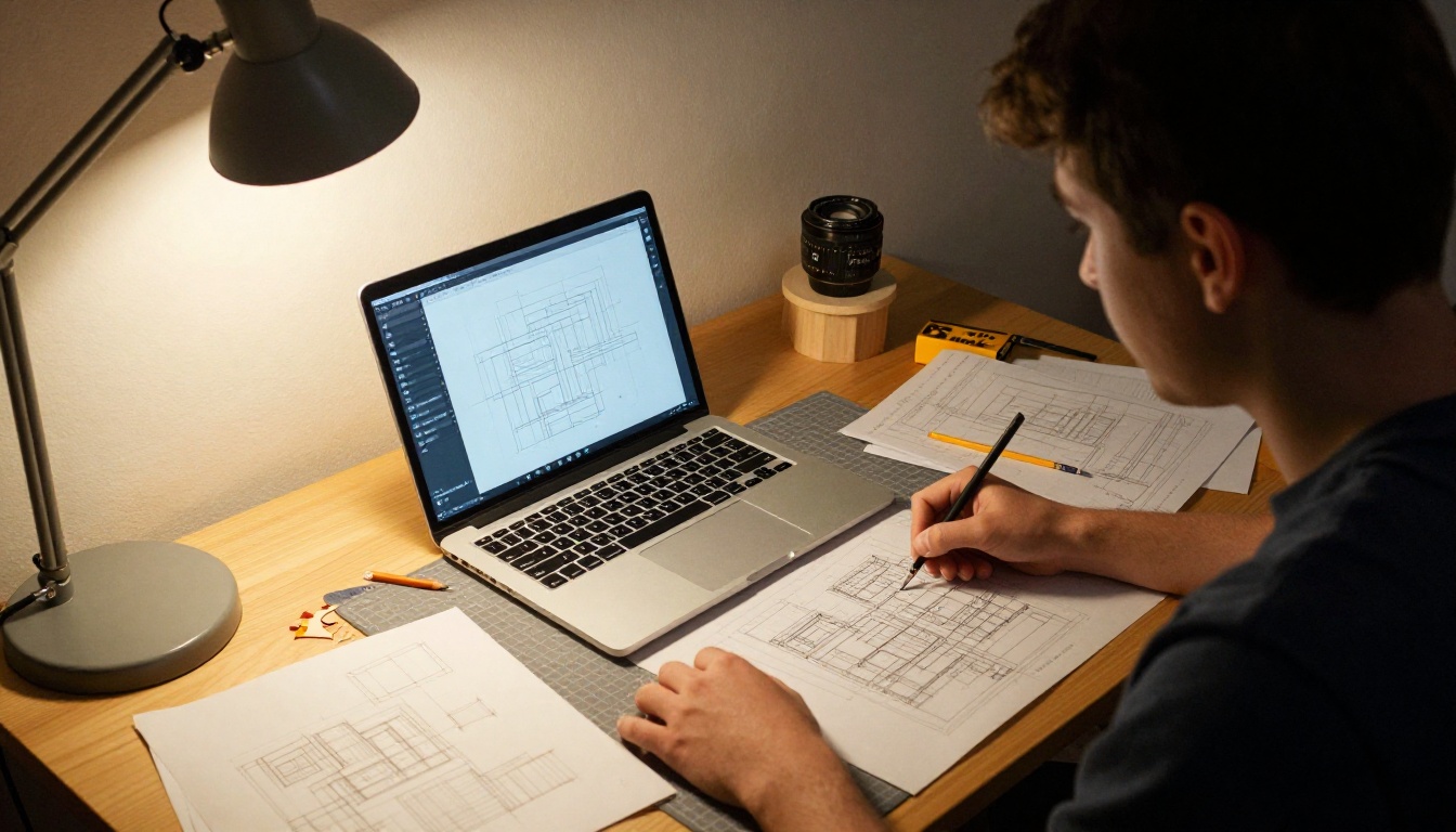
An architecture student, for example, might show three studio projects with plans, sections, and photos of physical models. The pages matter more than the domain name.
✅ Lead with your strongest project, not your most recent one. Recruiters often stop after the first spread.
What to Put on the First Page
The first screen or page should carry your name, your specialty, and one standout image. Skip long biographies. Add one line about the kind of role you want, such as "UX design intern" or "junior brand designer."
The Hybrid Setup That Works
You do not have to pick one. The most effective candidates ship one portfolio in two forms: a link that opens instantly online, and a light file that travels in an email.
Why a Flipbook Bridges the Gap
A flipbook keeps the page-by-page storytelling of a PDF while living at a link like a website. You get the layout control of print with the convenience of the web. With PDF to Flipbook Converter you upload the file you already have, and it becomes a shareable, mobile-friendly reader.
Benefits for job seekers:
- One link, any device. No downloads, no pinch and zoom struggles.
- No file size limits in email. You share a link, not a 40 MB attachment.
- Instant updates. Replace the file and the same link shows the new version.
- Private when needed. Add a password for confidential client work.
- Viewing insights. Professional plan users can see opens and reading behavior through analytics.
How to Turn Your PDF Portfolio Into a Flipbook
Follow these steps to publish your portfolio as an online flipbook:
- Create an account. Go to Flipbooks AI and sign up.
- Upload your PDF. Drag in the file. Pages convert automatically while keeping your layout intact.
- Set your branding. Choose background colors, add your logo, and pick page-turn effects that fit your style.
- Add media. Embed a short video or audio clip on pages where motion helps the story.
- Protect or publish. Turn on password protection for private projects, or keep the link open.
- Share it. Copy the direct link for your resume, or use an embed code on your own site. See how to embed a flipbook on a website.
- Track results. On the Professional plan, check analytics and lead generation to see who viewed your work.
Flipbooks AI never adds watermarks, so your portfolio looks like yours alone. For design-heavy work, the Digital Portfolio Creator and Portfolio Flipbook Builder are good starting points, and photographers can try the Photography Portfolio tool.
💡 Put the flipbook link on your resume header and in your email signature. One short link works everywhere.
Adding a third option changes the picture. Here is how a flipbook compares with the two classics.
| Feature | PDF Attachment | Portfolio Website | Online Flipbook |
|---|
| Opens by link | No | Yes | Yes |
| Mobile friendly | Weak | Strong | Strong |
| Keeps your page layout | Yes | Depends | Yes |
| Embeds video and audio | No | Yes | Yes |
| Password protection | Limited | Varies | Yes |
| Needs hosting or coding | No | Often | No |
| Tracks views | No | Yes | Yes (Professional plan) |
| Time to build | Hours | Days to weeks | Minutes from an existing PDF |
For students and early-career designers, the flipbook column hits the best balance between effort and results. See pricing plans for the tier that fits your needs.

Common Mistakes to Avoid
Whichever format you choose, these mistakes cost interviews:
- Too many projects. Eight mediocre pieces lose to four excellent ones.
- No context. Show your role, tools, and the result of each project.
- Huge file sizes. Compress images before exporting.
- Dead links. Test every link before you apply.
- Vague first page. Say who you are and what you do in one line.
- Ignoring mobile. Open your own portfolio on a phone before sending.
A Quick Pre-Send Checklist
- Open the link in a private browser window.
- Open it on your phone over mobile data.
- Check that the first project is visible without scrolling or clicking.
- Confirm that videos play and links work.
- Ask a friend to find your contact details in under ten seconds.

Recruiters do not care about the format debate. They care about speed, clarity, and strong work. A PDF wins on control and portability. A website wins on interactivity and discoverability. A flipbook gives you both with far less effort.
If you already have a PDF, you are minutes away from a link that opens on any phone. Get started for free on Flipbooks AI, browse all flipbook tools, and compare pricing plans when you are ready for analytics and private sharing. Your next application deserves a portfolio that opens first.



