Most photo books fail for a simple reason: every page is treated as its own little poster. The photos are good, the print is crisp, and yet flipping through feels flat. The fix is to design spreads, not pages, and to make each spread answer one question for the reader. These photo book layout ideas will help you build spreads that connect, so the whole book reads like a story. And before you spend money on printing, you can preview the flow as a digital flipbook with Flipbooks AI.
Why Spreads Matter More Than Pages
When a photo book lies open, the eye sees two pages at once. The gutter in the middle is a pause, not a wall. Treat the left and right pages as one canvas and your layout instantly gains rhythm.
The Spread Is Your Unit of Story
Think of a spread like a paragraph. It has one idea, a clear focal point and a small supporting cast. A spread of a beach morning might have one big sunrise image and three small details: footprints, a thermos, a child's sandals. Together they say "the day began quietly."
What One Story Per Spread Looks Like
Ask yourself a single question before you place any photo: what is this spread about? If you cannot answer in five words, split the photos across two spreads.
💡 Pro tip: Write a five-word caption for every spread on a sticky note before designing. If two spreads share the same caption, merge or cut one.
Plan the Story Before the Layout
Layout choices come last. Sequence comes first. A quick paper mock-up saves hours of dragging boxes around later.
Sort Photos Into Story Beats
Group your images into beats, the same way a film does: opening, build-up, high point, quiet moment, ending. Each beat gets one to four spreads, depending on how many strong photos you have.
- Opening: wide, scene-setting images.
- Build-up: people, movement, small details.
- High point: your single best image, given the most space.
- Quiet moment: a calm, simple spread to let readers breathe.
- Ending: a final image that echoes the opening.
Pick a Hero for Every Spread
Every spread needs one hero image, the photo your eye lands on first. Make it larger than the others, or give it more empty space around it. Without a hero, the viewer wanders.
Mock Up on Paper First
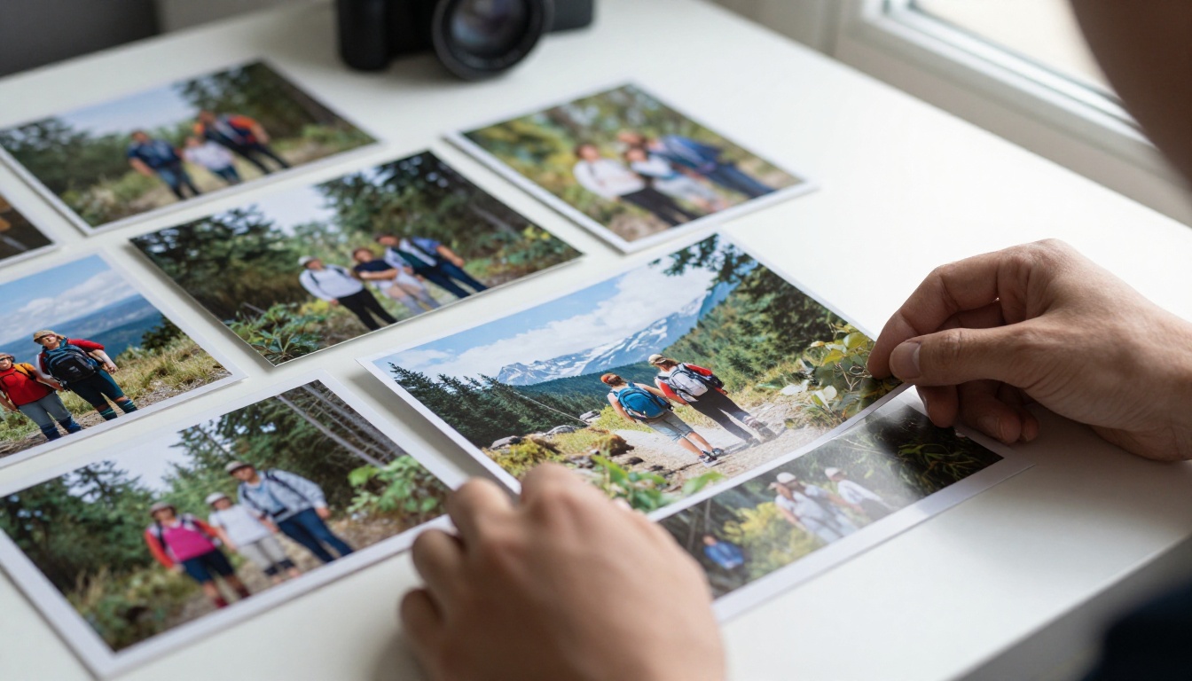
Print thumbnails at roughly 2 inches wide, lay them out on a table and move them around. You will spot weak pairings in seconds. It also reveals pacing issues, such as five busy spreads in a row.
Eight Spread Layouts That Work
Here is a quick comparison of the most reliable spread types, with what each is best at.
| Layout | Best For | Photos Per Spread | Mood |
|---|
| Full bleed panorama | Landscapes, big moments | 1 | Dramatic, immersive |
| Hero plus details | Travel, events | 3 to 5 | Balanced, narrative |
| Even grid | Portraits, series | 4 to 9 | Calm, organized |
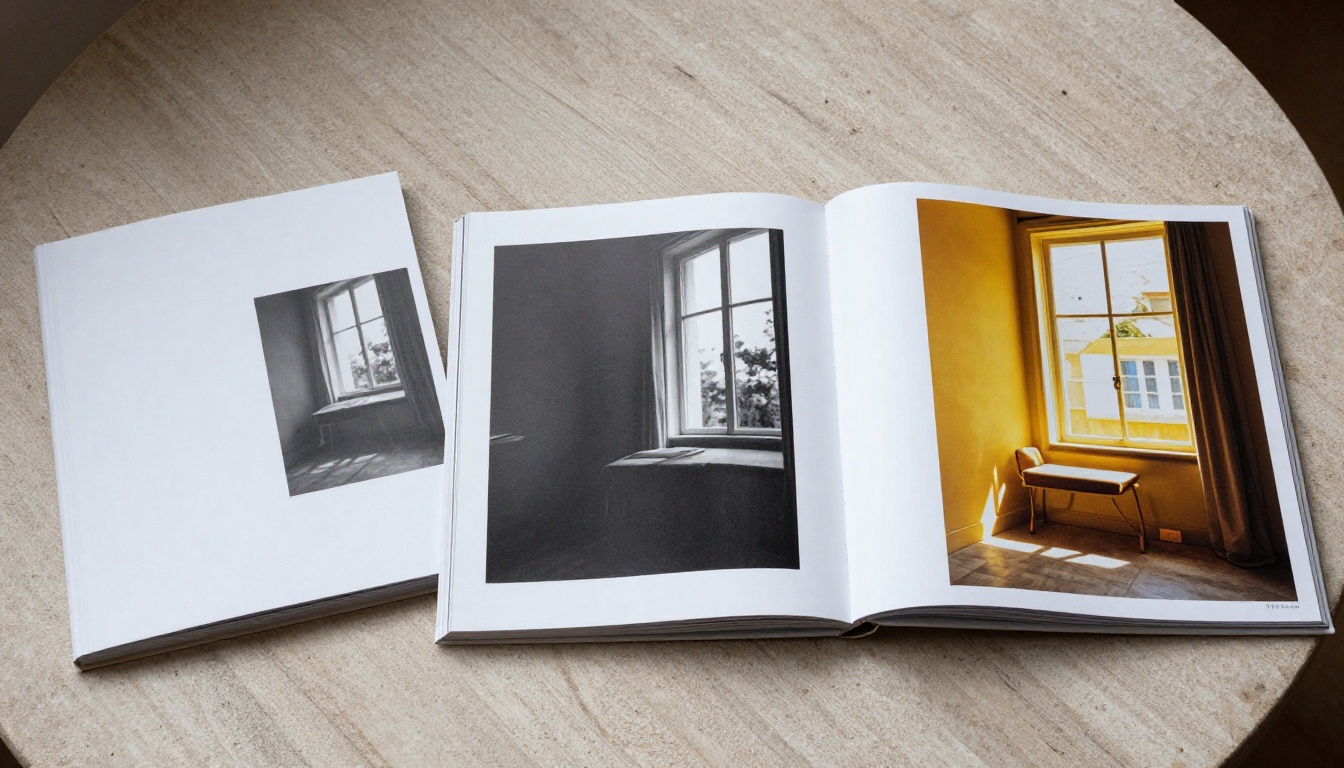
| Diptych | Contrast, before and after | 2 | Reflective |
| Single image, wide margins | Quiet moments | 1 | Gallery-like |
| Collage cluster | Candid fun | 6 to 10 | Playful |
| Left text, right photo | Captions, stories | 1 plus text | Editorial |
| Color-matched pair | Mood and palette | 2 to 3 | Cohesive |
Full Bleed Across the Gutter
A single photo running edge to edge across both pages is the loudest thing you can do in a book. Use it once or twice, not ten times. Choose images where nothing important crosses the gutter, such as a face or a horizon detail you care about.
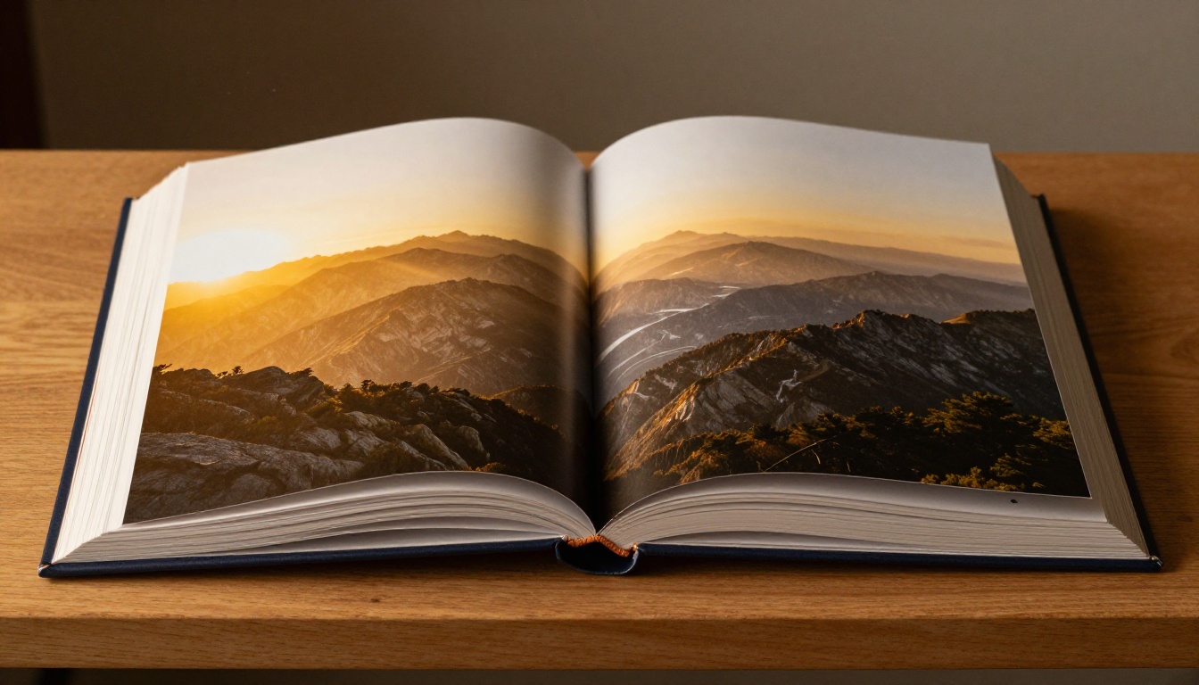
⚠️ Warning: Binding can swallow 5 to 10 mm near the gutter in some book styles. Lay-flat binding avoids this, but always keep faces and text well away from the center line.
The Even Grid
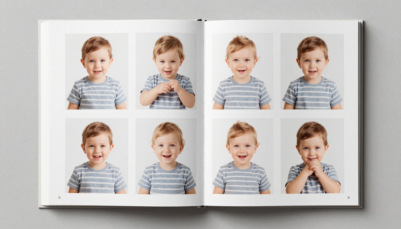
Equal-sized squares with equal gaps feel orderly and gentle. They suit baby portraits, product series or a day broken into hours. Keep the gap consistent, typically 3 to 6 mm, and the spread looks designed rather than assembled.
Hero Plus Supporting Details
One large image on the left, two or three small ones on the right. This is the workhorse of travel and event books. The small photos add texture: a ticket stub, a hand on a railing, a plate of food.
Diptychs and Visual Echoes
Two images side by side that share a shape, color or gesture create instant meaning. A child's raised arms next to a bird taking off. A red umbrella opposite a red door. Readers feel the link even if they cannot name it.
Pacing: The Rhythm of a Photo Book
A book made entirely of loud spreads exhausts the reader. A book made entirely of quiet ones bores them. Alternate.
Loud, Quiet, Medium
A simple pattern is loud, medium, quiet, medium, loud. Loud means a full bleed or dense collage. Quiet means one small image on a field of white. Medium sits in between, such as a hero plus details.
| Spread Type | Energy | Use It |
|---|
| Full bleed | High | At chapter openings and the high point |
| Collage cluster | High | For lively, candid moments |
| Hero plus details | Medium | As the default workhorse |
| Even grid | Medium | To organize a series |
| Single image, wide margins | Low | After a loud sequence |
The Power of White Space
Empty space is not wasted space. It tells the viewer "look here, slowly." A single photo placed slightly off-center on a wide white field feels like a gallery wall, and it makes the next busy spread hit harder.
Chapters Without Headings
You do not need a title page for each section. Signal a new chapter with a change of color mood, a full bleed opener or a spread that is mostly empty. Readers pick up on the shift.
Pairing Photos So They Talk
Two photos on one spread should feel like a conversation, not two strangers at a bus stop.
Match by Color
Place warm tones with warm tones, cool with cool. A golden-hour portrait beside a sunlit kitchen feels natural. The same portrait next to a blue night street feels jarring unless you want the contrast.
Match by Direction
If someone in the left photo looks or moves to the right, the eye follows the line into the next image. Faces pointing off the page edge pull attention out of the book. Faces pointing toward the gutter keep it inside.
Match by Scale
Pair a wide landscape with a tight detail. The wide photo sets the place, the close-up gives it a heartbeat. It is the same logic film editors use when they cut from an establishing shot to a close-up.
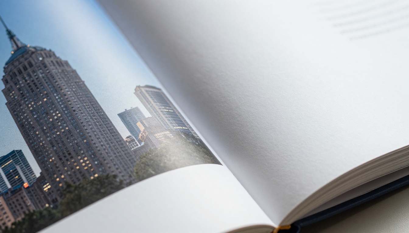
✅ Best practice: Read each spread aloud as a sentence. "The family arrives (wide), and the kids spot the sea (close-up)." If the sentence works, the pairing works.
Typography and Captions Without Clutter
Text should whisper. A photo book is not a magazine.
Short Captions Beat Long Ones
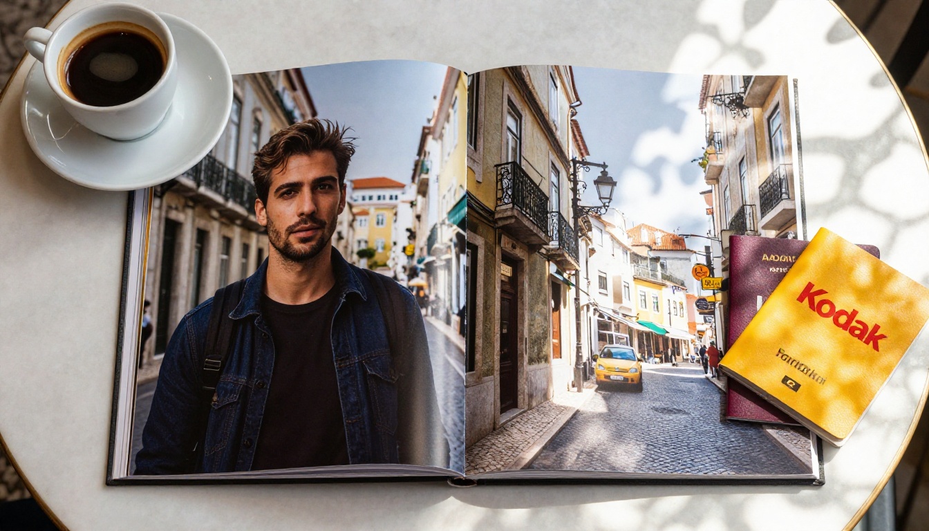
Aim for under 15 words. A date, a place and one human detail is usually enough: "Lisbon, June. Marta insisted on the third pastry." Place captions in the same spot on each spread so readers learn where to look.
One Typeface, Two Sizes
Pick one clean typeface and use two sizes: one for chapter titles, one for captions. Black or dark grey on white has the best readability. If text sits on a photo, place it over a calm area such as sky or wall.
Where Text Should Never Go
Keep text away from the gutter, off faces and clear of the trim edge. Leave at least 10 mm from every edge so a printer's cutting variation never clips a word.
Real Examples You Can Copy
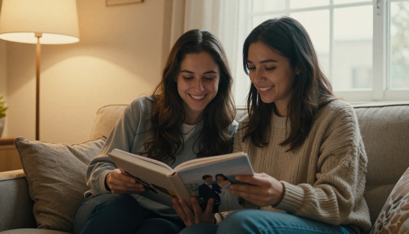
Here are three spread sequences, each built on a different story.
A Weekend Trip in Five Spreads
- Spread 1: full bleed of the arrival view.
- Spread 2: hero portrait plus three food details.
- Spread 3: even grid of six street scenes.
- Spread 4: single quiet image, wide margins, with a short caption.
- Spread 5: full bleed sunset that mirrors the opener.
A Wedding Day Arc
A wedding follows a built-in timeline, so lean on it. Start with details (rings, shoes, flowers) in a grid. Move to the ceremony with a hero plus details. Give the first kiss a full bleed. Close with quiet candid moments. If you want a ready-made structure, the Wedding Album Flipbook tool is built around exactly this flow.
A Child's First Year
Twelve months suggests twelve small grids, but that gets repetitive. Instead, give birth and first steps a hero spread each, group the in-between months into collage clusters and finish with a diptych: newborn hands next to one-year-old hands.
| Story Type | Opening Spread | High Point | Ending Spread |
|---|
| Weekend trip | Full bleed arrival view | Sunset panorama | Echo of the opener |
| Wedding | Details grid | First kiss full bleed | Quiet candid |
| First year | Newborn portrait, wide margins | First steps hero | Hands diptych |
| Family reunion | Group photo hero | Dinner collage | Single portrait of the oldest guest |
Preview Your Spreads as a Flipbook
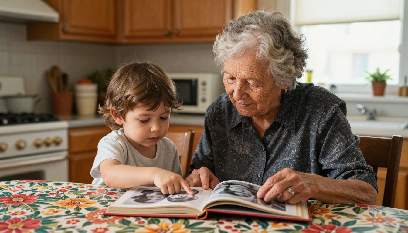
Printing is permanent and often pricey. A digital preview lets you test the flow, catch awkward pairings and share the draft with family before you commit. It also works as a keepsake on its own, since it can live on any phone.
How to Build a Flipbook Preview
- Export your photo book layout as a PDF, with spreads on facing pages.
- Go to Flipbooks AI and create an account.
- Upload the file with the PDF to Flipbook Converter. Pages convert into a page-turning book in seconds.
- Pick your background color and page-turn effect so it matches the mood of the book.
- Share a direct link or embed the flipbook on a website. Add password protection if the photos are private.

Photographers who want to show finished work can also use the Photography Portfolio tool. There are no watermarks on your pages, and the result is mobile-responsive, so relatives can flip through on a phone.
Print, Digital or Both
| Format | Strength | Weakness | Best For |
|---|
| Printed photo book | Tactile, lasting gift | Cost, no edits after printing | Weddings, milestones |
| Digital flipbook | Instant sharing, free to revise | No paper feel | Drafts, remote family |
| Both | Test first, then print | Slightly more work | Anything you care about |
Analytics are available on the Professional plan if you share a flipbook publicly and want to see which spreads people linger on. Check the pricing plans for details.
Feedback From a Fresh Pair of Eyes
Send the preview link to one person who was not there. Ask them what they think each spread is about. If their answer matches your five-word caption, the spread works. If not, adjust the hero or remove a photo.

Common Mistakes to Avoid
Even good photographers repeat the same layout errors.
- Too many photos per spread. More than eight and nothing is a hero.
- Faces in the gutter. Always check the center line.
- Inconsistent margins. Pick one outer margin and stick with it.
- Mixed filters. Edit all photos with one color profile.
- No quiet pages. Pacing needs rests.
- Orphan photos. A lone small image with nothing to anchor it looks like a mistake.
A Final Checklist Before Printing
- Every spread has a hero.
- Captions are short and consistently placed.
- Nothing important sits within 10 mm of the gutter or trim.
- Loud and quiet spreads alternate.
- The opening and ending echo each other.
- You previewed it as a flipbook and someone else read it.
Ready to Build Your Next Spread?
Strong spreads come from a clear story, one hero per spread, thoughtful pairings and a rhythm that lets readers breathe. Plan on paper, test on screen, then print with confidence.
Ready to preview your book? Get started for free on Flipbooks AI, browse all flipbook tools for more formats, or compare pricing plans to choose what suits your project.



