Most catalog pages fail before a buyer finishes the first scroll. Not because of the product, but because of the photo. Colors look off, backgrounds are distracting, and some shots are so soft they feel like they were taken on a phone from 2012. Flipbooks AI sees thousands of catalog uploads every month, and the ones that convert share one trait: properly edited images. Not fancy images. Just edited ones. This article breaks down exactly what that means and how to do it.
Why Photo Quality Defines Catalog Success
The Cost of Poor Product Images
A blurry or color-shifted product photo doesn't just look bad. It actively costs sales. Buyers interpret inconsistent imagery as a signal that a brand is unreliable. When the product looks different in every photo because white balance wasn't controlled, customers lose confidence before they ever click "buy."
In print catalogs, poor image quality is even more damaging. Once ink hits paper, there's no going back. A photo that looked acceptable on screen can print muddy, flat, or with a heavy color cast that makes a white shirt look beige or a red bag look brown.
⚠️ A catalog with inconsistent product images loses customer trust faster than one with no images at all.
What Buyers Actually Notice First
Eye-tracking studies on e-commerce and catalog pages consistently show the same result: buyers look at product images before they read a single word of copy. The photo carries more weight than the price, the description, or the brand name in those first two seconds.
What specifically catches negative attention:
- Inconsistent backgrounds (some white, some gray, some shot in a living room)
- Color shifts between similar products in the same family
- Soft or blurry shots that suggest low quality
- Blown-out highlights that erase product detail

Color Correction First, Always
Color correction is the single most impactful edit you can make to a product photo. It costs nothing except time and changes how every product reads on the page.
White Balance and Why It Matters
White balance controls whether the overall tone of a photo reads warm (orange/yellow), cool (blue), or neutral. Product photos almost always need neutral white balance. When white balance is wrong, white products look cream or gray, and product colors shift in ways that don't match reality.
Most cameras default to Auto White Balance, which varies shot to shot. Fix this in post-processing:
- Set a neutral reference point: Click on something that should be white or 18% gray in your editing software
- Use a physical color checker card: Shoot one frame with the card visible, then sample it as a reference for the whole batch
- Match Kelvin manually: Most catalog studio shots fall between 5000K and 5600K (daylight)
💡 If you shoot the same product line at 5500K every time, your entire catalog will have consistent color temperature automatically.

Exposure, Contrast, and Highlights
After white balance, exposure is the next fix. Most product photos are either slightly overexposed (highlights clipped, no detail in light areas) or underexposed (the product looks dull and flat).
The target for most catalog product shots:
- Exposure: Histogram should show data all the way to the right without touching the edge
- Highlights: Pull back 15-25 points to recover any clipped areas
- Blacks: Lift slightly (5-10 points) to avoid pure black shadows that lose detail
- Contrast: Keep it moderate. Catalog images need to reproduce well in both print and digital formats
A quick exposure check: if the background is supposed to be white, it should read 250-255 on an RGB histogram. If it reads 230, the shot is underexposed. If it reads 255 and nothing else nearby does, highlights are clipped.
Background Work That Changes Everything
Backgrounds tell a story. In catalog photography, that story needs to be tightly controlled.
Clean White Backgrounds vs. Lifestyle Shots
There's no single right answer between white backgrounds and lifestyle photography. Both serve different catalog types depending on the product and the buyer's expectations.
| Background Type | Best For | Buyer Signal | Editing Complexity |
|---|
| Pure white seamless | E-commerce, technical, apparel | Professional, neutral | Low |
| Light gray seamless | Electronics, home goods | Modern, minimal | Low |
| Lifestyle/contextual | Furniture, food, cosmetics | Aspirational, emotional | High |
| Flat lay on texture | Accessories, stationery, food | Creative, branded | Medium |
The mistake most brands make is mixing background types within the same catalog without intention. If your catalog has 80% white background shots and then suddenly a product on a wooden table, the inconsistency breaks the visual rhythm of the page.

Removal vs. Replacement
When a product photo has a background that doesn't work, you have two options: remove it or replace it.
Background removal works best when:
- You want a true white or transparent background
- The product has clear edges (hard goods, packaged items)
- You'll be placing products on catalog pages over a designed layout
Background replacement works best when:
- You want a specific lifestyle feel without reshooting
- The product needs context (furniture shown in a room, food on a table)
- You have high-quality background references to swap in
💡 For apparel and soft goods with complex edges (hair, fur, loose fabric), clean background removal requires manual masking or AI-assisted tools, not just a simple selection.
Sharpness, Detail, and Resolution
A photo can be perfectly exposed and correctly colored but still fail in a catalog because it's soft.
Minimum Resolution for Print vs. Web
Resolution requirements differ significantly between print and digital catalogs. Using the wrong specification for your output format wastes file storage (too high for web) or produces noticeably soft output (too low for print).
| Output Format | Minimum DPI/PPI | Minimum Long Side (px) | File Format |
|---|
| Print catalog (CMYK) | 300 DPI at final size | 3000px | TIFF or high-quality JPEG |
| Digital catalog (screen) | 72-96 PPI | 1500-2000px | JPEG or WebP |
| Retina/HiDPI screens | 144 PPI | 2500px+ | JPEG or WebP |
| Social media crop | 72 PPI | 1080px | JPEG |
For digital catalogs published through Flipbooks AI, the sweet spot is 1500-2000px on the long side at high JPEG quality (85-90%). This keeps file sizes reasonable for fast page load while maintaining visible detail on modern screens.
Sharpening Without Over-Processing
Sharpening is the last step of editing, not the first. Apply it after all other corrections are done, and ideally as an output-specific step (different sharpening for print vs. screen).
A practical sharpening approach in most editing software:
- Amount: 60-80% (enough to see, not enough to create halos)
- Radius: 0.8-1.2 pixels for screen output, 1.5-2.0 for print
- Masking: Increase to 40-60% so sharpening applies only to edges, not flat background areas
Over-sharpened product photos create visible halos around edges and make textures look artificial. This is especially damaging for fabric, leather, and cosmetic packaging where natural texture sells the product.

Consistency Across All Product Shots
Individual great photos don't make a great catalog. Consistency does.
Batch Editing to Save Hours
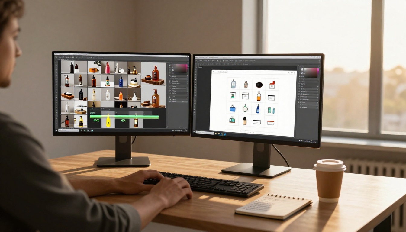
If you shot 40 products under the same studio conditions, you shouldn't be editing them one at a time. Batch editing applies the same corrections to an entire set in one pass.
How to batch-edit efficiently:
- Shoot a reference frame first: one well-lit, accurately exposed shot with a gray card visible
- Edit the reference frame to perfection: correct white balance, exposure, and contrast
- Sync settings across all frames shot under the same lighting conditions
- Review and spot-fix: check 10-15% of the batch for any outliers needing individual attention
- Export with a consistent preset: same sharpening, same JPEG quality, same file naming convention
✅ In Adobe Lightroom, the "Sync Settings" function can apply adjustments from one photo to hundreds in seconds.
Color Profiles and Export Settings
Color profiles determine how colors in your photo are interpreted by different devices and software. Using the wrong profile when exporting catalog images creates color shifts that appear at print time or across different screens.
For web/digital catalogs: Export in sRGB. This is the standard for screens and ensures colors display consistently across monitors and mobile devices.
For print catalogs: Export in CMYK (Adobe 1998 or your printer's specified profile). RGB photos sent to a print shop will be converted to CMYK during RIP processing, often with unexpected color shifts.
⚠️ If your catalog will be used for both digital and print, prepare two separate export versions with the correct color profiles for each.

Editing Software Worth Using
Free vs. Paid Options
The best editing software is the one your team will actually use consistently. Both free and paid tools can produce catalog-quality results.
| Software | Cost | Best For | Batch Editing | Raw Support |
|---|
| Adobe Lightroom | $9.99/mo | Professional workflow, catalogs | Yes (excellent) | Yes |
| Adobe Photoshop | $20.99/mo | Retouching, background work | Limited | Yes |
| Capture One | $24/mo | Color accuracy, tethered shooting | Yes | Yes |
| GIMP | Free | Manual retouching, background removal | Limited | With plugins |
| Darktable | Free | Lightroom alternative, raw editing | Yes | Yes |
| Canva Pro | $14.99/mo | Layout plus basic image editing | No | No |
For most catalog workflows, Lightroom handles 90% of the work: culling, color correction, batch sync, and export. Photoshop handles the remaining 10% (complex background removal, composite work, retouching).
Mobile Editing for Quick Fixes
Not every catalog photo goes through a desktop workflow. Mobile editing tools have improved enough to handle basic product photo fixes when working fast.
Reliable mobile options:
- Lightroom Mobile (free with limitations): full raw support, sync with desktop presets
- Snapseed: solid exposure and color tools, completely free
- VSCO: good for consistent color grading presets across a product line
Mobile editing works well for social catalog assets and quick web updates. For print-quality output or complex background work, desktop remains the standard.

Building Your Catalog with Flipbooks AI
Once your images are edited, consistent, and exported correctly, the next step is putting them into a catalog that actually works. Flipbooks AI converts your designed PDF catalog into an interactive digital flipbook that loads fast, works on mobile, and can be shared anywhere.
Upload and Convert in Minutes
Create your catalog layout in any design software (InDesign, Canva, Illustrator), export as PDF, then upload directly to your Flipbooks AI account. The platform handles conversion automatically, preserving your image quality and layout.
For product catalogs specifically, the Digital Catalog Maker and Catalog Flipbook Creator are purpose-built for this workflow. If your catalog leans toward fashion, the Fashion Catalog Creator offers layouts and options tailored to apparel presentation.
💡 For the best image quality in the flipbook output, export your PDF at 150-200 DPI rather than maximum. This balances visual quality with fast page load times.
Branding and Customization
A flipbook catalog that looks like a generic PDF viewer doesn't represent your brand. Flipbooks AI includes full branding controls: custom colors, logo placement, custom domain support, and page transition effects that give your catalog a polished feel.
Core customization features available:
- Custom branding: Logo, colors, favicon
- Page effects: Realistic page-flip animation
- Multimedia embedding: Add video or audio to catalog pages
- Password protection: For private price lists or restricted catalogs
- No watermarks on Standard plan and above
Sharing, Analytics, and Lead Generation
A static PDF shared over email is a dead end. You can't track who opened it, how long they spent on each page, or whether they clicked anything. Flipbooks AI's Professional plan adds full analytics that show exactly how buyers engage with your catalog.
Available sharing and tracking features:
| Feature | Standard | Professional |
|---|
| Direct shareable link | Yes | Yes |
| Embed on website | Yes | Yes |
| Password protection | Yes | Yes |
| Analytics dashboard | No | Yes |
| Lead generation forms | No | Yes |
| Offline download | No | Yes |
| Custom domain | No | Yes |
For sales teams using catalogs to close deals, lead generation forms embedded directly in the flipbook let you capture buyer information at the moment of peak interest. See full pricing plan details to compare what's included at each tier.

Every hour spent editing product photos correctly is an investment that multiplies across every catalog page, every sales season, and every channel the catalog appears in. A buyer who looks at a page with sharp, consistent, well-lit images doesn't think about the photography at all. They think about the product. That's exactly what you want.
The editing steps in this article are not complicated. Color correction, background work, resolution settings, batch consistency, and proper export profiles are all achievable in an afternoon of focused effort. The difference they make in how a catalog reads is not subtle.
When your images are ready, get started on Flipbooks AI to convert your catalog into a shareable, trackable digital flipbook. Browse the tools directory to find the right template for your catalog type, from fashion catalogs to furniture catalogs to product lookbooks. Compare pricing plans to choose what fits your publishing volume.