Your publication's thumbnail does not get a second chance. It either stops the scroll or it doesn't, and in most cases, that judgment happens before anyone reads a single word. Whether you're publishing a digital catalog, a lookbook, an ebook, or a company report, the thumbnail version of your publication page is what actually drives clicks. Full-size beauty means nothing if the 150-pixel preview looks like noise.
This is exactly why picking the right image is one of the most consequential decisions in digital publishing. On Flipbooks AI, your flipbook's thumbnail is the first visual impression on every share, embed, and library view. Getting it wrong is a silent traffic killer. Getting it right is one of the cheapest performance wins available to any publisher.
Most people treat the front page image as decoration. It's not. It's a conversion element. The moment your flipbook appears in a grid, a search result, or a social feed, the thumbnail is competing against dozens of other visuals for the same eyeballs.
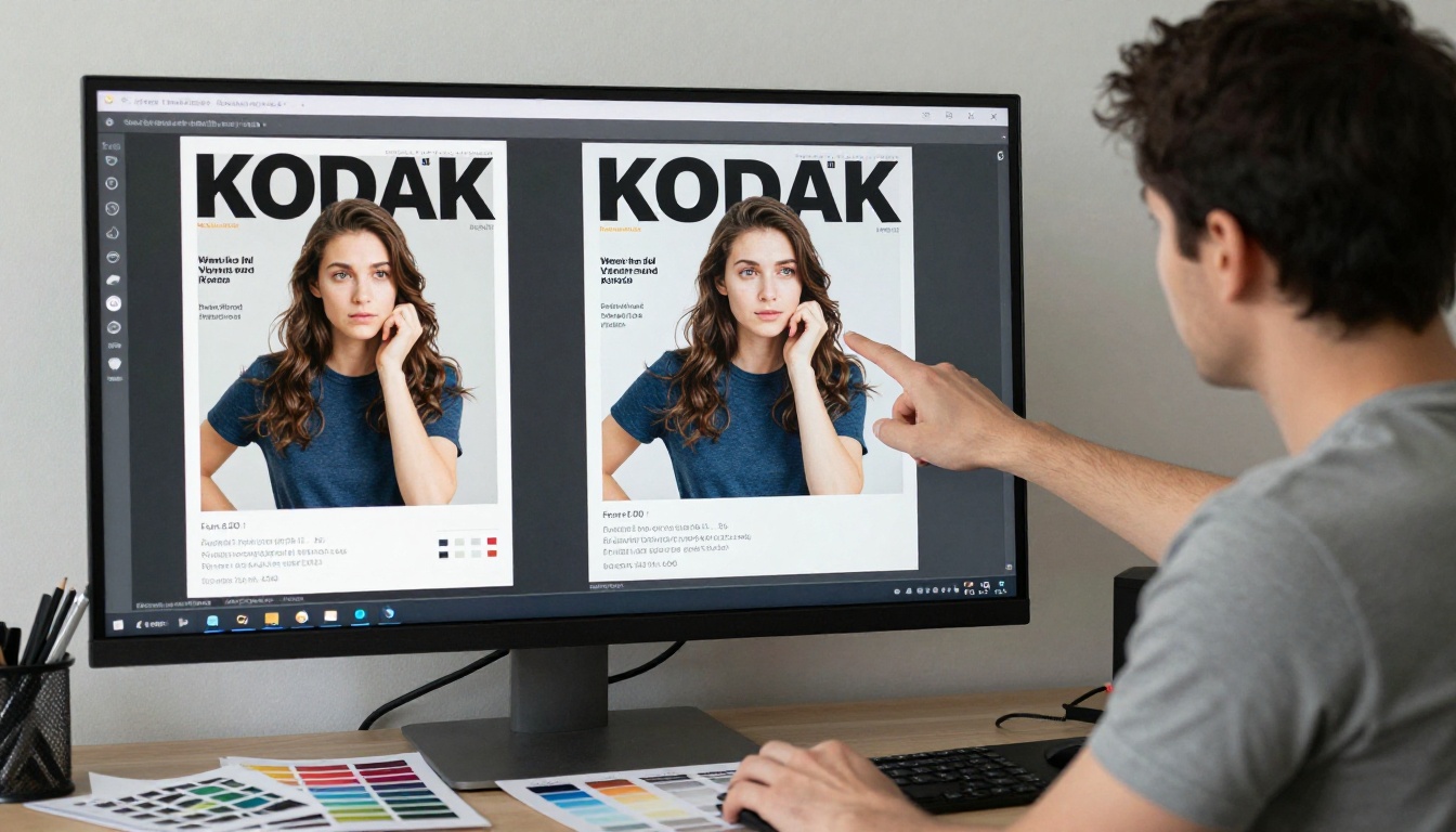
Think of it like a bookshelf: people scan, not read. They make visual snap judgments based on shape, brightness, and subject recognition. If your thumbnail doesn't communicate something instantly, it gets skipped.
The 3-Second Scroll Test
Scroll behavior has been studied extensively. A person browsing a content library or social media feed typically spends between 1.5 and 3 seconds per item before committing or moving on. Your thumbnail has that window.

To pass the 3-second test, a thumbnail must do three things at once:
- Signal what the content is about
- Communicate quality or credibility
- Trigger enough curiosity or desire to warrant a click
If your image requires someone to pause and study it before they understand what it shows, it has already failed.
What Viewers Actually Notice First
Eye-tracking research consistently shows that humans fixate on faces first, then high-contrast areas, then large text, in roughly that order. Knowing this is immediately useful. An image with a clear face, a strong contrast ratio, or a bold single element will outperform a busy, layered composition at thumbnail scale almost every time.
💡 A single strong subject beats a dozen well-designed elements when the frame is smaller than your thumb.
What Makes an Image Work at Thumbnail Size
The characteristics that make a beautiful full-size image are not the same ones that make it work at thumbnail scale. A stunning wide-angle landscape with rich detail may render as an indistinct blur at 150x100 pixels. You need images architected for small viewing.
Contrast and Visibility at Small Scale
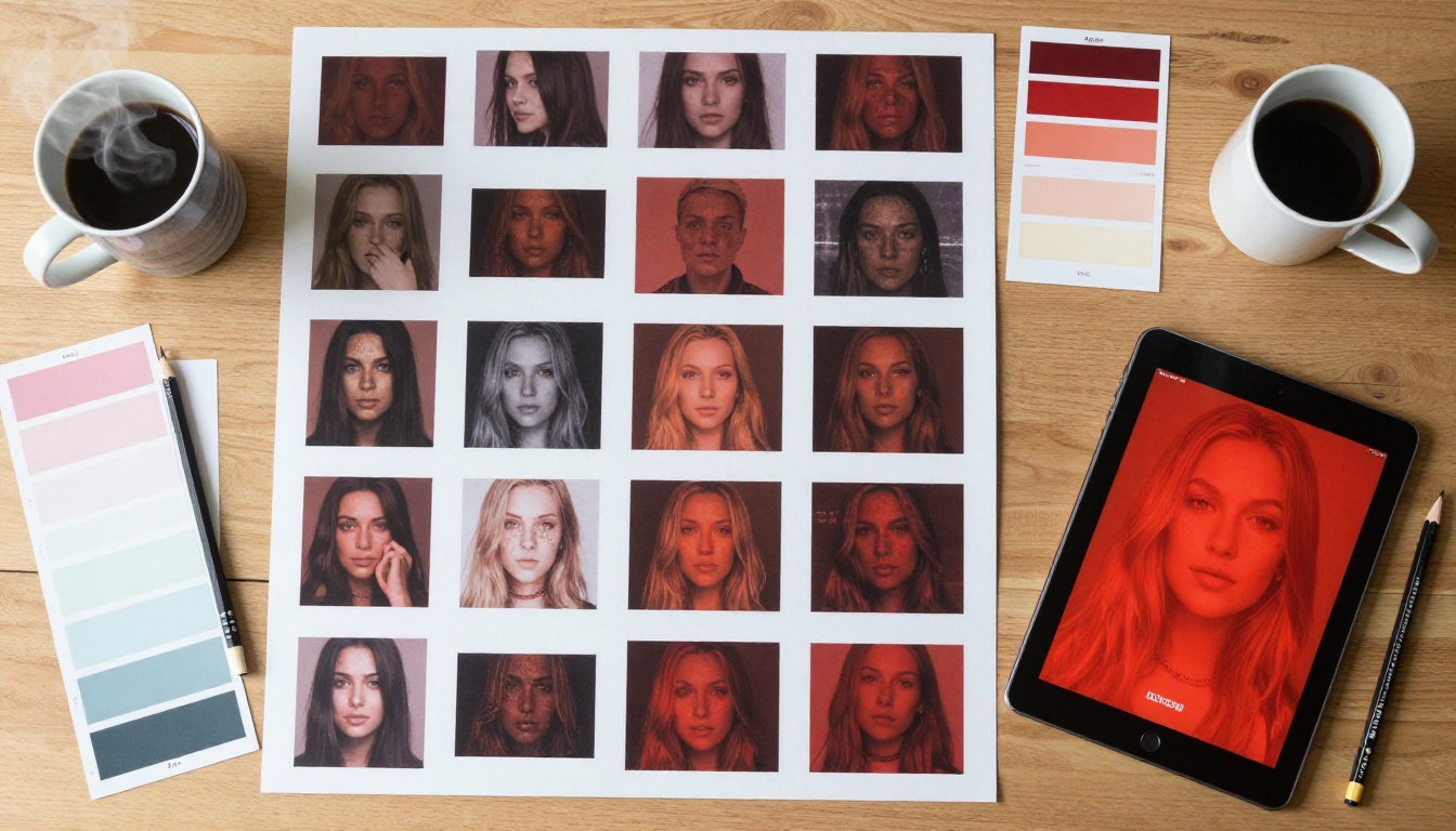
High contrast is the single most reliable quality to look for. When an image scales down, midtones flatten and subtle gradients disappear. What remains is the difference between light and dark areas.
| Contrast Level | Full-Size Appearance | Thumbnail Appearance |
|---|
| High | Bold, slightly intense | Clear, immediately readable |
| Medium | Natural, balanced | Muddy, lacks definition |
| Low | Soft, artistic | Near invisible, flat |
Choose images with strong light-to-dark separation. A product photographed on a white background with directional lighting will outperform the same product shot on a gradient at thumbnail size every time.
Focal Point Clarity
Every strong thumbnail image has one obvious focal point. Not two. Not three. One. This is the element your eye lands on first and fastest, and it must be immediately legible at small scale.
Test your focal point with this quick method: squint until the image blurs. Whatever remains as a visible shape is your focal point. If nothing remains distinct, the image lacks a focal point strong enough for thumbnail use.
Color Psychology in Tiny Frames
Color communicates before content does. At thumbnail scale, your image's dominant color palette sends an immediate mood signal:
- Warm reds and oranges: Urgency, appetite, boldness (effective for food menus, promotions)
- Cool blues and greys: Trust, professionalism, calm (strong for reports, portfolios)
- High-saturation yellows: Energy, optimism, visibility (excellent for educational content)
- Deep blacks and golds: Premium, luxury, exclusivity (ideal for fashion lookbooks)
✅ A thumbnail's dominant color should match the emotional register of the content inside it. Mismatched mood is confusing and reduces click-through rates significantly.
Mistakes That Kill Click-Through Rates
The most common thumbnail failures are not random. They follow patterns. Knowing what not to do is as valuable as knowing what to do.
Overcrowded Layouts
The number one thumbnail killer is too much information. A publication page that looks polished at A4 size often has three or four design elements competing for attention. Shrunk to thumbnail size, all of it collapses into visual noise.
The fix is simple: before finalizing any front-page image, ask yourself which single element you would keep if forced to remove everything else. That element is what the thumbnail needs to lead with.
⚠️ A front page designed for print is almost never optimized for thumbnail display. These are two different jobs requiring two different visual strategies.
Text That Disappears at 150px
Text is one of the most abused elements in thumbnail design. Publishers include subtitles, edition numbers, author names, and taglines, all of which render as illegible smudges below 200 pixels wide.
The rule of thumb: if text must appear in a thumbnail, it should be no more than 2 to 4 large words, set in a heavy-weight font with strong background contrast. Everything else should be removed or moved to interior pages.
| Text Element | Readable at Thumbnail | Action |
|---|
| Single bold title (24pt+) | Yes, if high contrast | Keep, increase contrast if needed |
| Subtitle or tagline | Rarely | Remove from front page entirely |
| Author/brand name | Only if very short | Use icon/logo instead |
| Multiple text blocks | Never | Consolidate to one element |
| Body text or descriptions | Never | Remove completely |
Wrong Aspect Ratios
Publishing a 4:3 image into a 16:9 thumbnail slot creates cropping artifacts, letterboxing, or subject truncation. This is a structural problem with no visual fix. The image itself must match the display ratio before it ever gets uploaded.
For most digital publishing platforms, 16:9 is the dominant horizontal format. For mobile-first contexts, 9:16 vertical or 1:1 square often performs better in social sharing scenarios. Know where your thumbnail will appear before you finalize the crop.
How to Evaluate an Image Before Publishing
Testing before publishing is not optional if performance matters. There are three reliable methods that require no special software.

The Shrink Test
Open your candidate image in any image viewer and shrink the window to approximately 150 to 200 pixels wide. This simulates exactly how it will appear in most content grids. If the image still communicates its core subject clearly, it passes. If it looks like a smudge, it fails.
Comparing Against Competitors
Place your thumbnail candidate next to three or four images from similar publications in your category. If yours doesn't immediately stand out or hold its own visually, the click will go elsewhere. This side-by-side test is brutal and honest, and it's the most useful evaluation you can run.
Mobile vs Desktop Preview
The same thumbnail renders at different sizes on desktop browsers versus mobile devices. On desktop, a content grid might show thumbnails at 250 to 300px wide. On mobile, the same grid compresses to 120 to 150px. Always preview your thumbnail at both sizes before publishing.

Composition Rules That Scale Down
Not all photographic compositions survive the scaling process. Specific composition frameworks hold up better than others when an image is reduced to thumbnail dimensions.

Rule of Thirds in Thumbnail Framing
Placing the main subject at a rule-of-thirds intersection creates natural visual tension that draws the eye. At thumbnail scale, this off-center composition is significantly more compelling than a centered subject, which can read as static or flat.
For publication front pages, this means positioning your hero image, product shot, or featured person at the left or right third of the frame, leaving the opposite third as breathing room or text space.
Negative Space as a Tool
Empty space is not wasted space. It is a focusing mechanism. An image with generous negative space around the primary subject isolates that subject visually, making it faster to read at small scale.
Real estate brochures, portfolio showcases, and professional reports all benefit from this approach. The subject is the message. Negative space makes that message impossible to miss.
Subject Isolation
Depth of field is a powerful isolation tool. A sharp subject against a blurred background creates an immediate visual hierarchy that survives scaling. When the background is in focus and competing with the subject, both lose.
For images that will be used as publication thumbnails, favor shots with narrow depth of field (f/1.8 to f/2.8 range) where the background is visibly soft and the subject is crisply rendered.
💡 Wide aperture shots with blurred backgrounds retain their visual hierarchy even at 100px wide. Wide-angle shots with everything in focus often turn into walls of undifferentiated texture at the same size.
Setting Your Flipbook Thumbnail with Flipbooks AI
When you publish through Flipbooks AI, the thumbnail for your flipbook is generated from the first page of your PDF by default. This is convenient, but it means the quality of your thumbnail is entirely determined by how well that first page is designed.
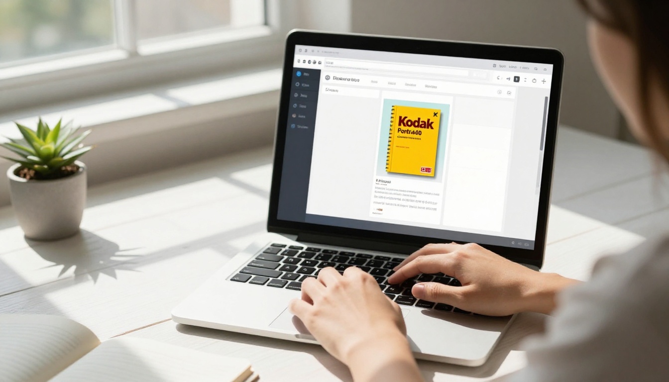
Here is how to set up and optimize your thumbnail on the platform:
Step 1: Prepare your PDF's first page before uploading. Apply all the thumbnail principles above to your PDF's opening page. That page becomes your thumbnail. If it's not designed to work at small scale, your thumbnail will suffer regardless of what the platform does.
Step 2: Upload your PDF via the PDF to Flipbook Converter. Drag your file into the converter. The platform processes the document and uses page one as the preview image automatically.
Step 3: Review the generated thumbnail immediately. After conversion, check the thumbnail in the flipbook library view. Compare it at the size it will appear on screen. If it reads poorly, revise now, not after publishing.
Step 4: Customize branding and layout. Flipbooks AI lets you add custom branding, colors, and visual effects to the flipbook interface. Consistent branding between the thumbnail and the flipbook interior creates a coherent reading experience.
Step 5: Test sharing previews. When you copy the shareable link or embed the flipbook on a website, the thumbnail appears in Open Graph previews on social platforms. Test the link in a social preview checker before distributing widely.
Step 6: Use password protection for exclusive content. If the flipbook is gated, the thumbnail still appears publicly. This means the thumbnail needs to communicate value and exclusivity clearly, since it's the only free preview your audience sees.
| Flipbooks AI Plan | Thumbnail Control | Analytics | Branding |
|---|
| Free | Auto from first PDF page | No | Platform branding |
| Standard | Auto from first PDF page | No | Custom branding |
| Professional | Custom, analytics-backed | Yes, with lead gen | Full custom branding |
✅ On the Professional plan, analytics show you exactly how many people viewed your flipbook after seeing the thumbnail. This data is invaluable for A/B testing different front-page designs.
Different publication types have different thumbnail needs. The Interactive Lookbook Designer benefits most from fashion-forward imagery with a strong single subject. The Digital Portfolio Creator works best with a clean, minimal image that lets a signature project do the talking. The Restaurant Menu Creator needs food photography with strong color and visible appetite appeal.
The final variable is the format of the image itself: its ratio, resolution, and color space.
| Format | Best Use Case | Thumbnail Behavior |
|---|
| 16:9 (landscape) | Web content, reports, catalogs | Fills horizontal cards perfectly |
| 4:3 (landscape) | Print-origin PDFs | Slight letterboxing in 16:9 slots |
| 1:1 (square) | Social media sharing | Crops in landscape cards, ideal for Instagram |
| 9:16 (portrait) | Mobile-first publications | Clips heavily in desktop grids |
| A4/Letter (portrait) | Standard PDF format | Requires careful vertical composition |
For most web-embedded flipbooks, designing the first page to lean toward a 16:9 composition, even within an A4 vertical PDF, is the smart move. It means the visually important content sits in the top portion of the page, which is the area most likely to render in the thumbnail crop.
Resolution matters less than most people expect for thumbnails. A 72 DPI image at 1920x1080 pixels produces a sharper thumbnail than a 300 DPI image at 600x400 pixels. Pixel count, not print DPI, determines thumbnail clarity on screen.
Color space matters more than most people realize. RGB is the correct color space for digital thumbnails. PDF files exported from print design tools often default to CMYK, which can cause color shift when displayed on screen. Always confirm your PDF is in RGB before uploading.
⚠️ A first page designed in CMYK and converted to RGB on export may look correct on your screen but render with muted, desaturated colors in the thumbnail. Always check the export settings in your design tool before uploading.
There is no single perfect thumbnail image. What works for a fashion catalog is wrong for a technical report. What performs on desktop is different from what performs on mobile. The discipline is in testing, iterating, and treating the thumbnail as a deliberate design decision rather than an afterthought.
Every flipbook you publish on Flipbooks AI is competing for attention. The thumbnail is where that competition plays out. Invest accordingly.
Ready to put these principles into practice? Create your first flipbook and apply everything above from day one. If you want to see what plan fits your needs, compare pricing options to choose what works for you. And if you're building something specific, browse the full tools directory to find the right starting point for your publication type.



