A senior legislative aide opens her inbox at 7:40 in the morning and finds forty new attachments. Thirty-nine are long PDFs. One is a crisp, visual brief with a clear ask on the first page. Guess which one gets forwarded to the member before the committee hearing. Think tanks have spent decades studying that exact moment, and the way they package research now decides whether years of work shape a law or sit unopened. If you publish research of any kind, you can borrow their playbook, and tools like Flipbooks AI make the delivery side far easier than a plain attachment ever was.
This article breaks down what makes policy briefs policymakers read different from ordinary reports, how think tanks structure them, and how nonprofits and small research teams can copy the format without a large communications department.
Why Most Research Never Gets Read
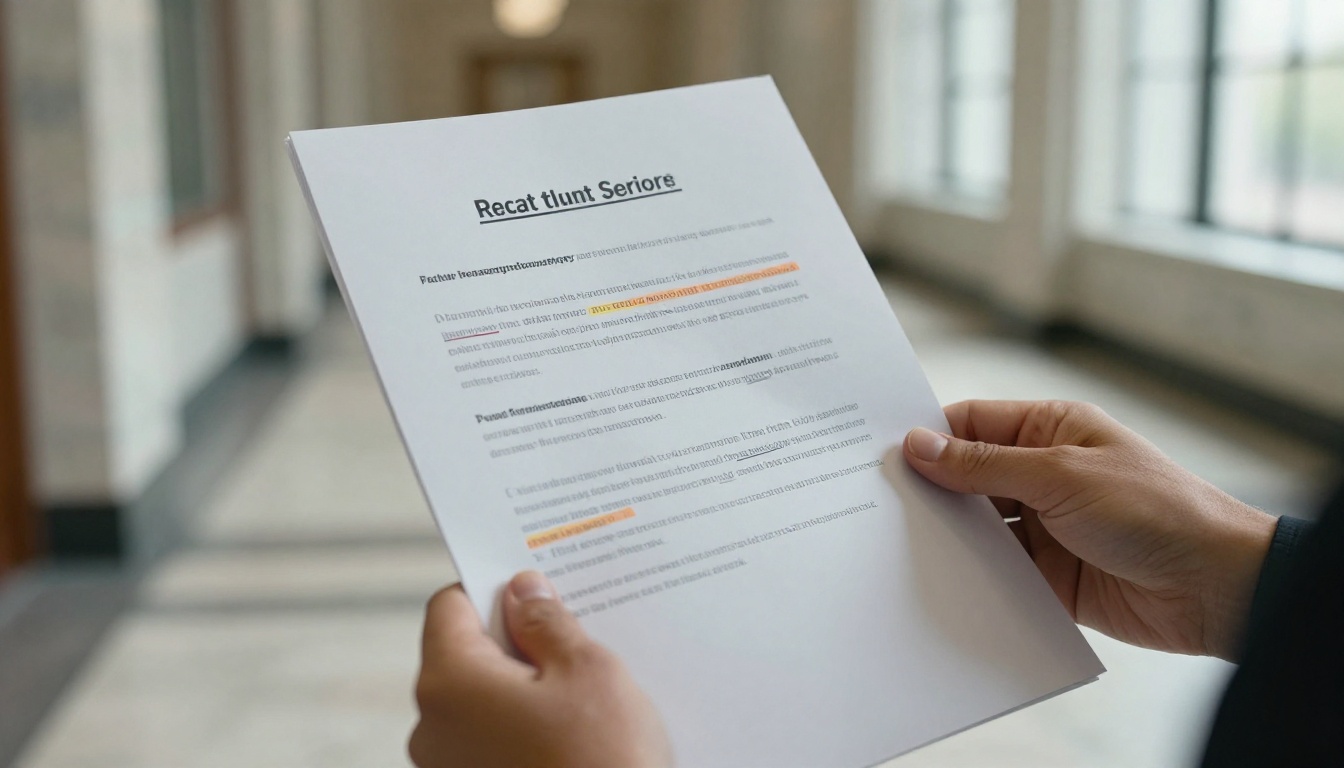
Research is written for peers. Policy documents are read by people who have ninety seconds, a deadline, and a constituency. That gap explains almost every failure of evidence to reach decision makers.
A typical academic paper opens with a literature review. A typical staffer needs to know three things first: what is happening, what it costs, and what they are being asked to do. When the answer sits on page 14, the document is skipped.
The Attention Budget of a Staffer
Staffers triage. They sort incoming material into "needed today," "needed this week," and "never." A document earns the first pile by showing relevance in the first few lines.
- Relevance: does it name a bill, a budget line, or a vote coming up?
- Credibility: does the author or institution have a track record?
- Usability: can the main point be repeated to a boss in one sentence?
- Format: does it look quick to read, or does it look like homework?
Where Briefs Fail
Most weak briefs fail in predictable ways. They bury the recommendation, use jargon from the author's field, or run past six pages. Others look like a dense journal article with a new cover sheet stapled on.
⚠️ A brief that needs a glossary to be understood has already lost its reader. Define terms in the sentence where they first appear, or cut them.
What Think Tanks Do Differently
Established think tanks treat a brief as a product. It has an audience, a purpose, a length limit, and a design standard. The research team supplies evidence, while editors and designers decide how it travels.
Separate the Research From the Brief
The full study remains available, usually as a long report or data appendix. The brief is a different document with a different job: to start a conversation and send the curious reader deeper. This separation lets the brief be short without being shallow.
One Brief, One Decision
Strong briefs aim at a single decision. A document that tries to inform on six topics rarely moves anyone. Think tanks often publish a series of narrow briefs instead of one broad paper, and each one is built around a specific question a policymaker might face.
Write for the Forwarder
The first reader is often not the final one. A staffer reads the brief and then forwards it, summarizes it, or pastes a paragraph into a memo. Good briefs make that easy by putting quotable lines, clear numbers, and an obvious summary box where a busy person can lift them.

The Anatomy of a Brief People Finish
Across the major institutions, the same skeleton appears again and again. Lengths vary, but the order of ideas barely changes.
| Section | Purpose | Typical Length |
|---|
| Headline | State the finding or the question | 8 to 14 words |
| Summary box | Give the full argument in brief | 60 to 100 words |
| The problem | Show why it matters now | 150 to 250 words |
| Evidence | Present two or three strongest data points | 250 to 400 words |
| Options | Compare realistic choices and tradeoffs | 200 to 300 words |
| Recommendation | Say exactly what to do | 80 to 150 words |
| Sources and contact | Build trust and invite follow-up | Short block |
The Headline Does Heavy Lifting
Policy headlines work best when they promise a claim, not a topic. "Rural Clinics Lose Staff Faster Than They Can Hire" says more than "Workforce Issues in Rural Healthcare." The first can be argued with, which is exactly why it gets opened.
The Summary Box
The summary box is the single most read element in any brief. Many readers stop there. It should work as a standalone document, so test it by covering the rest of the page with your hand and asking whether a reader could still act. If the answer is no, rewrite it.
💡 Write the summary box last, then read it aloud. If you run out of breath, it is too long.
Options Before Recommendations
Policymakers dislike being handed a single answer with no alternatives, because it hides the tradeoffs they will be questioned about. Present two or three realistic options, state what each costs and who it affects, and then say which one you favor and why. This makes your recommendation look earned instead of assumed.
Design Choices That Signal Credibility
People judge the quality of research by how it looks, whether they admit it or not. Messy typography suggests messy thinking. Think tanks invest in design for that reason.
Hierarchy and White Space
A page with a clear visual order lets the eye find the main point in seconds. Use one strong headline size, one subhead size, and generous margins. Dense gray text blocks are the visual equivalent of a long speech with no pauses.
Charts That Make One Point
A good policy chart carries a single message, and its title states it. Instead of "Unemployment by Region," write "Unemployment Is Twice as High in Border Counties." Remove gridlines, label lines directly, and keep colors few.
- Use one highlight color for the data that matters and gray for the rest.
- Place the source directly under the chart.
- Keep the number of charts per brief to two or three.
- Avoid 3D effects, which distort comparisons.
Pull Quotes and Callouts
Short callouts break up the page and give skimmers a second path through the content. A pull quote with a striking figure often becomes the line a staffer repeats in a meeting.
Delivery format affects whether a brief is opened, read on a phone, and shared. Here is how the common formats compare for policy audiences.
| Format | Mobile Reading | Tracking | Sharing | Visual Polish |
|---|
| Email attachment PDF | Poor, needs pinch and zoom | None | Forwarding only | Static |
| Printed leave-behind | Not applicable | None | Hand to hand | High |
| Web page | Good | Page analytics | Link | Variable |
| Digital flipbook | Good, responsive | Views and time | Link or embed | High, page-turn feel |
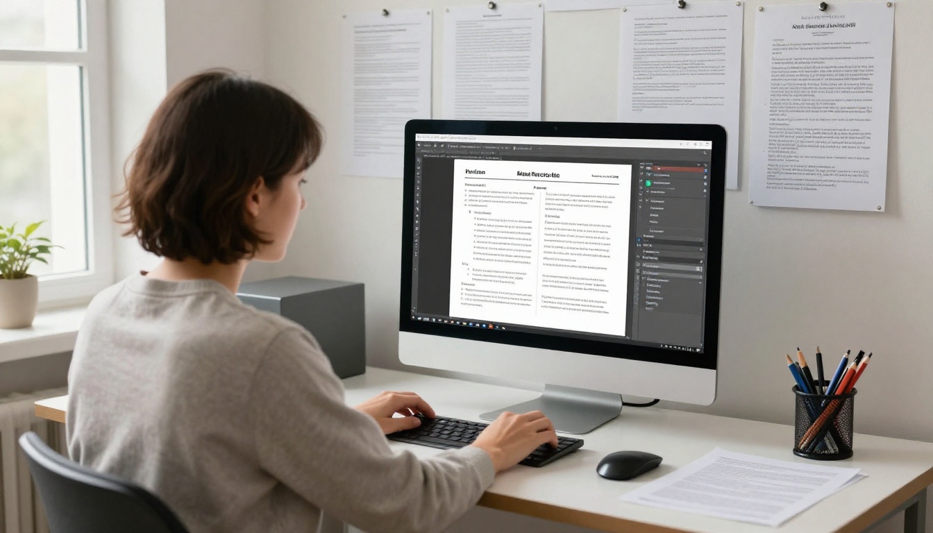
Policymakers read on trains, in hallways, and between votes, mostly on phones. A PDF that forces constant zooming loses them. A responsive digital publication keeps the look of a designed document while adapting to the screen.

How to Publish a Brief as a Flipbook
If you already have a designed PDF, you can turn it into a shareable interactive publication in a few minutes. The PDF to Flipbook Converter handles the conversion, and the Report Flipbook Creator is built for longer research documents.
Step by Step
- Create an account. Sign up on Flipbooks AI and open the dashboard.
- Upload your PDF. Drag in the finished brief. Pages convert automatically and keep their layout, fonts, and charts.
- Customize the look. Add your organization's logo, set brand colors, and choose a page-turn effect. For policy audiences, a subtle effect usually works better than a dramatic one.
- Add multimedia. Embed a short explainer video, an audio summary, or links to the full dataset on the relevant pages.
- Choose sharing settings. Copy a direct link for email, generate an embed code for your website with the Embed Flipbook on Website tool, or add a password for embargoed briefs shared with journalists or partners.
- Track results. On the Professional plan, analytics show how many people opened the brief and how far they read. Compare pricing plans to see which tier fits your team.
✅ Best practice: send staffers a single link instead of an attachment. Links avoid spam filters, never bounce for size, and let you update a figure after publication without sending a corrected file.
Features Worth Using
- ✅ No watermarks, so the brief looks like yours alone.
- ✅ Password protection for embargoed or confidential drafts.
- ✅ Offline downloads for readers who need the file on a flight.
- ✅ Mobile-responsive reading that suits phone-first staffers.
- ✅ Custom branding to match your institution's identity.
- ✅ Lead capture and analytics on the Professional plan, useful for knowing who engaged.
Real Examples of Packaging That Works
The following scenarios show how different organizations adapt the same principles.
A Regional Health Nonprofit
A small nonprofit studied emergency room wait times across three counties. The full report ran 60 pages. They produced a two-page brief with a single map, a headline stating the average wait, and a recommendation to fund two mobile clinics. It was published as a flipbook and sent to county commissioners with a link. The Non-Profit Annual Report tool offered a similar layout for their yearly summary, so both documents shared one visual identity.
A Budget Think Tank
A fiscal research group releases a one-page "numbers sheet" before every budget season. It lists five figures, each with a plain sentence of context. Staffers keep it open during hearings. The group also publishes a longer brief, linked from the sheet, for anyone who wants the method.
A University Research Center
A university center struggled because faculty wrote for journals. They hired an editor to translate each paper into a four-page brief with a summary box, two charts, and three options. Downloads of their work rose, and legislators began citing the briefs in committee notes.

Common Mistakes to Avoid
| Mistake | Why It Hurts | Better Approach |
|---|
| Starting with background | Reader quits before the point | Lead with the finding |
| Ten charts in four pages | No chart gets noticed | Keep two or three, one point each |
| Passive, hedged language | Sounds unsure | State claims plainly, note limits briefly |
| No clear ask | Nothing to act on | End with a specific recommendation |
| Unlinked sources | Weakens trust | Cite sources and link to data |
| Huge file size | Fails to send or load | Share a link, not an attachment |
Three Habits of Teams That Succeed
- They test with a real reader. Before release, someone outside the team reads the brief and explains it back in one sentence.
- They design for the phone first. If it reads well on a small screen, it reads well anywhere.
- They follow up. A brief sent once is rarely read. A short note a week later, tied to a vote or hearing date, often is.
Measuring Whether Anyone Read It
Publishing is not the finish line. Think tanks track outcomes at several levels, and small organizations can do the same on a modest scale.
- Opens and reading depth: how many people viewed the brief and how far they got.
- Shares and forwards: whether the link travels beyond the first recipient.
- Citations: mentions in hearings, memos, news stories, and bills.
- Meetings requested: the most valuable signal that a brief worked.
Digital publications make the first two measurable. If most readers stop at page two, your summary box probably works but the evidence section does not. If they drop off on page one, the headline or opening paragraph needs a rewrite.

A Simple Template You Can Use Today
Copy this outline for your next brief and adjust the length to your topic.
- Headline: a claim, not a topic.
- Summary box: problem, finding, recommendation in under 100 words.
- Why now: the vote, deadline, or budget line that makes this urgent.
- Evidence: two or three data points, each with a clear chart.
- Options: a small comparison table with cost, impact, and tradeoffs.
- Recommendation: one paragraph, specific and actionable.
- Sources and contact: a named person with an email address.
Then design it cleanly, export a PDF, and publish it as a flipbook for a link that works everywhere. For reference libraries or collections of past briefs, the Digital Portfolio Creator can gather your work into one browsable shelf that policymakers can revisit.

Build Your Next Brief With Intent
The difference between research that changes policy and research that gathers dust is rarely the quality of the evidence. It is the packaging: a sharp headline, a short summary, honest options, clean design, and a format that opens instantly on the device in a staffer's hand.
Ready to publish your first brief? Get started for free on Flipbooks AI, browse all flipbook tools for the format that fits your report, and compare pricing plans when you want analytics to see who is reading. If you are ready to commit, you can create an account and go straight to pricing.