A typical city publishes an audited financial report that runs three hundred pages, and a typical resident never opens it. That gap is exactly why popular annual financial reports (PAFRs) exist: short, plain-language summaries of the same numbers, designed for people who pay the taxes but do not read fund accounting. If you want to publish one that people actually open, a digital format such as a flipbook from Flipbooks AI makes the job far easier than a static PDF buried on a website.
This article walks through what a PAFR is, what belongs inside, how to design it, and how to publish it so residents, journalists, and council members can read it on a phone.
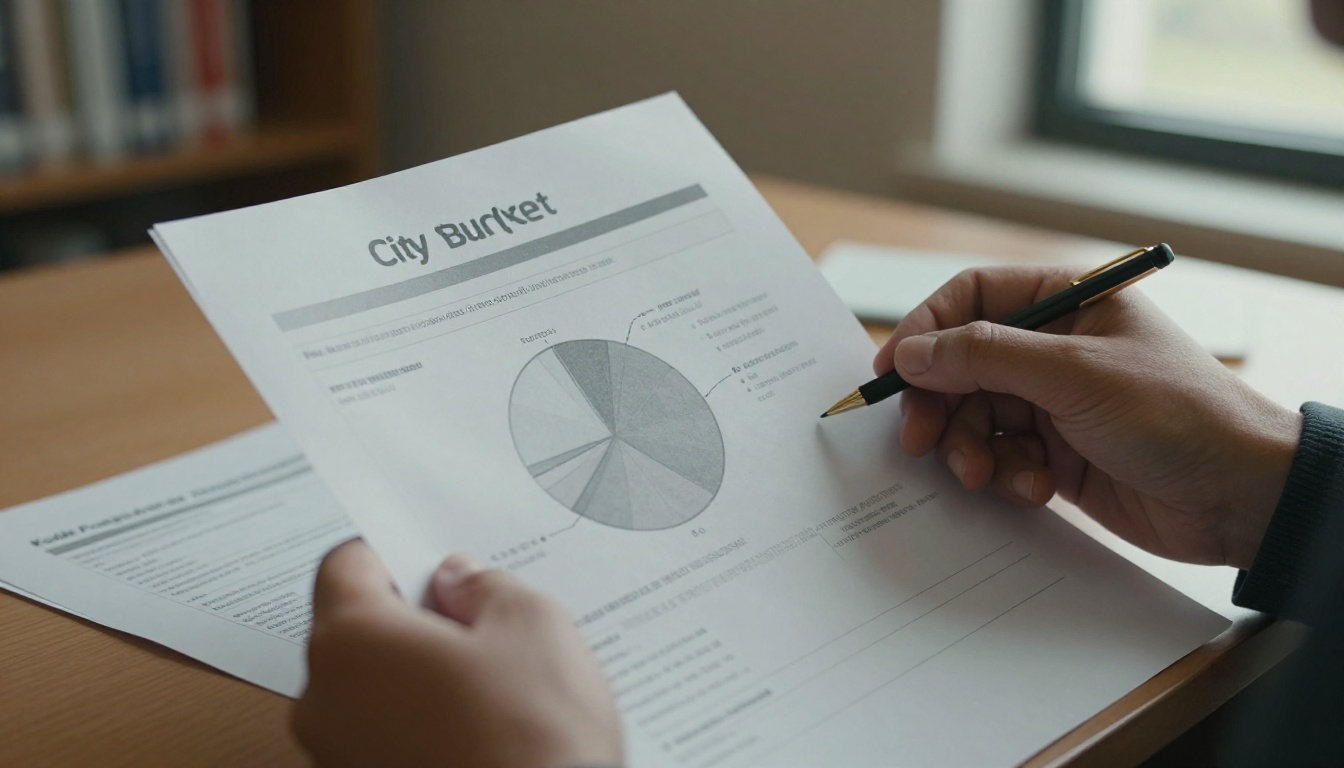
What Is a PAFR?
A popular annual financial report is a condensed, non-technical summary drawn from a government's Annual Comprehensive Financial Report (ACFR). It is written for a general audience, usually runs between four and twelve pages, and uses charts, photos, and short explanations instead of footnotes and fund statements.
The Government Finance Officers Association (GFOA) runs an award program for these reports, which has become the informal quality benchmark. Even if you never apply, its criteria are a handy checklist.
Three traits define a good PAFR:
- It is derived from audited data. The numbers must tie back to the ACFR, so nothing in the summary contradicts the official record.
- It is written for non-accountants. No unexplained jargon, no acronyms without a definition.
- It is visual. Charts and photos carry more of the message than paragraphs do.
💡 Think of the ACFR as the legal record and the PAFR as the conversation. Both matter, but only one is meant to be read on a bus.
PAFR vs. ACFR at a glance
| Feature | ACFR | PAFR |
|---|
| Primary audience | Auditors, bond analysts, regulators | Residents, media, council |
| Typical length | 200 to 400 pages | 4 to 12 pages |
| Language | Technical, standards driven | Plain English |
| Visuals | Tables and statements | Charts, photos, icons |
| Format | Long PDF | Print plus digital flipbook |
| Update cycle | Once per year after audit | Once per year, shortly after |
Why cities bother
Publishing a PAFR is not mandatory in most places, so it is fair to ask why cities invest in it. The reasons are practical:
- Trust. Residents who can see where money goes are less likely to assume it vanishes.
- Fewer repeat questions. Staff stop answering the same "where did the tax increase go" email twenty times.
- Better bond conversations. A clear public story supports credit narratives.
- Council alignment. Elected officials share one readable document instead of quoting different spreadsheets.
The Problem With Dense Budgets

A budget is a map of priorities written in a language most people never studied. Fund balances, encumbrances, enterprise funds, and deferred inflows are accurate terms, but they tell a resident nothing about whether the library stays open on Saturdays.
The result is a quiet credibility problem. When people cannot read the document, they fill the gap with rumor, and rumor is rarely generous.
Three common mistakes
- Publishing only the ACFR. It is complete and correct, and almost nobody reads it.
- Shrinking the ACFR into a PDF teaser. Cutting pages without rewriting leaves the jargon intact.
- Treating the PAFR as marketing. Residents spot spin quickly. A report that hides the pension liability loses trust faster than no report at all.
What Belongs Inside
A strong PAFR answers six questions, in roughly this order. Each can be a single page or even a half page.
- Who are we? Population, area, a short profile of the city.
- Where does the money come from? Property tax, sales tax, fees, grants, and transfers.
- Where does it go? Public safety, streets, parks, utilities, administration.
- What do we own and owe? Assets, debt, pension and retiree obligations.
- How are we doing? Reserves, credit rating, trends over five years.
- What is next? Major projects and fiscal risks.

Revenue and spending in plain words
Resist the temptation to show every fund. Group spending into five to eight categories residents recognize, and show each as a percentage and as a "per resident" figure. A statement such as "$412 of every resident's tax bill goes to public safety" is far more memorable than a line item.
| Category | Technical label | Plain label |
|---|
| Police, fire, 911 | Public safety function | Keeping people safe |
| Roads, signals, snow | Transportation and public works | Streets and getting around |
| Libraries, pools, parks | Culture and recreation | Parks and community life |
| Water, sewer, trash | Enterprise funds | Utilities |
| Payroll, legal, IT | General government | Running City Hall |
Debt and pensions without panic
Debt is where many PAFRs turn evasive. The better approach is calm and specific. State how much the city owes, what it was borrowed for, how fast it is being paid down, and what the credit rating says. For pensions, show the funded ratio and one sentence about what the city is doing about any gap.
⚠️ Do not soften a liability with vague wording. A direct sentence like "The pension plan is 71% funded, up from 66% five years ago" builds more trust than three paragraphs of reassurance.
How to Make Numbers Readable

Readable does not mean simplistic. It means every number arrives with a reason to care. The most effective PAFRs pair each chart with a photo and a one-line takeaway.
Pair data with real places
If the report says the city resurfaced 38 lane miles, show a photo of a crew on a street residents know. If it reports park spending, show families in a park. The photo anchors the number in daily life.
Choose charts that fit the question
| Question | Best chart | Avoid |
|---|
| Where does each dollar go? | Stacked bar or simple pie (5 slices max) | 3D pies, 12 slice pies |
| How has this changed? | Line chart over 5 to 10 years | Dual axis charts |
| How do we compare to peers? | Horizontal bar, sorted | Radar charts |
| What is the debt trend? | Column chart with one highlight color | Rainbow palettes |
A short checklist for every page
- One main message per page, stated in a heading.
- No more than two charts per page.
- Every acronym defined on first use.
- Every figure labeled with units and the fiscal year.
- A source line pointing back to the ACFR page.
✅ Test each page by asking a colleague outside finance to explain it back to you in one sentence. If they cannot, rewrite.
Design Principles That Work

Government design has a reputation for gray tables and clip art. It does not have to. A few principles lift a PAFR well above the usual.
Typography and hierarchy
Use two typefaces at most: one for headings, one for body text. Keep body text at 10 to 11 points in print. Make the headline number on each page large, then let the supporting text recede.
Color with a purpose
Choose a palette of three or four colors drawn from the city's brand. Assign one color to revenue and another to spending, then keep that logic consistent throughout the report. Consistency lets readers learn the code once.
Accessibility is not optional
Public agencies have legal and ethical reasons to publish accessible documents, and good accessibility helps everyone:
- Maintain a contrast ratio of at least 4.5 to 1 for body text.
- Never rely on color alone to separate chart series.
- Provide alt text for every chart and photo.
- Offer the report in plain text or a tagged PDF for screen readers.
- Translate the summary into the languages your residents speak.
Print, PDF, or Flipbook?
Most cities still print a few hundred copies for libraries and council meetings, then post a PDF. That works, but the PDF is the weakest link. It loads slowly on phones, cannot be tracked, and feels like a download rather than a read.
| Format | Mobile reading | Page turn feel | Analytics | Embeds on city site | Cost per update |
|---|
| Printed booklet | Not applicable | Natural | None | No | High |
| Plain PDF | Poor | None | Basic download count | Link only | Low |
| Flipbook | Excellent | Realistic | Page level | Yes | Low |
A flipbook keeps the familiar feel of a printed booklet while loading instantly on any device. Residents can flip, zoom, and share a link to a specific page, which matters when a council member wants to point at the debt chart during a meeting.

How to Publish a PAFR as a Flipbook
If your report is already laid out as a PDF, publishing a flipbook takes minutes. Cities can start with the Annual Report Creator or the Report Flipbook Creator, both built for exactly this kind of document.
Step by step
- Create an account. Sign up on Flipbooks AI and open your dashboard.
- Upload the PDF. Drop in the final PAFR. The PDF to Flipbook Converter turns each page into a turnable spread, keeping text sharp and links active.
- Customize the look. Add the city logo, match the brand colors, and pick a page-turn effect that feels calm rather than flashy. No watermarks are added, ever, which matters for official documents.
- Add media where it helps. Embed a two minute video from the finance director or an audio walkthrough for residents who prefer to listen.
- Set sharing options. Copy a direct link for email newsletters, or use the Embed Flipbook on Website tool to place the report on the city's budget page.
- Protect drafts. Use password protection while the report is under council review, then remove it at release.
- Measure what happens. Page-level analytics show which sections residents read, and which they skip. These Pro features are listed on the pricing page.
💡 Check analytics after the first month. If most readers drop off on page four, that page is probably the place to simplify next year.
Offline access and lead capture
Libraries, senior centers, and community meetings sometimes lack reliable internet, so offline downloads are useful. For cities running a budget input campaign, the lead generation feature on the Professional plan can invite residents to subscribe for budget updates before they flip the first page.

A Realistic Example
Consider a mid-sized city of about 85,000 residents. Its finance team previously posted a 280 page ACFR and received roughly a dozen budget questions per week from residents.
They built a 10 page PAFR with this structure:
| Page | Content |
|---|
| 1 | Cover photo, fiscal year, one sentence on the year |
| 2 | City profile and population trends |
| 3 | Where revenue comes from |
| 4 | Where each tax dollar goes |
| 5 | Major projects, each with a photo |
| 6 | Debt and credit rating |
| 7 | Pension funding trend |
| 8 | Five year financial trends |
| 9 | Frequently asked questions |
| 10 | Contacts and where to find the full ACFR |
They published it as a flipbook, linked it from the city homepage, and shared the link in the monthly utility bill insert. Within the first quarter, page-level analytics showed the "where each tax dollar goes" page drew the most reading time, so they moved it to page two the next year.
This example is illustrative, but the pattern is common: simple structure, one idea per page, and a link people can tap.
Timing and Workflow

The biggest enemy of a PAFR is lateness. A report released ten months after year end feels like old news. Aim to publish within 30 to 60 days of the ACFR.
A simple production calendar
- Week 1: Extract final numbers from the ACFR into a single spreadsheet.
- Week 2: Draft plain-language copy and select photos.
- Week 3: Lay out the pages and build charts.
- Week 4: Finance, communications, and legal review.
- Week 5: Publish the flipbook, print a short run, announce.
Who should be in the room
- A finance lead who owns the numbers.
- A communications writer who owns the tone.
- A designer, in-house or contracted.
- An accessibility reviewer.
- One resident volunteer who reads the draft cold.
That last person is surprisingly valuable. They find the sentence everyone else has read so often that they cannot see it anymore.
Measuring Success
A PAFR is only worth the effort if it changes something. Track a few simple signals:
- Reads and completion rate from flipbook analytics.
- Source of traffic: newsletter, social, city homepage, or search.
- Budget related inquiries to staff before and after release.
- Council and media use: quotes, citations, and shared pages.
- Resident survey items on trust and transparency.
| Metric | Healthy sign | Warning sign |
|---|
| Average pages read | More than half the report | Most readers leave by page three |
| Mobile share of readers | Above 50% | Mostly desktop, possible layout issue |
| Staff budget inquiries | Declining year over year | Flat or rising |
| Social shares | Specific pages shared | No shares at all |

Common Questions
Does a PAFR replace the ACFR?
No. The ACFR remains the official audited record. The PAFR summarizes it and should always link back to it.
Does it need to be audited?
The PAFR itself is generally unaudited, but its figures should come directly from audited statements and say so clearly.
How long should it be?
Most strong examples run 6 to 12 pages. Shorter is fine if the story is complete, and longer is rarely better.
Can small towns do this?
Yes. A town with a two person finance office can produce a four page summary using a flipbook template. Small reports often read better than large ones because there is less to hide behind.
Which Flipbooks AI tools suit local governments?
Beyond annual reports, cities use the Non-Profit Annual Report layout for community foundations, the Event Program Maker for town halls, and the Newsletter Flipbook Publisher for monthly budget updates. You can browse all flipbook tools in one place.
Make Your Budget Worth Reading
A readable budget is not a favor to residents. It is part of the job of spending public money. A good PAFR has a clear structure, honest numbers, charts that answer real questions, and a format people can open in two seconds on their phone.
Ready to publish yours? Get started for free on Flipbooks AI, compare pricing plans to see which features fit your team, or open the Annual Report Creator and turn this year's PDF into a flipbook residents will actually read.



