A recruiter opens your portfolio, waits three seconds for it to load, squints at tiny text on a phone, and closes the tab. Your work was never the problem. The format was. Most of the portfolio format mistakes that get you skipped by recruiters have nothing to do with talent, and every one of them is fixable in an afternoon. A tool like Flipbooks AI can solve several of them at once, but first you need to know what is quietly costing you interviews.
Recruiters and hiring managers review dozens of portfolios in a single sitting. They are tired, they are scanning, and they are looking for a reason to say yes or a faster reason to say no. A clumsy format hands them the "no" for free.
Why Recruiters Skip Portfolios So Fast
Reviewers do not read portfolios the way you imagine. They triage. A first pass takes roughly 10 to 30 seconds, and the only question is "is this worth a closer look?" Anything that adds friction in that window gets punished.
Here is what a typical review looks like:
- The recruiter clicks your link or opens your attachment.
- They wait for it to load and judge the first screen.
- They scan headings, images and numbers, not paragraphs.
- They check whether it works on the device in front of them.
- They decide: shortlist, maybe, or skip.
💡 Pro tip: Treat the first screen like a headline. If a stranger cannot tell who you are, what you do and where to look next within five seconds, rewrite it.
The nine mistakes below map to those five steps. Fix them in order and your portfolio will survive triage far more often.
Mistake 1: A Bloated, Slow File
This is the most common reason a portfolio dies before it opens. A 120 MB PDF packed with uncompressed photos will choke on a hotel Wi-Fi connection, bounce from email servers, and freeze on older laptops.
What Recruiters Actually Experience
They do not think "this person has high resolution assets." They think "this is broken" and move on. Email attachments over 10 MB are often blocked or sent to spam, so your portfolio may never arrive at all.
How to Fix It
- Compress images before placing them in your layout. 1600 pixels wide is plenty for most screens.
- Export at a sensible quality, around 75 to 85 percent for JPEGs.
- Share a link instead of attaching a file whenever possible.
- Test the load time on a phone using mobile data, not your office connection.
| File Approach | Typical Size | Load Experience | Recruiter Reaction |
|---|
| Raw export PDF | 80 to 200 MB | Slow, often fails | Skipped |
| Compressed PDF | 8 to 20 MB | Acceptable | Neutral |
| Web based flipbook | Streams page by page | Fast, opens instantly | Positive |
A web based flipbook loads the first pages immediately and streams the rest, which is why it handles image heavy work so well. You can turn an existing file into one with the PDF to Flipbook Converter.
Mistake 2: Unreadable on a Phone
Plenty of recruiters open your link from a phone, between meetings or on a commute. If your portfolio is a landscape PDF with 9 point type, they will pinch, zoom, scroll sideways, and give up.
⚠️ Warning: If you have never opened your portfolio on a phone, assume it is broken there. Check it today.
Mobile Readability Checklist
- Body text at 12 points or larger in the source file
- High contrast between text and background
- Buttons and links big enough for a thumb
- No layouts that rely on hover effects
- Pages that scale, not pages that need sideways scrolling
A mobile responsive flipbook adapts to the screen, so pages stay legible without zooming. The Digital Portfolio Creator is built around exactly this problem.
Mistake 3: Showing Everything You Have Ever Made
More is not better. A portfolio with 40 projects forces the recruiter to do your curation for you, and they will not. They will see volume, assume inconsistent quality, and leave.
The Right Number of Projects
| Role | Recommended Projects | Pages | Why |
|---|
| Graphic designer | 5 to 7 | 15 to 25 | Shows range without repetition |
| Photographer | 15 to 25 images in 3 series | 20 to 30 | Series prove consistency |
| UX designer | 3 to 4 case studies | 15 to 30 | Depth matters more than count |
| Architect | 4 to 6 projects | 20 to 35 | Plans plus finished photos |
| Copywriter | 6 to 8 samples | 10 to 20 | Variety of tone and format |
A Simple Curation Test
Ask three questions about every project:
- Is it recent enough to reflect how I work now?
- Is it relevant to the job I am applying for?
- Can I explain my specific role in two sentences?
If the answer to any of them is no, cut it. You can always keep a longer archive on a separate page for people who ask.
Mistake 4: Cluttered Layouts With No Hierarchy
Crowded pages signal crowded thinking. When every element competes for attention, nothing wins, and the reviewer's eyes slide off the page.
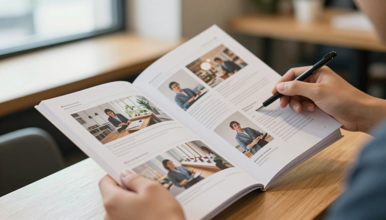
Signs Your Layout Has a Problem
- Three or more fonts on one page
- Images squeezed into thumbnails with captions overlapping them
- Paragraphs longer than five lines
- No clear starting point for the eye
- Inconsistent margins from page to page
Fixes That Work
- Use one grid and stick to it across every page.
- Pick two typefaces at most: one for headings, one for body.
- Give images room. White space is not wasted space, it is emphasis.
- Lead with the result. Put the outcome or the hero image first, then the story.
✅ Best practice: Squint at each page. If you cannot tell what the most important element is, the layout needs work.
Mistake 5: Case Studies Without Context or Results
Beautiful images with no explanation leave recruiters guessing. They want to know the problem, your role, your process, and what changed because of your work. Without that, your portfolio is a gallery, not evidence.
A Simple Case Study Structure
| Section | What to Include | Length |
|---|
| The brief | Client, problem, constraints | 2 to 3 sentences |
| Your role | What you did, what the team did | 1 to 2 sentences |
| Process | Two or three decisions and why | Short bullets |
| Outcome | Numbers, quotes or shipped result | 1 to 3 lines |
Real example: A product designer replaced a ten page project with a single spread: one hero screen, three bullet points on decisions, and a line reading "checkout drop off fell 18 percent." Her callback rate improved almost immediately, because the recruiter could verify impact in seconds.
PDF, website, slide deck, flipbook. Each has strengths, and each fails in specific situations. Many candidates pick whatever they used last time and never ask whether it fits the audience.

| Format | Strengths | Weaknesses | Best For |
|---|
| Attached PDF | Familiar, prints well | Heavy, poor on mobile, no tracking | Formal applications that demand a file |
| Personal website | Flexible, searchable | Costs time to build and maintain | Developers and ongoing freelancers |
| Slide deck | Easy to create | Looks generic, awkward on phones | Internal presentations |
| Flipbook | Fast, page turning feel, mobile friendly | Needs a link to share | Designers, photographers, architects |
A flipbook gives you the control of a designed document with the speed of a web page. It keeps your page order, your typography and your pacing, which a plain website often scrambles. For creative work in particular, the Portfolio Flipbook Builder and the Photography Portfolio tool are designed for this.
How to Build a Recruiter Friendly Portfolio Flipbook
If you already have a portfolio in PDF form, you can fix several mistakes at once by converting it. Here is the process on Flipbooks AI.
Step by Step
- Create your account. Sign up here to start.
- Upload your PDF. Drag the file into the uploader. Conversion takes a short while, and your pages become a flipbook with realistic page turning.
- Customize the look. Add your logo and colors, choose a background that suits your work, and adjust page effects so the pacing feels right.
- Add multimedia. Embed videos and audio, such as a project walkthrough or a short voiceover.
- Set sharing options. Copy a direct link for email, or use an embed code to place the portfolio on your own site. See the Embed Flipbook on Website tool for details.
- Protect private work. Turn on password protection for client projects under NDA.
- Test on three devices. Open the link on a phone, a tablet and a laptop before you send it.
💡 Pro tip: Flipbooks AI never adds watermarks, so your portfolio looks like yours and not like a template demo.
Features Worth Using
| Feature | Why It Helps With Recruiters | Plan |
|---|
| Mobile responsive design | Readable on any phone | All plans |
| Custom branding | Consistent personal identity | All plans |
| Password protection | Safe sharing of confidential work | All plans |
| Offline downloads | Recruiters can save a copy | All plans |
| Analytics and lead generation | See who opened your portfolio and for how long | Professional plan |
Mistake 7: Hard to Share, Hard to Find
Even a well designed portfolio fails if the recruiter cannot reach it easily. Broken links, files that need downloading, and shared drive folders that ask for permission all create the same result: no view.

Common Sharing Failures
- A cloud folder set to "request access"
- A link that expires after seven days
- A giant attachment that bounces
- A file named "final_final_v3.pdf"
- A portfolio link buried in the third paragraph of your email
Better Sharing Habits
- Use one clean link that always opens, no login required.
- Put the link in your email signature, resume header and professional profiles.
- Name the file or page clearly, for example "Jordan Reyes Portfolio."
- Mention the link in the first two lines of your message.
If you share with a recruiter and want to know whether they actually opened it, view data matters. On the Professional plan, analytics show opens and time spent per page, so you can follow up at the right moment instead of guessing.
Mistake 8: Ignoring Navigation and Page Flow
A recruiter should never wonder where to go next. Missing page numbers, no table of contents and inconsistent ordering turn a simple review into a scavenger hunt.

Before and After
| Element | Weak Version | Strong Version |
|---|
| Opening page | Logo only | Name, role, one line of value, contact |
| Navigation | None | Clickable contents page |
| Section order | Random | Best work first, then supporting work |
| Page numbers | Missing | Small and consistent |
| Closing page | Ends abruptly | Contact details and a clear next step |
Order Your Work Like a Story
- Open with your strongest project, not your oldest.
- Put a second strong project at the end, because people remember how things finish.
- Keep weaker or experimental pieces in the middle, or remove them.
- Group similar projects so the reviewer sees patterns, not noise.
✅ Best practice: Add a contents page with clickable links, and make the contact page the last thing anyone sees.
Mistake 9: Skipping the Final Check
Typos, mismatched images, outdated contact details and dead links are small errors that create a large impression. A recruiter who sees a spelling mistake in your own portfolio will wonder what happens in client work.

A Five Minute Pre-Send Checklist
Better still, ask a friend outside your field to open it cold and tell you what they notice first. Their confusion is a preview of the recruiter's.
Quick Reference: Mistakes and Fixes
| Mistake | What Goes Wrong | Fast Fix |
|---|
| Bloated file | Slow load, bounced email | Compress and share a link |
| Poor mobile layout | Pinching and zooming | Use a responsive format |
| Too many projects | Reviewer loses interest | Show 5 to 8 best pieces |
| Cluttered pages | No clear focus | One grid, two fonts, more space |
| No context | Gallery with no proof | Brief, role, outcome |
| Wrong format | Friction on the device in use | Match format to audience |
| Hard to share | Access errors | One open link |
| Weak navigation | Reviewer gets lost | Contents page, clear order |
| No final check | Small errors, big impression | Run the checklist |
Real World Examples of Fixes
A freelance photographer sent a 150 MB PDF to magazines and heard nothing for weeks. After converting it to a flipbook with a short link, she got replies within days, because editors could open it on their phones instantly.
A junior architect had a 38 page portfolio with every university project. He cut it to five, added a one line outcome to each, and put a built project first. His interview rate rose noticeably.
A copywriter was sending separate attachments for every application. She built a single flipbook, protected the client samples with a password, and shared one link in every message. Updating it once updated it everywhere.
Ready to Fix Your Portfolio?
You do not need a new design from scratch. You need a lighter file, a readable layout, a tighter selection and a link that opens every time. Start with the changes that remove the most friction, then refine the rest.
Recruiters will skip any portfolio that makes them work. Make yours effortless, and your work finally gets the attention it deserves.



