Most rejected art school applicants did not lack talent. They lacked a portfolio that let a tired reviewer see that talent in ninety seconds. If you are about to submit, this list of portfolio mistakes that get art school applicants rejected will show you where points are lost, and how to fix each problem. You can also turn the final result into a polished page-turning showcase with Flipbooks AI, which we will come back to near the end.
Admissions officers often review hundreds of submissions in a single week. They are not cruel, but they are fast. Every confusing file name, blurry photo, and random piece of work costs you attention you cannot get back. The good news: nearly every mistake below is cheap to fix.
How Reviewers Actually Read Portfolios
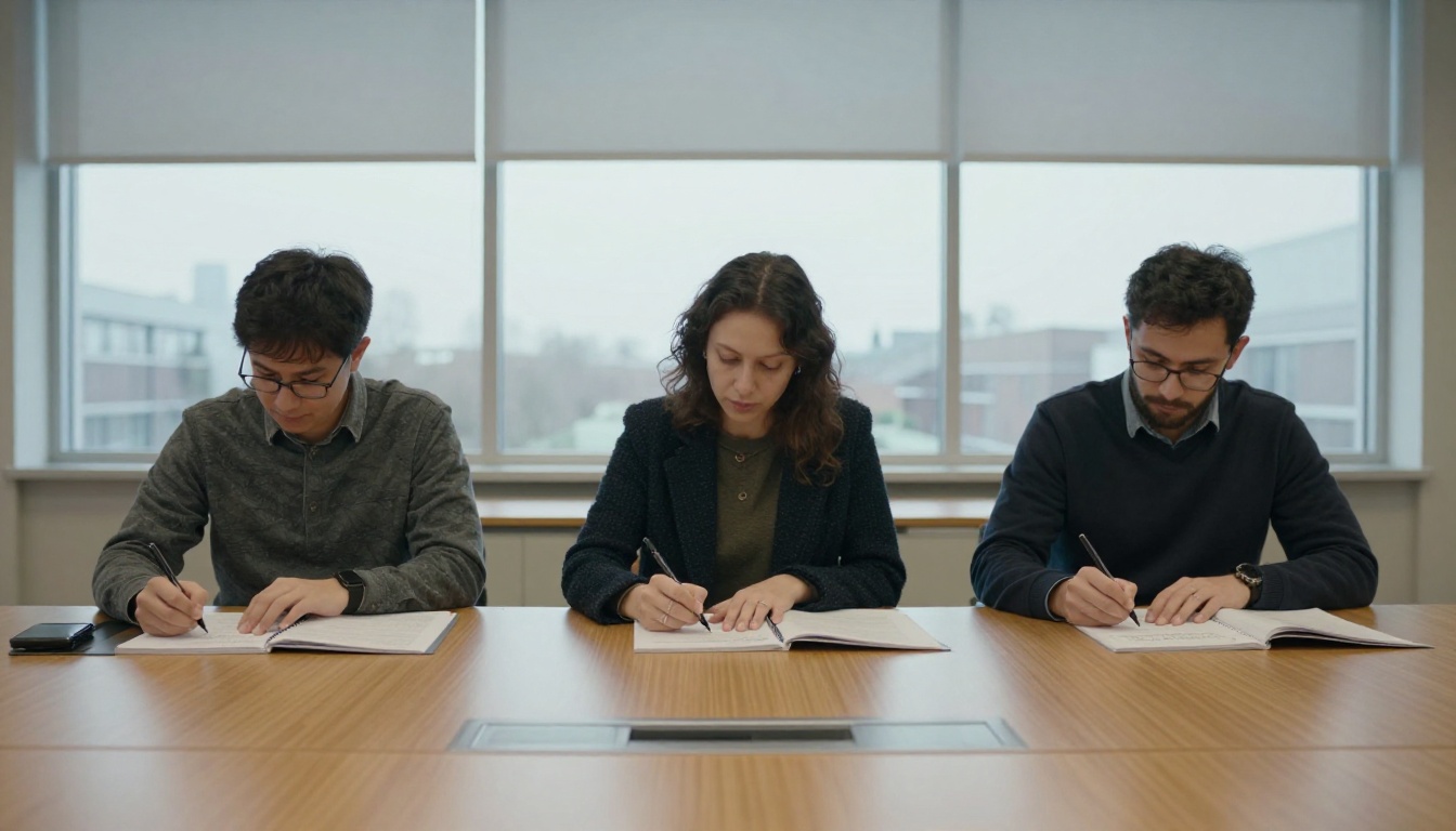
Before the mistakes, you need the reviewer's point of view. Panels usually score on a rubric: technical skill, creative thinking, consistency of vision, and potential to grow. They look at the first few pieces to form an opinion, then spend the rest of the time confirming or doubting it.
That means your opening pieces carry far more weight than the middle. It also means a single weak piece near the start can color how the strong ones are read.
💡 Pro tip: Treat your first three pieces like an opening statement. Put your strongest, most original work there, not your safest.
What Panels Say They Want
- Evidence of observation, not only imitation
- Clear thinking behind finished work
- A recognizable voice, even if it is still forming
- Basic professionalism: labels, order, clean presentation
What Panels Quietly Penalize
- Work that looks copied from a tutorial or a famous artist
- Pieces with no context or explanation
- Sloppy files that are hard to open or view
- Padding to hit a page count
Mistake 1: Showing Too Much Work
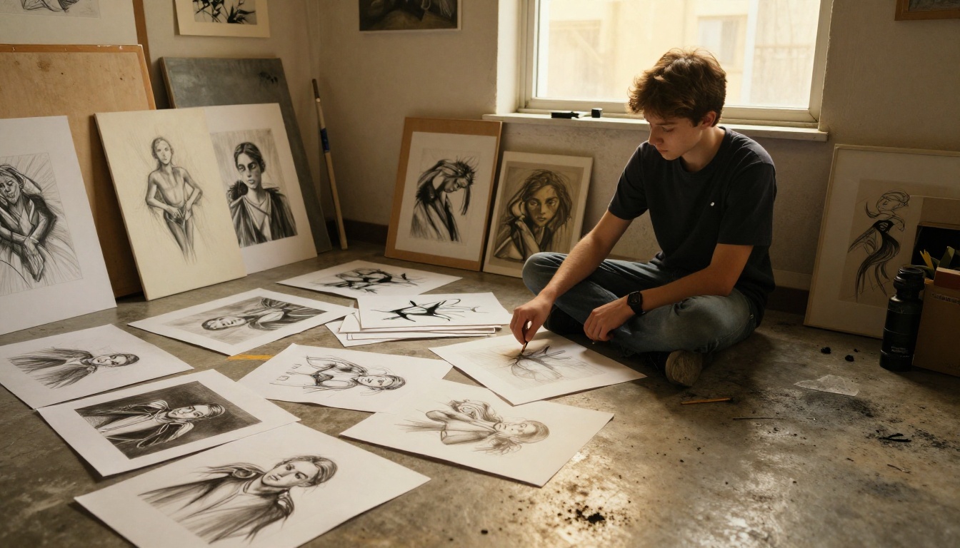
The most common error is also the most tempting. Applicants worry that fewer pieces looks lazy, so they include everything. The result is a portfolio where the best three pieces are buried under twenty average ones.
Why More Is Not Better
A reviewer judges you by your weakest visible work as much as your strongest. Each extra mediocre piece lowers the average impression. A tight set of twelve excellent pieces beats thirty uneven ones almost every time.
The Fix: Cut Ruthlessly
- Lay out every candidate piece.
- Ask a teacher and one honest peer to pick their top ten independently.
- Keep anything both of them chose.
- Remove anything you are including only because it took a long time.
- Check the submission rules and stay under the stated limit.
⚠️ Warning: Hours spent on a piece do not make it good. Reviewers see the result, not the effort.
Mistake 2: Ignoring the Submission Requirements
Every school publishes rules: file format, number of pieces, file size, required categories such as observational drawing, and sometimes a written statement. Applicants who skip the fine print get filtered out before anyone judges their art.
| Common Requirement | Typical Mistake | Better Approach |
|---|
| Number of pieces (10 to 20) | Sending 35 images | Match the stated range exactly |
| Observational drawing | Only drawing from photos | Include at least 2 from life, labeled |
| File format (PDF or JPG) | Mixed formats, huge files | Convert once, keep each file small |
| Written statement | Copy pasted generic text | Short, specific, about your own work |
| Deadlines | Submitting at the last minute | Upload 48 hours early to test links |
✅ Best practice: Print the requirements and check them off one by one the night before you submit.
Mistake 3: Poor Photography of Your Work
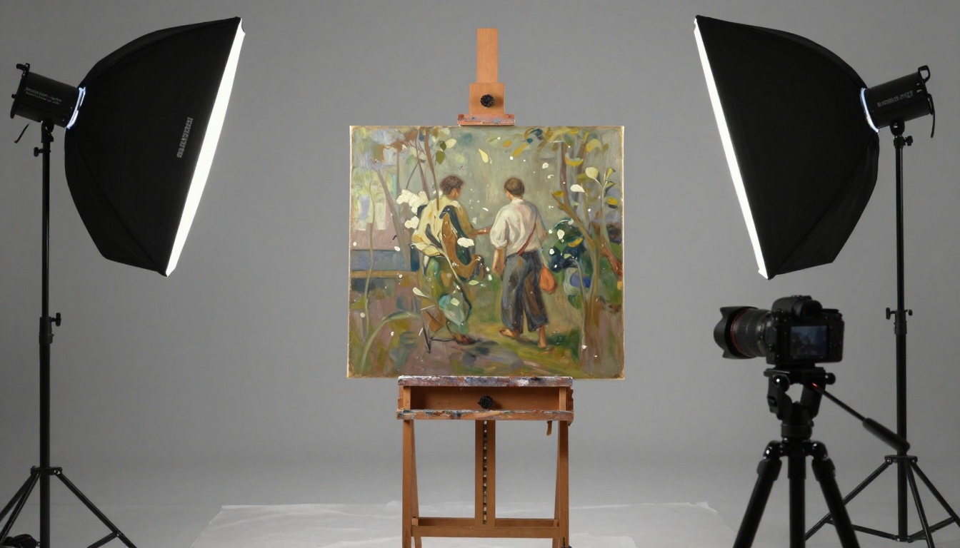
Your painting might be wonderful, but a phone snapshot with a shadow across one corner tells the reviewer it is not. Bad documentation is one of the easiest ways to look careless.
Common Photo Problems
- Visible shadows from your hand or phone
- Keystone distortion, where the artwork looks like a trapezoid
- Color shifts from yellow indoor bulbs
- Cluttered backgrounds, floors, or furniture in the frame
- Low resolution that hides texture and brushwork
A Simple Setup That Works
- Place the piece on a wall or flat surface with a neutral background.
- Use two lights at roughly 45 degrees, or shoot near a large window on an overcast day.
- Keep the camera parallel to the artwork, at its center height.
- Shoot in the highest quality setting and in raw if available.
- Crop tightly, correct white balance, and nothing more.
💡 Pro tip: Add one close-up detail shot for important pieces. Texture and mark making impress reviewers more than they expect.
Mistake 4: Hiding Your Process
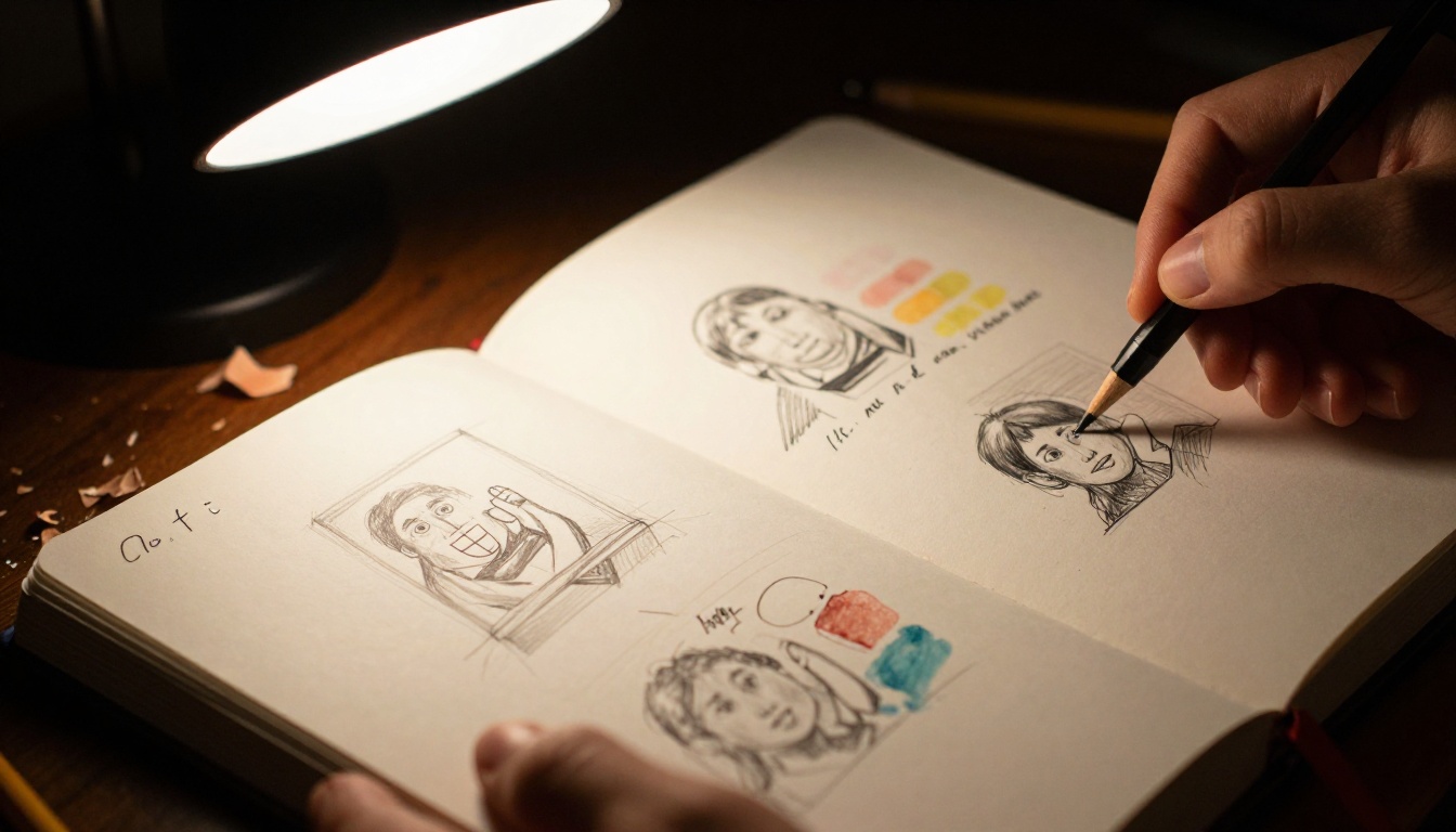
Many schools are not looking for polished perfection. They are looking for how you think. A portfolio of only finished pieces reveals little about your problem solving, which is exactly what faculty want to teach.
What Process Work Looks Like
- Thumbnails and rough compositions
- Research pages, color tests, and material experiments
- Notes about what failed and what you changed
- Side by side drafts showing revision
You do not need to show process for every piece. Two or three well chosen sequences are enough to prove that your finished work came from real thinking, not luck.
Finished Work vs Process Work
| Type | What It Proves | How Many to Include |
|---|
| Finished piece | Technical control and polish | 8 to 12 |
| Process sequence | Thinking, iteration, curiosity | 2 to 3 |
| Sketchbook spread | Habit of daily practice | 1 to 2 |
| Experiment or failure | Willingness to take risks | 1 |
Mistake 5: No Consistent Voice or Direction
Some applicants try to show every skill: one anime drawing, one oil landscape, one logo, one clay sculpture. The intention is to look versatile. The effect is often a portfolio that seems to have no point of view.
Range Is Fine, Randomness Is Not
A reviewer wants to see threads: a recurring subject, a favorite palette, a question you keep returning to. You can show different media while still showing one mind at work.
Try this exercise:
- Print thumbnails of all your candidate pieces.
- Group them by theme, mood, or subject.
- Find the largest group and build the portfolio around it.
- Keep one or two outliers only if they show real strength.
⚠️ Warning: Do not invent a theme at the last minute and force every piece into it. Reviewers can feel when a statement was written after the fact.
Mistake 6: Copying Instead of Interpreting
Fan art, trending styles, and tutorial recreations are fine for practice. In a portfolio, they raise a question: where are you in this work? Reviewers have seen the same viral style hundreds of times, and they know the tutorial it came from.
How to Keep Influences Without Copying
- Draw from life and from your own photographs
- Change the subject, scale, or context of anything you admire
- Add a personal element: your neighborhood, your family, your materials
- State your influences honestly in a caption
A short note such as "inspired by early Dutch still life, reinterpreted with kitchen objects from my home" shows maturity and honesty at once.
Mistake 7: Messy Presentation and Poor Sequencing
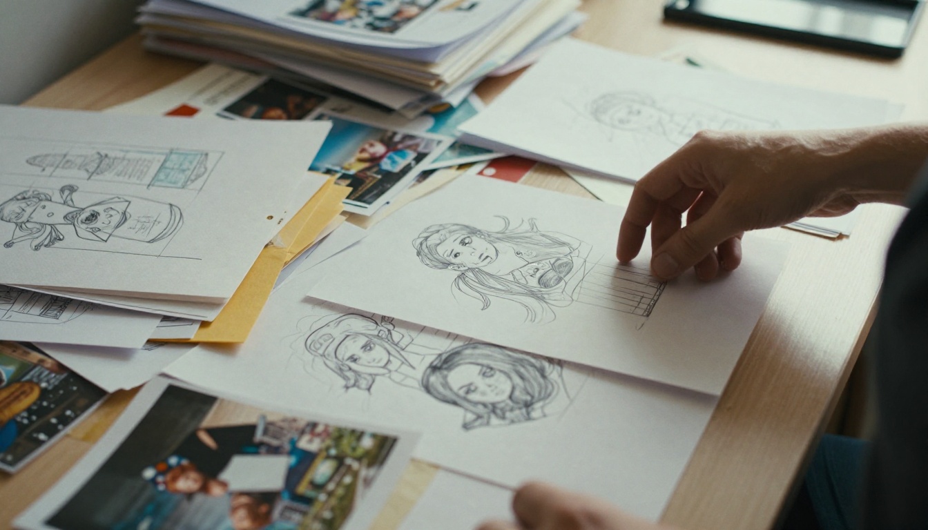
Even great pieces suffer when the order is random. Inconsistent margins, mixed image sizes, unlabeled works, and files named "IMG_4472" feel like a lack of care.
A Reliable Sequence
- Opening: your single strongest, most original piece
- Early section: two or three pieces that show range inside your voice
- Middle: process work and observational drawing
- Closing: another strong piece, so the last impression is as good as the first
Labeling Checklist
- Title of the piece
- Medium and approximate size
- Year created
- One short sentence of context when helpful
| Presentation Detail | Amateur Version | Professional Version |
|---|
| File names | IMG_4472.jpg | 03_still-life-oil-2026.jpg |
| Image size | Mixed, some cropped | Consistent ratio, uncropped |
| Captions | None or paragraphs long | One clean line each |
| Order | Chronological or random | Curated for impact |
| Backgrounds | Different on every slide | One neutral tone throughout |
Mistake 8: Weak or Missing Written Context
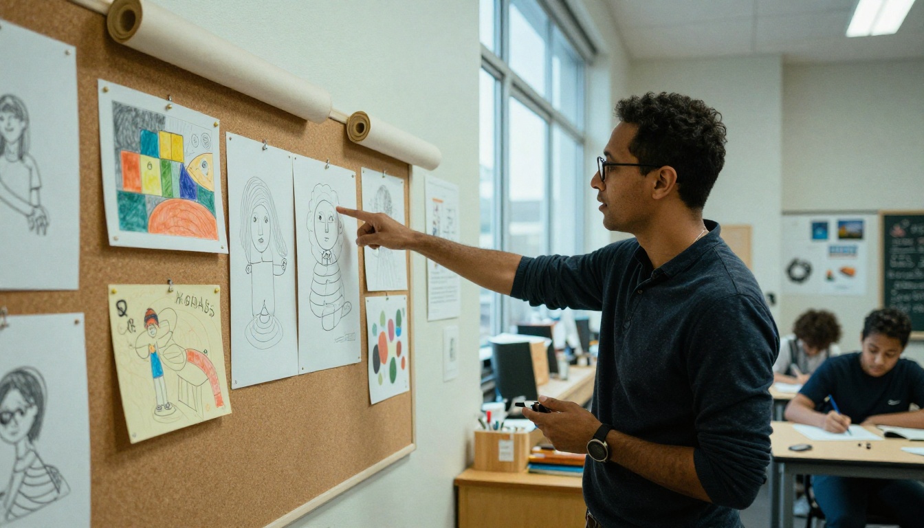
A statement is not a place to show off vocabulary. It is a short window into your motivation. Applicants often write vague lines like "I have always loved art" or paragraphs of theory that do not match what the images show.
What a Good Statement Does
- Names specific subjects and materials
- Explains one or two real decisions you made
- Connects your interests to what the school offers
- Stays honest and plain
Before and After
Weak: "Art is my passion and I express myself through many mediums."
Stronger: "I paint my grandmother's kitchen in the hour before dinner because that light changes every week, and I keep trying to catch it."
The second version tells the reviewer what you notice, which is the whole point.
💡 Pro tip: Ask a teacher to read your statement without seeing your portfolio. If they cannot guess what kind of work you make, rewrite it.
Mistake 9: Skipping Feedback Before You Submit
Applicants who work alone often miss obvious problems. A piece that looks unfinished, a confusing caption, or a pair of near identical works can sit in the final set simply because nobody pointed them out.
Where to Get Useful Feedback
- Your current art teacher, ideally someone who has seen portfolios succeed
- Alumni of the program you want, often reachable through open days or social media
- Admissions events where staff review work in person
- A peer who will be honest, not just kind
When you receive feedback, sort it into three piles: fix now, consider, and ignore. Not every comment deserves action, but patterns do. If three people say the same piece is weak, believe them.
Mistake 10: Delivering a Clumsy Digital Portfolio
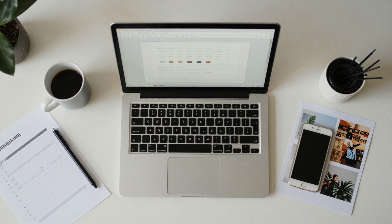
Most schools now accept or require online submissions. That means your presentation is the screen. A giant ZIP file, a link that needs a login, or a PDF that takes a minute to load can end a review early.
Problems Reviewers Report
- Links that expire or require permission
- Slideshows that crash on older machines
- Tiny images that cannot be zoomed
- Inconsistent layouts across pages
- Pages that look wrong on a phone or tablet
Comparing Delivery Options
| Format | Strengths | Weaknesses |
|---|
| Plain PDF | Universal, simple | Static, large files, no polish |
| Slide deck export | Easy to build | Layout shifts, heavy files |
| Personal website | Flexible and public | Requires design effort and upkeep |
| Interactive flipbook | Page-turn feel, fast, shareable by link | Needs a tool to build |
How to Build a Flipbook Portfolio with Flipbooks AI

A page-turning flipbook gives reviewers a clean, familiar way to move through your work, and it avoids most of the delivery problems above. With the Digital Portfolio Creator or the Portfolio Flipbook Builder, you can turn a finished PDF into something that opens in a browser on any device.
Step by Step
- Get started: Create an account on Flipbooks AI.
- Prepare your PDF: Export your curated, ordered pages from your design software at a sensible resolution. A PDF to Flipbook Converter handles the rest after upload.
- Upload and convert: Drop in the file and wait a few moments while pages are turned into a flipbook.
- Customize: Choose a neutral background, add your own branding or initials, adjust page-turn effects, and embed a short video or audio note if your work includes motion or sound.
- Share safely: Copy the direct link, use an embed code on your own site, or add password protection if the school asks for a private submission.
- Check on devices: Open the link on your phone and a laptop before sending it.
Flipbooks AI includes no watermarks, a mobile-responsive viewer, and offline downloads. On the Professional plan, analytics show whether your link was opened, which is handy when you want to confirm that your submission was viewed. Review the pricing plans to see which tier fits.
✅ Best practice: Keep one PDF version too. If a portal only accepts files, you will be ready.
If you work in photography, the Photography Portfolio tool suits image-heavy sets, and the Interactive Lookbook Designer works well for fashion and styling applicants.
A One-Week Fix Plan
If your deadline is close, here is how to spend seven days.
| Day | Task | Result |
|---|
| 1 | Read the rules and gather every candidate piece | A full pool to choose from |
| 2 | Cut to the final selection with feedback | 12 to 15 strong pieces |
| 3 | Re-photograph weak documentation | Clean, consistent images |
| 4 | Add process pages and captions | Evidence of thinking |
| 5 | Sequence the order and write the statement | A clear narrative |
| 6 | Build the digital version and test on devices | A fast, tidy file or link |
| 7 | Final review and early submission | No last-minute surprises |
A Final Self-Check
- Is the strongest piece first?
- Would a stranger know what I care about after five pieces?
- Is every image sharp, straight, and evenly lit?
- Does each file open instantly on a phone?
- Did I follow every requirement on the school's list?
Your Next Step
You do not need to be the most technically gifted applicant to stand out. You need to make it easy for a reviewer to see what you can do and how you think. Cut the extras, document your work well, show your process, and present it cleanly.
Ready to build yours? Get started for free on Flipbooks AI, browse all flipbook tools, or compare plans to pick what fits your application. Good luck, and submit early.



