The moment you start building a digital flipbook, it hits you: do you go portrait or landscape? It sounds like a small detail, but this single choice shapes how your audience reads, scrolls, and remembers your content. Whether you're building a magazine, a product catalog, or a sales presentation on Flipbooks AI, the orientation you pick directly affects how people experience every page.

What the Numbers Actually Tell Us
Before we get into aesthetics, let's talk behavior. Over 60% of web traffic now comes from mobile devices, and when people hold their phones, they default to portrait. That's not opinion; it's physics and habit. The human hand wraps naturally around a phone held vertically. Flipping it horizontal requires deliberate intent.
This behavioral baseline matters enormously for digital publications. If most of your readers open your flipbook on a phone, forcing them into landscape creates friction before they've read a single word.
Mobile Dominates, and Mobile Means Portrait
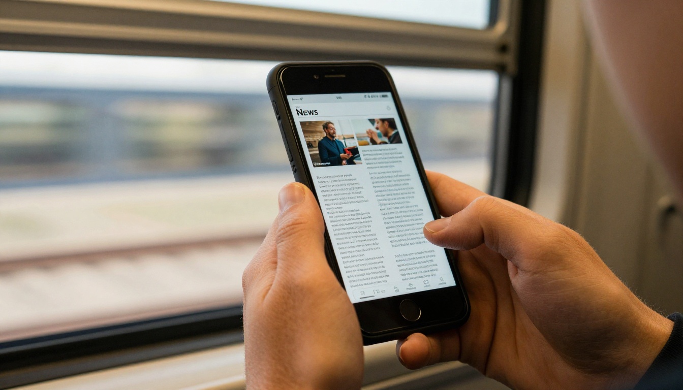
Smartphone screens are taller than they are wide. A portrait flipbook fits that shape. Text lines stay short and scannable. Images fill the vertical space naturally. Readers scroll or flip pages with their thumb without shifting their grip.
The practical result: portrait flipbooks on mobile have lower bounce rates. When content fits the screen, people stay longer.
When Desktop Still Shapes the Experience
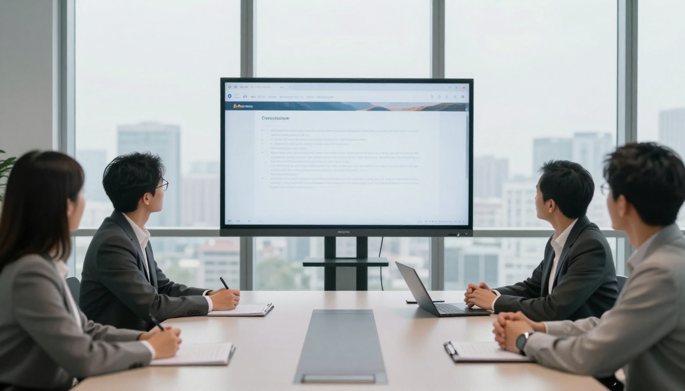
Desktop and laptop screens are wide. A portrait-format flipbook on a 27-inch monitor sits in the center of the screen with large grey margins on either side. It looks like a document, not a publication. Landscape fills the screen edge to edge, creates a more immersive experience, and better matches how people expect presentations and reports to look.
If your flipbook lives primarily in a corporate intranet, embedded in a slide deck, or displayed on a desktop browser, landscape almost always wins.
Portrait Mode: Where It Shines
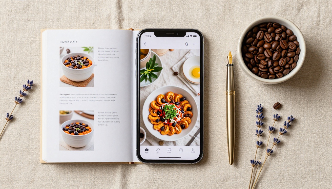
Portrait orientation (taller than wide, typically 4:5, A4, or letter-size proportions) mimics how people have read physical books, newspapers, and documents for centuries. That familiarity creates immediate comfort.
💡 Portrait works best when your primary audience is mobile. If you're unsure about your audience, portrait is the safer default.
Why Vertical Just Feels Natural
Reading in portrait mode aligns with how the eye naturally moves: top to bottom. Short line lengths reduce eye fatigue over longer reading sessions. Single-column layouts work cleanly, and photo-heavy pages feel editorial rather than cramped.
Portrait also makes scrolling feel natural on touch screens. The thumb moves up and down, matching the format of the content.
Best Content for Portrait Flipbooks
- E-books and long-form articles: Text-heavy content needs short lines for comfortable reading
- Recipe books: Ingredient lists and step instructions read best in vertical columns
- Lookbooks and style publications: Fashion imagery reads as editorial when cropped vertically
- Reports and proposals: Professional documents match standard paper dimensions
- Newsletters: Email-newsletter-style layouts map perfectly to portrait dimensions
- Wedding albums: Vertical portrait photography fills the page without cropping
Landscape Mode: Where It Dominates
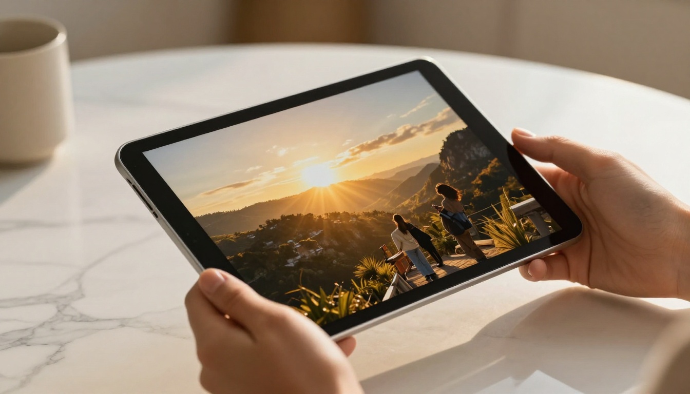
Landscape orientation (wider than tall, often 16:9 or A4 rotated) matches the natural view of the human eye, which has a wider horizontal field of vision than vertical. This is why cinema is horizontal, why photography defaults to landscape, and why your TV is wider than it is tall.
💡 Landscape is ideal for content that benefits from side-by-side layouts: before/after comparisons, two-column design, or wide panoramic images.
Where Horizontal Wins Every Time
Wide screens reward wide content. A landscape flipbook on a desktop browser feels immersive. Two-page spreads display as they were designed. Panoramic photography shows its full depth. Tables and data comparisons sit comfortably in multi-column layouts without feeling squeezed.
Landscape also dominates in presentation contexts. When someone shares a flipbook in a Zoom meeting or on a conference room screen, landscape fills the frame naturally.
Best Content for Landscape Flipbooks
- Product catalogs: Two-column grid layouts fill wide pages elegantly
- Annual reports: Data tables and charts breathe in wide layouts
- Presentations: Slide-deck proportions are inherently landscape
- Real estate brochures: Wide interior shots lose impact when cropped to portrait
- Menus and price lists: Side-by-side category columns read faster in landscape
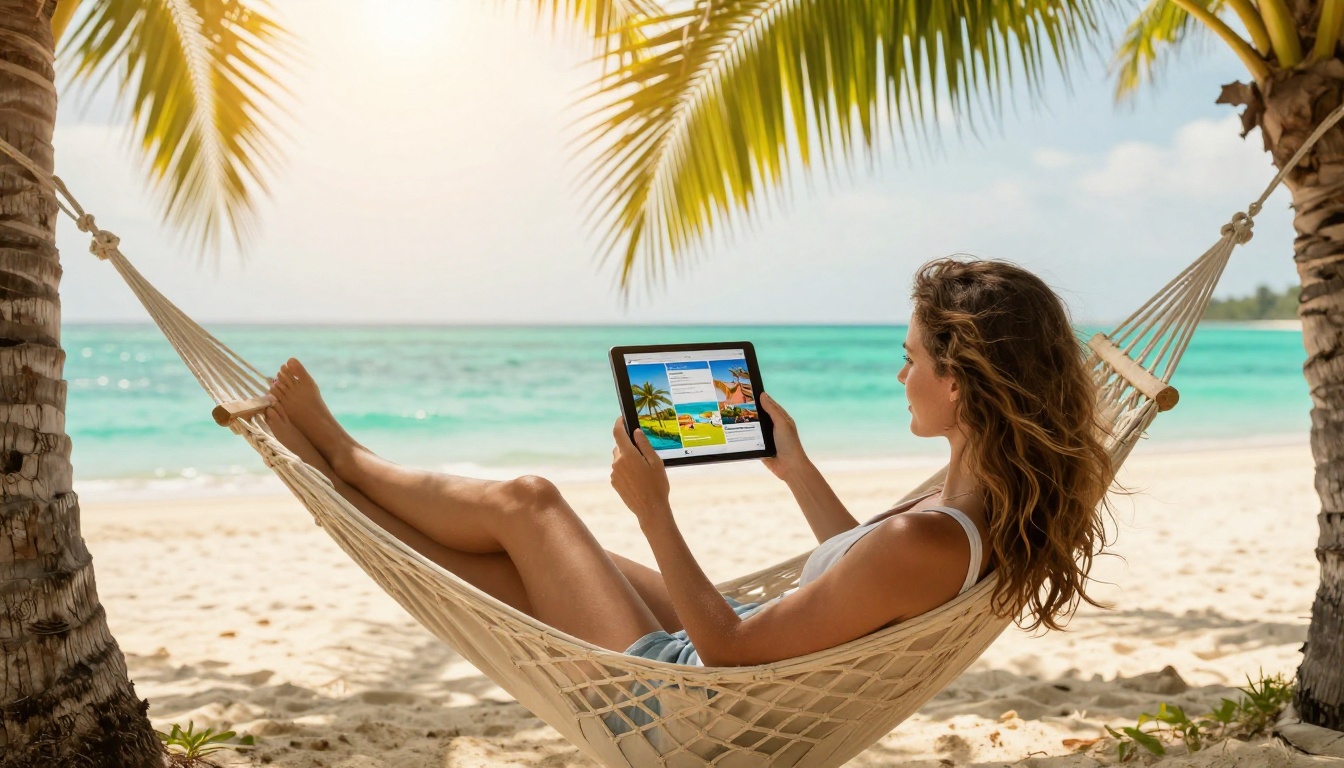
- Travel publications: Panoramic destination photography needs width
Portrait vs Landscape: The Head-to-Head
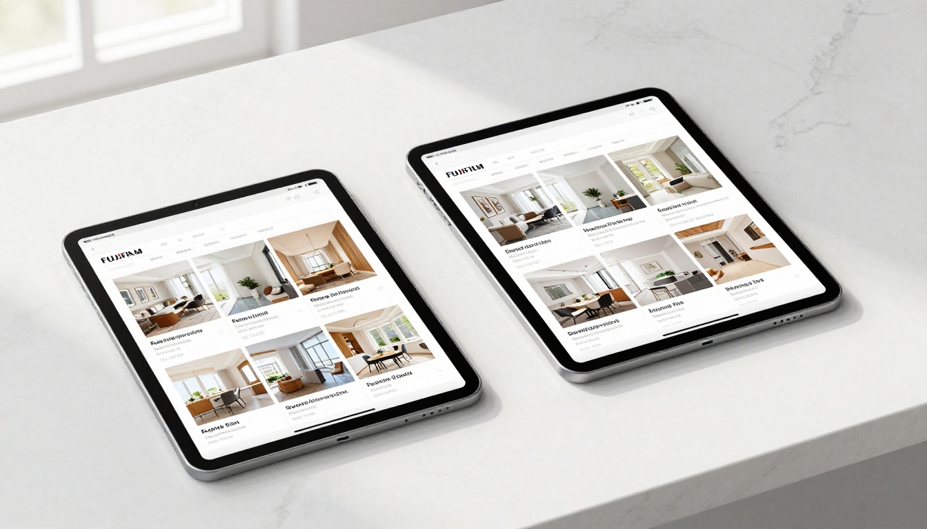
Here's where both orientations stack up across the factors that matter most for digital flipbooks:
| Factor | Portrait | Landscape |
|---|
| Mobile experience | Excellent, native phone shape | Requires horizontal hold |
| Desktop experience | Narrow with margins on wide screens | Fills screen edge to edge |
| Text readability | Short lines, natural eye movement | Wider lines, better for tables |
| Image display | Vertical crop, editorial feel | Panoramic, cinematic impact |
| Two-page spreads | Simulates book double-page | Wide panoramic spreads |
| Embed behavior | Fits most blog embeds well | Better for widescreen embeds |
| Printing | Matches standard A4/Letter paper | Requires landscape printer settings |
| Presentations | Feels like a document | Matches slide-deck proportions |
| Catalog layouts | Single column, limited grid | Multi-column grids work well |
| Default reader comfort | Matches phone habits | Matches screen habits |
⚠️ There is no universally "correct" orientation. The right answer is the one that matches your content type and your audience's primary device.
Choosing by Content Type
Not sure which to pick? Start here. This table maps common flipbook content types to their ideal orientation and the platform where they perform best:
| Content Type | Best Orientation | Primary Platform | Notes |
|---|
| E-book / Long reads | Portrait | Mobile | Short lines reduce fatigue |
| Product catalog | Landscape | Desktop | Multi-column grids |
| Fashion lookbook | Portrait | Mobile | Vertical fashion photography |
| Annual report | Landscape | Desktop | Data tables need width |
| Recipe book | Portrait | Mobile/Tablet | Vertical ingredient lists |
| Travel publication | Landscape | Tablet/Desktop | Panoramic photography |
| Restaurant menu | Landscape | Tablet | Category columns |
| Sales presentation | Landscape | Desktop | Slide proportions |
| Wedding album | Portrait | Mobile/Tablet | Vertical portrait photography |
| Newsletter | Portrait | Mobile | Email-style column layout |
| Real estate brochure | Landscape | Desktop | Wide interior shots |
| Training manual | Portrait | Desktop | Document-style reading |
Before you finalize orientation, ask these three things:
1. Where will most people open this?
Check your analytics or make an educated guess. A flipbook shared by email to a general consumer audience will be opened mostly on mobile, which means portrait. A flipbook embedded in a corporate intranet will be opened mostly on desktop, which means landscape.
2. What does your source PDF look like?
If your PDF was designed in portrait (standard A4), convert it as portrait. Rotating a portrait PDF to landscape crops content or creates awkward margins. Work with your source format, not against it.
3. Does your content have wide or tall elements?
Wide panoramic photos, comparison tables, and slide-style layouts belong in landscape. Tall portrait photography, single-column text, and editorial magazine imagery belong in portrait.
✅ Best practice: Before publishing, preview your flipbook on both a phone and a desktop browser. If it looks good on both, you've picked the right orientation.
How to Publish Your Flipbook in the Right Orientation
Flipbooks AI handles both portrait and landscape orientations natively, and the process of setting your format takes seconds. Here's exactly how it works.

Step 1: Create Your Account
Head to flipbooksai.com/account and sign up. No watermarks on any plan, and the Standard plan gives you unlimited flipbooks with no output restrictions.
Step 2: Upload Your PDF
On the dashboard, click Create New Flipbook and upload your PDF. Flipbooks AI automatically detects the dimensions of your source document and sets the flipbook orientation to match. A portrait A4 PDF becomes a portrait flipbook. A 16:9 landscape PDF becomes a landscape flipbook.
Step 3: Choose Your Tool
Depending on your content type, browse the tools directory to find the right template:
Step 4: Customize and Protect
Add your logo, choose your color scheme, and configure page-turn effects. Password-protect private publications, or make them publicly shareable with a direct link. All plans include mobile-responsive viewing with no technical setup required.
Step 5: Preview on Multiple Devices
Before publishing, use the built-in preview to check how your flipbook looks on mobile and desktop. Verifying your orientation choice on both screen types takes 30 seconds and can save you from publishing something that reads poorly on half your audience's devices.
Step 6: Publish and Share
Generate an embed code to place the flipbook directly on your website via Embed Flipbook on Website, or share the direct link. Professional plan users get access to analytics to track views, time-on-page, and lead generation data. Compare pricing plans to see which tier fits your publishing workflow.
Real-World Use Cases
Theory is useful, but real examples show the difference more clearly.
A fashion brand's seasonal lookbook: Portrait, always. Fashion photography is shot vertically. Models look taller and more aspirational in portrait crops. The editorial magazine feel that portrait creates matches the brand aesthetic of luxury fashion. On Instagram and mobile, it fits seamlessly. The Interactive Lookbook Designer is built for exactly this format.
A furniture retailer's product catalog: Landscape. Room photography is wide. Dining tables look bigger, living room layouts look more spacious, and kitchen installations show more context in a wide frame. A portrait crop of a dining room feels claustrophobic. The Furniture Catalog Maker uses landscape templates specifically for this reason.
A restaurant's menu: Landscape. Menus traditionally organize into categories side by side. A landscape layout lets appetizers sit in the left column, mains in the center, desserts on the right. Portrait forces everything into one long scroll. The Restaurant Menu Creator defaults to landscape for this reason.
A photography portfolio: Portrait for headshots and fashion, landscape for architecture and travel. The best portfolios use portrait for people-focused work and landscape for environment-focused work. The Photography Portfolio tool supports both.
By Industry: Which Orientation Wins
Fashion and Retail
Portrait wins in fashion, nearly without exception. Fashion photography is vertical by nature. A portrait flipbook on mobile (where most fashion browsing happens) fits the format readers already use on Instagram, Pinterest, and brand apps. Use portrait for lookbooks, style publications, and seasonal collections.
Corporate and B2B
Landscape wins for corporate content. Annual reports, presentations, and proposals display better in wide format. When a CFO shares a financial report in a video call, landscape fills the screen correctly. Use the Annual Report Creator or Corporate Report Maker for landscape-optimized corporate publications.
Education and Training
Portrait for text-heavy training materials and course content. Landscape for visual presentations and slide-style course decks. The choice depends on whether the content is reading-based or viewing-based. The Training Manual Flipbook and Course Material Publisher both support either orientation.
The Hybrid Reality
Some content genuinely works across both orientations. A travel publication might have portrait pages for hotel room descriptions and landscape spreads for panoramic destination photography. A real estate brochure might use landscape for exterior shots and portrait for floor plans.
Flipbooks AI handles mixed-dimension PDFs by following your source document's layout. If your PDF designer mixed portrait and landscape pages intentionally, the resulting flipbook respects that mix. The mobile-responsive viewer adjusts dynamically.
For most use cases, though, consistency wins. A flipbook that switches orientation mid-read creates jarring visual breaks. Design your source PDF with a single dominant orientation and use that orientation as the foundation of your flipbook.
Make Your Choice and Publish
The portrait vs landscape decision comes down to three things: where your audience reads, what your content looks like, and what device they're using. Portrait works for mobile-first audiences and text-heavy content. Landscape works for desktop viewing, wide imagery, and data-rich publications.
The best way to settle the question is to try it. Get started for free on Flipbooks AI, upload your PDF, and preview the result on both mobile and desktop before publishing. The platform handles all the technical conversion; your only job is to start with the right source document dimensions.
Browse all flipbook tools to find templates optimized for your content type, or check pricing plans to choose the tier that fits your workflow.



