Most sustainability reports get downloaded once and never opened again. Investors skim the first page, journalists search for a single number, and customers never see them at all. The reports that break this pattern share a few habits, and you can spot them quickly in the sustainability report examples from Patagonia, Nestlé and a handful of smaller brands. This article breaks down what each one does well, where each one struggles, and how to publish your own report as an interactive flipbook with Flipbooks AI so people actually read it.
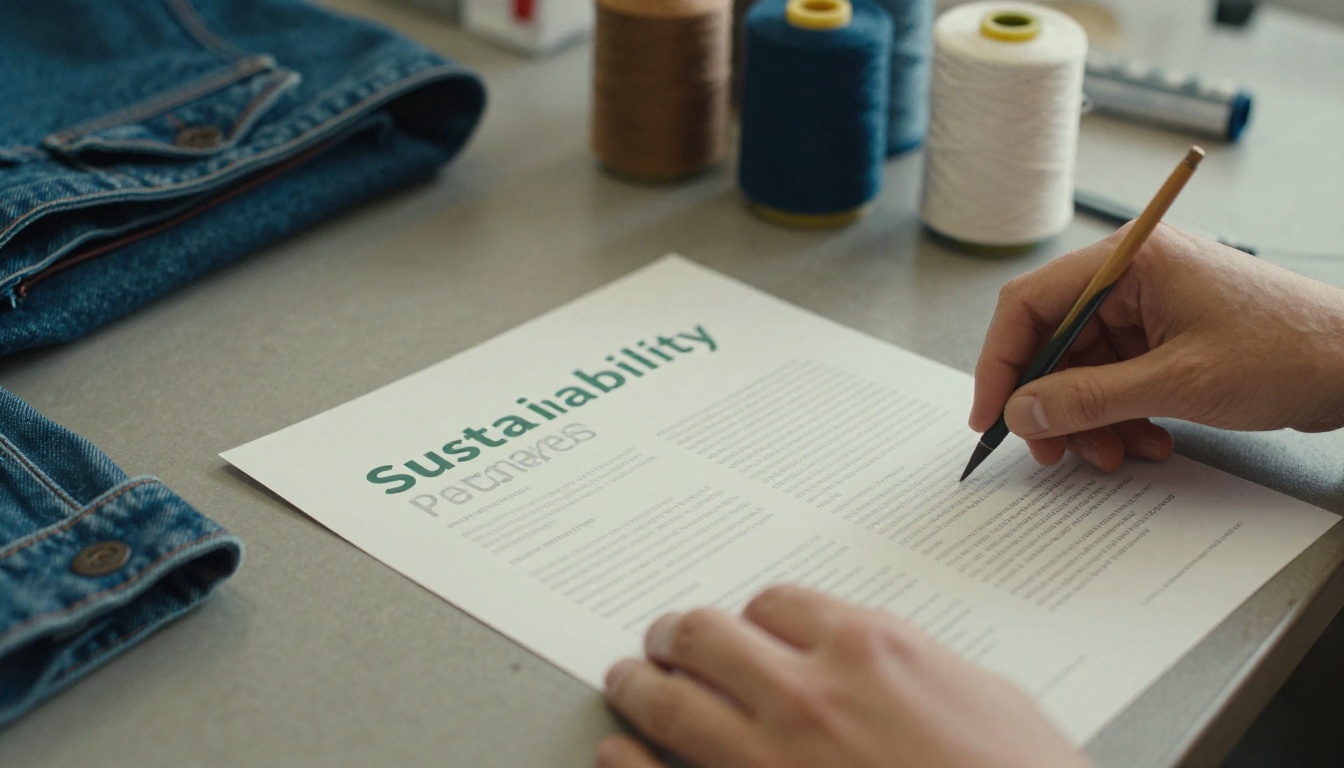
Why Sustainability Reports Matter Now
Regulation, investor pressure and customer scrutiny have turned the sustainability report from a nice extra into a business document. Buyers ask for it during procurement. Lenders ask for it during due diligence. Employees check it before accepting an offer.
A report is also a trust test. Anyone can claim a brand is "green." A report forces you to publish baselines, targets and progress, and then lets the public compare your words with your numbers.
What Readers Look For First
Different audiences open the same report for very different reasons:
- Investors want risk, targets and governance.
- Journalists want one honest number and one honest failure.
- Customers want proof that the product they hold is better than the alternative.
- Employees want to see leadership taking responsibility.
- Regulators and auditors want methodology and boundaries.
A strong report serves all five without forcing any of them to dig.
The Cost of Vague Claims
Vague language is the fastest way to lose a reader. Phrases like "we care deeply about the planet" tell nobody anything. Specific language does: tonnes of emissions, percent of recycled fibers, number of audited suppliers.
⚠️ Claims you cannot back with a number, a date or a third party are a liability. Regulators in several regions now penalize misleading environmental marketing.
Patagonia: Story First, Data Close Behind
Patagonia is the example most marketers reach for, and for good reason. The company treats its environmental and social reporting as an extension of its mission rather than a compliance exercise. The tone is direct, personal and often self-critical.

What Patagonia Does Well
It admits flaws. Patagonia has long been willing to say that making clothes always causes harm and that the goal is to cause less of it. That candor is rare, and it makes the positive claims more believable.
It ties reporting to the product. Programs like Worn Wear (repair and resale) and its supply chain disclosures sit next to the products customers actually buy. The report is not a separate universe.
It links to ownership and governance. The 2022 decision to place the company's ownership in a purpose trust and a nonprofit gave the company a headline that no spreadsheet could match, and the reporting reflects that commitment.
Where It Can Frustrate Readers
Storytelling-heavy reports can bury the hard numbers. If you want a precise emissions figure by scope, you may need to hunt across several pages and supplementary documents. That is a design problem as much as a content problem.
💡 Pro tip: Borrow Patagonia's voice, but keep a one-page data summary near the front so analysts do not have to search.
Nestlé: Scale, Structure and Standards
Nestlé sits at the other end of the spectrum. It is a global food company with thousands of products and a supply chain that touches farms in dozens of countries. Its reporting leans on frameworks, targets and detailed appendices.
What Nestlé Does Well
It publishes clear targets. Net zero commitments, interim reduction goals and regenerative agriculture programs are laid out with dates, so progress can be tracked year over year.
It uses recognized frameworks. Alignment with established standards such as GRI and the Science Based Targets initiative gives auditors and investors a familiar map.
It breaks a huge business into topics. Climate, water, packaging, sourcing and human rights each get dedicated sections. That makes a very long document easier to scan.
Where It Gets Heavy
Big reports carry big risks: length, jargon and a corporate tone that can feel distant. Critics also point out that large companies face harder questions about packaging waste and sourcing, and a polished report invites close reading.
| Feature | Patagonia | Nestlé |
|---|
| Tone | Personal, candid | Formal, structured |
| Main strength | Brand story and credibility | Targets and framework alignment |
| Typical weakness | Numbers can be hard to find | Length and corporate distance |
| Best lesson | Admit trade-offs | Publish dated, trackable goals |
| Ideal reader | Customers and community | Investors and regulators |
How Smaller Brands Do It Differently
A company with fifty employees cannot publish a hundred-page report, and it should not try. Smaller brands win on speed, honesty and focus.

The One-Metric Approach
Many small brands pick two or three metrics they can measure well and report them every year. A ceramics studio might track kiln energy use, packaging waste and the share of clay sourced within 200 miles. A coffee roaster might track green bean traceability, bag recyclability and the share of fair-priced lots.
The point is consistency. A small report with three honest metrics over five years beats a large report with thirty metrics measured once.
Founder Voice Builds Trust
In a small company, the founder is the brand. A short letter that says "here is what we got right, here is what we missed" feels more credible than a polished executive statement. Readers can tell when a letter was written by a person.
Illustrative Example: A Small Apparel Label
Imagine a ten-person apparel label that publishes a twelve-page report each spring. Page one shows three headline numbers. Pages two to four explain materials and suppliers. Page five names one thing that went wrong, such as a delayed audit. The final pages list next-year goals. It is short, specific and easy to share.
Side-by-Side: What the Best Reports Share
Put the three types next to each other and the patterns become obvious.

| Element | Large Corporate | Mission-Led Brand | Small Business |
|---|
| Length | 80 to 200 pages | 30 to 80 pages | 8 to 24 pages |
| Data depth | Very high | High | Focused |
| Voice | Formal | Personal | Founder-led |
| Visuals | Charts and infographics | Photography and stories | Simple charts and photos |
| Update cycle | Annual | Annual or continuous | Annual |
| Main risk | Greenwashing perception | Overpromising | Thin data |
The Five Habits of Strong Reports
- Baseline and target. Every metric shows where you started and where you are going.
- Boundaries. The report states what is included (own operations, suppliers, products) and what is not.
- A failure section. At least one honest miss, with a plan.
- Third-party checks. Certifications, audits or assurance statements where possible.
- Plain language. Short sentences, defined terms, no filler.
✅ Best practice: Put the three most important numbers on the first spread, then let readers choose how deep to go.
Designing a Report People Finish
Content earns trust, but design earns attention. A 120-page PDF opened on a phone is punishing. A short interactive document with clear navigation is easy to share.

Structure That Scans Well
Use a repeating layout so readers learn the pattern quickly:
- A headline number at the top of each topic
- One short paragraph of context
- A small chart showing the trend
- A "what we did" and "what is next" pair
Photography Over Stock
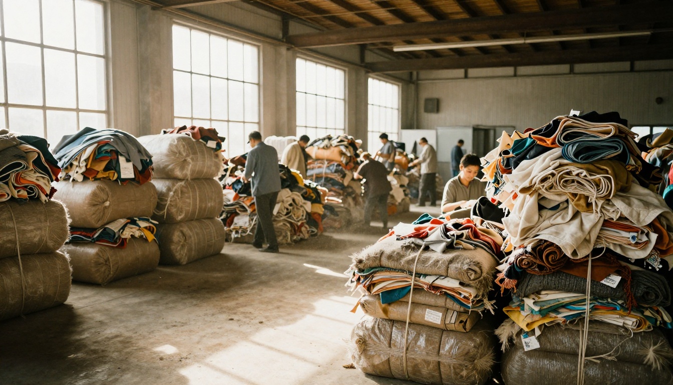
Real images of real facilities, farms and people carry more weight than generic icons. Patagonia leans on this heavily. Smaller brands can do the same with a phone camera and good morning light.
Make Data Visual, Not Decorative
A chart should answer a question. If it does not, cut it. Bar charts for year-over-year change, simple tables for supplier breakdowns, and a single map for sourcing regions cover most needs.
| Content Type | Best Format | Avoid |
|---|
| Emissions over time | Line or bar chart | 3D pie charts |
| Supplier locations | Simple map | Dense logo walls |
| Materials mix | Stacked bar | Unlabeled icons |
| Progress to target | Progress bar with date | Vague "on track" labels |
| Stories | Photo and short quote | Long blocks of text |
How to Publish Your Report as a Flipbook
A flipbook keeps the familiar page-turning feel of a printed report while adding links, video and mobile-friendly reading. You can build one from an existing PDF in a few minutes. For this kind of document, the Corporate Report Maker and the Annual Report Creator are good starting points.
Step-by-Step Process
- Create your account. Visit Flipbooks AI and sign in.
- Upload your PDF. Use the PDF to Flipbook Converter. Your pages are converted automatically and keep their layout.
- Customize the look. Add your logo, set brand colors and choose page-turn effects. Nothing is watermarked, so the report looks like yours.
- Add media. Embed a short factory video, a founder message or a supplier interview directly on the page where it belongs.
- Set sharing options. Copy a direct link, or use the Embed Flipbook on Website tool to place the report on your sustainability page.
- Protect drafts. Use password protection while stakeholders review the draft, then open it to the public at launch.
💡 Pro tip: Publish the interactive version on your site and keep the PDF as a downloadable option for auditors who want to archive it.
Track Who Reads What
Analytics and lead generation are part of the Professional plan. They show which sections get the most attention and where readers drop off. If nobody reaches the packaging chapter, that tells you something about the writing or the placement. See the pricing plans to compare options, including unlimited flipbooks on the Standard plan and above.
Offline Access for Auditors and Buyers
Procurement teams often need to store documents internally. Offline downloads let them keep a copy without emailing a bulky attachment. The Report Flipbook Creator supports this kind of workflow.
Mistakes to Avoid
Even well-meaning teams repeat the same errors. Here are the ones that damage credibility most.

Hiding Bad News
Skipping a missed target is worse than reporting it. Readers notice gaps between years. A short, factual note about why a goal slipped and what changes next builds more trust than silence.
Changing Metrics Every Year
If you switch definitions or boundaries without saying so, trend lines become meaningless. When you must change a method, state it and restate the previous year using the new method.
Treating the Report as a Marketing Brochure
A report written entirely by the marketing team often sounds like an ad. Involve operations, procurement and finance. Their numbers and their wording make the document credible.
Publishing Once and Forgetting It
A report is a living reference. Update it on a schedule, link to it from product pages and mention it in sales conversations. A report flipbook on your website is far easier to reference than a buried PDF link.

A Practical Checklist Before You Publish
Use this quick review to catch problems before the report goes live.
| Question | Yes / No |
|---|
| Are baselines and targets shown for every metric? | |
| Is the reporting boundary stated clearly? | |
| Is there at least one honest shortfall? | |
| Are claims supported by data or third parties? | |
| Does the first spread show the top three numbers? | |
| Is the document readable on a phone? | |
| Is there a named contact for questions? | |
What to Borrow From Each Example
- From Patagonia: a candid voice and a direct link between reporting and products.
- From Nestlé: dated targets, recognized frameworks and clear topic sections.
- From smaller brands: focus, speed and a founder who signs the letter.
Combine these and you get a report that is honest, scannable and easy to verify.
Ready to Publish Your Own Report?
The best sustainability reports are not the longest or the prettiest. They are the ones that say something specific, show the numbers and make it easy to read on any device. Patagonia shows how voice builds belief. Nestlé shows how structure builds credibility at scale. Smaller brands show that a short, honest report can beat a long, guarded one.

Ready to turn your PDF into something people will open? Get started for free on Flipbooks AI, browse all flipbook tools to find the right template, or compare pricing plans when you are ready for analytics and lead capture. When you want to go straight to checkout, use the account to pricing link and publish your first sustainability report today.



