Color is one of the most powerful tools in any publication. It directs the eye, signals importance, and creates emotional response before a single word is read. But walk through most digital catalogs, flipbooks, and brochures today, and you'll find the same pattern: too many colors, all fighting for attention at once. Red buttons. Blue headers. Green highlights. Orange CTAs. The result isn't rich, it's chaotic. The single most effective design shift you can make is to strip your palette down to one accent color and nothing else, then use it with surgical precision.
This isn't minimalism for minimalism's sake. It's a structural decision that changes how readers process your content. Flipbooks AI is built around this principle, making it straightforward to apply a single brand color across every page of your digital publication. The results speak clearly.

Why Most Designs Use Too Many Colors
The "More is More" Trap
There's a common instinct in design: if one color makes something noticeable, three colors must make it three times more noticeable. It's intuitive but wrong. Each additional color you add to a layout competes with every other color for visual attention. When everything is emphasized, nothing is.
The problem isn't aesthetic preference, it's neurological. The human eye naturally moves toward contrast. In a field of grey text on white, a single terracotta headline stops the eye cold. Add a blue subheading, a green icon, and a red button, and the eye doesn't know where to land. It scans frantically, finds no clear hierarchy, and the reader feels fatigued without knowing why.
⚠️ Color overload is one of the top reasons readers abandon catalogs and flipbooks before reaching the second page. Visual fatigue sets in within seconds.
What Color Overload Costs You
Beyond aesthetics, too many accent colors have real costs:
- Brand recall drops: Readers can't associate your publication with a single color if five colors appear equally prominent
- Navigation confusion: When CTAs, warnings, headings, and decorative elements all use different colors, readers can't predict what each color means
- Production inconsistency: More colors mean more decisions to maintain, and more places for the design to break down across page ranges
- Trust signals weaken: Cluttered color palettes signal a lack of editorial control, which subtly undermines credibility
The fix is almost offensively simple: one color. One.
The Logic Behind One Accent Color
How Scarcity Creates Focus
Color works on scarcity. When something appears rarely, it reads as significant. A single accent color placed only where it matters becomes a visual signal your readers track without conscious effort. They start to recognize that wherever that color appears, something important is happening.
This is why the most respected print publications have used this approach for decades. The Economist uses red, and only red. The New Yorker uses black with selective accent. These aren't accidents, they're strategic choices that create immediate recognizability and help readers move through content.

The Hierarchy Effect
When you commit to one accent color, something interesting happens to your layout. All your other design decisions become clearer. Body text stays in charcoal or black. Backgrounds stay white or very light grey. Supporting elements stay in neutral tones. And the accent, wherever it lands, instantly creates hierarchy.
You don't need to rely on size or weight alone to signal importance. You have color working for you: a single, trustworthy signal that scales from your first page to your last without losing its power.
💡 Think of your accent color as a highlighter marker. You wouldn't highlight every word in a book. You'd highlight the one sentence on the page that matters most.
Picking the Right Accent Color
Not all accent colors are equal. The right choice depends on your content, your audience, and the emotional register your publication needs to hit.
Color Psychology at a Glance
| Color | Common Associations | Best For | Avoid When |
|---|
| Cobalt Blue | Trust, precision, calm | Corporate reports, tech catalogs | Warm lifestyle brands |
| Terracotta / Rust | Warmth, craft, approachability | Artisan brands, food catalogs, menus | Finance, medical |
| Emerald Green | Growth, health, luxury | Sustainability brands, wellness menus, portfolios | Budget or bargain positioning |
| Mustard Yellow | Optimism, creativity, energy | Fashion lookbooks, creative portfolios | Professional services |
| Coral / Warm Red | Urgency, passion, appetite | Restaurant menus, seasonal catalogs | Formal business contexts |
| Dusty Rose | Elegance, softness, femininity | Beauty brands, wedding publications | Industrial or tech catalogs |
| Charcoal (as accent) | Authority, sophistication | Legal, academic, luxury real estate | Youth-oriented or playful content |
Warm vs. Cool Accents
Warm accents (terracotta, amber, coral) create a sense of approachability and appetite. They're naturally energetic and tend to push forward visually. Cool accents (blue, green, grey-violet) create distance and suggest authority or calm. Neither category is better, they serve different readers and different content types.
A real estate brochure benefits from deep navy or forest green, communicating stability and investment value. A restaurant menu benefits from warm coral or amber, activating appetite and warmth. Choose the temperature that matches what you want the reader to feel.
How to Test Before You Commit
Before locking in your accent color, run three quick tests:
- The squint test: Reduce the page to a thumbnail. Can you immediately spot where the accent is? If it disappears at small size, it's too weak.
- The contrast check: Place your accent color against your background. The WCAG minimum contrast ratio for body text is 4.5:1. For large display text, 3:1. Use a contrast checker.
- The isolation test: Put your accent color alone on a white page. Does it feel confident and intentional, or does it feel arbitrary? Trust your gut here.
✅ Your accent color should feel like it belongs to the brand, not just the current project. If it could easily swap to a different color without anyone noticing, it's too generic.
Where the Accent Goes (and Where It Doesn't)
Choosing the right accent color is only half the work. Knowing exactly where to place it, and more importantly where not to place it, is what separates disciplined design from decoration.
The Right Spots
These are the elements where the single accent color earns its place:
- Primary headlines (H1, H2): The accent at headline level guides reading flow across the entire page
- CTAs and buttons: One accent-colored button on a page reads as the clear action to take
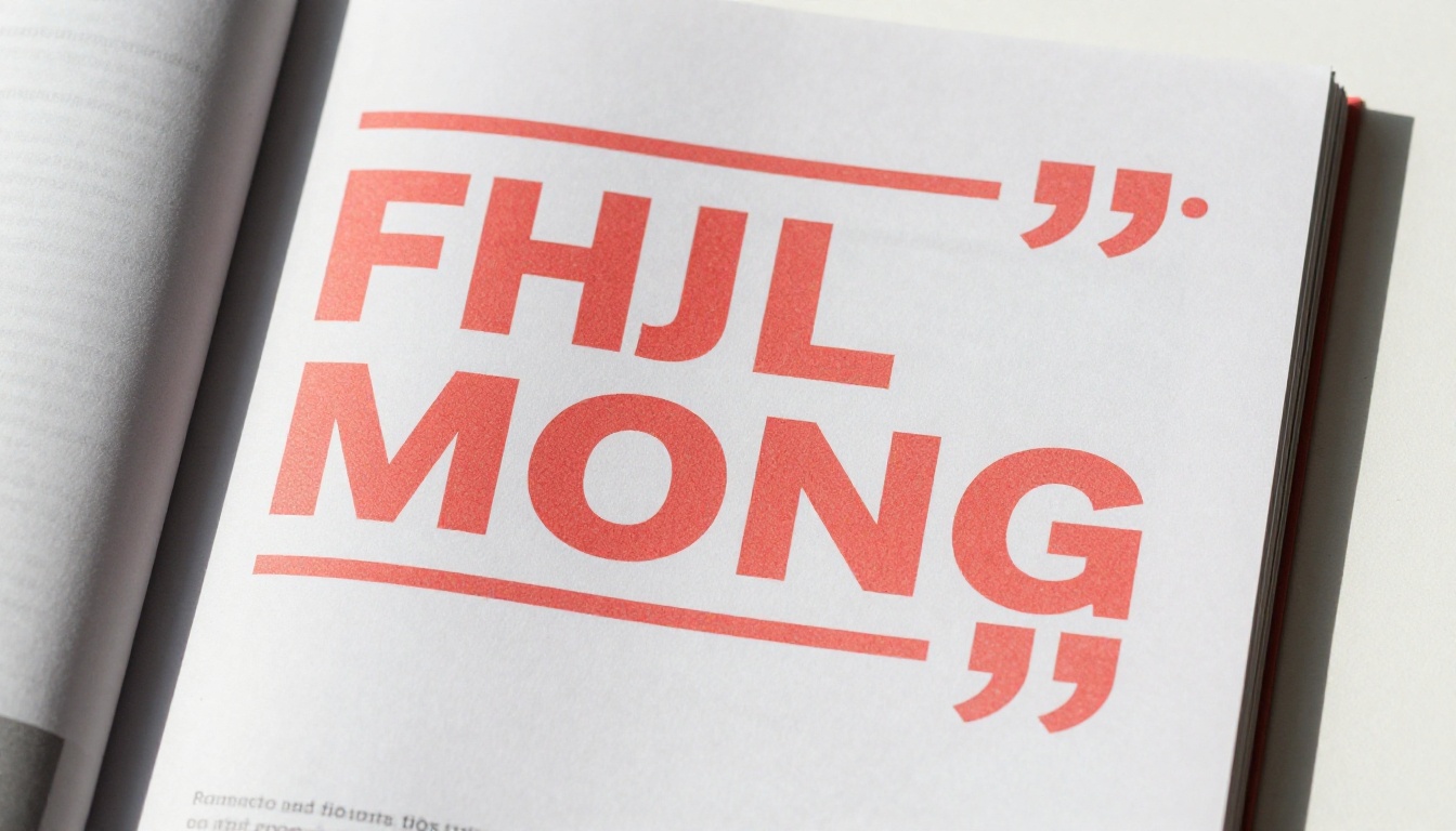
- Pull quotes: The accent on quotation marks or rule lines signals this content is important
- Page numbers and navigation: Consistent accent placement in navigation builds a sense of spatial control
- Category labels and tags: Small accent-colored category badges create scannable organization
- Section dividers: A thin accent-colored rule or stripe between sections creates rhythm without weight
What to Keep Neutral
| Element | Recommended Treatment | Why |
|---|
| Body text | Deep charcoal (#2D2D2D) or black | Maximum readability, no accent competition |
| Subheadings (H3, H4) | Dark grey (#444444) | Subordinate to H1/H2 accent headings |
| Background | Pure white or very light warm grey | Accent color reads strongest against neutral |
| Supporting icons | Monochrome or grey | Color icons compete with the accent |
| Photography | Full color or desaturated | Images provide visual interest independently |
| Borders and rules | Light grey (#E0E0E0) | Structural without drawing attention |
| Captions | Light grey (#888888) | Clearly subordinate hierarchy |
The discipline here is intentional. Every element that stays neutral makes the accent more powerful. Every neutral you break weakens the effect.
How to Apply This in Flipbooks AI
This design principle becomes practical the moment you open Flipbooks AI. The platform's customization system is built for exactly this kind of intentional, single-color branding.
Setting Your Brand Color
When you upload your PDF and begin customization, the first thing to lock down is your single accent color. In Flipbooks AI, this appears in the branding panel:
- Upload your PDF: Head to Flipbooks AI and create an account or sign in. Upload your document.
- Open the Brand Settings panel: Once your flipbook is generated, access the customization editor.
- Set one primary brand color: Input your chosen hex code. This single color will flow through the flipbook's navigation elements, CTAs, and interactive controls.
- Disable secondary colors: Keep all other interface elements in white, black, or grey. Resist the temptation to assign additional colors.
- Apply to page elements: For elements within your PDF pages, make sure your source document already uses the accent color consistently before upload. The accent you set in Flipbooks AI handles the shell; your PDF design handles the inner pages.
- Preview at multiple sizes: Check both mobile and desktop previews. Your accent color must remain visible and clear at smartphone screen widths.
- Share or embed: Use the share link or embed code to publish. Flipbooks AI includes no watermarks on Standard plans and above, so your single-accent design is the only thing readers see.
💡 Design your source PDF with the single accent already applied before uploading. The two layers, your PDF design and the Flipbooks AI interface color, should use the exact same hex code for full visual coherence.
Flipbooks AI supports a full range of publishing formats where this approach shines. The Digital Catalog Maker and the Interactive Lookbook Designer are particularly strong tools for single-accent application.
The Accent in Action
Here's how the single accent color principle plays out in real Flipbooks AI outputs:
- Navigation arrows: One accent color on all navigation controls creates an immediately learnable interface
- Page flip animations: The accent visible during page turns reinforces brand identity at the moment of interaction
- Table of contents: Accent-colored section titles in the TOC give readers a clear color-coded roadmap
- Social share buttons: Keeping share buttons in your single accent rather than the platform's default colors maintains design consistency
Real-World Scenarios That Prove It Works
Product Catalogs
A product catalog with 80 pages needs strong navigation. When every product category is tagged in the same single accent color, readers pick up the visual language within the first three pages. They know exactly what that color means: this is a category, pay attention. The Catalog Flipbook Creator makes this approach natural.
A furniture brand using a deep forest green accent on category labels, price tags, and CTA buttons creates a catalog that feels premium and deliberate. The same forest green on the Flipbooks AI navigation shell ties the experience together end to end.

Portfolios and Lookbooks
Fashion brands and creative studios benefit enormously from the single accent approach. A photography portfolio where the photographer's name, section titles, and page numbers all appear in one distinct color creates a signature that readers associate with the work. It's branding without the branding cluttering the images.
The Photography Portfolio Flipbook and the Interactive Lookbook Designer both work well with this strategy. A dusty rose accent on a fashion lookbook reads sophisticated and intentional. A charcoal accent on a fine art photography portfolio reads authoritative without competing with the images.
Business Reports and Presentations
Mistakes That Break the Single Accent Rule
Accent Creep
Accent creep is the most common failure mode. It starts with a single accent color, then one page gets a second color added "just for this section." Then another page. Then a special section uses three colors "because it needs to stand out." Within ten pages, the design has abandoned the principle entirely.
The solution is structural. Before you build your first page, write down your hex code and pin it above your monitor. Every color decision goes through one question: "Is this my accent color?" If no, it's either white, black, or a neutral grey.
⚠️ Secondary colors that appear "just once" are rarely just once. Accent creep is exponential.
Wrong Contrast Ratios
Using an accent color that doesn't contrast sufficiently against its background undermines the entire strategy. A light yellow accent on a white page disappears. A light blue accent on a cool grey page has no visual separation.
Your accent color must create strong contrast against the surface it appears on. For text-based accent uses (headings, labels), aim for a contrast ratio above 4.5:1. For decorative uses (borders, rules), 3:1 is acceptable. Test the combination with a free contrast checker before committing it across your entire publication.

Using the Accent as Background
The accent color is for foreground elements only. The moment you use it as a large background fill, it stops being an accent and becomes a dominant color. A page with a full cobalt blue background no longer reads as "cobalt blue is our accent." It reads as "cobalt blue is our primary color," and the system breaks.
The one exception: a small accent-colored box containing white text, used for callout stats or pull quotes. This works because the accent area is still small relative to the overall page.

One Color, Every Time
The brands readers remember, the publications that feel cohesive and professional, the catalogs that convert browsers into buyers, they all share this structural choice. Not more colors. One color, placed deliberately, used consistently, and protected fiercely from dilution.
The argument for adding a second or third accent color is always "this part needs to stand out more." But it never works, because you can't make everything stand out. You can only make one thing stand out. That's the point.
Pick your color. Use it with discipline. Trust that restraint is strength.
Ready to put this into practice? Create your first flipbook on Flipbooks AI and apply a single accent color from page one. Browse the full range of flipbook tools to find the format that fits your project. Compare pricing plans to get started without limits.



