Every catalog owner eventually asks the same question: which products actually sell, and which ones just take up space on the page? Recent retail and ecommerce research gives a surprisingly consistent answer, and it has less to do with the product itself than with how it is shown, priced and placed. If you publish your catalog as an interactive flipbook with Flipbooks AI, you can also measure those patterns on your own audience instead of guessing.
A quick note on sources. Rather than quote single numbers out of context, this article summarizes the patterns that show up again and again in published retail studies, merchandising reports and ecommerce experiments. Treat them as strong hypotheses to test, not guarantees. Your audience, your margins and your season will always shape the final result.
The Short Answer
Across studies, the products that sell best from catalogs tend to share four traits:
- Clear everyday use. Buyers understand in seconds what the item does for them.
- Mid-range price with a visible anchor. A premium option nearby makes the main option feel reasonable.
- Strong visual proof. Sharp photography, scale reference and context shots.
- Easy comparison. Variants, sizes and bundles sit on the same spread.
Categories that repeatedly perform well include consumables and refills, home and kitchen goods, apparel basics, gift sets, and accessories that attach to a bigger purchase. Highly technical or very expensive items usually need more explanation and sell better when the catalog sends people to a detail page.

What Research Says About Categories
Studies of catalog and ecommerce behavior point to a few category-level trends. Here is how they usually break down.
| Category | Typical catalog behavior | Why it works | Watch out for |
|---|
| Consumables and refills | High repeat orders | Low risk, habit driven | Thin margins |
| Home and kitchen | Strong browsing, steady orders | Easy to picture in use | Crowded competition |
| Apparel basics | Good conversion on staples | Familiar sizing, simple choice | Returns |
| Gift sets and bundles | Spikes before holidays | Removes decision effort | Seasonal only |
| Accessories and add-ons | High attach rate | Cheap relative to main item | Needs a main product nearby |
| Technical or high-ticket items | Lower direct conversion | Needs trust and detail | Long sales cycle |
💡 Pro tip: Your own order history beats any general study. Pull the last 12 months of sales and rank products by units and by margin before redesigning a single page.
Low Risk Beats Low Price
Shoppers browsing a catalog are often not in a rush to buy. Items that feel safe, such as a known size, a familiar material or a simple refill, win because they require no extra research. A slightly higher price on a trusted item often outsells a cheaper unknown.
Bundles Reduce Decisions
Bundles show up in research as one of the most reliable ways to raise order value. A "starter set" that groups three items turns three small decisions into one. Gift sets do the same job for people shopping on behalf of someone else.
Add-Ons Ride on Hero Products
Accessories rarely sell alone. They sell when they sit next to a hero product. If you sell a coffee grinder, the filters, cleaning brush and storage canister belong on the same spread.

Why Placement Changes Results
Two identical products can perform very differently depending on where they appear. Merchandising research has repeatedly shown a few placement effects.
- The first spread gets the most attention. Put your proven sellers here, not your newest or most profitable experiment.
- Right-hand pages in a spread tend to be read first in left-to-right markets, so the hero product often belongs there.
- Larger images draw more clicks than a grid of equal thumbnails, because they signal importance.
- The last pages are not dead zones in a digital flipbook, since readers can jump straight to them from the table of contents.
| Page position | Best use | Example |
|---|
| Cover and first spread | Top sellers and a clear offer | Best-selling set with a headline price |
| Middle spreads | Category depth and comparisons | Three sizes side by side |
| Final spreads | Add-ons, refills, gift cards | Accessories and care products |
| Inside back page | Contact, ordering steps, shipping info | How to order in three steps |
Use Hero and Support Layouts
A reliable layout pattern is one large hero product with three to four smaller supporting products. The hero anchors attention, and the supporting items give options at lower or higher price points.
The Role of Photography
Visual quality is one of the strongest levers in any product catalog. Research on online and print shopping consistently links better images with higher conversion, and the reason is simple: the image is the only thing the buyer can touch.
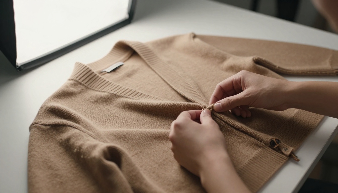
What tends to work:
- A clean main shot on a neutral background so the product is clear.
- A scale reference, such as a hand, a desk or a shelf, so people judge size correctly.
- A lifestyle shot showing the product in the situation where it is used.
- A detail shot of texture, stitching or finish for quality-sensitive items.
- Consistent lighting across the whole catalog, so pages feel like one brand.
⚠️ Warning: Heavily retouched images can raise returns. If the real item looks different from the page, the sale you won today becomes a refund next week.
For apparel and decor, a purpose-built layout helps. The Fashion Catalog and Furniture Catalog tools are designed around image-heavy pages like these.
Price Presentation Patterns
How you display the price can matter as much as the price itself. Studies on pricing display point to a few repeatable effects.
| Technique | What it does | Practical example |
|---|
| Price anchoring | Makes the middle option feel fair | Show premium, standard and basic side by side |
| Charm pricing | Prices ending in 9 or 99 feel lower | 19.99 instead of 20 |
| Tiered quantities | Raises units per order | 1 for 12, 3 for 30, 6 for 54 |
| Crossed-out price | Signals a deal, when truthful | Was 40, now 32 |
| Bundled price | Hides the cost of single parts | Starter kit with three items |
A sample layout for a candle brand might show a single candle, a trio and a gift box of six. The trio is the target product, the single candle is the entry point and the six-pack is the anchor. Most buyers pick the trio.
✅ Best practice: Keep price styling the same on every page. Changing fonts or placement from spread to spread makes comparison harder and slows decisions.
Be Honest About Discounts
Fake "was" prices damage trust and, in many regions, break consumer rules. Use real previous prices, and let the product and the page design carry the persuasion.
How Digital Catalogs Change the Picture
Print catalogs give you one chance per mailing. A digital catalog changes the economics in a few ways:
- You see what readers actually view. Page-level analytics show which spreads get attention and which get skipped.
- You can update prices and stock without reprinting.
- You can add links, video and audio directly on the page.
- Mobile readers are the default. Many people open catalogs on a phone during the day, and a responsive flipbook adapts to that.

| Feature | Print catalog | PDF attachment | Interactive flipbook |
|---|
| Update after publishing | No | Resend file | Yes |
| Page-level data | No | Limited | Yes, with the Professional plan |
| Clickable products | No | Basic links | Yes |
| Mobile friendly | Not applicable | Awkward zooming | Yes |
| Cost to distribute | High | Low | Low |
| Password protection | No | Sometimes | Yes |
If you already have a PDF, the PDF to Flipbook Converter is the fastest route to a shareable version.
Mobile Behavior Deserves Its Own Plan
Phone readers swipe quickly and zoom on images. That favors pages with fewer products, larger photos and short product names. A dense twelve-item grid that works in print can feel cramped on a small screen.

Seasonality and Timing
Research on seasonal retail is consistent about one thing: preparation starts earlier than most small businesses expect. Gift sets, decor and cozy goods get browsed weeks before they get bought.
- Publish early. Release your seasonal catalog before the buying peak so people can save it and return.
- Refresh mid-season. Swap in best sellers from the first weeks and remove what stalled.
- Keep evergreen pages stable. Staples should not move around, because returning customers rely on finding them.

A boutique owner, for instance, might publish a holiday flipbook in early autumn, check page-level views after two weeks, then move the most viewed gift sets to the first spread and retire the pages nobody opened.
How to Test This in Your Own Catalog
Research tells you where to look. Your readers tell you what is true. Here is a simple testing routine.
Step by Step: Build and Measure a Catalog
- Export your product data. List best sellers by units and by margin.
- Choose a hero product per category. Pick one you can photograph well and price clearly.
- Design the layout. Use the Product Catalog tool or the Digital Catalog Maker as a starting point.
- Upload your PDF. Create an account at Flipbooks AI, upload the file and let it convert to a page-flip experience.
- Customize the look. Add your logo, brand colors and page effects, and place videos or audio where they help explain a product.
- Choose how to share. Use a direct link, an embed on your website, or password protection for wholesale price lists. The Embed Flipbook on Website page shows how.
- Review analytics. With the Professional plan you can see which pages get views and collect leads. Compare pricing plans to see what fits.
- Adjust and republish. Move top performers forward, rewrite weak pages and update prices.
💡 Pro tip: Change one thing at a time. If you move a product and change its photo in the same edit, you will not know which change made the difference.
A Simple Testing Schedule
| Week | Action | What to check |
|---|
| 1 | Publish the first version | Baseline views per page |
| 2 | Move one hero product to the first spread | Change in views and clicks |
| 3 | Test a bundle against single items | Orders per visitor |
| 4 | Swap a lifestyle photo for a clean shot | Time on page and clicks |
| 5 | Review and keep what worked | Overall order value |

Common Mistakes That Hurt Sales
Even strong products struggle when the catalog works against them. These are the mistakes that show up most often.
- Too many products per page. Crowded spreads make every item feel less important.
- No clear hero. If everything is the same size, nothing stands out.
- Inconsistent photography. Mixed lighting and backgrounds look unprofessional.
- Hidden ordering steps. Buyers who cannot see how to order simply leave.
- Outdated prices or stock. Nothing kills trust faster.
- Ignoring mobile. Tiny text and dense grids lose phone readers.
Real-World Examples
- A home goods seller grouped mugs, a kettle and a tray into one "morning set" and moved it to page two. Orders of the set rose while single mug sales stayed flat, which raised average order value.
- A clothing label replaced a twelve-item grid with a hero sweater and four colorways. Readers spent longer on the page and clicked more variants.
- A wholesale supplier put the price list behind a password and added a one-page ordering guide at the back, which cut repeated questions from buyers.
Results will differ by business, but the pattern is the same: fewer choices, clearer visuals, obvious next steps.

Fulfillment Matters Too
A catalog sale is only finished when the parcel arrives. Products that are easy to pack, hard to break and simple to return tend to earn better reviews and repeat orders, which feeds back into what sells best next season. If your catalog highlights fragile or oversized items, state shipping times and costs plainly on the page.

Ready to Find Your Best Sellers?
The best-selling products in a catalog are rarely a mystery once you can see how readers behave. Start with the patterns above: everyday products, a visible price anchor, strong photos, sensible bundles and a hero on every spread. Then let your own data confirm or correct them.
Ready to build yours? Get started for free on Flipbooks AI, browse all flipbook tools and templates, or compare pricing plans to choose the one that gives you analytics and lead capture.



