There is a reason why a product photo inside a Chanel boutique looks worth three times what it would in a discount store, even if it's the same item. The answer is not the lighting, the model, or even the product itself. It's the grid. The invisible structure that decides where each item sits, how much space it claims, and what sits beside it. Once you see it, you cannot stop noticing it. And once you apply it, your products will never look cheap again.
Grid layouts are the silent language of perceived value. Flipbooks AI has helped thousands of brands translate print catalogs and product sheets into digital experiences that carry this same premium feel. But before you publish a single page, you need to understand the design principles that make a grid work, and why they work at a psychological level.
The Psychology Behind the Grid
Order Signals Value
The human brain interprets order as effort. When products appear arranged in a deliberate pattern with consistent margins and aligned edges, the viewer's subconscious registers that someone paid attention. That attention translates directly into perceived product value.
Research published in the Journal of Consumer Research found that shoppers consistently rate products higher in quality when they are displayed in symmetric, organized arrangements versus cluttered ones. This is not about aesthetics for aesthetics' sake. It's about what order communicates without words.
Luxury brands have always known this. Walk into a Hermès store and count the products on any given shelf. You will rarely see more than four or five items. The white space is doing exactly as much work as the product itself.
What Your Eye Does First
When a user lands on a product page or opens a digital catalog, the eye does not wander. It follows what designers call a visual hierarchy: a sequence of attention driven by contrast, size, and position.
A well-constructed grid creates a predictable path. The eye enters at the top left, scans right, drops to the next row, and continues. This F-pattern or Z-pattern of reading is hardwired into how we process pages. A grid supports it. A cluttered layout fights it.
When the eye is forced to work too hard, it reads "cheap." When the path is clear and rhythmic, it reads "quality."

White Space Is Not Wasted Space
This is the single biggest mistake brands make when building product pages and catalogs. They fill every pixel. They assume that more products on the page equals more value for the viewer. The opposite is true.
The Luxury Brand Formula
Pick up any catalog from a top-tier fashion house and measure the whitespace. You will find that empty space often accounts for 40 to 60 percent of each page. That's not an accident. It's a formula.
White space, also called negative space, performs three functions:
- It gives each product room to breathe and be seen individually
- It communicates that the brand is confident enough not to crowd its own work
- It reduces cognitive load, making the browsing experience feel effortless rather than overwhelming
💡 Pro tip: When building a digital catalog, aim for a padding margin of at least 15-20% of your page width on each side. Products should never feel like they're touching the edges.
Spacing Affects Price Perception
Research from the University of Michigan showed that consumers perceive products in high-whitespace environments as significantly more expensive than the same products in dense, crowded layouts, even when the actual price is identical.
This is a measurable, repeatable effect. You're not just making your catalog look nicer. You're actively shifting what customers are willing to pay.

| Layout Style | Whitespace % | Perceived Price Range | Customer Trust |
|---|
| Budget/Discount | Under 15% | Low | 3.1/5 |
| Mid-Market | 15-30% | Medium | 3.7/5 |
| Premium | 30-50% | High | 4.3/5 |
| Luxury | 50%+ | Very High | 4.8/5 |
Grid Types That Actually Sell
Not all grids are created equal. The type of grid you choose signals the category of your product before the customer even reads a word.
Symmetric vs. Asymmetric Grids
A symmetric grid places equal-sized items in equal-sized cells. Think a 3-column product grid where every cell is identical. This reads as organized, reliable, and clean. It works best for:
- Apparel and accessories
- Home goods and furniture
- Skincare and beauty
An asymmetric grid deliberately breaks the equal-cell pattern to create visual interest. One product might take up twice the space of another. This creates hierarchy within the page and works well for editorial-style catalogs or fashion lookbooks. The asymmetry signals curation, which itself implies higher taste and value.
⚠️ Warning: Asymmetric grids require significantly more design skill to execute well. Asymmetry done poorly looks like a mistake, not a decision. If in doubt, start symmetric.
Column Count and Product Value
The number of columns in your grid directly affects how premium your products appear.
| Columns | Best Use Case | Perceived Feel |
|---|
| 1 | Hero products, editorial feature items | Ultra-premium, magazine |
| 2 | Jewelry, fragrance, watches, luxury fashion | High-end, exclusive |
| 3 | Mid-market apparel, accessories, beauty | Balanced, professional |
| 4 | Everyday fashion, home goods, accessories | Accessible, contemporary |
| 5+ | Flash sales, budget retail, marketplaces | Volume-focused, discount |
A single-column layout forces the viewer to slow down and consider each product individually. A five-column layout accelerates the eye and creates an impression of mass quantity. Choose based on where your brand actually sits.
The Rule of Consistent Image Framing
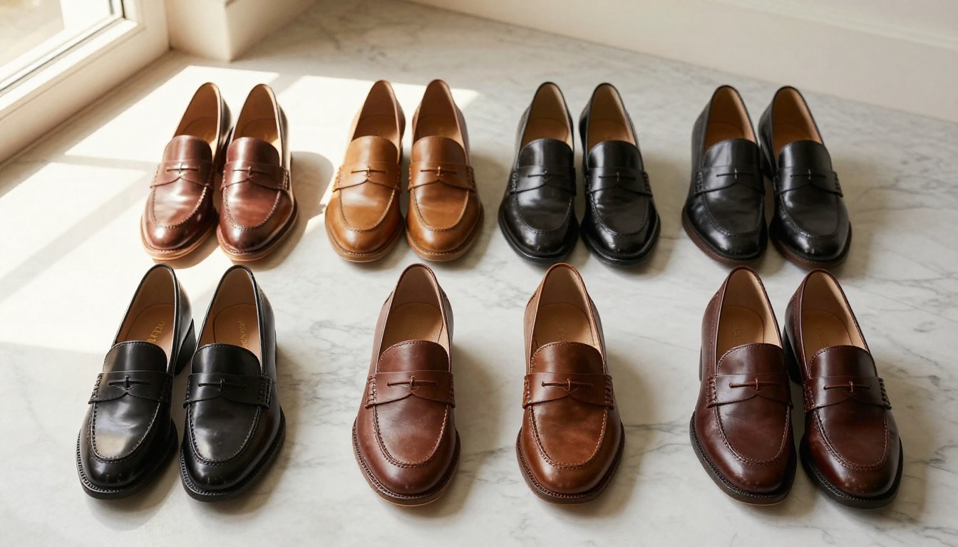
Every image in your grid must be photographed or cropped to the same aspect ratio and from the same relative distance to the product. Inconsistent framing is one of the fastest ways to destroy the premium feel of a grid.
When one shoe photo is close-cropped and the next shows the same shoe from two feet away, the grid breaks visually. The viewer's eye has to recalibrate. That friction reads as unprofessional.
✅ Best practice: Before building any catalog page, establish a shot list that specifies aspect ratio (16:9 or square), distance from subject, and background color. Apply this across every product without exception.


4 Mistakes That Make Products Look Cheap
Overcrowding the Frame
When a brand puts 24 products on a single page, it communicates desperation, not abundance. The page feels like a clearance sale. Even if your prices are premium, the layout sends the wrong message.
The fix is simple: show fewer products per page, give each one more space, and use page breaks deliberately. Eight products shown well will always outperform twenty shown poorly.
Inconsistent Image Sizes
Mixing landscape photos with portrait photos in the same grid creates immediate chaos. One product appears twice as large as the next, even if they're the same physical size. Customers lose trust in what they're looking at.
The solution is a strict image template. Every product photo submitted to your catalog must match the same pixel dimensions before it ever enters the grid.
Ignoring Baseline Alignment
Every row in a grid should have a consistent baseline. Product names, prices, and secondary details should all start at the same vertical position across columns. When these elements bounce up and down across the page, the eye works overtime and the result reads as amateur.
Wrong Background Color
White backgrounds work for 90% of product categories because they create clean contrast that lets the product take center stage. Dark backgrounds can work for watches, jewelry, and tech products. But never mix background colors within the same grid. Consistency signals intentionality.


| Element | Cheap Look | Premium Look |
|---|
| Products per page | 20+ | 4-8 |
| Whitespace | Under 15% | 30-50% |
| Image consistency | Mixed ratios, varying distances | Uniform aspect ratio throughout |
| Background | Gradient or mixed colors | Clean white or consistent neutral |
| Alignment | Approximate | Pixel-perfect |
| Typography | Multiple fonts, mixed sizes | One font family, clear hierarchy |
How to Build a Premium Grid Catalog with Flipbooks AI
Flipbooks AI gives you the infrastructure to take these grid principles and publish them as a polished, interactive digital catalog that works on any device. Here's exactly how to do it.
1. Start with a Well-Structured PDF
Before you upload anything, your PDF must already respect grid principles. Use a design tool like Adobe InDesign or Canva to create your layout. Set a consistent column structure (2 or 3 columns is recommended for premium products), apply uniform margins, and use consistent image sizing throughout every page.
Create an account on Flipbooks AI before you start, so your upload is ready to go the moment your PDF is final.
2. Upload and Convert
Once your PDF is ready, upload it directly through the Flipbooks AI dashboard. The conversion process preserves your grid structure, typography, and spacing exactly as designed. No reformatting, no layout collapse.
For product catalogs specifically, the Product Catalog Generator or the Digital Catalog Maker give you purpose-built tools tailored to ecommerce and retail presentations.
3. Apply Custom Branding
After conversion, apply your brand colors, logo placement, and custom domain if needed. Flipbooks AI allows full custom branding with no watermarks on Standard plans and above, which means the finished catalog reflects your brand, not the platform.
💡 Pro tip: Set your brand's primary color as the flipbook opening page accent and navigation color. This reinforces brand identity before the customer even opens the first page.
4. Add Interactive Elements
This is where digital catalogs outperform print. Flipbooks AI lets you embed:
- Clickable product links that take customers directly to your store
- Video clips showing products in use
- Audio narration for catalog walkthroughs
- Pop-up product detail panels
All of these work within your grid layout without disrupting it. The interactivity layers over the design rather than replacing it.
5. Share and Protect
Your finished catalog can be:
- Embedded directly into your website with a simple code snippet via Embed Flipbook on Website
- Shared as a direct link for email campaigns
- Password-protected for wholesale clients or VIP customers
- Tracked with analytics covering page views, click-through rates, and time spent per page on the Professional plan
The analytics data tells you which products in your grid are getting the most attention. That information lets you redesign your layouts around what actually converts, not what you assumed would work.

Grid Layouts Across Industries
Grid principles apply everywhere, but the execution varies by category. Here's how different industries put them to work:
Fashion and apparel: A 2-column grid with overhead flat-lay photography on white linen creates the aesthetic of a high-end lookbook. Brands using the Interactive Lookbook Designer see customers spending significantly more time per page when whitespace is generous and image framing is consistent.
Jewelry and watches: The single-item or 2-item horizontal grid on dark velvet or marble communicates exclusivity. Each piece needs visual isolation to be appreciated on its own terms.
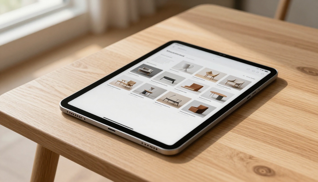
Furniture and home goods: A 2-column or 3-column grid with lifestyle photography works better than product-only shots. Context adds perceived value. Brands using the Furniture Catalog Maker benefit from showing pieces in styled room settings rather than white-background isolation.
Beauty and skincare: Overhead flat-lay grids on neutral linen or marble surfaces have become the category standard for premium brands. Consistency across a skincare range is especially important since customers assess the whole line, not just individual products.
Food and specialty products: A 3-column or 4-column grid works well here, but image quality is paramount. Natural light and minimal post-processing make food photography feel authentic rather than over-produced.
Your Products Deserve Better
The difference between a product that looks like it costs $40 and one that looks like it costs $400 is rarely the product itself. It's the frame you put around it. Grid layout, whitespace, image consistency, and column structure are that frame. These are not luxury concerns reserved for big brands with design departments. They are decisions available to anyone willing to be intentional about presentation.
Whether you sell handmade jewelry, artisan food, premium apparel, or professional services, the principles here apply. And the tools to put them into action are more accessible than ever.
Ready to put these principles to work? Get started for free and build your first grid-based digital catalog on Flipbooks AI. Browse all available catalog tools and templates to find the format that fits your product category. Or compare pricing plans to see which features match where your brand is going.
Your products are good enough. Now make sure your presentation is too.