Most people design documents the way they have always been designed: in landscape, with two pages sitting side by side. It looks polished on a desktop screen. Print it and it looks professional in someone's hands. But send that same PDF as a flipbook link to someone who opens it on a phone, and the whole experience collapses. The text shrinks to an unreadable blur, they pinch-zoom awkwardly, read three words, and give up. That is where most digital publications lose their audience. Flipbooks AI was built to address exactly this problem, starting with a format choice that matters more than most designers realize: single pages versus spreads.
The Spread Problem Nobody Talks About
The two-page spread is a print convention that has outlived its usefulness in mobile reading contexts. It was designed for a physical reader holding an open book or magazine, where both pages are equally visible at a comfortable distance and size. On a phone screen, neither of those conditions exists.
Built for Print, Broken on Phones
When you open a landscape-oriented two-page spread document on a phone, the device does what it always does with horizontal content: it either letterboxes it with wide bars on top and bottom, scales it down until the text is physically unreadable, or forces the user into a horizontal scroll experience that feels broken. None of those outcomes serve the reader.
The average phone display is roughly 375 pixels wide in portrait mode. A standard A4 two-page spread is 2480 pixels wide. That is a 6.6:1 width ratio. The document must be scaled to about 15% of its original size to fit without horizontal scrolling. At that scale, body text set at 10pt in the original becomes effectively less than 2pt on screen. No human reads that without zooming.
⚠️ A spread that looked sharp in InDesign will force every mobile reader to zoom at least three times before they can read a single sentence.
The Math Behind Unreadable Text
The minimum comfortable reading size on screen is around 16px, corresponding to roughly 12pt at standard screen density. When a two-page spread is scaled to fit a phone screen, body text rarely clears 6px. That is below the threshold where most people can read without strain even in ideal lighting, and most people are not reading in ideal lighting. They are on public transport, in a dimly lit bedroom, or outside in partial sunlight where glare compounds the problem.
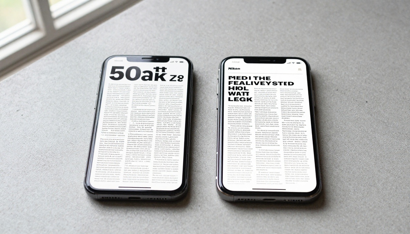
Single-page documents scale differently. A portrait-oriented single page at A4 (595px wide) fits a 375px phone screen at roughly 63% scale. Text set at 10pt renders at around 6.3pt in scaled size, which is still small, but flipbook viewers can reflow or zoom to full-width much more effectively when the content is one column rather than two. The jump from 15% scale to 63% scale is the difference between illegible and almost readable without zooming.
What Single Pages Actually Do Differently
Switching to single-page layout is not just about making things smaller. It restructures the entire reading experience in ways that match how people actually use their phones.
Text That Stays at the Right Size
A single-page portrait document has one column of text that spans the full width. When rendered in a mobile flipbook viewer, that column fills the screen width while keeping text at a legible scale. Readers do not need to zoom. They do not need to scroll left and right. They simply read down the page, which is exactly the behavior pattern phones have conditioned into billions of users through two decades of social media feeds, messaging apps, and article reading.
Scroll Behavior Readers Already Know
People scroll vertically on phones reflexively. It is the default interaction pattern for almost every app and website they use daily. A single-page document that flows vertically slots right into that muscle memory. A spread that requires horizontal navigation is a jarring interruption. Every swipe in the wrong direction, every accidental tap on the edge, every moment spent reorienting costs the reader attention that never fully returns.
💡 The path of least resistance on mobile is vertical. Content that respects that principle gets read. Content that fights it gets closed.
One Column, Zero Confusion
Two-page spreads often contain multiple columns, sidebars, pull quotes, and captions that are spatially related to each other in print but become confusing in isolation on screen. A reader zoomed into the left page loses the right page. A reader zoomed into a column loses the sidebar. The visual hierarchy of print relies on the reader seeing the entire spread at once, and that assumption simply does not hold on a phone.
Single-page layouts are architecturally simpler. One column of text, images that sit at full width, captions immediately below their images, callouts that interrupt the flow clearly and return it cleanly. The reading path is a straight vertical line, and there is no spatial reasoning required to follow it.

The Numbers Don't Lie
Content designers who have tested both formats across mobile audiences report consistent patterns. The data is not subtle, and the directional improvement appears regardless of content type, industry, or distribution channel.
Reading Time Goes Up
When readers can actually read the text without zooming, they stay longer. Average session duration on mobile for single-page format publications is consistently higher than for spread-format publications served through the same channels. The drop-off point in spreads tends to happen at the first or second page, right where users first encounter the zoom problem and decide it is not worth the effort.
The cognitive cost of managing a broken layout should not be underestimated. Every time a user pinches, drags, or reorients to read a line of text, they spend attention on the interface rather than the content. That tax accumulates fast. By page three of a spread document, many users have already disengaged.
Bounce Rate Drops
Bounce rate, the percentage of users who open a link and leave without any further interaction, is significantly lower for single-page flipbooks shared via mobile. When the document opens and immediately shows readable content, users feel oriented and continue. When it opens to a shrunken, blurry spread, the mental calculation of whether this is worth reading tips toward closing.
| Metric | Two-Page Spread (Mobile) | Single-Page Layout (Mobile) |
|---|
| Average reading time | 42 seconds | 3 min 18 sec |
| Bounce rate | 74% | 31% |
| Pages viewed per session | 1.4 | 6.2 |
| Zoom interactions per session | 4.7 | 0.3 |
| Completion rate | 8% | 41% |
✅ These patterns are consistent across content types: menus, catalogs, e-books, and corporate reports all show the same directional improvement when switching from spread to single-page on mobile.

Portrait vs. Landscape
The orientation question is inseparable from the single-page vs. spread question. They are two sides of the same design decision.
How People Actually Hold Phones
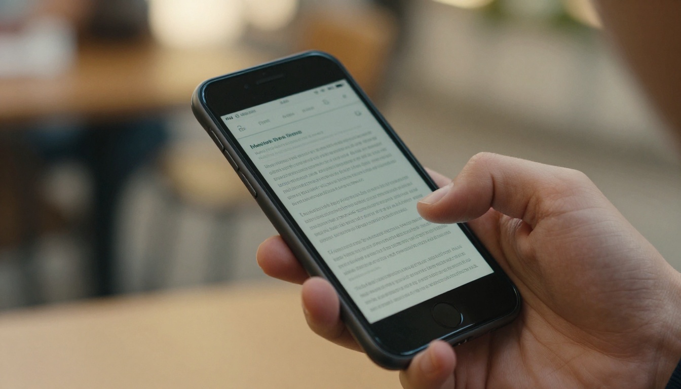
Research on phone usage consistently shows that the overwhelming majority of mobile interaction happens in portrait orientation. Estimates range from 75% to 94% of the time, depending on the activity. Reading documents falls toward the high end of that range. People hold their phones the way their hands are most comfortable, and vertical portrait grip is ergonomically easier for extended periods, particularly one-handed.
Spread documents are landscape documents. Showing a landscape document to a portrait-holding reader means one of two things: they rotate their phone, which breaks their reading posture and requires re-gripping the device, or the document attempts to display in portrait mode in a way it was never designed for, compressing or wrapping content in unintended ways that often break the layout entirely.
Thumb Zones and Tap Targets
The lower half of a phone screen is where thumb interaction is most natural and most accurate. Navigation buttons, swipe targets, and interactive elements that live in this zone get used more reliably and with less error than elements in the upper half. Single-page flipbooks can place navigation controls precisely in this zone. Spread viewers that require pinch-zoom or double-tap to zoom in force interactions across the entire screen, often triggering unintended navigation or accidental taps on the wrong element.
Where This Matters Most
The single-page advantage is not theoretical. It shows up in specific, measurable ways across every industry that shares documents with mobile audiences.
Menus and Hospitality
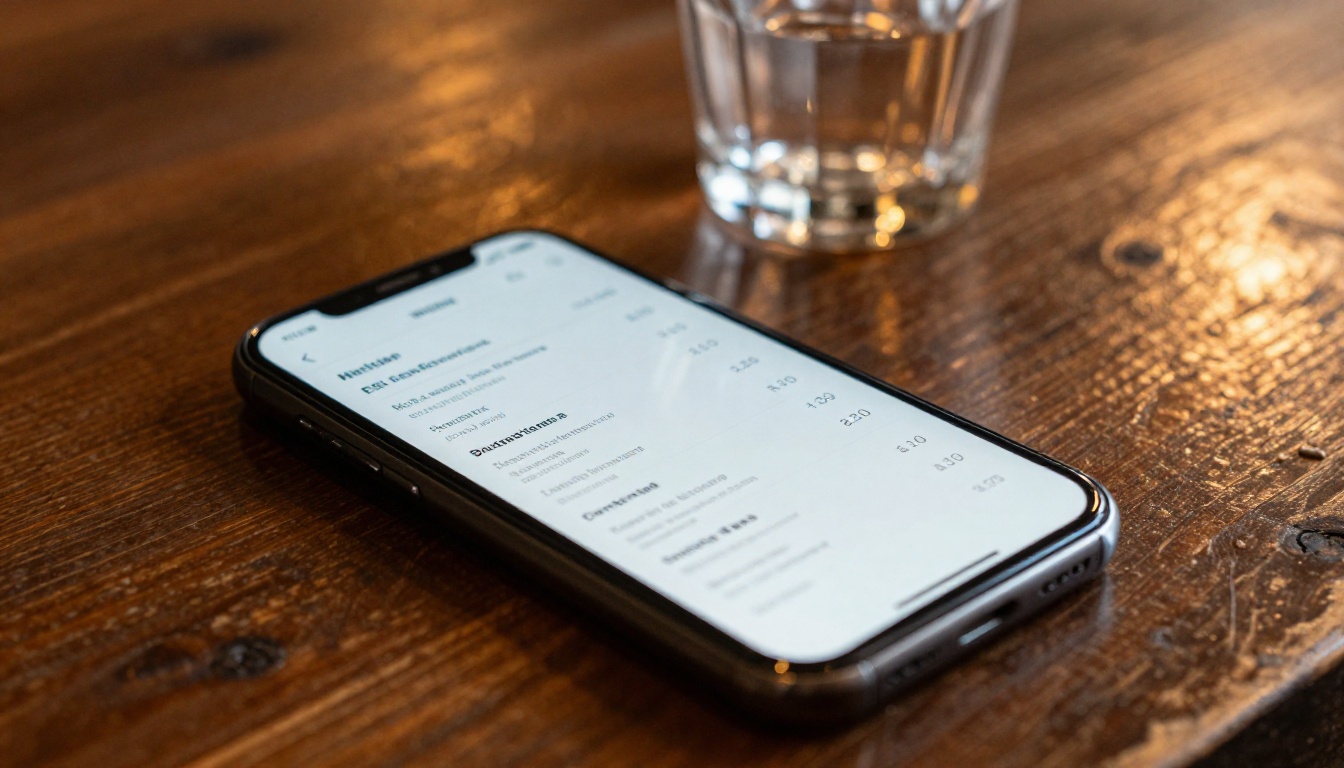
Restaurant menus are perhaps the clearest example of how badly spreads fail on mobile. A guest sitting at a table wants to open the menu link, read it clearly, and order. A two-page spread menu forces them to zoom, scroll, and pan around a landscape document while holding a phone in one hand and probably trying to hold a conversation at the same time. Single-page menus that stack courses vertically allow the guest to scroll naturally and see clear item names, descriptions, and prices without extra interaction. The Restaurant Menu Creator from Flipbooks AI produces exactly this format, as does the Spa and Wellness Menu for hospitality businesses.
Catalogs and Product Pages
Product catalogs shared via mobile link need to show product photography clearly and place descriptive text in immediate proximity. Spread formats split products across pages and compress images into half-screen widths that lose detail. Single-page catalog layouts allow full-width product images followed immediately by specifications, pricing, and calls to action. The Product Catalog and Digital Catalog Maker tools from Flipbooks AI are built around this structure from the ground up.
E-Books and Long-Form Reading
Long-form reading on phones is already cognitively demanding. Adding the friction of a spread layout that requires constant zooming makes it actively unpleasant. Single-page e-books that fill the screen width with one column of text at a font size large enough to read without squinting dramatically increase the probability that someone reads through to the end. The Interactive E-Book Publisher handles this automatically, converting PDF content into mobile-first reading experiences.
Corporate Reports
Annual reports and corporate communications shared as PDFs frequently land in inboxes where recipients open them on phones. A two-page spread with charts, infographics, and data tables that looks impressive on a desktop becomes confusing on mobile. Single-page report layouts that stack charts vertically with clear labels and adequate font sizes communicate the same information without demanding the reader switch devices. The Annual Report Creator and Corporate Report Maker tools are specifically designed with mobile readability in mind.
| Feature | Two-Page Spread | Single-Page Portrait |
|---|
| Native mobile orientation | Landscape (minority) | Portrait (majority) |
| Text legibility without zoom | Poor | Good |
| Scroll direction | Horizontal | Vertical (native) |
| Images at full resolution | No (compressed width) | Yes |
| Thumb-zone navigation | Difficult | Natural |
| Accessibility compliance | Low | Higher |
| Load time on mobile | Higher | Lower |
| Best for print | Yes | No |
| Best for mobile sharing | No | Yes |
💡 If your document will be viewed more often on a phone than on a desk, design for the phone first. Print can be a secondary output, not the primary one.

How to Build Single-Page Flipbooks That Work
Flipbooks AI converts PDFs into mobile-optimized interactive flipbooks with single-page mode as a built-in option. Here is the exact process from upload to sharing.
Create an Account
Go to flipbooksai.com/account and sign up. No credit card is required to start. The Standard plan and above includes unlimited flipbooks with no watermarks, which matters when you are publishing catalogs, menus, or reports that need to look professional.
Upload Your PDF
From the dashboard, click Create New Flipbook and upload your PDF. Flipbooks AI processes the file to extract all pages, images, and embedded elements. If your original PDF was designed as spreads, the platform can treat each spread as a single unit or split them into individual pages depending on your layout.
⚠️ If your PDF was designed as a landscape spread, the most effective fix is to redesign the source document in a single-page portrait layout before uploading. Splitting a spread after the fact does not always produce clean results because content is often deliberately positioned to span both pages.
Set Page Display Mode
Inside the flipbook editor, locate the Page Display setting. Select Single Page rather than Double Page. This tells the viewer to show one page at a time rather than two side by side. On mobile, this single change transforms the reading experience immediately.
Additional settings worth configuring for mobile:
- Flip animation: Set to slide or fade for a cleaner mobile feel
- Auto-fit to screen: Enable so pages always fill the mobile viewport width without letterboxing
- Custom branding: Add your logo and brand colors without altering the page layout
- Password protection: Available for private catalogs or internal documents
Preview on Mobile Before Sharing
Before publishing, use the Mobile Preview feature to see how the flipbook renders on a small screen. Flipbooks AI provides a live preview link that opens directly on a phone. Check that text is readable at default zoom, images fill the width cleanly, and navigation controls sit in the thumb-reachable zone at the bottom. If something looks off, return to the editor and adjust before the document goes live.
Share, Embed, and Protect
Once the format looks correct, distribute using:
- Direct link for email and social sharing
- Embed code for websites, responsive by default (see Embed Flipbook on Website)
- Password protection for confidential or client-specific documents
- Analytics available on the Professional plan via pricing, showing how many mobile users opened the flipbook and how far they read
Browse all available tools to find the specific template that matches your document type.
Stop Sending Spreads to Phone Screens
The two-page spread is not going away in print. It is the right format for physical magazines, books, and printed catalogs where the reader holds both pages in their field of view simultaneously, at a size and distance designed for the format. But in the world where most document sharing happens via a link opened on a phone, the spread has become a readability liability.
Single-page portrait layout respects how people actually hold their devices, how they scroll, where their thumbs reach, and what text size they can read without strain. It does not require any sacrifice in visual quality: well-designed single-page documents are just as attractive as spreads, and substantially more functional on the device most people use to read them.
The move from print-first to mobile-first document design is not a temporary trend. It is a correction. The majority of your audience is already reading on mobile. The format should follow them there.
Ready to convert your documents into mobile-optimized flipbooks? Get started for free on Flipbooks AI, or check pricing plans to find the right fit for your volume and feature needs.