Picking up your phone to read an article and immediately reaching for the pinch-to-zoom is not a content problem. It is a typography problem. When text is too small to read comfortably on a mobile screen, readers do not try harder. They leave. This is why small text kills mobile reading in a way that is measurable, preventable, and still surprisingly common on otherwise well-designed websites and digital publications.
If your readers are on mobile devices, and most of them are, the size of your body text is not a cosmetic detail. It is the difference between a reader who stays and one who bounces in under ten seconds. Flipbooks AI exists partly because this problem is so pervasive in digital publishing that even well-produced PDFs and documents fail readers the moment they open them on a phone.
The Scale Problem Nobody Talks About
How Screens Shrink Your Content
Most websites and documents are originally designed for desktop screens at 1440px or wider. When that same layout renders on a 375px-wide phone screen, everything becomes proportionally smaller unless the design explicitly accounts for it. A paragraph that reads comfortably at 16px on a 27-inch monitor can render at the visual equivalent of 10px or 11px on a 5-inch phone, particularly on sites that use fixed pixel values instead of fluid, responsive units.
The math is simple but brutal. A viewport that is less than one-quarter the width of a desktop screen, displaying text at the same point size, produces characters that are physically smaller on screen. Add to that the typical viewing distance of a phone held 25 to 35 centimeters from the eye (shorter than a laptop, but requiring more accommodation effort from the eye muscles), and you have a recipe for real, documented reading strain.
⚠️ Many CMS templates and email builders default to 13px or 14px body text. This was inherited from desktop-era design conventions and has never been corrected for the mobile era.
Many digital publishers discover this problem only after they notice high mobile bounce rates in their analytics. By then, hundreds or thousands of readers have already given up on content that simply was not readable on the device they happened to be using.

The Pinch-to-Zoom Trap
When text is too small to read, users do not immediately close the page. First, they try to zoom. They double-tap, they pinch, they hold the phone at varying distances. Every pinch-to-zoom interaction is evidence that typography failed the reader. It is an accessibility workaround performed out of necessity, not a feature that adds value to the reading experience.
Once a reader is zoomed in, horizontal scrolling becomes unavoidable to read across a line of text. Horizontal scrolling on a phone is one of the most friction-heavy interactions in mobile UX. Most readers tolerate it for two or three lines before abandoning the page. The publisher has traded the reader's attention for a broken experience that could have been avoided with slightly larger body text.
What the Data Actually Shows
The 16px Rule
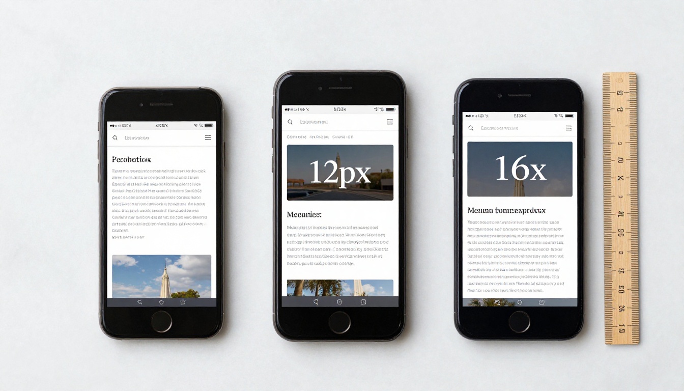
The 16px body text minimum for mobile is not an arbitrary preference. It maps to approximately 11 to 12 points at standard screen resolution, which is the threshold for comfortable reading without accommodation strain for adults with typical vision. Below 16px, legibility drops measurably. Reading comprehension errors increase. Reading speed decreases noticeably even in short sessions.
The World Wide Web Consortium's WCAG accessibility guidelines categorize text under 18px (or 14px bold) as "normal text" requiring a stricter minimum contrast ratio of 4.5:1. The size threshold is not arbitrary: it reflects real research into visual acuity and reading efficiency thresholds that apply to screen-based text.
| Font Size | Mobile Experience | Typical Outcome |
|---|
| 10px to 12px | Extremely difficult to read | Immediate zoom attempt or page exit |
| 13px to 14px | Uncomfortable for most readers | High bounce rate, short dwell time |
| 15px | Marginal, tolerable for very short text | Acceptable only for captions and labels |
| 16px | Comfortable reading minimum | Good reading retention and scroll depth |
| 17px to 18px | Optimal range for body text | Best reading speed and comprehension |
| 20px and above | Best reserved for subheadings | Excess for continuous body copy |
💡 18px is not too large for body text. Many leading reading apps default to 17px to 20px specifically because that range is the measurable sweet spot for reading speed and retention on mobile screens.
Line Height Is Half the Battle
Body text size is only one dimension of mobile legibility. Line height, the vertical space between lines of text, is equally important and far more frequently ignored by designers and developers working to compress content into tight layouts. A common mistake is setting line height at 1.2 or 1.3 on body text. On mobile, where lines are already short due to narrow viewport widths, tight line spacing creates a dense visual wall that is genuinely difficult to track line by line.
The practical minimum for body text line height on mobile is 1.5. Many typographers and UX researchers recommend 1.6 for screen-based reading. This means 16px text should have a line height of at least 24px. The difference between 1.2 and 1.6 line height at 16px looks subtle in a design tool but is night-and-day for a reader working through several paragraphs on a phone.
| Property | Too Tight | Minimum | Optimal |
|---|
| Body font size | Under 14px | 16px | 17px to 18px |
| Line height | Under 1.3 | 1.5 | 1.6 to 1.7 |
| Paragraph spacing | Under 0.5em | 1em | 1.2em to 1.5em |
| Max line length | Over 80 characters | 65 to 75 characters | 55 to 65 characters |
| Letter spacing | Negative values | 0 | 0 to 0.02em |
The Real Costs of Tiny Text
Bounce Rates and Lost Readers
The connection between mobile typography and bounce rate is well-documented in UX research but rarely appears in standard SEO or content strategy advice. When a reader arrives on a page and encounters text that requires active effort to read, their subconscious processes this as a signal about page quality. They do not consciously think "this text is 12px with a 1.2 line height." They feel the friction, judge the content as not worth the effort, and leave.
Google's mobile-first indexing and Core Web Vitals measurements capture some of this behavior indirectly. Dwell time, scroll depth, and return visit rate are all signals affected by typography quality. Pages with poor mobile typography consistently underperform on these metrics compared to pages with identical content but better typographic treatment. The content itself never gets a fair evaluation.
⚠️ A page that loses 40% of its mobile readers in under 15 seconds due to typography friction could rank lower than a less thorough page that kept readers engaged longer through better readability.
Practical implications for publishers: if your mobile analytics show a significantly higher bounce rate than desktop, and your content quality is consistent, the first thing to check is your mobile font size and line height. The fix is often a single CSS change that takes minutes to implement and delivers immediate, measurable results.

What It Does to Brand Perception
There is a subtler cost that does not show up directly in bounce rate data. Readers associate reading difficulty with content quality. A page that is physically hard to read feels less credible, less polished, and less worth their time. This is a documented phenomenon in cognitive psychology called processing fluency: when something is harder to process mentally, people rate the underlying content lower in quality, even when the content itself is identical.
When your digital catalog, brochure, menu, or publication is difficult to read on mobile, readers do not blame their phone or their eyesight. They form a negative impression of your brand. In competitive markets where attention is scarce and alternatives are one back-button tap away, that first impression is extremely difficult to recover from.
Font Size by Device and Context
Body Text Minimums That Work
Different text elements on a page carry different size requirements. Navigation labels can be slightly smaller than body text because readers are scanning rather than reading continuously. Footnotes and captions can be smaller because they are supplementary information. But body text, the content your readers actually came for, should never go below 16px on mobile.
| Element | Minimum Size | Recommended Size |
|---|
| Body text | 16px | 17px to 18px |
| Subheadings (H3) | 18px | 20px to 22px |
| Section headings (H2) | 22px | 24px to 28px |
| Page title (H1) | 28px | 32px to 40px |
| Captions and image labels | 12px | 13px to 14px |
| Navigation links | 14px | 15px to 16px |
| Button text | 14px | 15px to 16px |
| Footnotes | 11px | 12px to 13px |
The important principle here is hierarchy through scale. When all text renders at the same small size, readers cannot quickly orient themselves within the content structure. Clear, distinct size differences between heading levels and body text create a scannable visual map that reduces the cognitive effort of reading significantly.
💡 On retina and high-DPI displays (most modern smartphones), the physical pixel density is 2x or 3x the logical CSS pixel value. A 16px CSS font renders at 32 to 48 physical pixels on these screens. This is part of why modern phones can display text crisply at sizes that older devices struggled with.
Headings, Captions, and UI Labels
One area where designers often overcorrect is heading size on mobile. Attempting to preserve the visual drama of large desktop headings (40px to 60px) on a phone results in headings that wrap awkwardly, consume excessive vertical space, and delay the reader from reaching the actual content. Mobile headings should be readable and hierarchically distinct without dominating the viewport.
A practical approach for mobile heading sizing: H1 at 28px to 32px, H2 at 22px to 26px, H3 at 18px to 20px. These sizes are visually substantial without overwhelming the limited screen space. Reinforcing hierarchy through font weight (600 to 700) and generous spacing below each heading removes the need to rely purely on dramatic size differences between levels.
Contrast, Spacing, and the Other Half
Why Low Contrast Doubles the Damage
Small text at low contrast is exponentially harder to read than small text at high contrast. The two problems multiply each other. A 13px body text in medium gray on a white background is dramatically more difficult to read than 13px text in dark charcoal on white, even though neither meets the minimum recommended size. Poor contrast transforms a marginal legibility situation into an unusable one.
WCAG 2.1 Level AA requires a 4.5:1 contrast ratio for text under 18px. Level AAA requires 7:1. For practical mobile design, targeting a minimum of 5:1 for body text and 4.5:1 for secondary text provides a comfortable margin above the accessibility floor and covers readers with mild visual impairments or those reading in bright outdoor conditions where screen visibility is already challenged.
Common contrast mistakes that compound small text problems:
- Gray body text on white: #888888 on white produces only a 3.54:1 ratio, well below minimum
- Light text on brand colors: Decorative brand palettes are often chosen for visual appeal, not readability
- Placeholder text in forms: Faint gray placeholder text is frequently below 3:1 and nearly invisible in sunlight
- Captions in secondary color: Brand-colored caption text often fails contrast checks entirely
✅ Test your text contrast ratios with the WebAIM Contrast Checker before publishing any mobile content. Make this part of your design review workflow, not an afterthought.

Line Length and Paragraph Gaps
The optimal reading line length is 55 to 75 characters per line, including spaces. On mobile at 375px viewport width with 16px text and standard margins, a single-column body text layout naturally falls within this range when horizontal padding is correctly applied. The problem arises when mobile layouts fail to apply adequate horizontal margins, stretching text edge-to-edge across the phone screen.
Text running full-width with no horizontal padding creates lines that feel uncontained, as if the content might fall off the screen edges. A minimum of 16px horizontal padding on each side is the practical baseline for body text containers. Many modern mobile-first designs use 20px to 24px on each side, which produces a noticeably more comfortable reading experience without sacrificing useful reading width.
Paragraph spacing is the most consistently overlooked factor in mobile readability. Without visible spacing between paragraphs, readers must actively track where one thought ends and another begins. This converts what should be passive reading into active mental effort. Setting paragraph spacing at 1em to 1.5em (equal to one full line height gap) creates visible breathing room that measurably reduces reading fatigue in sessions over five minutes.
How Flipbooks AI Solves This
Mobile-Responsive by Default
One of the most practical advantages of publishing through Flipbooks AI is that mobile typography handling is built into the platform. When you convert a PDF to a flipbook, the interactive viewer adapts to the device's screen width while maintaining readable text sizes. Readers on phones do not need to pinch-to-zoom because the flipbook interface is built for mobile from the start.
This matters especially for businesses distributing product catalogs, menus, brochures, and publications to audiences spread across desktop and mobile devices. With Flipbooks AI, uploading a PDF once delivers every reader a version scaled for their screen, whether they are on a laptop, a tablet, or a phone in portrait or landscape orientation.
Features that directly address mobile reading quality on the platform:
- Mobile-responsive viewer: Automatically scales for any screen width
- Accessible zoom controls: Built-in zoom that does not break the reading flow or force horizontal scrolling
- No watermarks: Clean content presentation without visual clutter competing for attention on small screens
- Custom branding: Consistent brand appearance without sacrificing text legibility
- Password protection: Available for private publications across all paid plans
- Offline downloads: Readers can save content to read without a connection, in the same mobile-optimized format

Create Your First Mobile-Ready Flipbook
Publishing your content with properly handled mobile typography through Flipbooks AI takes minutes. Here is how the process works:
-
Sign up or log in at flipbooksai.com/account. Free and Standard plans are available. No credit card is required to start.
-
Upload your PDF: Drag and drop your PDF file onto the upload area. Flipbooks AI accepts standard PDF files exported from InDesign, Word, Canva, Illustrator, and most other document tools.
-
Apply your branding: Add your logo, select brand colors, and choose a cover presentation style. Your flipbook reflects your visual identity without requiring design software on the viewer's device.
-
Add multimedia if needed: Embed videos, audio, and hyperlinks directly into flipbook pages. These remain accessible and correctly scaled on mobile without any additional technical work.
-
Set sharing options: Generate a direct link, create an embed code for your website, or enable password protection for private content. All sharing options work equally well on mobile and desktop browsers.
-
Monitor performance: Professional plan subscribers can access reader behavior data, page views, and lead capture. This data shows exactly where mobile readers are spending time and where they stop reading.
💡 If your source PDF uses small text under 14px, the flipbook viewer's built-in zoom and mobile scaling will still help. The best results, however, come from PDFs designed with mobile-readable text from the start. 16px or larger body text in the source PDF produces the best mobile reading experience.
For specific content types, Flipbooks AI offers purpose-built creation tools: the Digital Catalog Maker for product listings, the Online Brochure Designer for service marketing, the Interactive E-Book Publisher for long-form publications, and the Restaurant Menu Creator for food service businesses. Each tool produces mobile-ready output without manual optimization steps.

Quick Reference: Mobile Typography That Works
The table below summarizes the practical rules covered in this article as a fast checklist for designing or reviewing any mobile content before it goes live.
| Consideration | What to Avoid | What to Do |
|---|
| Body font size | Under 15px | 16px to 18px minimum |
| Line height | Under 1.4 | 1.5 to 1.6 |
| Contrast ratio (body) | Under 4.5:1 | 5:1 or higher |
| Maximum line length | Over 80 characters | 55 to 65 characters |
| Paragraph spacing | None or under 0.5em | 1em to 1.5em |
| Heading hierarchy | All headings at same size | Clear scale between H1, H2, H3 |
| Horizontal padding | Zero to under 12px | 16px to 24px minimum per side |
| Font weight (body) | Under 300 | 400 to 500 for body, 600 to 700 for headings |
Before publishing any mobile content, run through this checklist:
✅ Run your mobile pages through Google's PageSpeed Insights and review the Accessibility section. Text size and contrast ratio issues are flagged automatically and linked to specific elements.
Stop Making Your Readers Work for It
The readers who reach your content have already done the work of finding it. Whether it is a product catalog, a company brochure, a restaurant menu, or a long-form article, the moment they open it on their phone, the typography either earns their attention or loses it within seconds. Small text is the single most common reason mobile readers give up on content they would have happily consumed on a larger screen.
Fixing the problem does not require a full redesign. In most cases, increasing body text from 12px or 14px to 16px or 17px, adding proper line height, and ensuring contrast ratios are above 4.5:1 is a change that takes hours and delivers lasting results in readability, dwell time, and reader satisfaction.
For digital publications distributed to mixed device audiences, Flipbooks AI removes the guesswork by handling mobile responsiveness automatically. Your content reaches every reader at a readable size, on every device, without requiring separate design or development work for mobile.
Compare pricing plans to find the right option for your publishing volume and feature needs. Start with a free account and see how your content reads on mobile before committing to anything.