Zooming into a document or webpage and watching the text turn soft and blurry is a frustrating experience. It feels like something is broken. But nothing is broken. What you're seeing is a predictable consequence of how digital images store visual information, and once you understand it, you can choose tools and formats that eliminate the problem entirely. Platforms like Flipbooks AI are built specifically to handle this, rendering text that stays sharp at any zoom level. But first, let's break down why the blur happens at all.
What Actually Makes Text Go Fuzzy
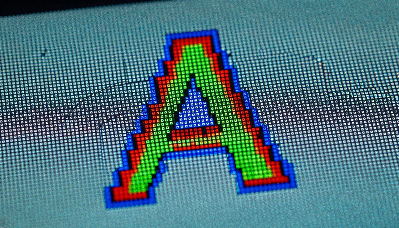
The short answer is pixels. Every digital display is a grid of tiny light-emitting dots, and every image or piece of text on that grid must fit into that structure. When text is stored as a raster image (the same format as a JPEG or PNG photograph), it gets locked into a specific pixel count at a specific size. Zoom in past that size and you're stretching those pixels, making each dot grow larger and the edges of letters bleed into each other.
Raster vs Vector: The Root Problem
There are two fundamental ways to store visual information digitally:
| Format | Storage Method | Zoom Behavior | Common File Types |
|---|
| Raster | Grid of pixels with fixed color values | Blurs and pixelates when scaled up | JPEG, PNG, BMP, GIF |
| Vector | Mathematical curves and coordinates | Stays perfectly sharp at any size | SVG, PDF (text layer), AI, EPS |
Text in a photo, a screenshot, or a scanned document is raster. It's just pixels. The letters have no special status; they're the same as the background around them. When you zoom in, the software has to guess what color each new pixel should be (a process called interpolation), and the result is that characteristic soft, blurry look.
Vector text is entirely different. Instead of storing the letter "A" as a set of pixels, it stores the mathematical description of that shape: the curves, the angles, the proportions. When you zoom in, the computer recalculates the shape at the new size and redraws it with sharp edges. The letter is always perfect because it's never been pixel-locked in the first place.
How Pixels Create the Blurry Effect
When an image is scaled up beyond its native resolution, the rendering engine must fill in pixels that don't exist in the original data. Modern operating systems use bilinear or bicubic interpolation to blend neighboring pixel colors and create a smoother transition. This is better than the alternative (hard, blocky pixelation), but it introduces softness.
Think of it this way: if the original letter "E" was drawn with a 3-pixel-wide stroke and you zoom in 300%, that stroke needs to be 9 pixels wide. The original only has 3 values to work from, so the software averages them out across 9 pixels. The result looks smooth but blurry.
⚠️ Saving a screenshot of text and then embedding that image in a document is one of the most common reasons text looks terrible at zoom. Always use live text whenever possible.
Screen Resolution and DPI Explained
Beyond file format, the display itself plays a major role in how sharp text looks.
Why Your Display Matters
Every screen has a native resolution (the total number of pixels it can display) and a pixel density (how many pixels fit into each inch, measured in PPI, pixels per inch). A screen with 100 PPI is relatively coarse; you can see individual pixels at normal viewing distance. A screen with 400 PPI is so dense that individual pixels are invisible to the naked eye at normal distance.
| Display Type | Typical PPI | Text Sharpness | Common Devices |
|---|
| Standard HD | 96-120 PPI | Acceptable | Older monitors, budget phones |
| Full HD (1080p) | 140-200 PPI | Good | Mid-range monitors, modern laptops |
| QHD / 2K | 200-250 PPI | Very good | High-end monitors, flagship phones |
| Retina / 4K | 250-500+ PPI | Excellent | MacBook Pro, iPhone, iPad Pro |
| OLED phone panels | 400-500+ PPI | Near-perfect | Samsung Galaxy, Google Pixel |
When you zoom in on a low-PPI screen, you're magnifying those already-large pixels, making the fuzziness far more obvious. The same text on a 400 PPI display holds its crispness much longer because the pixels start out far smaller.
Retina Displays and Pixel Density
Apple's Retina display marketing drew attention to a real technical distinction. When pixel density exceeds roughly 300 PPI at a typical viewing distance, the human eye can no longer resolve individual pixels. Text on these displays looks as sharp as ink on paper, partly because the physical pixels are small enough, and partly because the operating system renders text at 2x or 3x scale internally to take advantage of that density.
This is why the same webpage or document can look noticeably sharper on a current iPhone than on a budget Android phone, even if both are running the same app. Pixel density is doing real visible work.

Font Rendering and Anti-Aliasing
Even when text is live (not rasterized into an image), it can still look fuzzy due to how the operating system renders it on screen.
What Anti-Aliasing Does to Your Text
Anti-aliasing is a technique that blends the edges of text with the background color to create the illusion of smooth curves on a pixel grid. Without it, text would look jagged and blocky. With it, the edges look smooth but slightly soft.
There are different levels of anti-aliasing:
- None: Aliased, hard pixel edges; looks sharp but jagged on curves
- Grayscale anti-aliasing: Blends edges using gray pixels; smooth but slightly blurry
- Subpixel rendering (ClearType on Windows): Uses individual red, green, blue subpixels as separate elements to triple the effective horizontal resolution, giving sharper and crisper text
💡 On Windows, you can optimize text rendering by searching "ClearType text" in your settings and running the ClearType tuner. It takes two minutes and can noticeably sharpen text across all applications.
When Anti-Aliasing Makes Things Worse
At very small font sizes (below 10-11px on standard displays), anti-aliasing can actually make text harder to read because the blending effect dominates too many of the available pixels. Some designers and developers turn off anti-aliasing at very small sizes for this reason, accepting the jagged look in exchange for better legibility.
At very large sizes (after zooming in significantly), anti-aliasing stops mattering because each character occupies enough pixels to render its shape clearly. The fuzzy look at extreme zoom levels is purely about raster source data, not rendering technique.

Common Scenarios Where Text Goes Fuzzy
PDFs and Digital Documents
PDFs can contain either raster or vector content depending on how they were created. A PDF exported from a program like InDesign or Word contains live vector text that will stay sharp forever. A PDF created by scanning a physical document is a raster image wrapped in a PDF container, and it will blur exactly like any other raster image when zoomed.
This is one of the most frequent complaints in digital publishing: someone scans a brochure or report and then wonders why the text looks terrible at 200% zoom.
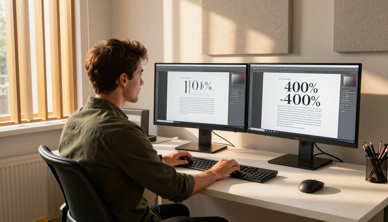
✅ Always export PDFs from the source application rather than scanning printed copies. This preserves the vector text layer and guarantees infinite zoom sharpness.
Web Browsers and Zoom Settings
When you zoom a webpage using Ctrl+Plus (or Cmd+Plus on Mac), the browser is doing two things at once: scaling live HTML/CSS text (which remains sharp because it rerenders at the new size) and scaling any raster images on the page (which blur).
If the webpage uses text embedded in images (a common but bad practice for logos, banners, and promotional graphics), that text will blur during browser zoom. Live HTML text never will.
Images with Text Overlays
Social media graphics, marketing banners, and presentation slides frequently embed text directly into image files. When those images are saved as JPEGs or PNGs and then displayed at larger sizes on high-resolution screens, the text loses its sharpness. The more compression applied to the JPEG, the worse the effect.
How to Fix Fuzzy Text at Any Scale
Use Vector Formats When Possible
The most reliable fix for fuzzy zoomed text is to stop using raster formats for anything that contains text. SVG files for web graphics, live text layers in PDFs, and HTML/CSS text on webpages will all render sharply at any zoom level on any device.
| Scenario | Raster (Avoid) | Vector (Use Instead) |
|---|
| Logo with text | PNG, JPEG | SVG |
| Document with text | Scanned image PDF | Exported PDF from source app |
| Web banner with text | JPEG image | HTML/CSS text over image background |
| Digital publication | Image-based pages | Proper PDF with text layer |
| Presentation slides | Screenshots of text | Native text in PowerPoint/Keynote |
Export Settings That Prevent Blur
When you must use raster formats (for photographs, complex gradients, or compatibility reasons), exporting at the highest resolution your use case allows gives you more pixels to work with before zooming causes blur.
For print: 300 DPI minimum. For screens: 144 DPI or higher (2x for high-density displays). For web images with text: consider SVG or use resolution-independent CSS text instead.
💡 For social media graphics that contain text, use a tool that exports SVG or uses CSS-based text rendering. If you must use JPEG, export at 150% larger than the display size to maintain sharpness on retina screens.
Font Size and Weight Choices
Thin, light-weight fonts (with very narrow strokes) suffer from blurriness far more than regular or bold weights at low resolutions. A 10px thin font on a 96 PPI display may have a stroke that's literally 1 pixel wide, making any rendering imprecision very visible.
Choosing slightly heavier font weights at small display sizes significantly improves on-screen legibility without sacrificing the design's intent.
Why Digital Publications Need Vector Text
If you publish catalogs, menus, brochures, or any multi-page document online, the fuzzy-text problem has direct consequences for your readers. People routinely pinch to zoom on mobile devices when reading digital documents. If your text blurs the moment they zoom in, the reading experience breaks down immediately.
The solution isn't just about file format; it's about the platform you use to deliver digital publications. A platform that renders your PDF as a sequence of JPEG images (common in older or cheaper tools) will always blur when zoomed. A platform that preserves the vector text layer and serves it as live, scalable content will stay crisp no matter how aggressively a reader zooms in.
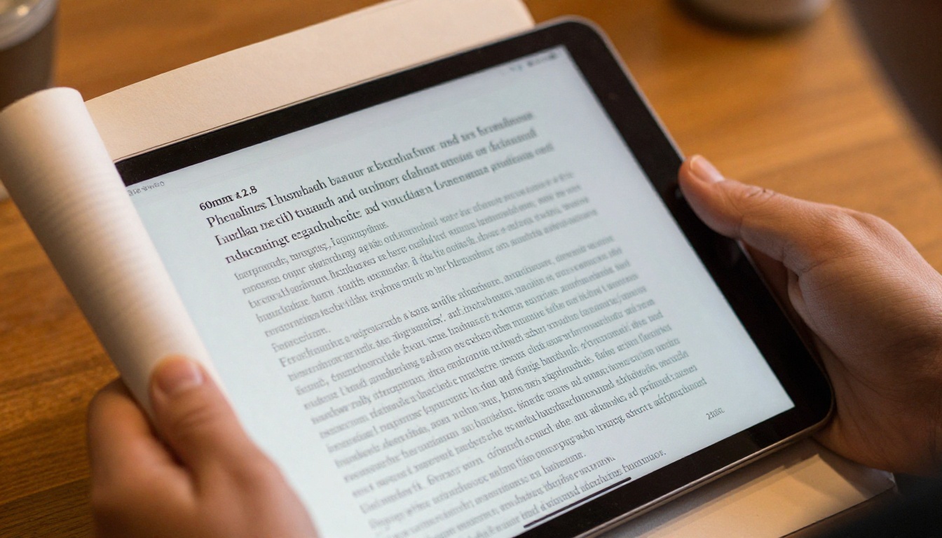
How Flipbooks AI Keeps Text Sharp
This is exactly where Flipbooks AI stands apart. Rather than converting your PDF pages to raster images (which would immediately introduce blur on zoom), Flipbooks AI processes and renders your document in a way that preserves text sharpness at every zoom level.
Creating a Sharp Flipbook: Step by Step
-
Create your account: Visit flipbooksai.com/account and sign up in under two minutes.
-
Prepare your PDF correctly: Export your document as a PDF from its source application (InDesign, Word, Publisher, Canva, etc.) rather than printing and scanning it. This preserves the vector text layer that guarantees sharpness.
-
Upload your PDF: Drag and drop your file into the Flipbooks AI dashboard. The platform processes it and creates your interactive flipbook automatically.
-
Customize the experience: Add your brand colors, logo, and background. Flipbooks AI lets you embed videos and audio, apply page-turn effects, and set a custom domain; all without watermarks.
-
Share and embed: Copy the direct link or grab the embed code to place your flipbook on your website. Readers can zoom in on any page and the text remains razor-sharp.
-
Track performance: With the Professional plan, you get full analytics showing who read your publication, how long they spent on each page, and lead generation tools to capture reader information.
Whether you're publishing a product catalog, a restaurant menu, or a real estate brochure, the sharpness of your text directly affects how professional your brand looks on every device.

✅ Always upload a properly exported vector PDF rather than a scanned document. If you only have a scanned version, recreate the document in its original software and export fresh before uploading.
Flipbooks AI Plans at a Glance
| Feature | Free | Standard | Professional |
|---|
| Number of flipbooks | 1 | Unlimited | Unlimited |
| Watermark | No | No | No |
| Custom branding | Limited | Yes | Yes |
| Password protection | No | Yes | Yes |
| Analytics | No | No | Yes |
| Lead generation | No | No | Yes |
| Offline downloads | No | No | Yes |
| Embed video and audio | No | Yes | Yes |
All plans benefit from the same sharp PDF rendering that keeps your text legible at any zoom level on any device. You can review what's included at each tier on the pricing page.
The Bottom Line on Fuzzy Text
Text looks fuzzy when you zoom in because raster images store information as fixed pixels, and scaling those pixels requires interpolation that introduces softness. The fix at the source is using vector formats: live text in PDFs, SVG for web graphics, HTML/CSS text instead of image-embedded type. The fix at the delivery layer is using a platform that respects and preserves the vector information in your documents rather than converting everything to pixel images.
For anyone publishing digital content online, choosing the right platform matters as much as choosing the right file format. Sharp, readable text at every zoom level isn't a luxury; it's what your readers expect and what your brand deserves.
Ready to publish a flipbook that stays crisp no matter how close your readers zoom in? Get started for free and see the difference for yourself. Browse all available tools and templates to find the right format for your content, or compare pricing plans to choose the features that fit your workflow.