White space is the invisible sales weapon most brands never use. While competitors cram product pages with banners, badges, cross-sells, and pop-ups, the brands converting at 3x the industry average are doing the opposite: they're leaving space empty on purpose.
This is not a design trend. It is a behavioral psychology principle proven across decades of retail research, eyetracking studies, and ecommerce A/B tests. Whether you're selling jewelry online, publishing a product catalog, or running a boutique, the amount of empty space around your products directly affects how much buyers are willing to pay for them.
Flipbooks AI applies these exact principles in its digital catalog platform, giving brands the tools to build breathable, conversion-focused presentations that feel premium from the first page turn.
White Space Is Not Wasted Space
The term "white space" is a holdover from print design, but it has nothing to do with color. White space (also called negative space) refers to the intentional absence of content: the margins around a product image, the padding between paragraphs, the gap between menu items, the empty shelf between displays.
Most brands see unused space as a missed opportunity. They fill it. Every pixel becomes real estate. And in doing so, they train buyers to see their products as cheap.

Here is the counterintuitive truth: the more space you give a product, the more valuable it looks.
Walk into a luxury watch boutique and a discount electronics store on the same day. In the boutique, one watch sits alone on a velvet tray in a glass case with three inches of empty space on every side. In the discount store, 40 watches hang side by side on a spinning rack. The watch in the boutique may be $12,000. The watches on the rack are $19.99. The product did not change. The space did.
The Psychology Behind Clean Design
Cognitive load is the amount of mental effort your brain needs to process what it sees. The more visual elements on a page, the higher the cognitive load. High cognitive load triggers a specific behavioral response in buyers: they hesitate, then leave.
Clean layouts with generous negative space do three things to the buyer's brain:
- Reduce decision fatigue: fewer competing elements mean the buyer's attention goes to the product, not the chaos around it.
- Signal quality: our brains associate spaciousness with luxury. Museums, high-end hotels, and flagship retail stores all use it deliberately.
- Increase perceived value: studies show that the same product photographed on a white background with generous padding is consistently rated as higher quality and worth more money than the same product crammed into a busy layout.
💡 If buyers feel rushed or confused on your product page, they will not buy. White space creates the psychological equivalent of a calm, patient salesperson who gives the customer time to think.
Visual Hierarchy and the F-Pattern
Eyetracking research by the Nielsen Norman Group found that users scan web pages in an F-pattern: strong attention at the top, then scanning left to right, then a quick vertical scan. White space guides and controls this natural eye movement.
When you add breathing room around a headline or product image, you create a visual anchor. The eye knows exactly where to go. Without white space, the F-pattern breaks down into scattered fixations and fast exits.
The Price Perception Study
A study published in the Journal of Consumer Psychology tested the same product in two catalog layouts: one with dense surrounding content, one with generous white space. Buyers rated the white-space version as worth 20 percent more on average, without a single change to the product description, price, or photography.
Twenty percent more perceived value. From negative space.
How Luxury Brands Use Space to Signal Value
Apple, Hermès, Aesop, Glossier, Rolex. Every brand that commands premium pricing in its category has one thing in common in its visual communication: restraint.
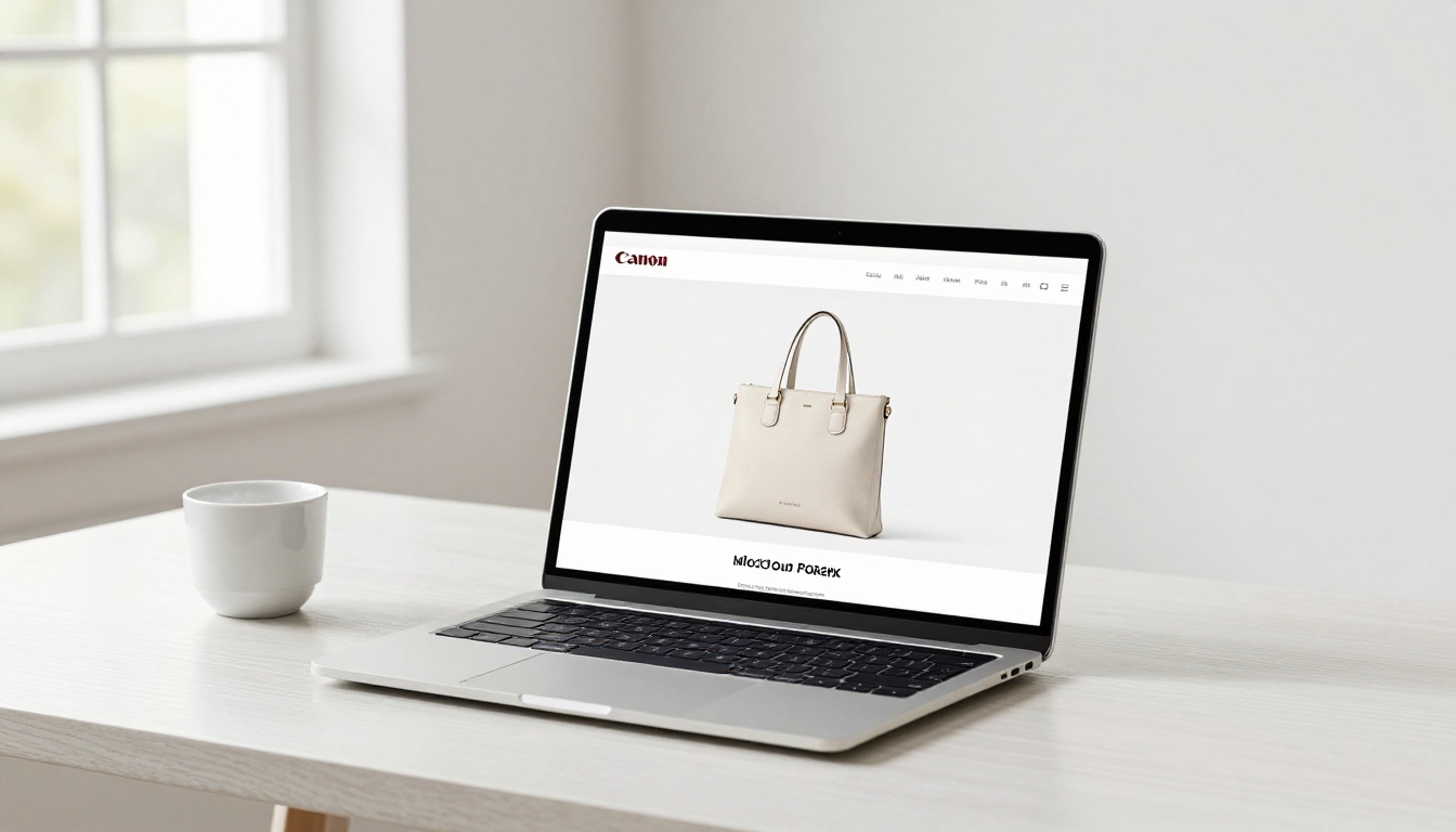
Apple's product pages are a masterclass. A single iPhone floats in white space above the fold. No banner ads, no "also bought" suggestions cluttering the area. The product is the page. By the time you scroll to the first paragraph of copy, you already believe the phone is worth a thousand dollars, and Apple has not said a word yet.
What Premium Retailers Do Differently
| Brand Type | Average Products Per Page | White Space Usage | Perceived Value Score |
|---|
| Discount retail | 12-20 items | Minimal | Low |
| Mid-market retail | 6-8 items | Moderate | Medium |
| Premium brand | 1-3 items | Generous | High |
| Luxury boutique | 1 item | Maximum | Very High |
The correlation is clear. As product density drops, perceived value climbs.
Space as a Brand Signal
When a brand uses white space aggressively, it is making an implicit claim: our products are worth your undivided attention. It is an act of confidence. And buyers respond to confidence.
Brands that crowd their pages are, consciously or not, signaling the opposite: we are not sure this is worth your attention on its own, so we'll show you seventeen other things too.
White Space in Ecommerce Product Pages
The principles that work in a luxury boutique translate directly to digital commerce. The data from ecommerce platforms is consistent across industries:
- Product pages with a single hero image above the fold and generous padding convert at higher rates than cluttered alternatives.
- Removing sidebars from product pages increases add-to-cart rates by 15-30 percent in documented tests.
- Increasing line-height (vertical white space in text) by 20 percent improves readability scores and time-on-page.

The Three Zones of Product Page Space
Every ecommerce product page has three zones where white space decisions are made:
- The hero zone: the area above the fold where the primary product image lives. This is the highest-leverage space on the page. Give the product at least 40 percent of the pixel area as breathing room.
- The copy zone: the product title, price, and description area. Line-height, paragraph spacing, and left/right margins all determine whether buyers read or skim past.
- The CTA zone: the area surrounding the Add to Cart button. Isolating the button in white space increases tap and click rates, especially on mobile.
Mobile-First White Space Rules
On mobile, fingers are the cursor. Touch targets that are too close together create friction: buyers tap the wrong thing, get frustrated, and leave. Standard minimum tap target size is 44x44 pixels, but premium product experiences use 60-80 pixels with clear space around each interactive element.
⚠️ The most common mobile product page mistake is compressing everything to "save space." Mobile screens already have limited real estate, which means every pixel of white space you preserve becomes proportionally more valuable, not less.
Practical White Space Rules for Catalogs
Product catalogs carry a specific design challenge: they need to show multiple products without triggering the discount-store effect. The solution is not to cram more onto each page. It is to control density deliberately.

Products Per Page: The Density Matrix
| Catalog Type | Products Per Spread | Recommended Margin | Perceived Tier |
|---|
| Lookbook / Editorial | 1-2 | 30-40% of page | Luxury |
| Premium product catalog | 2-4 | 20-30% of page | Premium |
| Standard retail catalog | 4-6 | 15-20% of page | Mid-market |
| Promotional flyer | 8-12 | 5-10% of page | Value/Discount |
Choosing where your catalog sits on this matrix is a branding decision, not just a design one. If you sell mid-market products but want to move upmarket, starting with a more spacious catalog layout can lift perception before you change a single product or price.
Typography and Readability Spacing
Beyond images, text spacing is where many catalogs lose credibility:
- Line-height: 1.5 to 1.7 for body copy. Never below 1.4.
- Paragraph spacing: at least one full line-height between paragraphs.
- Column gutters: in multi-column layouts, minimum 20px, ideally 30-40px.
- Caption spacing: product captions should have at least 8-12px of breathing room above and below.
✅ Treat typography spacing with the same intentionality you give image placement. Tight text reads as unprofessional. Spaced text reads as confident.
Consistent Grid Structures
A grid is the invisible architecture of every well-designed catalog. White space in a grid is not random, it is systematic. Using a 12-column grid with defined margins and gutters means every page has structural breathing room built in, even when content changes.
How to Create Breathing-Room Catalogs with Flipbooks AI
Flipbooks AI is built for exactly this kind of intentional catalog design. Whether you're creating a fashion lookbook, a product catalog, or a real estate brochure, the platform supports clean, spacious layouts that translate beautifully from PDF to interactive digital flipbook.
Here is how to apply white space principles directly using Flipbooks AI:
Step 1: Design in your PDF tool first
White space is a design decision made before you upload. In Adobe InDesign, Canva, or whatever tool you use, set your page margins to at least 15-20mm on all sides. Resist the urge to push content to the edges. Leave generous padding around every product image.
Step 2: Upload your PDF to Flipbooks AI
Go to Flipbooks AI and upload your PDF directly. The platform converts it to a fully interactive digital flipbook in seconds, preserving every margin, every gap, every intentional breath you built into the design.
Step 3: Apply custom branding
Use the branding tools to add your logo, custom colors, and fonts without disrupting the spatial design of your pages. Flipbooks AI lets you add branding elements that complement rather than crowd your layout.
Step 4: Set page-turn effects
The platform's page-turn animation adds a physical, tactile quality to the catalog experience. This reinforces the premium feel that your white space design establishes. A clean page with a smooth page-turn signals craft and attention to detail.
Step 5: Enable sharing and analytics
Use embed codes to place your catalog on product pages, in emails, or on landing pages. The Professional plan includes analytics so you can see which pages buyers spend time on, which products get the most attention, and where they drop off.
Step 6: Add lead generation (Professional)
Flipbooks AI's lead generation tool lets you gate specific pages with an email capture form, so your premium catalog does double-duty: it closes browsers into buyers and captures warm leads for follow-up.
Flipbooks AI Plan Comparison
| Feature | Free Plan | Standard Plan | Professional Plan |
|---|
| Flipbooks | Limited | Unlimited | Unlimited |
| Custom branding | No | Yes | Yes |
| Password protection | No | Yes | Yes |
| Analytics | No | No | Yes |
| Lead generation | No | No | Yes |
| Offline downloads | No | Yes | Yes |
| Watermarks | None | None | None |
| Embed on website | Yes | Yes | Yes |
All plans include zero watermarks. The Standard plan covers most catalog needs. If you want the data to back your design decisions with buyer behavior, Professional is the clear choice.
Relevant tools for catalog creators:
White Space in Action: What the Data Says
The case for white space is not aesthetic, it is commercial. Here is a summary of documented findings from conversion rate optimization studies and behavioral research:

Conversion Data Points
- Basecamp reported a 37% increase in conversions after simplifying their homepage and increasing white space around key CTAs.
- Google found that users overwhelmingly prefer search results pages with clean spacing over dense alternatives, even when result quality is identical.
- Crazy Egg heat maps consistently show that CTA buttons surrounded by white space receive more clicks than buttons buried in content.
The 2-Second Rule
Research on first impressions shows that users form an aesthetic judgment of a website or catalog page in approximately 2 seconds. This judgment then colors everything else: how long they stay, how much they trust the brand, how much they are willing to pay.
In 2 seconds, buyers cannot read your copy. They cannot evaluate your features. They see the overall visual field, including how much space is in it. White space works in 2 seconds. Features take longer.

Real-World Application: Three Industries
Fashion retail: A women's clothing brand switched from 6 products per catalog spread to 3. Average order value increased by 22% over the following two seasons. The products did not change. The space did.
Skincare: An independent skincare brand redesigned their ecommerce product pages to use 40% white space around hero images. Add-to-cart rate improved by 18% in the first month.
Real estate: A luxury property developer created a spacious brochure with one property per page using the Real Estate Brochure Creator. Qualified inquiry rates doubled compared to their previous multi-property pages.
The Mistakes That Kill Space
Not all white space works. Done wrong, it can make pages feel empty rather than premium. Here are the four most common errors:

1. Inconsistent margins: White space must be systematic. Random gaps look like errors, not design choices. Use a consistent grid across all pages.
2. Space without hierarchy: White space guides the eye, but only if there is something to guide it toward. Make sure your focal point, whether the product, the headline, or the CTA, is clearly the star.
3. Too much copy near the product: Text that crowds a product image negates the effect of any surrounding space. Keep copy below or beside, never overlapping.
4. Ignoring mobile breakpoints: A beautifully spaced desktop layout can collapse into a crowded mess on mobile if breakpoints are not designed. Always check your catalog on a phone screen before publishing.
✅ When in doubt, remove. Every time you feel tempted to add something, ask whether the space it would occupy is doing more work as space than whatever you're about to place there.
Space Is the Strategy
White space is not a design detail. It is a positioning statement. Every time you resist the urge to fill a gap, you are telling buyers: this product is worth looking at by itself. That message, delivered visually and instantly, sets the price expectation before a single word is read.
The brands that own their categories are not the ones with the most information on the page. They are the ones confident enough to leave space empty.
If you are ready to build catalogs, lookbooks, and digital publications that communicate that same confidence, start with Flipbooks AI. Upload your first PDF, see how clean presentation changes buyer perception, and browse all available tools for every catalog type.
Compare pricing plans and choose the plan that fits your volume. Or get started free and see the difference space makes.



