The final page of your digital publication is the last thing your readers see before they close the tab. For most creators, it's an afterthought: a blank white page, a repeated logo, or maybe just the end of the PDF. That's a serious mistake, and it's costing brands real conversions every day. Flipbooks AI users who treat that closing page as prime real estate consistently outperform those who don't, and the gap is not subtle.
The Last Page Problem Nobody Talks About
Most design attention goes to the front. The opening spread, the hero image, the first impression. That's natural. But here's the thing: by the time someone reaches the final page of your flipbook, they've already invested time. They've read through your content. Their interest is at its highest point of the entire reading experience. And what do they find?
Nothing.

Most Creators Leave It Blank
A blank or nearly-blank final page sends an implicit message: we didn't plan for you to get here. For a reader who made it all the way through, that's a jarring note to end on. It's the equivalent of a sales presentation that stops mid-slide without any next steps.
The problem isn't laziness. Most people simply don't think about the back page during production because the creative energy is spent on the interior content. The last page gets whatever's left over, which is usually nothing. The result is a publication that does everything right for eight pages and then trips on the ninth.
Why First Impressions Get All the Credit
There's a cognitive bias called the primacy effect that makes opening pages feel more important than closing ones. But its counterpart, the recency effect, means people also remember the last thing they experienced. Your final page is the note your reader carries with them after closing your flipbook. If that note is blank, you've left the most memorable moment empty.
Psychologists have long documented that the beginning and end of any experience are retained most strongly. Your publication's interior spreads are the middle. Important, yes, but not where lasting impressions are forged. That happens on page one and the last page, which is exactly why both deserve the same design intention.
What the Best Publications Do Differently
The brands and creators who consistently convert readers into customers treat their final page as a deliberate design decision, not an afterthought.
The Conversion Opportunity
Think about what the final page moment actually represents. The reader just finished your product catalog, your brochure, your menu, or your portfolio. They are:
- At their highest point of interest in your content
- Primed to take an action
- Looking for a signal about what to do next
- Already warm to your brand because they read through it
Without a clear next step, that interest dissipates within seconds. With one, you capture it. The final page is where browsers become buyers and where readers become leads. No other page in your publication has that setup baked in.
Brand Recall at Its Peak
Beyond the CTA, the final page is where brand recall is cemented. When someone closes your digital publication and your logo, tagline, and visual identity are the last thing they saw, that image stays with them. Publications that invest in this moment build stronger brand associations than those that repeat the same interior page format all the way to the end.
The closing moment is emotional. A reader who just finished your content feels a micro-sense of completion. Placing your brand prominently at that moment anchors your identity to a positive feeling.
💡 Pro tip: Treat your final page like a business card, a landing page, and a thank-you note rolled into one. Each of those three purposes has its own design logic, but they can coexist elegantly on a single well-organized page.
The Anatomy of a High-Impact Back Page
There's no single correct formula, but the most effective final pages share a consistent set of elements arranged with intention.

Contact Information Placement
Your contact details belong on the final page. Not buried in the interior, not only on the first page, but here, at the exact moment when a reader is most likely to want to reach you.
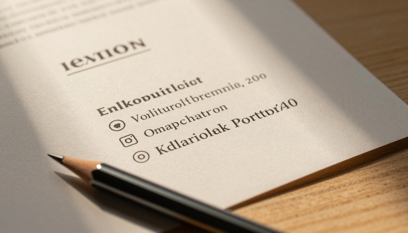
The optimal layout places contact information in a legible hierarchy:
- Business name at the top, in your primary typeface
- Website URL directly below, prominent and clickable in digital formats
- Email address or phone number for direct contact
- Physical address if relevant to your business type
- Social media handles in a small, clean row at the bottom
Keep each element on its own line. Crowding four contact channels into a single line drops readability significantly and makes none of them easy to act on.
The Call to Action Sweet Spot
Your CTA should occupy the visual center of the page. Not the typographic center, which often reads as floating, but the optical center, slightly above the mathematical midpoint. This is where the eye naturally rests when scanning a page.
The CTA itself should be specific. "Visit our website" is weak. "Shop the full collection," "Book your table tonight," or "Request a free sample" tells the reader exactly what action to take and creates immediate intent. The more concrete the instruction, the higher the response rate.
| CTA Type | Best For | Example Phrasing |
|---|
| Direct purchase | Product catalogs, lookbooks | "Shop the full collection at [URL]" |
| Reservation | Restaurant menus, event programs | "Book your table: [phone or link]" |
| Lead generation | B2B brochures, annual reports | "Request a consultation today" |
| Portfolio inquiry | Creative portfolios, photography | "Available for new projects: [email]" |
| Download or Subscribe | E-books, newsletters, magazines | "Get new issues free: [link]" |
| Free trial | SaaS, apps, digital services | "Start free at [URL], no card needed" |
Social Proof Elements
A single line of social proof on the final page can do serious work. A short testimonial snippet, a press mention ("As seen in..."), a client count ("Trusted by 12,000+ businesses"), or a star rating badge all serve the same function: they validate the reader's interest at the exact moment of decision.
Keep it to one proof element. Two or more compete for attention and dilute the impact of each. One strong, specific proof point outperforms three vague ones every time.
Back Page Strategies by Publication Type
The right final page strategy depends heavily on what kind of publication you're producing. Here's how the approach shifts across the most common flipbook formats.
For Catalogs
Product catalogs need a final page that converts browsing into shopping. The back page should include:
- A summary of the ordering process (online, phone, or in-store)
- A featured bestseller or limited-time offer with a small visual
- The brand's website URL and any current discount code
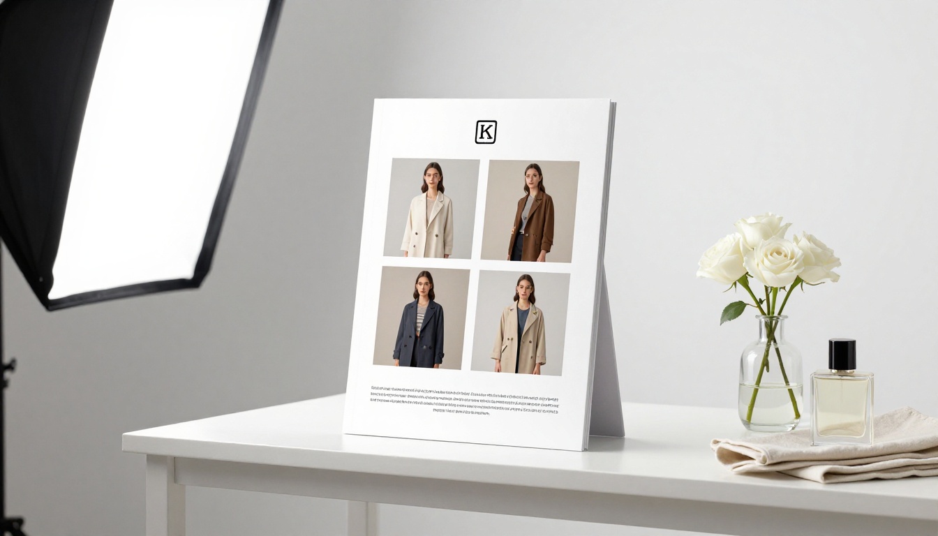
Flipbooks AI makes this straightforward with the Digital Catalog Maker and Product Catalog Generator tools, both of which give you full design control over every page including the final one.
For Restaurant Menus
A menu's final page should feel like an invitation, not a full stop. The best restaurant menu back pages include:
- A warm, atmospheric photograph of the dining space
- Reservation information (phone number and booking link)
- Opening hours and location
- A brief brand statement or chef's note
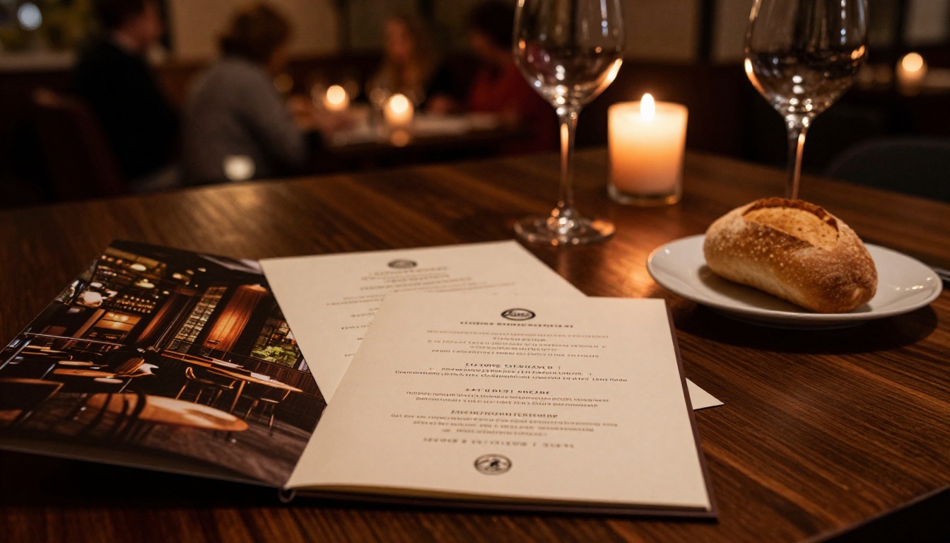
The Restaurant Menu Creator on Flipbooks AI is built for exactly this use case, with full design control over every page in the publication. Pair it with the Spa & Wellness Menu Creator if your venue offers both.
For Brochures and Reports
Corporate brochures and annual reports have a different goal: building trust and opening a door to further conversation. The final page should include:
- Legal entity name and registration number (if required)
- Investor relations or media contact details
- A dignified brand statement
- Website and social links in a restrained, professional layout
For real estate applications, the Real Estate Brochure Creator and Corporate Report Maker both include templates designed with this closing page in mind.
For E-Books and Magazines
Digital publications aimed at readers benefit from a final page that creates continuity rather than closure. Consider including:
- A "What to read next" recommendation
- A subscription or newsletter sign-up prompt
- Author contact details or social handles
- A short bio or brand backstory
The Interactive E-Book Publisher and E-Magazine Publishing Tool on Flipbooks AI support embedded links and interactive elements on any page, including the final one.
| Publication Type | Primary Final Page Goal | Must-Have Element |
|---|
| Product Catalog | Direct purchase | Order process + URL |
| Restaurant Menu | Reservation | Phone + booking link |
| Corporate Brochure | Trust building | Contact + legal info |
| Real Estate Brochure | Lead generation | Agent contact + CTA |
| E-Book | Reader continuity | Next read + subscribe |
| Portfolio | Client inquiry | Email + selected work |
| Annual Report | Stakeholder trust | Contacts + brand statement |
| Event Program | Post-event action | Social + next event date |
Common Back Page Mistakes to Avoid

Even when creators do try to design a final page, certain patterns consistently underperform.
Too Much Text
A wall of text on the final page kills momentum. The reader has just processed your entire document. They don't want to read another paragraph, they want to act. Keep all copy to its shortest possible form: one headline, one CTA, essential contact details only.
⚠️ Warning: If your final page has more than 60 words of body copy, it's too long. Cut everything that isn't an action, a contact point, or a proof element.
No CTA at All
Some creators design a beautiful final page with the logo, brand colors, and a warm photograph, but forget to include any actionable element. Without a CTA, even a visually impressive final page fails at its primary job. Beauty without direction is just wallpaper.
Ignoring Mobile Readers
Digital flipbooks are opened on phones and tablets as often as on desktops. A final page designed only for landscape desktop viewing will look broken or unbalanced on a mobile screen. This is particularly true for CTA text and contact details that rely on small type and tight horizontal layouts.
✅ Best practice: Test your flipbook final page on mobile before publishing. Flipbooks AI renders publications in responsive mobile-first format automatically, but your content layout choices still affect how readable the page is on small screens.
Repeating the Front Page
Using the front page design verbatim on the back, just mirrored, feels lazy and misses the conversion opportunity entirely. The front exists to draw readers in. The back exists to move them to action. Same design language, completely different purpose, completely different content.
How to Build Your Back Page on Flipbooks AI
Flipbooks AI makes it easy to design an intentional, high-converting final page as part of your flipbook creation workflow.

Step 1: Upload Your PDF
Go to flipbooksai.com and create an account if you haven't already. Upload your existing PDF using the PDF to Flipbook Converter. Your file converts into a page-flipping digital publication within seconds, with every page preserved exactly as designed.
Step 2: Navigate to the Final Page
In the flipbook editor, scroll to the last page of your publication. If your PDF already has a designed back page, you'll see it here. If it's blank, this is your opportunity to build something purposeful.
Step 3: Apply Your Brand Elements
Use the customization panel to apply your brand colors, upload your logo, and set your typography. Flipbooks AI supports full custom branding with no watermarks on Standard plans and above, giving your final page the polished, professional look that matches the rest of your publication.
Step 4: Place Your CTA and Contact Details
Add a text block for your call to action in the optical center of the page. Below it, place your contact hierarchy: website URL, email or phone, social handles. Generous white space around each element increases readability and the perceived quality of the entire page.
Step 5: Add Interactive Links
Flipbooks AI supports embedded clickable links on any page. Turn your website URL into a live hyperlink so readers can act immediately, without copying and pasting. You can also embed a video, a lead capture form, or an audio element on the final page if relevant to your publication type. Analytics and lead generation tools are available on the Professional plan.
Step 6: Test on Mobile and Publish
Preview your flipbook in both desktop and mobile views before publishing. Confirm that all links are active and the page reads clearly at small sizes. Then publish and share via embed code, direct link, or a password-protected URL for private audiences.
💡 Pro tip: Use Flipbooks AI's Embed Flipbook on Website tool to place your flipbook on a landing page. Visitors who finish reading are already on your site and already warm.
What Happens When You Get It Right
The difference between a thoughtful final page and an empty one shows up in measurable ways across every publication type.

Real Results from Better Back Pages
Creators who redesign their final pages typically see improvements in three specific areas:
- Direct inbound contacts: Readers who finish a flipbook and find a phone number or email on the last page act on it at higher rates than those who have to search elsewhere for contact details.
- Website click-through: A prominently placed, hyperlinked URL on the final page drives qualified traffic because the visitor arrives already familiar with your product or service. They're not cold.
- Brand recall in follow-up conversations: When sales teams follow up with prospects who read a flipbook, those who reached the final page recall the brand more accurately and in more detail than those who browsed only part of it.
✅ Best practice: Track final page visits and CTA link clicks using the analytics tools available on the Flipbooks AI Professional plan. This data tells you exactly how many readers made it to the end and what percentage took a real action.
The Compound Effect
A well-designed final page doesn't just improve individual reader conversion rates. Over time, it builds a reputation for polish and professionalism that operates before a prospect even opens your publication. Distributors, partners, and clients who have seen your flipbooks before expect quality throughout, because quality throughout is what they remember.
That expectation starts on the first page and is confirmed on the last one.
| What Readers Remember | Without Final Page Design | With Final Page Design |
|---|
| Brand name | Sometimes | Consistently |
| How to contact the brand | Rarely | Most of the time |
| Next step to take | Almost never | Frequently |
| Overall quality perception | Mixed | Positive |
| Likelihood to refer or return | Lower | Meaningfully higher |
The final page of your flipbook is not where the story ends. It's where the relationship begins. Every reader who makes it to the last page is a warm prospect. The only question is whether you've given them somewhere to go.
Ready to build a final page that works as hard as the rest of your publication? Get started on Flipbooks AI for free and turn your next document into a high-converting digital flipbook. Browse all available tools to find the perfect format for your content, or compare pricing plans to choose the plan that fits your workflow.



