You spent hours building the perfect PDF, uploaded it to create your digital flipbook, and then something felt off. The pages look soft, the text is hard to read, and the images that looked crystal-clear in your original file now appear muddy and pixelated. This is one of the most common frustrations people run into with digital publications, and the good news is that it is almost always fixable. This article breaks down exactly why your flipbook looks blurry and walks you through concrete steps to get it looking sharp on Flipbooks AI.
The Real Reason Pages Look Blurry
Blurriness in a flipbook is not random. It comes from one of a handful of root causes, and identifying the right one is the fastest path to a fix.
The three most common culprits are:
- Low source resolution: Your original PDF was created at a low DPI (dots per inch), meaning the pixel data was never there to begin with
- Aggressive compression: The file was compressed during export, stripping away image detail to reduce file size
- Scaling artifacts: Your design was created at one size and scaled up, causing natural image degradation
Most people assume the flipbook platform itself is the problem. In reality, the platform can only work with what it is given. If the source file is blurry, the output will be too.
⚠️ A flipbook converter cannot add resolution that was never in the source file. Fixing blurriness always starts with fixing the source PDF.
PDF Resolution Is the Root Problem
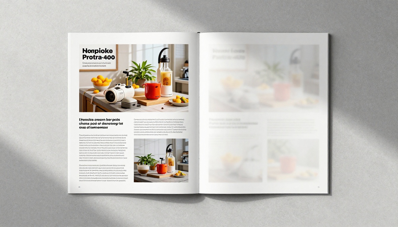
Resolution is measured in DPI, which stands for dots per inch. The higher the DPI, the more detail is packed into each inch of your document. For digital publications viewed on screen, 72 DPI to 96 DPI is the display resolution of most monitors, but that does not mean you should export at 72 DPI.
Here is why: when a flipbook platform renders your pages for zoom, full-screen, or high-density displays (Retina screens), it needs extra pixel data to maintain sharpness. If your PDF is only 72 DPI, zooming in even slightly will reveal blurry, blocky pixels.
The Right DPI Settings for Flipbooks
| Use Case | Minimum DPI | Recommended DPI | File Size Impact |
|---|
| Text-only documents | 150 DPI | 200 DPI | Low |
| Mixed text and images | 200 DPI | 300 DPI | Medium |
| Photo-heavy content | 250 DPI | 300 DPI | High |
| Print-quality output | 300 DPI | 300 DPI | High |
| Retina or 4K display viewing | 300 DPI | 300-400 DPI | Very High |
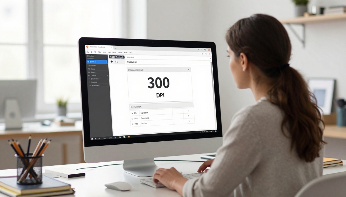
For most digital flipbooks, 300 DPI is the sweet spot. It gives you sharp rendering at full size, acceptable file sizes, and clean results on high-density screens.
Checking Your PDF's Actual Resolution
Before re-exporting, check what resolution your current PDF actually contains:
- Open your PDF in Adobe Acrobat
- Go to File > Properties > Description
- Look at the output intent and print production settings
- Alternatively, use the Preflight tool to check embedded image resolutions
In design tools like InDesign or Illustrator, the export resolution is set in the PDF export dialog. Always verify this before saving.
How Compression Kills Image Quality
Even a high-resolution PDF can look blurry if it was exported with aggressive image compression. PDF files use several compression algorithms, and some of them visibly degrade image quality in exchange for smaller file sizes.
JPEG Compression Artifacts
JPEG compression works by discarding color data that the human eye theoretically cannot see. At high quality settings (90-100%), this is nearly invisible. At low settings (50-70%), you start to see blocky artifacts, halos around text, and softening of fine details.
These artifacts look almost identical to blurriness in a flipbook, but they are actually a different problem with a different fix.
PDF Compression Settings That Affect Quality
| Setting Type | Safe Value | Risky Value | Effect on Flipbook |
|---|
| JPEG Image Quality | 90-100% | Below 75% | Text halos, soft edges |
| Color Image Downsampling | Off or 300 DPI | 72-150 DPI | Pixelated photos |
| Grayscale Downsampling | Off or 300 DPI | 72 DPI | Muddy grayscale areas |
| Monochrome Downsampling | Off or 1200 DPI | Below 600 DPI | Jagged text edges |
💡 In Adobe Acrobat's "Save As Optimized PDF" dialog, check the Images panel. If downsampling is enabled at 150 DPI or less, that is what is blurring your flipbook.
Vector vs Raster: A Hidden Factor
One thing many designers overlook is the difference between vector and raster content in their PDFs:
- Vector content (text, logos, icons) scales infinitely without quality loss. If your text looks blurry, it may have been rasterized during export.
- Raster content (photos, gradients) is resolution-dependent. These are most vulnerable to compression and DPI reduction.
If your typography looks blurry, check whether your PDF export settings accidentally rasterized text. In Illustrator, this can happen when "Rasterize Text" is enabled during export.
Source File Quality: It Starts Before You Upload
Sometimes the blurriness is baked into the design itself, before you ever export to PDF.

Low-Resolution Images in Your Design
If you placed a 72 DPI web image into InDesign or Canva and then exported at 300 DPI, the export resolution does not improve the image. The PDF will contain the original 72 DPI data for that image.
This is especially common with:
- Screenshots used as illustrations
- Images downloaded directly from websites
- Social media exports repurposed in print layouts
- Stock photos purchased at web resolution instead of print resolution
Always source images at 300 DPI or higher for any content that will go into a flipbook.
Canva and Google Slides PDF Exports
Canva's free plan has limited PDF export quality. The standard PDF export compresses images automatically, which often results in a blurry flipbook. For best results:
- Use Canva's "PDF Print" export option, not "PDF Standard"
- Ensure your design canvas size matches the intended output
- Avoid upscaling small elements to fill large areas
Google Slides PDFs are frequently exported at lower resolution, which makes them particularly prone to blurriness when converted. If you use Slides, download as a PowerPoint file and re-save from PowerPoint using a high-quality PDF export setting.
Step-by-Step Fix for a Blurry Flipbook
Here is the practical workflow to go from blurry to sharp:
Step 1: Identify the source of the blur
Open your PDF in Adobe Reader and zoom into the affected areas. If text is blurry, rasterization is likely the issue. If photos are blurry, DPI or compression is the cause. If everything is blurry uniformly, DPI is almost certainly the root cause.
Step 2: Fix the source file
Return to your original design software. Do not try to fix a compressed PDF, always fix the source file.
- In InDesign: File > Export > Adobe PDF > set Quality to High Quality Print preset > Images: set color images to 300 DPI, compression to JPEG, quality to Maximum
- In Illustrator: File > Save As > PDF > select PDF/X-4 preset > Compression tab > set all to 300 DPI
- In Canva: Use Download > PDF Print and enable "Crop marks and bleed" for maximum quality
Step 3: Verify before uploading
Open the new PDF, zoom to 200%, and check that images and text look crisp. If you see sharp detail at 200%, the flipbook will look correct.
Step 4: Re-upload to your flipbook platform
Delete or replace the existing flipbook with the corrected PDF.
✅ Always preview your flipbook on multiple devices after uploading, including a smartphone and a Retina display if possible, before sharing publicly.
How to Create a Sharp Flipbook with Flipbooks AI
Flipbooks AI is built to handle high-resolution PDFs and render them with clean, sharp output across all devices. Here is how to get the best results from the platform.
Setting Up Your Account
Go to flipbooksai.com/account to create your account. The process takes under two minutes and you can upload your first PDF immediately after signing up.
Uploading Your High-Resolution PDF
- From your dashboard, click Create New Flipbook
- Drag and drop your PDF or click to browse for the file
- The platform automatically processes the PDF and renders each page
- Wait for processing to complete, then click Preview to verify sharpness before publishing
💡 If your PDF is larger than 100MB, consider splitting it into sections or using Acrobat's Preflight tool to locate and reduce oversized embedded images without touching display quality.
Customization That Does Not Affect Quality
Once uploaded, you can adjust branding and appearance without touching image quality:
- Custom colors and logos: Applied as overlays, they do not recompress your pages
- Background music and video embeds: Added separately, no effect on page rendering
- Page transition effects: Visual effects applied at display time, not baked into page data
- Password protection: Adds access control without modifying your content
Sharing Your Sharp Flipbook
After confirming the quality looks good, you have several ways to distribute it:
- Direct link: Copy the URL and share via email, social media, or messaging
- Embed code: Use the Embed Flipbook on Website tool to place it directly on your site
- Password protection: Lock it with a private password for internal or client documents
- Download: Professional plan users can offer offline downloads to readers
Plan Features That Affect Publishing
| Feature | Free Plan | Standard Plan | Professional Plan |
|---|
| Unlimited flipbooks | No | Yes | Yes |
| No watermarks | No | Yes | Yes |
| Custom branding | No | Yes | Yes |
| Analytics | No | No | Yes |
| Lead generation | No | No | Yes |
| Offline downloads | No | No | Yes |
| Password protection | No | Yes | Yes |
Check the pricing page to see which plan fits your needs.
Common Mistakes That Ruin Flipbook Quality
Even after fixing DPI and compression issues, certain habits keep causing blurry flipbooks. These are the ones that come up most often.

Using the Wrong PDF Export Preset
Most design applications include export presets for different purposes. The "Smallest File Size" preset in InDesign, for example, aggressively compresses images down to 72 DPI. This is fine for email attachments, but not for flipbooks.
Always use a preset labeled "High Quality Print" or create a custom preset with:
- Color images: 300 DPI, JPEG Maximum
- Rasterize text: disabled
- Font embedding: full
Relying on PDF Optimization Tools
Third-party PDF compressors (online tools, printer utilities) often downscale images to reduce file size. Running your PDF through these before uploading to a flipbook platform is one of the fastest ways to introduce blurriness. Skip the compressor and upload the full-quality export directly.
Building at the Wrong Canvas Size
If your source design is built at a small canvas size (for example, 800x600px for a slide) and then exported as a PDF, the image data is tied to those original pixel dimensions. Even at 300 DPI, a small canvas means less actual detail.
For flipbooks that will be viewed full-screen, build your content at standard document sizes: A4, Letter (8.5x11), or at minimum 1920px wide for landscape layouts.
Not Checking on Multiple Devices
A flipbook that looks sharp on your desktop might appear blurry on a smartphone with a high-density screen if the platform does not serve high-DPI versions. Flipbooks AI handles responsive rendering automatically, but always verify on mobile before sharing.
When Content Type Changes Everything
Not every flipbook needs to be at maximum quality. Knowing when to prioritize file size versus visual fidelity helps you make smarter decisions.
A restaurant using the Restaurant Menu Creator benefits from maximum image quality since food photography is central to the customer experience. Soft, blurry food photos can directly hurt how customers perceive quality.
A corporate report built with the Annual Report Creator might accept a smaller file size since it is text-heavy and distributed via email. In this case, 200 DPI with JPEG quality at 85% is a reasonable balance.
A fashion portfolio created with the Digital Portfolio Creator should always be at maximum quality. Photography portfolios lose their entire purpose if the images are soft.
✅ Match your quality settings to your content type and distribution method. Photo-heavy content always deserves 300 DPI and maximum JPEG quality. Text-heavy documents can tolerate slightly lower settings without visible loss.

The most reliable way to produce a sharp flipbook is to treat quality as a decision made at the source, not something you patch at the end. Getting the resolution right in your design software, avoiding aggressive compression, and verifying the output before publishing will prevent the vast majority of blurriness issues.
Ready to put these fixes into action? Create your first high-quality flipbook and see what sharp, professional digital publishing looks like. Browse all available tools and templates to find the right format for your content, or compare pricing plans to access analytics, custom branding, and offline downloads.



