Why Your Flipbook Looks Squished on Tablets and How to Fix It
Your flipbook looks distorted, squished, or stretched on tablets because of aspect ratio conflicts between your PDF dimensions and the tablet viewport. This article breaks down the root causes, walks through practical fixes for your PDF export settings and embed code, and shows you how to publish flipbooks that display correctly on every tablet screen.
You opened your flipbook on a tablet, and instead of the clean, crisp layout you designed, you got something that looks like it was squeezed through a pasta machine. Pages are narrow, images are stretched, and text is hard to read. If this sounds familiar, you're not alone. The squishing problem is one of the most common display issues digital publishers run into, and it almost always comes down to a mismatch between your PDF dimensions and the tablet's viewport. The good news: it's fixable, and Flipbooks AI makes the process far easier than doing it by hand.
What "Squished" Actually Means on a Tablet Screen
Before fixing anything, it helps to understand exactly what's happening visually and technically.
Aspect Ratio vs. Screen Dimensions
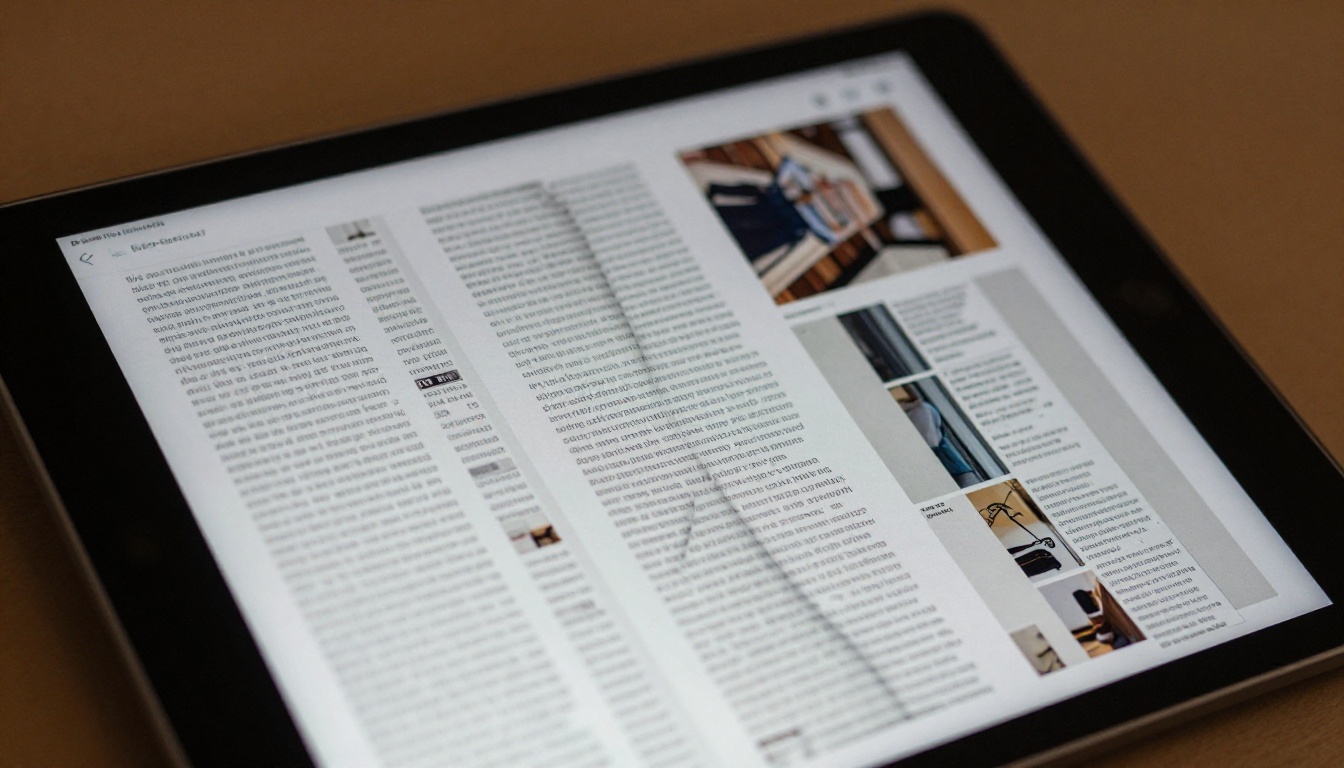
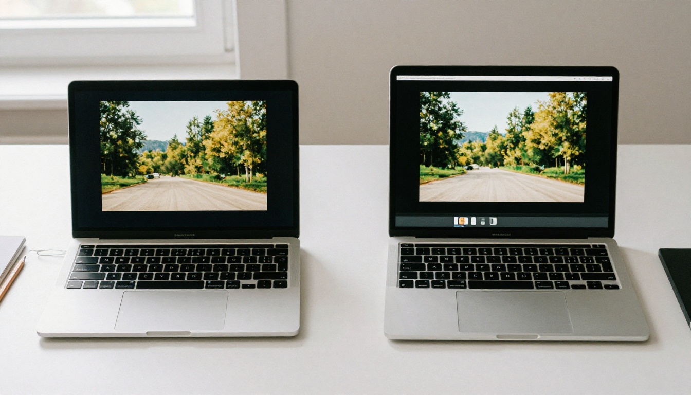
"Squished" is the user experience. The technical term is aspect ratio mismatch. Your PDF has a native width-to-height ratio, say 1:1.41 for A4 portrait pages. Your tablet screen has a completely different ratio, often 4:3 on an iPad or 16:10 on many Android tablets. When the flipbook viewer tries to fit your pages into the available screen space without respecting the original ratio, it scales one axis independently of the other. The result: everything looks compressed.
Portrait PDFs on Landscape Tablets
Most people design PDFs in portrait orientation, because that's how print layouts work. But tablets are often held in landscape mode, especially during presentations or while browsing product catalogs. A portrait page squeezed into a landscape viewport gets compressed horizontally to fit the height, making your carefully designed columns look like they belong on a narrow phone screen.
⚠️ The squishing is predictable, not random. It maps directly to the ratio difference between your PDF and your target screen. Once you know the ratio, you can fix it systematically.
Why Tablets Create Unique Display Problems
Tablets sit in an awkward middle ground between phones and desktops. They're large enough to show two-page spreads, but they don't behave like desktop browsers when it comes to rendering embedded content.
How Tablets Render Embedded Content Differently
When you embed a flipbook using an <iframe> tag on a website, a desktop browser typically has plenty of horizontal space and reflows content around the embed. Tablet browsers apply their own viewport scaling logic, which can override your intended dimensions if they're set in fixed pixels. A width="800" attribute works fine on a wide desktop but breaks on a tablet with a narrower viewport, causing the flipbook to compress vertically so everything fits.
iPad vs. Android: Not the Same Problem
iPads and Android tablets handle pixel density and viewport scaling differently. iPads are more consistent, especially across Safari versions. Android tablets from different manufacturers apply different scaling behaviors. A flipbook that looks correct on a Samsung Galaxy Tab might appear squished on a Lenovo Tab because of different screen resolutions and browser rendering defaults.
Tablet
Screen Ratio
Common Resolution
Default Orientation
iPad Pro 12.9"
4:3
2732 x 2048
Landscape
iPad Air 11"
4:3
2360 x 1640
Portrait
Samsung Galaxy Tab S9
16:10
2560 x 1600
Landscape
Lenovo Tab P12
16:10
2560 x 1600
Portrait
Google Pixel Tablet
16:10
2560 x 1600
Landscape
💡 Design for the most common tablet ratio first: 4:3 for iPads, 16:10 for Android. If your audience uses both, use a platform that handles scaling automatically instead of building two separate PDFs.
The 5 Root Causes of a Squished Flipbook
The squishing problem almost always comes from one of five places. Identify which applies to your situation, and the fix becomes clear.
Your PDF Dimensions Don't Match Any Tablet Ratio
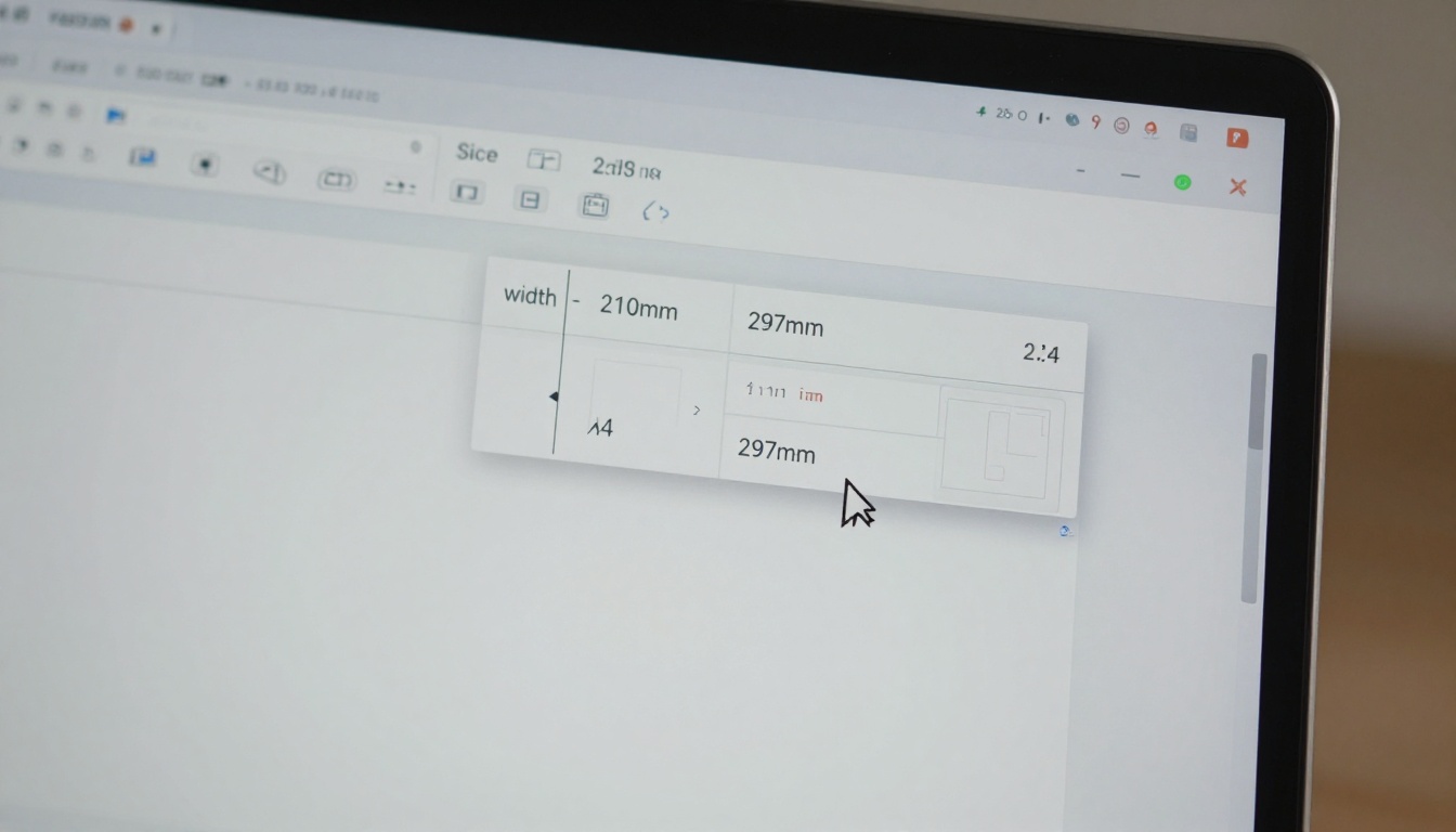
If you built your PDF in a standard print size like A4 (210 x 297mm) or US Letter (8.5 x 11 inches), those dimensions don't map neatly to any tablet screen ratio. The flipbook converter scales the page to fit the viewer, but when there's a significant ratio mismatch, it compresses content to fill the available space.
Your Embed Code Uses Fixed Pixel Widths
This is the single most common cause. Embed codes with width="1200" height="900" work fine on wide desktops but fail on tablets. The browser applies the fixed width, and because the height is also fixed, the content gets compressed to fit the constrained dimensions.
Missing or Wrong Viewport Settings
If you're hosting the flipbook on your own website, the <meta name="viewport"> tag in your HTML <head> controls how tablet browsers scale the page. A missing or misconfigured tag causes the browser to apply a default 980px virtual viewport, which can distort your embed significantly on tablet screens.
Container CSS Is Clipping the Content
The div wrapping your embedded flipbook may have overflow: hidden combined with a fixed height. When the tablet renders the page at a different scale, the height constraint clips or compresses the flipbook to make it fit inside the box.
The Conversion Tool Isn't Scaling Correctly
Some older PDF-to-flipbook converters use fixed rendering pipelines that don't account for tablet viewports. They generate the flipbook at one canonical size and expect every screen to display it at exactly that scale.
Fix It Before You Convert: PDF Dimension Settings
The cleanest fix starts with your source PDF. Getting the dimensions right before conversion means the flipbook viewer has less work to do and fewer opportunities to scale incorrectly.
Choosing the Right Page Size for Tablets
Instead of designing in print dimensions, use a screen-friendly ratio. For iPad-first audiences, a 4:3 page ratio such as 1024 x 768pt fills the screen without scaling artifacts. For Android tablet audiences, a 16:10 ratio at 1280 x 800px works better. Either way, you're starting with a ratio that maps cleanly to how the tablet will render it.
Landscape Orientation Is Usually the Right Call
For tablet viewing, landscape PDFs consistently perform better. A landscape page fills a horizontally-held tablet edge-to-edge, leaves no awkward whitespace on the sides, and supports two-column layouts that remain readable at normal zoom without requiring the reader to pinch and pan.
Use Case
Recommended PDF Size
Ratio
Best For
Product catalog
1024 x 768px
4:3
iPad-primary audiences
Magazine spread
1280 x 800px
16:10
Android tablets
Double-page spread
2048 x 768px
~8:3
Two-page flipbook view
Portrait book
800 x 1067px
3:4
Portrait tablet holding
Square brochure
1000 x 1000px
1:1
Mixed device audiences
✅ Export your PDF with no crop marks, no bleeds, and RGB color mode when targeting digital screens. Print-export settings add invisible whitespace that throws off ratio calculations during conversion.
Fix the Embed Code After Conversion
If you've already converted your PDF and don't want to start over, the embed code is where you can often solve the squishing issue without touching the original document.
Use Percentage-Based Widths, Not Pixels
Replace any fixed-pixel dimensions in your <iframe> embed with percentage values and a CSS aspect-ratio declaration:
This tells the browser to fill 100% of the container width and maintain the correct height automatically, regardless of the device's screen size or orientation.
The aspect-ratio CSS Property
Modern browsers, including Safari on iPad and Chrome on Android tablets, fully support the CSS aspect-ratio property. Adding aspect-ratio: 16/9 or aspect-ratio: 4/3 to your embed container div forces the browser to calculate height proportionally, eliminating the compression effect entirely.
Testing on Real Devices
Browser developer tools have a device emulation mode, but tablet emulation in a desktop browser is not a full substitute for real hardware testing. The rendering engines, pixel density handling, and touch behaviors all differ meaningfully. If you can't test on real hardware, share the direct flipbook link with someone who has the target tablet and ask them to screenshot what they see.
💡 Most flipbook platforms give you a shareable link, not just an embed code. Send that direct link to your tablet for a quick device test without modifying any website code or needing developer access.
How to Create a Tablet-Optimized Flipbook with Flipbooks AI
Flipbooks AI handles the tablet scaling problem automatically. Its viewer is built on a responsive rendering engine that adapts to any screen size, so you don't need to configure CSS or modify iframe attributes manually. Here's how to use it:
Step 1: Upload Your PDF
Go to Flipbooks AI and create an account or sign in. Click "New Flipbook" and upload your PDF. The platform supports large multi-page documents and preserves your fonts, images, and vector graphics at full quality throughout the conversion process. For the best tablet results, upload a PDF already in a screen-friendly ratio. If your PDF is A4 portrait, the viewer will still display it, but a landscape layout fills the tablet screen more naturally and requires less viewer-side scaling.
Step 2: Preview Across Device Sizes
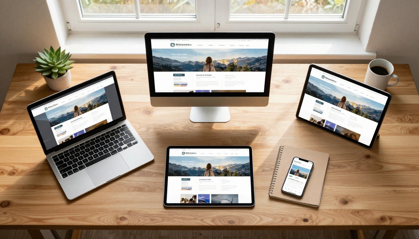
Once converted, Flipbooks AI shows a live preview. Use the device preview options to check how your flipbook looks at tablet and mobile sizes before publishing or sharing. The viewer uses percentage-based scaling internally, so the flipbook fills whatever viewport it's loaded in without manual intervention. You can also enable the mobile-responsive design toggle in your flipbook settings, which switches the default interaction from click-based to swipe-based for a more natural tablet experience.
Step 3: Share With a Responsive Link or Embed
Flipbooks AI gives you two sharing options: a direct link and an embed code. Both are fully responsive. The direct link opens the flipbook in a full-screen viewer that adapts to any device orientation and screen size. The embed code uses percentage-based dimensions by default. For website integrations, the Embed Flipbook on Website tool provides a pre-built embed snippet with responsive settings already configured.
✅ Use the PDF to Flipbook Converter for a streamlined upload experience. It detects your PDF dimensions automatically and applies the appropriate scaling settings for responsive display.
Common Tablet-Specific Mistakes
Even with the right tools, the same mistakes keep appearing in support threads and user forums. Here's a quick reference for the most frequent issues:
Mistake
Why It Squishes
Fix
Fixed iframe width="800"
Tablet viewport narrower than 800px overrides the fixed dimension
Use width="100%" with CSS aspect-ratio
A4 portrait PDF on landscape tablet
1.41:1 ratio conflicts with 4:3 or 16:10 screen
Redesign in landscape or 4:3 ratio
overflow:hidden on fixed-height container
Clips content, browser compresses flipbook to fit
Remove fixed height, use padding-top percentage trick
Re-export with digital/screen export settings only
Double-spread pages saved as single pages
Each spread is twice as wide, squishes to fit viewer
Split spreads into individual pages before converting
⚠️ Watch out for double-page spreads. Many print designers export PDFs with two pages combined into one wide spread. Flipbook converters treat each spread as a single page and try to fit it into the viewer, creating an extremely squished result. Always split spreads into individual pages before converting.
When the Fix Needs More Than a Setting Change
Sometimes the squishing issue runs deeper than a dimension tweak. If your PDF was originally created for a specific print size with non-standard margins, bleed areas, or printer marks baked into the page geometry, the source document itself needs correction before any converter can produce a clean result.
Go back to your original design file in InDesign, Illustrator, Affinity Publisher, or Canva, and re-export with these settings:
No bleed: Remove any bleed extensions (typically 3mm on print documents)
No crop marks: These add whitespace around pages that distorts ratio calculations
RGB color profile: Screen-optimized, not CMYK
Screen resolution: 72 to 150 DPI is sufficient; 300 DPI adds file size without visual benefit on screen
Flatten transparency: Some tablet browsers struggle with unflattened transparency layers in PDF rendering
After re-exporting with these settings, reconvert through Flipbooks AI. The platform's converter handles clean screen-exported PDFs with the most consistent and accurate results.
If your original design file is unavailable and you only have the PDF, Adobe Acrobat's "Crop Pages" dialog lets you set a CropBox that trims invisible whitespace from around each page. This restores the correct content ratio before you send the file through the converter.
For catalog publishers starting fresh, the Digital Catalog Maker and Product Catalog Generator tools on Flipbooks AI include built-in templates already sized for tablet screens, removing the need to correct any existing PDF at all.
Ready to Stop Fighting Tablet Displays?
The squished flipbook problem is almost always solvable. The solution sits somewhere in the chain between your PDF dimensions, your embed code, and the platform doing the conversion. Start with the source file dimensions, verify your embed uses responsive sizing, and use a platform that handles the rendering intelligently without requiring manual CSS work.
Get started for free on Flipbooks AI and upload your first PDF today. No watermarks, no fixed-size embeds, and no squishing on any screen.