You sent the brochure to the printer, the boxes arrived, and the first person who tried the QR code got nothing. No page, no flipbook, just a phone camera hunting for something to lock onto. It is a frustrating moment, and it is almost always fixable. A flipbook built on Flipbooks AI gives you a short, stable link, which is the ideal input for a QR code, so the problem is rarely the flipbook itself. It is usually how the code was made, sized, or printed.
This article breaks down the real reasons a flipbook QR code won't scan from print, shows you how to test each one, and gives you a repeatable routine so the next print run works on the first try.
Why Print Breaks QR Codes
A QR code on a screen is made of glowing pixels with perfect contrast. On paper, the same code becomes ink dots, absorbed light, and reflections. Everything that was invisible on screen suddenly matters.
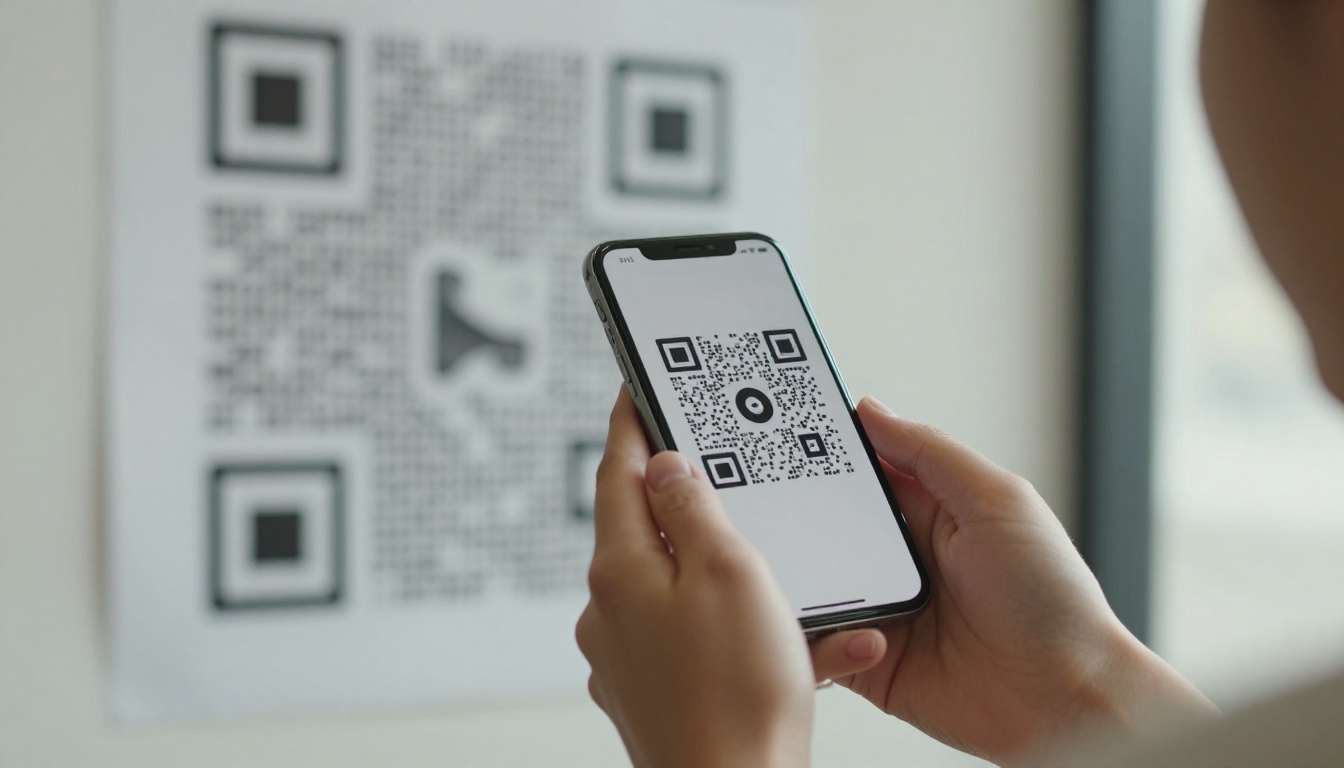
Scanners need to find three corner squares, read the grid between them, and decode the pattern. If any of those steps is disturbed, the scan fails silently. Phones rarely tell you why it failed, which is why people assume the code is "broken."
The Screen Versus Paper Gap
Designers approve QR codes on a monitor. Printers then reproduce them with CMYK ink on a coated or uncoated stock. Dot gain makes black squares swell, thin white gaps close up, and light colors lose contrast. A code that scans perfectly from a laptop can fail from a flyer.
Silent Failures
Most scan failures fall into six buckets. The table below lists them with the usual symptom.
| Cause | Typical symptom | Difficulty to fix |
|---|
| Code printed too small | Phone never locks on | Easy |
| Low contrast colors | Locks on, then loses it | Easy |
| Missing quiet zone | Camera reads nothing | Easy |
| Glossy glare | Works only at certain angles | Medium |
| Overly dense code | Only new phones scan it | Medium |
| Low resolution artwork | Blurry edges, slow scan | Medium |
Size and Distance Problems
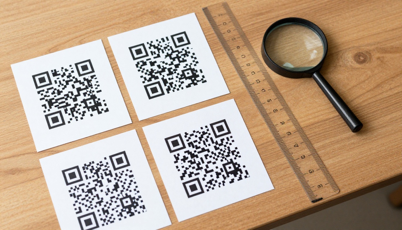
The most common culprit is size. A QR code needs to be big enough for a phone camera to resolve each module, the small squares that make up the grid.
The 10 to 1 Rule
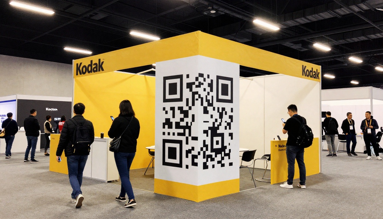
A reliable rule of thumb: the scanning distance should be about ten times the width of the code. A code that is 2 cm wide scans comfortably from about 20 cm. A poster scanned from two meters away needs a code roughly 20 cm wide.
| Print format | Typical scan distance | Minimum code width |
|---|
| Business card | 15 to 20 cm | 2 cm |
| Flyer or brochure | 25 to 30 cm | 2.5 to 3 cm |
| Restaurant table card | 30 to 40 cm | 3 to 4 cm |
| Poster | 1 to 2 m | 10 to 20 cm |
| Shop window or banner | 3 m and up | 30 cm and up |
💡 Pro tip: When in doubt, go one size up. Nobody has ever complained that a QR code was too easy to scan.
Real Example
A boutique printed 1.5 cm codes on hang tags that linked to its lookbook. Customers had to hold their phones almost touching the tag. Doubling the code to 3 cm fixed it the same week, and the boutique later used the Interactive Lookbook Designer to refresh the flipbook behind it without touching the printed tags.
Contrast, Color, and Quiet Zones
Scanners look for dark modules on a light background. Break that pattern and the camera loses confidence.
Contrast Mistakes
Brand colors are the usual cause. Light blue on white, gold on cream, or a dark code on a dark photo all fail. Inverted codes (white on black) work on some phones and fail on others.
- Use near-black modules on a white or very light background.
- Avoid gradients inside the code itself.
- Skip photo backgrounds behind the code. Put it on a solid panel.
- Never invert the colors unless you have tested on both iPhone and Android.
The Quiet Zone
The quiet zone is the empty border around the code. The standard asks for at least four modules of blank space on every side. Designers often crop it to make the code "fit," and that single decision kills scans.
⚠️ Warning: A decorative border, a line, or text touching the code counts as noise. Keep the margin completely clean.
| Design choice | Scan reliability |
|---|
| Black on white, wide margin | Excellent |
| Dark brand color on white | Good |
| Light color on white | Poor |
| White on black | Inconsistent |
| Code over a busy photo | Poor |
| Code with logo in the center | Good if small |
Glare, Paper, and Print Quality
Material changes everything. A code printed on glossy stock under shop lights behaves very differently from one on matte card.
Glossy Stock Reflects Light
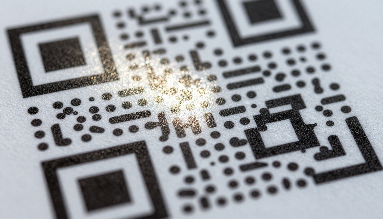
Gloss coating and spot UV create bright patches. When a ceiling light or window reflects across a corner, the scanner loses a finder square and gives up. If a customer says it works "only if I tilt it," glare is the reason.
Fixes:
- Switch to matte or satin stock for the code area.
- Remove spot UV and foil from the code panel.
- Ask the printer to leave the code on an uncoated patch.
- Avoid laminating over codes on posters in bright windows.
Resolution and File Format
Raster images stretched to size give blurry edges. Always export the code as SVG or vector PDF, never a small PNG enlarged in a layout tool. At minimum, use 300 dpi at final print size.
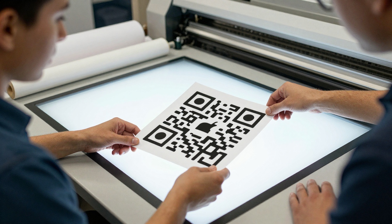
✅ Best practice: Ask your printer for a physical proof, and scan it before approving the full run. A proof costs little, a reprint costs a lot.
Dense Codes and Long Links
Here is a cause people overlook. The more characters in the link, the more modules the code needs, and the smaller each one becomes at a fixed print size.
Why Link Length Matters
A short link produces a simple code with big, chunky modules. A long link with tracking parameters creates a dense grid that older phones, dim light, and cheap cameras struggle with.
| Link type | Example length | Code density | Scan difficulty |
|---|
| Short flipbook link | 30 to 40 characters | Low | Easy |
| Link with one UTM tag | 80 to 100 characters | Medium | Moderate |
| Link with many parameters | 150+ characters | High | Hard |
| Redirect through a shortener | 20 to 30 characters | Low | Easy |
Use a Short Redirect
Print a short, clean URL and let it redirect to the full destination. This also lets you change the destination later without reprinting. Use a link you control, not a free shortener that might expire or inject ads.
Static Versus Dynamic Codes
A static code encodes the final URL directly. A dynamic code encodes a short redirect you can edit. For anything printed in volume, dynamic is safer: if the flipbook moves, you update the redirect instead of recalling 5,000 brochures.
💡 Pro tip: Keep a spreadsheet of every printed code, where it appears, and its destination. It saves hours when something changes.
Check the Flipbook Link Itself
Sometimes the code scans fine and the page behind it fails. Then people blame the QR code anyway.
Common Link Problems
- The flipbook was deleted or unpublished after printing.
- A password was added and the printed material gives no hint.
- The link points to a draft or a test copy.
- The page loads a huge file and times out on mobile data.
- The URL contains typos or trailing spaces from copy and paste.
Make the Destination Mobile Friendly
People scan codes on phones, often on weak connections. A flipbook that opens fast, reflows to the screen, and does not demand a download is far more likely to get read. Flipbooks AI publishes responsive pages by default, and you can keep file weight down by optimizing the source PDF before conversion with the PDF to Flipbook Converter.
How to Build a Scan-Safe Flipbook QR Code
Follow this routine and you will avoid nearly every problem above.
Step by Step
- Create your flipbook. Sign up for Flipbooks AI, upload your PDF, and publish. The upload converts your pages into a flipbook with a permanent link.
- Customize it. Add your branding, colors, and page effects, and embed any video or audio you want readers to see.
- Pick your sharing settings. Use a direct link for print. Add password protection only if you also print the password or plan to share it separately.
- Shorten the link. Use a short custom redirect so the code stays simple.
- Generate the code. Export as SVG with black modules on white.
- Place it on a clean panel with a quiet zone of at least four modules.
- Set the size using the 10 to 1 rule for your format.
- Print a proof on the real stock and scan it with at least two different phones.
- Monitor results. Plans with analytics let you see whether scans lead to real reads. Compare options on the pricing page.
✅ Best practice: Add a short line of text near the code, such as "Scan to read the catalog," and print the short URL underneath as a fallback.
Tools for Common Print Pieces
Testing Like a Skeptic
A test that only works on your own phone is not a test. People scan in dim restaurants, on crowded streets, and from awkward angles.
The Five Minute Test Routine
- Scan with the default camera app on an iPhone.
- Scan with the default camera app on an Android phone.
- Try an older phone if you can borrow one.
- Scan from the real distance your audience will use.
- Scan in dim light and in bright light, and tilt for glare.
- Open the flipbook on mobile data, not just Wi-Fi.
If every step passes, the print run is safe.
Troubleshooting Quick Reference
| If this happens | Try this first |
|---|
| Phone shows nothing | Enlarge the code and widen the margin |
| Works only when tilted | Switch to matte stock |
| Works on iPhone, not Android | Raise contrast, remove inversion |
| Scans, then error page | Check the flipbook is published |
| Scans slowly | Shorten the link |
| Blurry on print | Re-export as vector |
Placement Mistakes That Waste Good Codes
Even a perfect code fails when it sits in the wrong place.
Where Codes Go Wrong
- On a fold or crease. The paper bends and distorts the grid.
- On curved surfaces. Bottles and mugs warp the pattern.
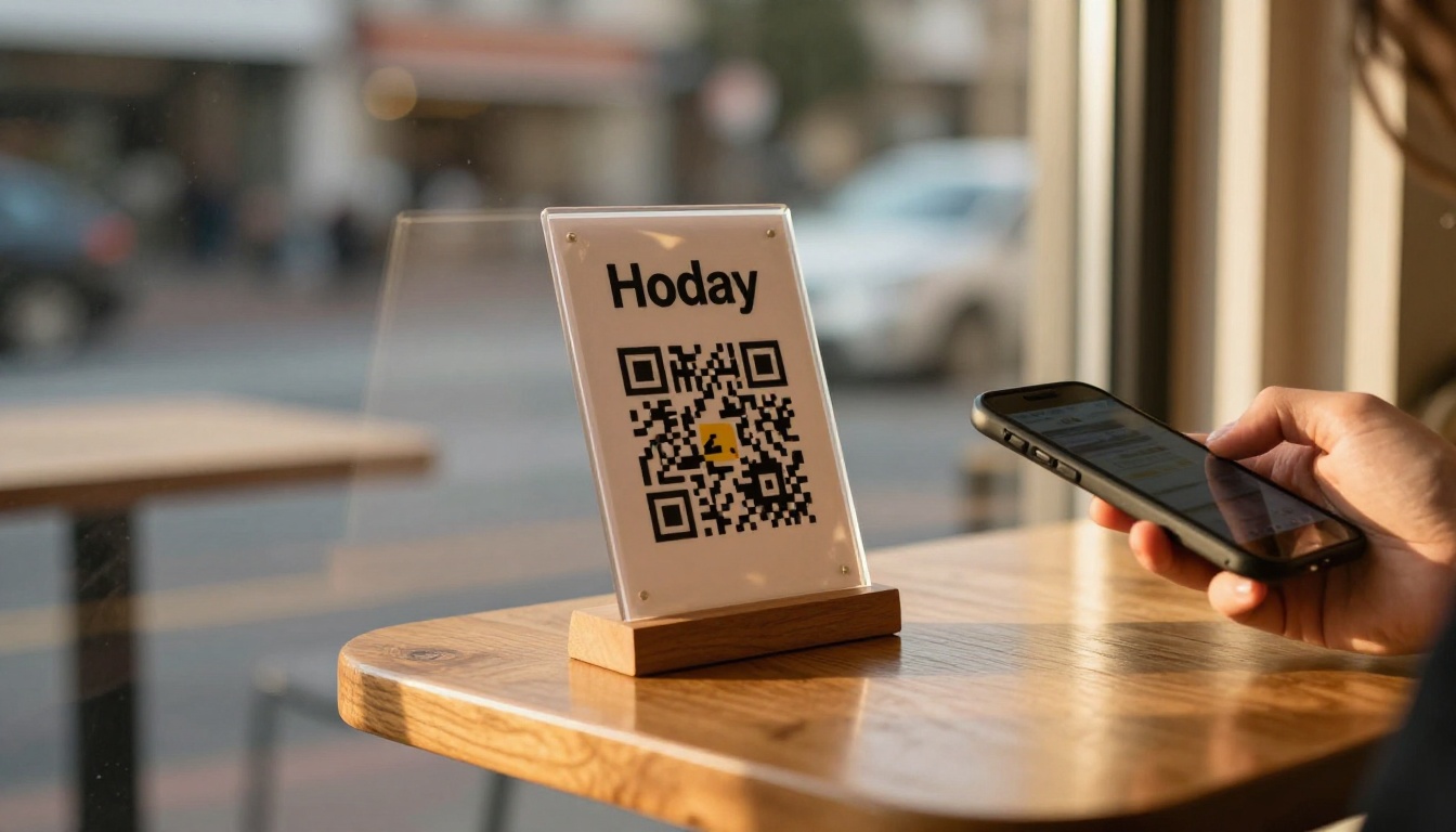
- Behind glass. Reflections wipe out the contrast.
- Too high or too low. Posters should have the code at chest height.
- On moving vehicles. Nobody can scan a bus at speed.
Give People a Reason to Scan
A code with no context gets ignored. Say what the reader gets: "Scan for the full menu," "Scan to flip through the catalog." Clear promises raise scan rates more than any design tweak.
After the Fix: Keep It Working
Printing is permanent, but your digital side is not. Protect your investment with a few habits.
Habits That Prevent Repeat Problems
- Never delete a flipbook that is linked from print. Replace its content instead.
- Keep the same link when you update a catalog or menu.
- Re-test every few months, especially after site or plan changes.
- Store the original vector file where your team can find it.
💡 Pro tip: Updating a flipbook on Flipbooks AI keeps the same link, so one printed code can serve a catalog for years while the pages behind it stay fresh.
Ready to Print With Confidence?
Most scan failures come down to size, contrast, margins, glare, and link length, all of which you can control before the press runs. Build your flipbook, shorten the link, test a proof on two phones, and approve the run only when it scans every time.
Ready to publish a flipbook worth scanning? Get started for free on Flipbooks AI, browse all flipbook tools for your print format, or compare pricing plans when you need analytics and lead generation. If you are placing codes on a website too, see how to embed a flipbook on your website.



