Most designers treat the logo like a VIP. It gets prime real estate, center stage, maximum size. But this instinct, while completely understandable, works against the publication it is supposed to represent. The catalogs that get picked up instead of passed over, the brochures that actually get read, the flipbooks that earn the click: they almost all share one design choice. A logo that knows its place. And that place is small.

What the Eye Does in Three Seconds
Human visual processing does not work like a checklist. The eye does not scan left to right looking for the brand name first. It moves toward contrast, toward the largest or most visually compelling element in the frame, and then it decides in milliseconds whether to stay or leave. In those first three seconds, a publication either earns attention or loses it permanently.
A large logo short-circuits this process in the worst way. Instead of drawing the reader into a mood, a story, or a feeling, it broadcasts an announcement: "This is our brand." That is appropriate inside the document itself. On the publication front, it is an enormous missed opportunity.
The Hierarchy Problem Nobody Talks About
Visual hierarchy is the invisible architecture of every page. It tells the eye what to see first, second, and third. When a logo occupies too much of the front page, it competes with the hero image, the headline, and the overall atmosphere of the piece. The result is visual noise, even when the individual elements are each beautiful on their own.
The reader's eye cannot prioritize between competing elements of similar scale. It stalls. And a stalled reader is a reader who moves on.
💡 Think of any film poster. The star of the film fills the frame. The studio logo sits discreetly at the bottom in small type. Nobody expects the production company shield to be the hero of the poster.
Why Logo Size Signals Brand Confidence
Here is the counterintuitive reality: a smaller logo reads as more confident, not less. Brands that plaster oversized logos on their publications are, whether they intend to or not, communicating insecurity. They are saying: "You might not recognize us, so we are going to make sure you cannot miss us."
Brands that have earned trust do the opposite. They let their visual identity speak through design quality, photography selection, and typographic choices. The logo appears as a quiet signature, not a demand for recognition.
What Actually Sells a Publication Front
The purpose of a publication's front is not to identify the brand. That is what the spine is for. The purpose is to create desire: to make someone want to pick it up, open it, or click through. Desire is created by imagery, by tension, by beauty, by relevance. Not by a large logo.
The Hero Visual vs. The Brand Mark
Every strong publication front has a clear protagonist. In magazines, it is usually a person or a landscape filling the frame. In branded catalogs and brochures, it is often a product or lifestyle photograph. In digital flipbooks, it might be a vibrant scene that sets the mood for the topic inside.
The brand mark is a supporting character in this story. Its job is to provide attribution without stealing focus. A well-placed small logo says: "We made this." A dominant logo says: "Look at us," which is exactly the wrong message when what you want the reader thinking is: "I want to read this."
How Dominant Logos Kill Curiosity
Curiosity requires a question. A well-designed publication front creates a question in the reader's mind: "Who is she?" "Where is that place?" "What is inside this?" A dominant logo answers a question nobody was asking, and in doing so, it crowds out the question you actually want them to have.
When the logo is small, the hero visual has room to do its job. The composition breathes. The reader's eye moves through the layout naturally and eventually lands on the logo as a quiet confirmation of origin, not a demand for attention.

The Numbers Behind Logo Size
Design instinct is useful, but actual ratios give you something concrete to work with, especially when justifying a decision to a client or stakeholder who defaults to "make the logo bigger."
Real Ratios That Work
The professional standard across editorial, retail, and corporate publishing is remarkably consistent. Logos on publication fronts should occupy between 3% and 7% of the total area. This is not a rule invented by minimalists. It is the result of decades of testing by some of the most widely distributed publications in the world.
For a standard A4 document, that translates to a logo roughly 3 to 5 centimeters wide. For a digital publication viewed on a laptop at 1280px width, that is approximately 80 to 120 pixels wide. Small enough to feel unobtrusive. Large enough to read clearly.
Where the Logo Lives on the Page
Placement matters as much as size. The upper-left corner is the most common position for logos on publication fronts, and for good reason. In Western reading culture, the eye naturally starts upper-left before traveling through the composition. A logo there gets seen first but does not dominate, because the eye immediately moves toward the larger, more visually compelling elements.
Upper-right and lower-right corners also work well, particularly for publications where the spine sits on the right. Dead center is almost always wrong.
| Publication Type | Recommended Logo Size | Best Position | Avoid |
|---|
| Magazine | 3% to 5% of area | Upper left or masthead strip | Center placement |
| Corporate report | 4% to 6% of area | Upper left | Full-width masthead |
| Product catalog | 3% to 5% of area | Upper left or upper right | Centered, oversized |
| Digital flipbook | 80 to 120px wide (1280px layout) | Upper left | Centered, bottom-heavy |
| Brochure | 4% to 7% of area | Upper left or lower right | Dominant center position |
| E-magazine | 5% to 7% of area | Upper left | Full-page logo lockup |

Big Logo vs. Small Logo
The difference in reader response between a large and small logo is measurable. A/B testing of print and digital publications consistently shows the same pattern: fronts with smaller logos and stronger hero visuals outperform logo-heavy versions in click-through rates, time-on-page, and reader recall of the actual content.
| Metric | Large Logo Front | Small Logo Front |
|---|
| First visual element noticed | Logo | Hero image or headline |
| Perceived brand confidence | Lower | Higher |
| Available space for hero visual | Reduced (often 30 to 50% lost) | Maximized |
| Reader curiosity created | Low | High |
| Brand recall after reading | Moderate | Strong |
| Professional perception | Mixed | Consistently high |
| Conversion on digital publications | Below average | Above average |
⚠️ A logo that occupies more than 10% of the publication front area is almost always working against you, regardless of how polished the logo itself is.
The pattern is clear: your logo's job on a publication front is attribution, not advertising. Once you internalize that distinction, sizing decisions become straightforward.

What Top Publications Actually Do
You do not have to take this on faith. Look at the fronts of any consistently well-designed publication and you will see the same restrained approach to brand mark sizing.
Vogue, IKEA, and the 5% Rule
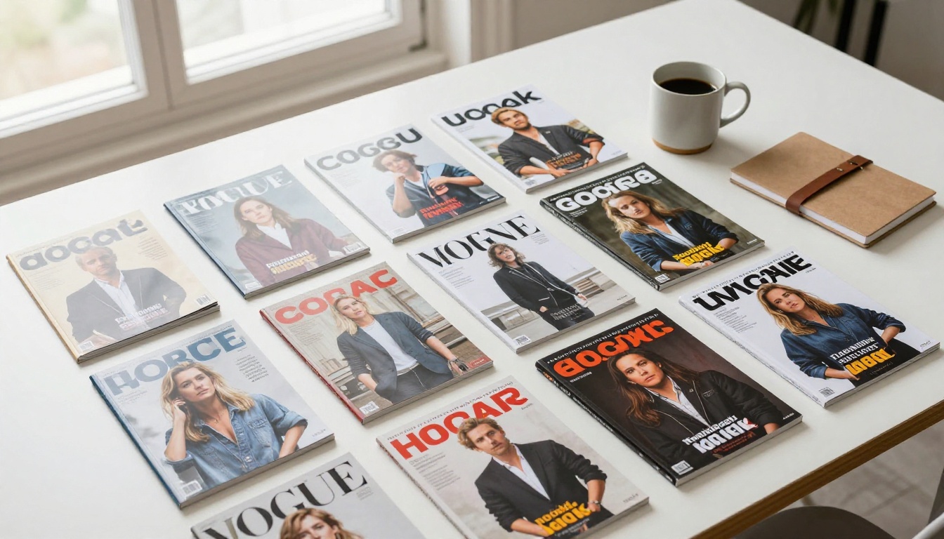
Vogue is one of the most recognized magazine brands on earth. Its masthead is iconic. And yet the masthead on a Vogue front occupies roughly 5% to 8% of the total area, and at that size it is often partially obscured by the cover model in a deliberate choice that communicates supreme confidence. The magazine does not need to shout its name. Everyone already knows it.
The IKEA catalog, one of the most widely distributed print publications in history, has always kept its logo mark small and positioned in a corner while a lifestyle photograph dominates. The front sells a feeling, an aspiration. The logo provides quiet confirmation that IKEA made it possible.
Why Restraint Is the Flex
Brands that resist the urge to scale the logo larger are the ones that have grasped something fundamental about visual communication. Size implies desperation. Restraint implies authority.
This applies whether you are building a luxury hotel brochure, a fashion lookbook, a corporate annual report, or a digital flipbook for a product launch. In every context, the small logo signals that the content is worth more attention than the brand name.
✅ A well-placed small logo on a strong publication front is not a compromise. It is the mark of a designer who knows the front's job is to earn the open, not to announce the brand.

3 Common Mistakes and How to Fix Them
Most over-logoed publications are not the result of bad taste. They come from specific misunderstandings about what a publication front is for.
Mistake 1: Treating the front like an advertisement
An advertisement creates awareness of a brand in a context where the audience does not yet know the brand. A publication front is an editorial invitation to people who are already curious. Switch your mental model from "brand awareness" to "editorial invitation" and the sizing decision becomes obvious.
Mistake 2: Scaling the logo to fill available white space
Decide logo size first, based on the 3% to 7% ratio. Then build the composition around that fixed constraint. Never scale the logo up because space exists around it.
Mistake 3: Using the logo as the anchor point for the layout
Some designers place the logo first, then arrange everything else around it. This gives the logo de facto visual priority. Instead, position your hero visual first and build the composition around it. Add the logo last, in the corner, at the appropriate scale.
| Common Mistake | Why It Happens | The Fix |
|---|
| Logo fills the top quarter | Stakeholder insisted on visibility | Show the 3 to 7% rule, present A/B data |
| Logo is centered at the top | Default template behavior | Move to upper-left corner, reduce size |
| Logo placed after layout is done | Afterthought in the design process | Lock logo size and position first |
| Logo color clashes with hero image | Logo dropped in without color mapping | Use white or dark variant for contrast |
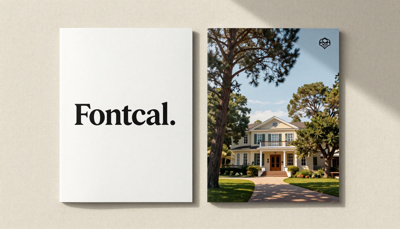
How to Set Your Logo in a Digital Flipbook
When working with digital publications, the same principles apply with equal force. A digital flipbook viewed on screen operates just like a printed piece in terms of visual hierarchy. The reader makes a split-second decision about whether to engage.
Flipbooks AI gives you precise control over logo placement on your flipbook publication front. You can upload your PDF and then customize the branding elements so that your logo appears exactly where it belongs: small, well-positioned, and working with the composition rather than against it.
Tutorial: Logo Placement in Flipbooks AI
Here is how to set up your flipbook with correct logo sizing on Flipbooks AI:
-
Create your account at flipbooksai.com. The platform supports all major plan levels, and the PDF to Flipbook Converter handles the initial file upload seamlessly.
-
Design your publication front in your preferred tool (Figma, InDesign, or Canva) with the logo already sized and positioned per the guidelines above. Export as PDF, then upload to Flipbooks AI.
-
Open the Branding section in the editor. If adding a logo overlay directly inside the platform, use the positioning controls to anchor it to the upper-left corner and scale it to no more than 10% of the publication width.
-
Check the hero visual dominance. Your cover photograph or key image should fill the majority of the visible area. If the logo is visually competing with it, reduce the logo size by 20% and reassess.
-
Enable custom branding. On the Standard plan and above, Flipbooks AI provides no-watermark output and full custom branding control. Browse pricing plans to see which level suits your publication volume.
-
Preview on mobile. Flipbooks AI publications are mobile-responsive by default. Check the mobile preview to confirm the logo remains readable without overpowering the layout on a smaller screen.
-
Publish and share. Once satisfied, publish and use the embed code to place the flipbook on your site, or generate a shareable direct link. Password protection is available for private publications.
💡 For fashion lookbooks, product catalogs, and hotel brochures, Flipbooks AI has dedicated tools that come with publication front templates already built with correct logo proportions. See the Interactive Lookbook Designer, Product Catalog, and Hotel Brochure tools.

Choosing the Right Plan for Branding Control
Different publication volumes and feature requirements call for different tools. Here is how Flipbooks AI plans compare for teams focused on branding precision:
| Feature | Starter | Standard | Professional |
|---|
| Custom branding | Limited | Full | Full |
| No watermarks | No | Yes | Yes |
| Unlimited flipbooks | No | Yes | Yes |
| Analytics and lead generation | No | No | Yes |
| Offline downloads | No | No | Yes |
| Password protection | No | Yes | Yes |
| Embed flipbook on website | Yes | Yes | Yes |
| Mobile-responsive design | Yes | Yes | Yes |
For teams publishing at scale, whether monthly catalogs, event programs, or annual reports, the Professional plan's analytics tools show exactly how readers interact with your publications. See the full breakdown at flipbooksai.com/pricing.
✅ The Annual Report Creator and Sales Presentation tools are worth looking into if consistent corporate branding across multiple document types is a priority for your team.
It Is Always About the Reader
Every design decision on a publication front should pass through one filter: does this make the reader more or less likely to open this? A large logo answers a question the reader did not ask. A small logo, positioned with care, lets the publication do its real job.
The best-designed publications in the world share a quality that is hard to quantify but easy to recognize. They feel effortless. The brand is present but not pushy. The content looks worth the time. That quality does not happen by accident. It happens when designers resist the pull toward bigger and instead trust the composition to carry the weight.
Your next publication front deserves that same discipline. Size the logo at 3% to 7% of the total area. Anchor it to the upper-left corner. Let the hero visual take the frame. Then publish it and watch what happens.
Ready to put this into practice? Create your flipbook on Flipbooks AI and start building publication fronts that earn the open. Browse all flipbook tools and templates to find the right format for your publication type. Compare plans to find the level that matches your output volume.



