Winter is a hard sell until you get the brochure right. Most travel agencies design winter brochures the same way they always have: a stock photo of snow, a departure date, a price. And then they wonder why bookings stay flat while the season slips by. The agencies filling their seats in January and February are doing something different. They treat winter travel brochures not as information sheets but as emotional triggers. This article breaks down exactly what those agencies are doing, and shows you how Flipbooks AI can turn any static PDF into an interactive experience that pushes people to actually book.
Why Winter Brochures Are a Different Animal
Summer sells itself. Beaches, sunshine, ice cream. Winter asks something harder of a brochure: it has to make cold sound good. That means the photography, copy, and layout all need to work together to reframe cold as cozy, darkness as dramatic, and the slow season as the insider's season.
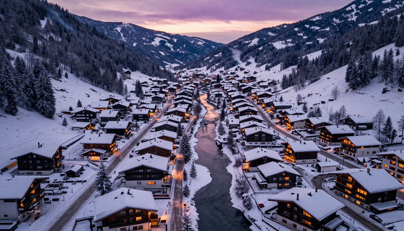
Travelers who book winter trips are not the same as summer travelers. They tend to have more disposable income, higher expectations, and they respond to specificity. "Ski Europe" does nothing. "Three days in a private chalet above Courchevel with ski-in, ski-out access and a personal chef" does everything. Winter brochures that sell understand this distinction before a single page is designed.
💡 Think of your winter brochure as a mood board first and an itinerary second. The emotion has to land before the logistics matter.
Photos That Make People Pack Bags
The single biggest mistake in winter travel brochure design is defaulting to generic snow photography. Pristine empty snowfields look beautiful but they feel cold and uninviting. What actually converts readers into customers is warmth inside the cold.
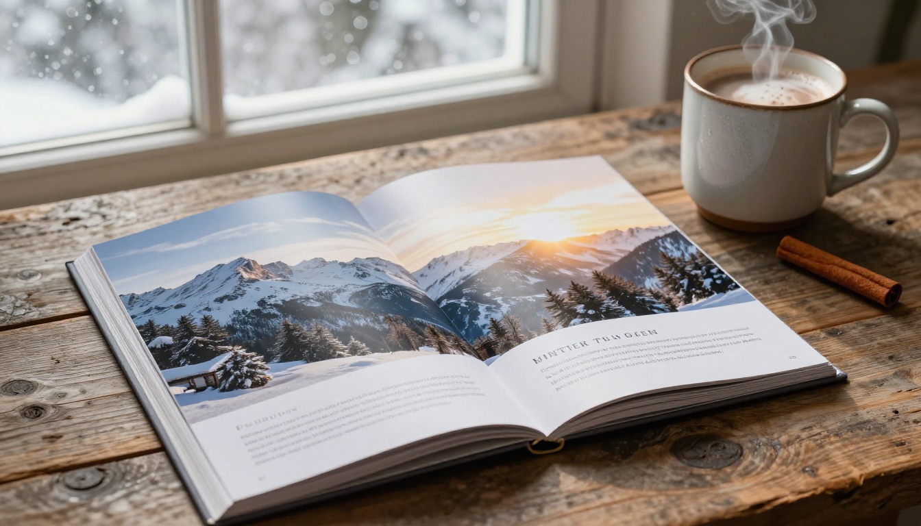
Photography that converts:
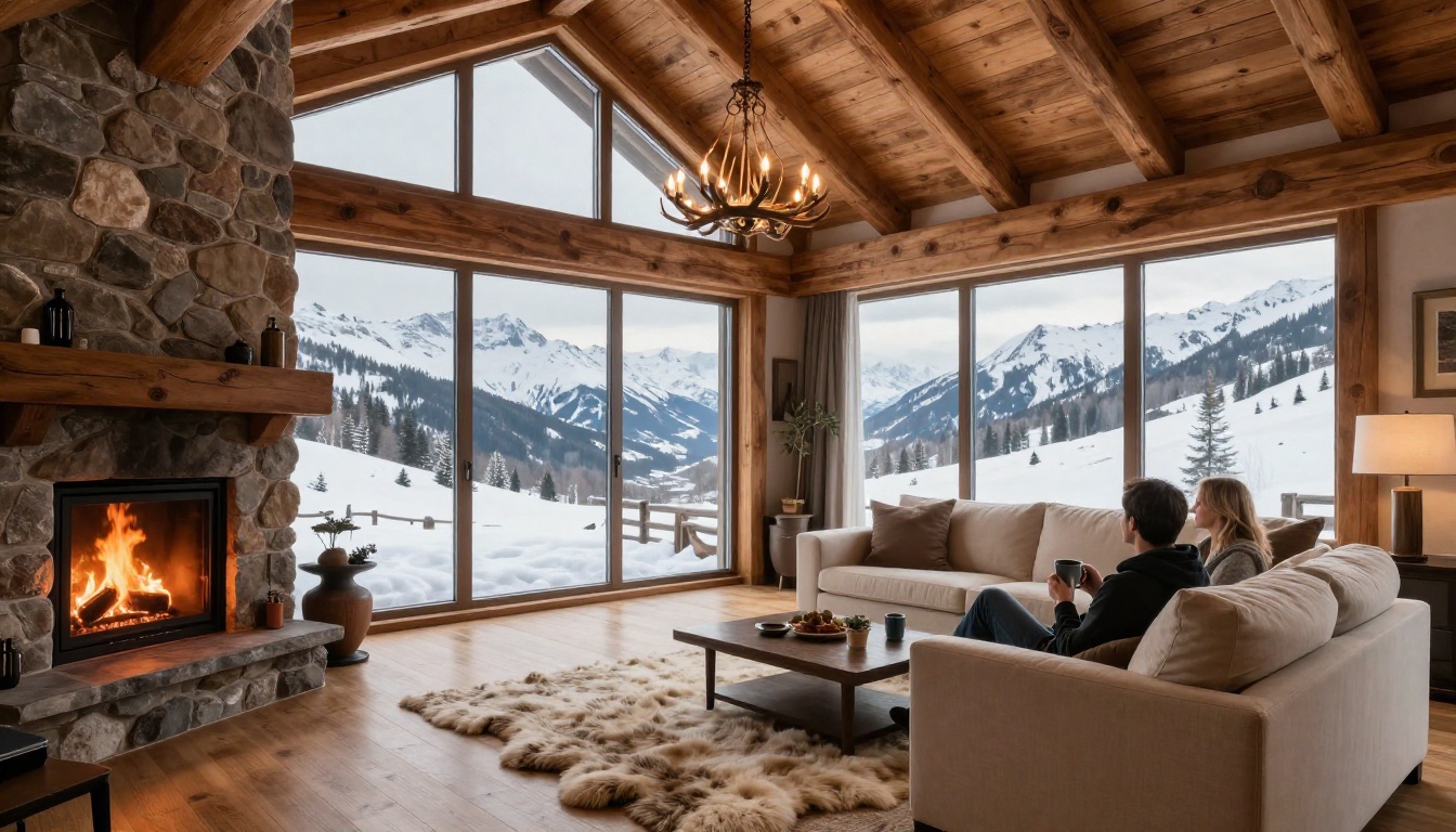
- Warmly lit chalet interiors contrasted against snowy windows outside
- Close-ups of people mid-laugh, not posed smiles
- Food and drink: mulled wine, fondue, hot cocoa with steam visible
- Couples or families actively doing things, not standing still for the camera
- Golden hour snow scenes that make cold look amber and inviting
Photography that kills conversion:
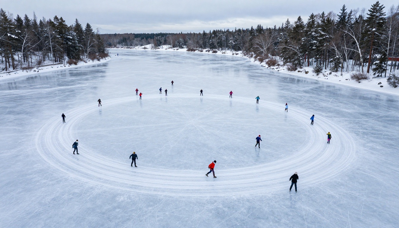
- Stock-looking images of empty landscapes with no human presence
- Overexposed snow that wipes out texture and detail
- Images that feel cold rather than atmospheric
- Photos that could belong to any season or any destination
The rule is simple: if someone looks at your brochure photo and their first reaction is "that looks cold," you have the wrong photo. Their reaction should be "I want to be there."
What Every Winter Brochure Needs
A strong winter travel brochure is not complicated, but it is specific. Here are the sections that produce actual bookings, in order of importance.
The Emotional Hook First
The very first spread should answer one question: how will the traveler feel on this trip? Not what they will do, not where they will sleep. How will they feel. Use one high-impact photograph and three to five words maximum. Everything else comes later.
The Experience Breakdown
After the hook, the reader is emotionally primed. Now you can sell the details: the destinations, the activities, the accommodations. Break these into visual chunks. No one reads dense paragraphs in a brochure. Bullet points, short headers, and white space do more work than three-sentence descriptions.
Pricing With a Narrative
Avoid bare price tables. Frame pricing as a value story instead. "What's included" lists that feel generous work better than nightly rate comparisons that feel sparse. "All-in from $2,400 per person, including transfers, guided ski days, and dinners" feels like a deal. The same number in a plain table just feels expensive.
Urgency That Is Real
Winter travel has natural urgency built in. Peak weeks sell out. Snow conditions change. These are real reasons to act. "Only 6 spots left for the December 26 departure" is honest, specific, and effective. Generic urgency language without specifics does nothing.
⚠️ Never manufacture false scarcity. One overpromised "limited spots" claim that turns out to be false destroys trust with an entire audience segment.
Layout Ideas That Actually Convert
The layout of a winter travel brochure determines whether someone reads it or puts it down. These are the formats that have consistent track records with travel marketers.
The Full-Bleed Opening
Your cover gets one second of attention. Use the entire page for a single, stunning image. No white border, no clip-art frame. Let the photograph breathe. Place the destination name in minimal, high-contrast type directly on the image, close to the center or lower third as the composition allows.
The Left-Page Image, Right-Page Text Split
For interior spreads, readers expect narrative flow. Image on the left, text on the right. Flip it occasionally to create visual rhythm, but keep this as your default. It is the format the eye expects in a brochure and fighting it creates friction.
The Activity Strip
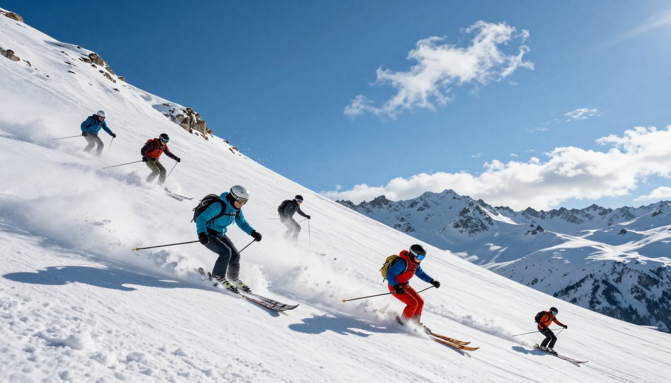
One horizontal band across a full spread showing three or four small photos with single-line captions beneath each. This works well for activity sections: skiing, snowshoeing, spa, dining. It communicates variety without requiring full-page treatment for each activity.
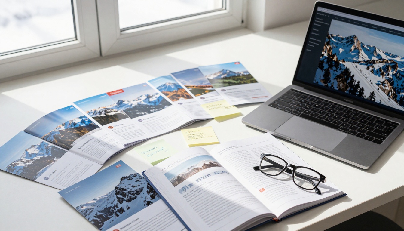
✅ The best-performing winter travel brochures use no more than three fonts and two color accents throughout. Visual consistency builds the premium perception that winter travel commands.
Digital vs. Print: The Real Trade-off
Most travel businesses are still choosing between print and digital when the answer is obviously both. But the how of going digital matters enormously. A PDF attached to an email is not a digital brochure. A PDF that opens as an interactive page-turn experience on mobile, embeds video, and tracks who reads what is a completely different tool.
| Feature | Print Brochure | Static PDF | Interactive Digital Flipbook |
|---|
| Cost per unit | High | Low | Low |
| Updatable after send | No | Yes | Yes |
| Mobile-friendly | No | Poor | Excellent |
| Embeds video or audio | No | No | Yes |
| Analytics and tracking | None | None | Full reader analytics |
| Password protection | No | Partial | Yes |
| Shareable link | No | Yes | Yes |
| Offline access | Yes | Yes | Yes (download) |
| Page-turn experience | Yes | No | Yes |
Interactive digital brochures typically see three to four times the read-through rate of static PDFs, because the page-flip experience creates just enough novelty to keep readers moving forward. The Brochure Flipbook Maker on Flipbooks AI is built specifically for this use case.
How to Create a Winter Travel Brochure with Flipbooks AI
Flipbooks AI converts any PDF travel brochure into a fully interactive digital flipbook in minutes. Here is the process from upload to a published link your clients can open on any device.

1. Create your account
Head to Flipbooks AI and create a free account. No credit card is required to start.
2. Design your PDF brochure
Use any design tool you prefer: Canva, Adobe InDesign, or Affinity Publisher. Build your winter travel brochure as a standard PDF and export at 300 DPI for best visual quality when the pages render in the flipbook viewer.
3. Upload and convert
Click "New Flipbook" in your dashboard and upload your PDF. The PDF to Flipbook Converter processes your file and renders each page with a realistic page-curl animation, typically in under two minutes even for large multi-page brochures.
4. Add your branding
Customize the flipbook with your agency's logo, brand colors, and a custom reading interface background. Matching the flipbook shell to your website palette creates a seamless brand experience that builds confidence.
5. Embed video
Winter travel content performs particularly well with embedded video: a 30-second resort overview, a drone flyover of the destination, or a short client testimonial. Flipbooks AI lets you embed video directly into specific pages, something a static PDF cannot do.
6. Set sharing options
Generate a shareable link, copy an embed code for your website, or enable password protection for exclusive client previews. The Online Brochure Designer also supports direct social sharing links so your sales team can send the brochure via WhatsApp, email, or Instagram DM.
7. Track performance
On the Professional plan, you get full reader analytics: how many people opened the brochure, which pages held their attention longest, and how far they read before leaving. This data shapes every seasonal campaign that follows it.
Here is how the plan tiers compare for travel agencies:
| Plan | Flipbooks | Analytics | Lead Capture | Password Protection | Offline Downloads |
|---|
| Free | 1 | No | No | No | No |
| Standard | Unlimited | No | No | Yes | No |
| Professional | Unlimited | Yes | Yes | Yes | Yes |
Compare all plans to find the right fit for your operation.
💡 Most high-converting travel agencies create two versions of every digital brochure: a public version for website traffic and social sharing, and a private password-protected version for high-value leads with custom pricing or exclusive itineraries.
Winter Travel Niches With the Highest Booking Rates
Not all winter travel sells at the same rate. These are the niches where well-designed brochures consistently outperform the category, and what each one needs visually and structurally.
| Niche | Avg. Booking Lead Time | Visual Hook in Brochure | Pricing Signal |
|---|
| Ski and Snowboard Resorts | 8 to 12 weeks | Action powder shots | Per-day lift and accommodation bundle |
| Christmas Markets in Europe | 6 to 10 weeks | Market lights and mulled wine | Weekend package total |
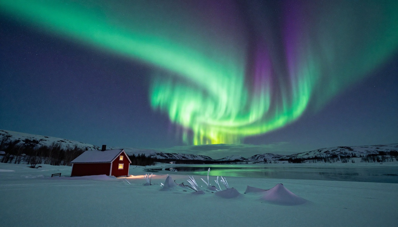
| Northern Lights and Aurora Tours | 12 to 20 weeks | Aurora sky and cabin warmth | Per-person all-inclusive |
| Winter Wellness and Spa Retreats | 4 to 8 weeks | Spa interior and sauna detail | Per-night with inclusions listed |
| Ice Hotels and Unique Stays | 16 to 24 weeks | Architectural ice detail | Per-night exclusivity price |
| Family Snow Holidays | 6 to 10 weeks | Children playing in snow | Family-of-four total price |
Each niche tells a different story. Aurora tours sell scarcity and timing. Ski resorts sell adrenaline and après-ski culture. Wellness retreats sell stillness and restoration. Your brochure's photography and copy need to be tuned to the emotional language of the specific niche, not generic winter imagery.
Pricing and Offers That Push Readers to Book
A beautifully designed brochure that does not create a clear path to booking is just a pretty PDF. Here is how the most effective winter travel brochures structure their pricing and offers.
The Anchor Offer
Lead with a premium package. Even if most people will not buy it, the presence of a high-price option makes every other option look more accessible. A $4,500-per-person Aurora package at the top of the page makes the $2,200 trip below feel like the sensible, well-priced choice.
The Bundle
Travelers respond to completeness. "Flights, transfers, 6 nights accommodation, 3 guided activities, and daily breakfast" feels more valuable than the same components listed separately with individual prices. Bundle everything you can and assign one clean total.
The Early Bird with a Real Deadline
"Book before October 31 and save $350" works because it is specific and time-bound. Vague early bird language without a hard date signals that the deadline is not real, so there is no reason to act now.
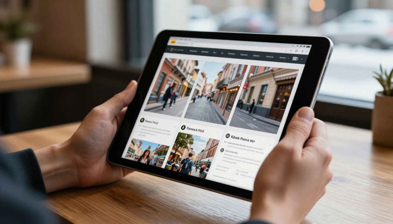
✅ Agencies getting the best results from digital brochures embed a live "Book Now" button directly inside the flipbook, linked to their booking system. Flipbooks AI lets you embed external links on any page, turning a passive brochure into a direct sales channel.
Destinations Worth Building a Whole Campaign Around
Some winter destinations carry so much inherent appeal that a single strong brochure can anchor an entire seasonal campaign. These locations have clear visual identities, strong name recognition, and traveler desire that is already primed before your brochure arrives.
The Alps (France, Switzerland, Austria): The global benchmark for ski travel. Any brochure featuring Chamonix, Verbier, Zermatt, or St. Anton starts with built-in desire. Focus the creative on exclusivity and access.
Lapland (Finland, Sweden, Norway): Santa Claus Village for families, husky safaris and aurora igloos for couples. Two completely different brochures for the same destination category, each speaking to a distinct audience.
Japan in Winter: Powder skiing in Hokkaido, onsens in the snow, the Sapporo Snow Festival. Winter Japan has grown rapidly in popularity, and brochures that lean into the cultural contrast perform consistently above purely Western ski destinations.
Iceland: Year-round aurora potential, volcanic landscapes, geothermal baths. Iceland winter brochures that balance the dramatic (glaciers, ice caves) with the comfortable (geothermal pools, design hotels) consistently outperform those that lean only on the extreme.
Start Your Winter Campaign Today
Winter travel does not sell on accident. It sells because someone designed a brochure that made cold feel like something worth paying to experience. The ideas in this article are drawn from the formats and approaches that consistently fill seats during the hardest selling season of the year.
The shift from print to digital is not optional anymore. Travelers expect to receive, view, and share brochures on their phones. They expect links to work and video to play. A static PDF in 2027 signals something about the organization behind it that no travel brand wants to signal.
The Travel Guide Flipbook tool on Flipbooks AI gives you everything you need to make this shift without a development team or a significant budget. Upload your PDF, customize your branding, embed your booking links, and share one link that works beautifully on every device.
Ready to build your winter campaign? Create your free account on Flipbooks AI and convert your first brochure today. When you are ready for analytics, lead capture, and offline downloads, compare pricing plans and choose what fits your operation.
Browse all available flipbook tools to find the exact format your next campaign needs.



