You wrote a beautiful workbook. Your client nodded, thanked you, and then showed up to the next session with blank pages. The problem is rarely motivation. It is almost always layout. A page that looks like homework makes people postpone it, while a page that looks like a small, winnable task gets done in ten minutes on a Tuesday night. If you publish your workbooks as interactive flipbooks with Flipbooks AI, layout becomes even more important, because clients will read on phones, tablets and laptops instead of paper.
This article walks through the layout decisions that decide whether a coaching client writes or scrolls past. You will see page structures, spacing rules, tracker designs and a build tutorial you can follow today.
Why Clients Skip the Exercises
Before changing a single page, it helps to name what actually stops people. Clients rarely refuse to do the work. They hesitate, and hesitation is a design problem.

The Wall of Text Problem
When an exercise page opens with three paragraphs of theory, the brain files it under "reading," not "doing." Clients skim the theory, feel they have already worked, and move on. Put the action first and the explanation second, in a smaller block.
Blank Pages Feel Risky
An empty page with the single instruction "Reflect on your goals" is intimidating. People worry about writing the wrong thing. Give them a frame: a sentence starter, a box sized to the answer you expect, or a short list of prompts.
Too Many Decisions Per Page
Every extra choice costs energy. If a page asks the client to rate, rank, write, draw and plan, they will do none of it. One page should carry one job.
💡 Pro tip: Read your workbook page by page and ask, "What is the one action here?" If you need more than one sentence to answer, split the page.
The Page Structure That Gets Pages Filled
The most reliable pattern for coaching exercises has four parts, always in the same order. Consistency matters more than creativity, because clients learn the rhythm and stop re-reading instructions.
- A one line purpose. Tell the client why this page exists in under 15 words.
- The task. A single imperative sentence, bold, at the top third of the page.
- The response area. Lines, boxes or checkboxes sized to the answer you want.
- A tiny next step. One sentence that tells them what to do with what they wrote.
Size the Response Area Honestly
The size of the writing box is a silent instruction. A large box says "write a lot." A three line box says "be brief." If you want a quick answer, use a short box. If you want depth, give a full half page and add a sentence starter.
| Response area | Best for | Typical client effort |
|---|
| Three lines | Quick wins, one sentence insights | 1 to 2 minutes |
| Half page | Reflection and storytelling | 5 to 10 minutes |
| Checkbox list | Habits, commitments, routines | 30 seconds |
| Grid or table | Weekly planning and tracking | 5 minutes |
| Scale (1 to 10) | Self assessment before a session | 20 seconds |
Use the Two Column Layout for Prompts
A narrow left column for the prompt and a wide right column for the answer works well because the prompt stays visible while the client writes. It also makes the page look organized, which lowers the feeling of effort. It is one of the simplest workbook layout upgrades you can make.
White Space Is a Feature
Coaches tend to fill pages because they want to deliver value. Clients read density as workload. A page that is 40 percent empty feels light, even when the task is demanding.
Margins and Line Spacing
Use margins of at least 0.75 inches on print versions. Keep body text at 11 to 12 points and line spacing near 1.4. On a screen, add extra padding around response boxes so fingers and cursors do not miss them.
Group With Spacing, Not Lines
Use space to separate sections instead of heavy borders or rules. Borders create visual noise and make pages feel like forms. A bit of extra space, one accent color and a clear heading do the same job more gently.

✅ Best practice: Limit yourself to one accent color for action items, one for reflection, and plain black for everything else. Clients start to recognize "blue means do this now."
Trackers and Checklists That Build Momentum
Completion creates its own motivation. The sight of ten checked boxes is a stronger nudge than any pep talk, so build visible progress into the layout.

The Seven Day Grid
A simple grid with days across the top and two or three habits down the side beats elaborate planners. Keep it to a maximum of three habits per week. More than that and clients abandon the grid by Wednesday.
The Progress Strip
Place a thin strip at the bottom of each section, such as "Section 2 of 6," with small circles that fill as pages are completed. It costs almost nothing in design time and gives clients a reason to keep going.
Win Logs
Add a recurring "One win this week" box at the start of every module. It trains clients to notice progress, and it gives you material to open your sessions with.
| Tracker type | Setup time for you | Client motivation boost | Risk |
|---|
| Seven day habit grid | Low | High | Too many habits |
| Progress strip | Low | Medium | Can feel decorative |
| Win log | Low | High | Needs weekly prompt |
| Monthly calendar | Medium | Medium | Gets abandoned mid month |
| Scorecard with scales | Medium | High | Takes longer to fill |
Layouts for Different Coaching Styles
One layout does not fit every practice. A career coach and a nutrition coach need different pages.
Life and Mindset Coaching
Lean on reflection pages with sentence starters. Example: "The story I keep telling myself is ____. A more useful version is ____." The blanks inside the sentence are far less scary than an empty box.
Business and Sales Coaching
Use fill in tables and calculators. A pipeline table with columns for "Lead," "Next action" and "Date" turns a lesson into a working document. A business coach can ask clients to bring the filled table to every call.
Health and Fitness Coaching
Weekly planners, meal check ins and measurement logs work best. Keep numbers large and boxes generous, because many clients fill these in on the go.
Group and Cohort Programs
Add a shared page, such as a "Share one thing" prompt, that clients can bring to group calls. Peer visibility is a quiet but powerful accountability tool.

| Coaching style | Best layout element | Example page |
|---|
| Life and mindset | Sentence starters | Story rewrite |
| Business | Fill in tables | Weekly pipeline |
| Health | Trackers and logs | Meal and mood check in |
| Career | Scorecards | Skills self rating |
| Group programs | Shared prompts | Share one thing |
Pacing the Workbook
Even good pages fail when the sequence is wrong. Pacing is a layout decision because it controls what clients see and when.
Start With an Easy First Page
The first exercise should take two minutes and produce a quick win. A client who completes page one is far more likely to complete page two. Never begin with the hardest reflection in the book.
Use Weekly Modules, Not One Long Document
A 60 page document feels like a mountain. Six weekly modules of eight pages each feel like six small hills. Label each module clearly and include a cover page with a short "this week in one sentence" summary.
Add Session Bridges
At the end of each module, add a one page "Bring to our next session" sheet. It lists exactly what to bring: a filled table, a short note, a score. Clients prepare when they know what is expected.
⚠️ Warning: Do not unlock every module on day one if you can avoid it. Clients who see the whole mountain at once tend to do less in week one.
Print Versus Digital Layouts
Many coaches still print. Many clients now prefer screens. Your layout should survive both, or you should choose deliberately.
Where Print Wins
Handwriting helps people think. For reflection heavy programs, printed pages with lines or boxes still produce richer answers. Print also removes notifications from the picture.
Where Digital Wins
Digital workbooks update instantly, carry links and video, and never get lost in a bag. Clients can open them on any device in the first minute of a session. They also let you see how pages perform, which paper never will.
| Factor | Print | Digital flipbook |
|---|
| Handwriting depth | Strong | Weaker unless fillable |
| Updates | Reprint needed | Instant |
| Links and video | None | Embedded |
| Cost per client | Printing and shipping | Near zero |
| Tracking usage | Not possible | Analytics available |
| Access on phone | Poor | Responsive |
A practical compromise: publish a flipbook for reading, instructions and videos, and offer a printable pack of the response pages for clients who like pen and paper.
How to Build a Coaching Workbook Flipbook
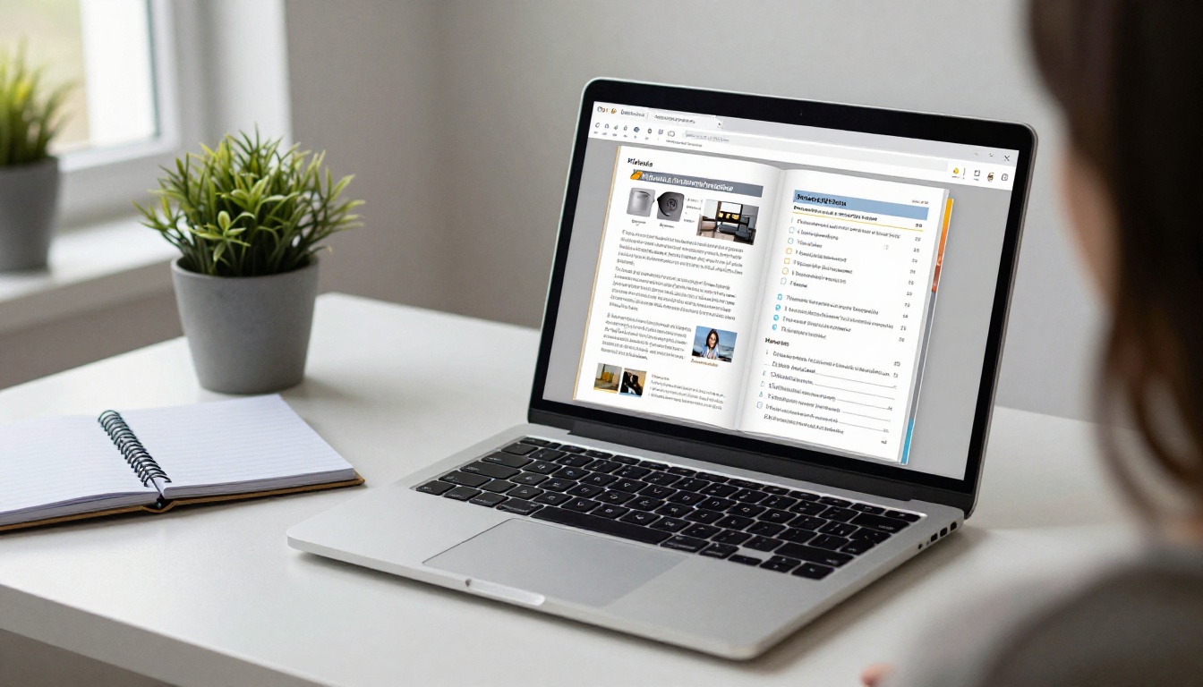
A well laid out PDF becomes far more useful when it turns into an interactive flipbook. Here is the process with Flipbooks AI.
- Design the pages first. Use any design tool, set the page size to A4 or Letter, and follow the four part page structure from earlier. Export as PDF.
- Create your account. Create a free account on Flipbooks AI.
- Upload and convert. Drop your PDF into the PDF to Flipbook Converter. Conversion keeps your layout, fonts and spacing, with realistic page turning.
- Customize the look. Add your logo, set brand colors, choose page effects and background. Keep the accent colors the same as the ones in your workbook so the experience feels like one product.
- Add multimedia. Embed a short intro video at the start of each module and an audio meditation or voice note where it helps. Short clips under three minutes work best.
- Control access. Use password protection so only paying clients can open the workbook. This protects the value of your program.
- Share it. Send a direct link, or use the Embed Flipbook on Website option to place it inside a client portal or course page.
- Track what happens. On the Professional plan, analytics show which pages get opened and where readers stop. Pages that lose people are the pages to redesign.
If you publish several programs, the Course Material Publisher and Training Manual Flipbook tools are tuned for structured learning material. You can also browse all flipbook tools to find a format that fits.
💡 Pro tip: Flipbooks AI adds no watermarks, so your workbook looks like your brand, not ours. Offline downloads let clients keep a copy for travel days.
Features Worth Using for Coaching Programs
| Feature | Why a coach cares | Plan |
|---|
| Password protection | Keeps paid content private | Standard and above |
| Custom branding | Looks professional and consistent | Standard and above |
| Video and audio embeds | Replaces long explanations | All plans |
| Mobile responsive pages | Clients read anywhere | All plans |
| Analytics and lead capture | Shows which pages work | Professional |
| Offline downloads | Access without internet | All plans |
See the pricing plans to compare what each tier includes.
Turning the Workbook Into Income
A strong workbook is also a product. Layout choices influence what you can charge and how you can package it.
Sell It as a Standalone Product
A well designed workbook with clear pages and a progress strip can sell on its own as a self paced program. Because flipbooks are protected by passwords and carry no watermarks, you can deliver it cleanly after purchase.
Use It as a Lead Magnet
Release the first module free. Clients who finish page one and see a quick win are the easiest to convert into paying clients. With lead generation on the Professional plan, you can collect email addresses before the flipbook opens.
Increase Retention in Group Programs
Clients who finish their workbooks renew. If you run a six month program, a workbook that stays in use through month five is worth more than any added bonus call. Layout is not decoration here, it is retention.

Common Layout Mistakes
Here are the errors that show up again and again in coaching workbooks.
- Centered body text. It is harder to read. Left align everything except short headings.
- Tiny fonts for long instructions. If you need small type to fit it, cut the words.
- Ten exercises per module. Three to five is plenty.
- Inconsistent icons. Pick a small set and reuse it. A pencil always means write, a checkbox always means commit.
- No example answer. One short sample answer lowers fear more than any reassurance.
- Missing page numbers. Clients reference pages in sessions. Number everything.
A Quick Self Audit
- Can a client tell what to do within five seconds of seeing the page?
- Is the response area the right size for the answer you want?
- Does the page end with a next step?
- Is there at least 30 percent empty space?
- Would you want to fill this page out on a busy day?
If you answer no to two or more, redesign that page.

A Sample Week One Page Plan
To make this concrete, here is how a first module could be laid out for an eight page week.
| Page | Purpose | Layout |
|---|
| 1 | Welcome and one sentence goal | Short text, one three line box |
| 2 | Where I am now | Scale from 1 to 10 for five life areas |
| 3 | One win from the past month | Sentence starter and half page box |
| 4 | What I want instead | Two column prompt and answer |
| 5 | Smallest next step | Checkbox list with three options |
| 6 | Seven day habit grid | Grid with two habits |
| 7 | Obstacles and plans | Fill in table: if this happens, I will |
| 8 | Bring to next session | Checklist and one reflection line |
Notice the rhythm: short, medium, short, medium. Easy pages are placed between harder ones, so clients keep moving.
Your Next Step
Pick one workbook you already have and fix three pages this week: shrink one wall of text, resize one response box, and add one progress strip. Then watch what your clients bring to the next session.
Ready to turn that workbook into something clients actually open? Get started for free on Flipbooks AI, browse all tools and templates, or compare pricing plans to choose what works for your practice.



