Most year-end reports get ignored. They sit in inboxes unopened, or worse, they get skimmed for 30 seconds and quietly closed. If you have spent weeks pulling together data, writing summaries, and formatting pages only to watch your report disappear into the void, the problem is not the data. It is the delivery.
The good news? A few structural and design decisions change everything. Whether you are building a corporate annual report, a non-profit impact summary, or a small business year-in-review, the ideas below will help you create something people actually open, read, and remember. And with tools like Flipbooks AI, turning a static PDF into an interactive, shareable digital experience takes minutes.
Why Most Year-End Reports Fail
Before fixing your report, it helps to understand why most fail in the first place. The issues are almost always the same.
The Wall of Text Problem
Dense paragraphs. No visual hierarchy. Pages that look identical from start to finish. When readers cannot scan a page in three seconds and find something interesting, they stop reading. Annual reports are notorious for this. Executive teams write for compliance, not for communication.
The fix: Break every page into scannable chunks. Use bold statistics, short callout boxes, and headlines that make a point on their own. Every page should have one element that catches the eye before the reader commits to reading.
Data Without a Story
Numbers do not speak for themselves. A 23% revenue increase means nothing without context. Did the team hit a record? Recover from a crisis? Outpace the industry average by 3x? When data floats without narrative, readers cannot connect emotionally, and they forget what they read within minutes.
💡 Pro tip: Every major data point in your report needs a one-sentence "so what." Make it human, specific, and tied to something the audience already cares about.
Format That Does Not Match the Audience
A 60-page PDF sent to busy board members is a different problem than a 5-page digital report shared with customers on social media. Reports fail when the format ignores who will actually read them and where. Matching format to audience is not a cosmetic decision. It is a readership decision.
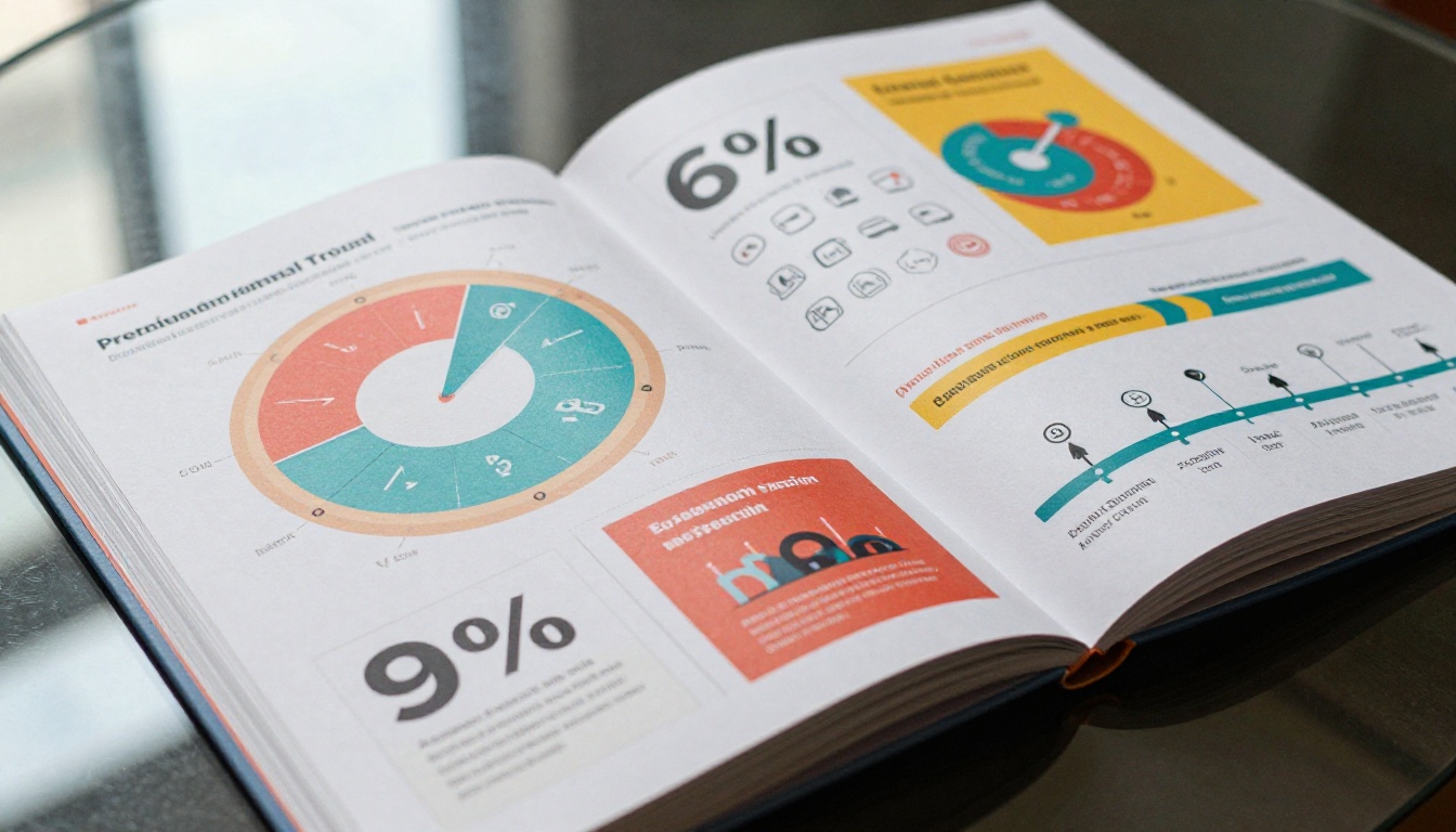
There is no one-size-fits-all format, but certain structures consistently outperform the rest in readability and retention.
The Visual Story Report
This format leads with impact. Big photography. Bold numbers. Short sentences. Think of it like a magazine layout applied to business data. Each spread tells one chapter of the year's story.
- Open with a striking visual and one headline stat (e.g., "47,000 people served this year")
- Use full-bleed images at the start of each section
- Let white space breathe between every element
- Limit body copy to 150 words per page at most
- Use color blocks to visually separate chapters
This works exceptionally well for non-profits, consumer brands, and any organization with a strong visual identity. It is also the format most likely to get shared on LinkedIn.
The One-Page Executive Summary
For busy stakeholders who will not read more than two pages, the executive summary format is the smartest choice. One page. The five most important numbers. Three major achievements. One forward-looking statement.
Everything else lives in the appendix for those who want depth.
✅ Best practice: Put your executive summary on page one, not buried after a table of contents. The reader should hit the most important content within 10 seconds of opening.
The Interactive Digital Report
Printed reports are static. Digital reports with interactive features, embedded video, clickable charts, and page-flip animations hold attention far longer and can be shared instantly via link or embed code.
An interactive digital annual report created through the Annual Report Creator on Flipbooks AI gives stakeholders something they can interact with rather than just passively read. Clickable table of contents, embedded multimedia, and mobile-responsive layouts make the experience feel modern and worth their time.
Year-End Report Ideas by Industry
Different sectors have different audiences and different goals. Here is what works for each.

Non-Profits: Lead with Human Impact
Non-profit annual reports are donor-facing documents first and compliance documents second. The biggest mistake is leading with financials. Donors want to see faces, stories, and proof that their contribution changed something real.
Ideas that work:
- Open with a single story from a beneficiary (photo + 200 words, told in their voice)
- Show a "cost per impact" metric (e.g., "$47 feeds one child for a month")
- Use a map to visualize geographic reach
- Include a donor honor roll with a personal thank-you message
- Add a progress tracker showing this year vs. last year vs. the 5-year goal
- Dedicate one full spread to photography from the field
The Non-Profit Annual Report tool makes it straightforward to turn a designed PDF into a shareable digital flipbook your donors can access on any device, any time.
Corporate Teams: Make Data Visual
Corporate year-end reports often need to serve multiple audiences at once: board members, employees, investors, and press. The trick is layering depth so each audience finds what they need without wading through what they do not.
Ideas that work:
- Use a bold stat as your opening hook (e.g., "Revenue up 31%. Here is how.")
- Organize by department with a color-coded section system
- Include a candid team photo spread to humanize the numbers
- Add a timeline of the year's major milestones in visual form
- Use comparison tables for year-over-year performance across core metrics
- Open each section with a one-line summary for executives who skim
The Corporate Report Maker on Flipbooks AI turns corporate PDFs into polished, interactive flipbooks with custom branding, password protection for confidential board versions, and analytics to show you which pages got the most attention.
Small Businesses: Keep It Personal
Small business year-end reports do not need to look like enterprise annual reports. In fact, they should not. Authenticity wins here because your audience knows you personally.

Ideas that work:
- Write a personal letter from the founder in a real, human voice (not corporate speak)
- Highlight your three biggest wins and one honest challenge you overcame
- Show customer or client testimonials with real photos and first names
- Include a "year in numbers" infographic: orders shipped, reviews earned, countries reached
- Preview what is coming next year to build anticipation and reward loyalty
- Share a behind-the-scenes photo of the team at work
What to Include in a Year-End Report
Not everything deserves a page. Here is a breakdown of what earns its space and what can live in an appendix.
| Element | Include? | Notes |
|---|
| Executive Summary | Always | First page, never buried |
| Mission Statement | Optional | One line only if included |
| Financial Overview | Always | Use charts, not raw data tables |
| Milestones Timeline | Always | Scannable, visual format |
| Team Spotlight or Photos | Recommended | Humanizes the data |
| Donor or Client Recognition | Depends | Essential for non-profits |
| Goals vs. Actuals Table | Always | Shows accountability clearly |
| Case Studies or Stories | Recommended | One per major section |
| Forward-Looking Statement | Always | Ends the report with momentum |
| Full Financial Appendix | Optional | For those who want depth |
⚠️ Warning: Including every piece of data you have is the fastest way to get your report ignored. Curate ruthlessly. If removing a page would not hurt the story, remove it.
Design Tips That Make Reports Readable
Content strategy only works if the design supports it. These are the design decisions that make the biggest difference in whether people actually read past page three.
Color and Typography
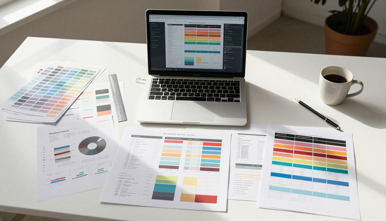
Pick a two or three color system and commit to it. One primary brand color, one accent for callouts, and a neutral for body text. Typography should use one family with clear size hierarchy: large for stats and headlines, small for body copy, medium for section labels.
Avoid:
- More than three font sizes on one page
- Light gray text on white backgrounds (fails accessibility tests)
- Centering all body text (left-aligned copy reads significantly faster)
- Decorative fonts for anything other than display headlines
Data Visualization
Raw tables are hard to read under pressure. Transformed into charts, the same data becomes memorable and shareable.
| Data Type | Best Visualization |
|---|
| Year-over-year comparison | Bar chart or grouped bars |
| Percentage of whole | Donut chart or pie chart |
| Change over time | Line graph with milestone markers |
| Geographic distribution | Map with proportional circles |
| Multiple metric comparison | Radar or spider chart |
| Step-by-step process | Horizontal timeline |
| Rankings or top lists | Horizontal bar chart |
💡 Pro tip: Label your charts directly instead of using a legend. Readers should not have to cross-reference to read a chart. Direct labels cut friction and increase comprehension.
Page Layout Principles
Every spread should have a clear visual anchor: one image, one large stat, or one full-bleed color block that draws the eye immediately. From there, supporting text and secondary data fill in the detail without competing for attention.
- Use consistent margins (at least 20mm on all sides for print)
- Keep paragraph widths to 60-70 characters for optimal reading comfort
- Use icons to replace repeated text labels wherever possible
- Never place more than three data visualizations on one page
Digital vs. Print Reports
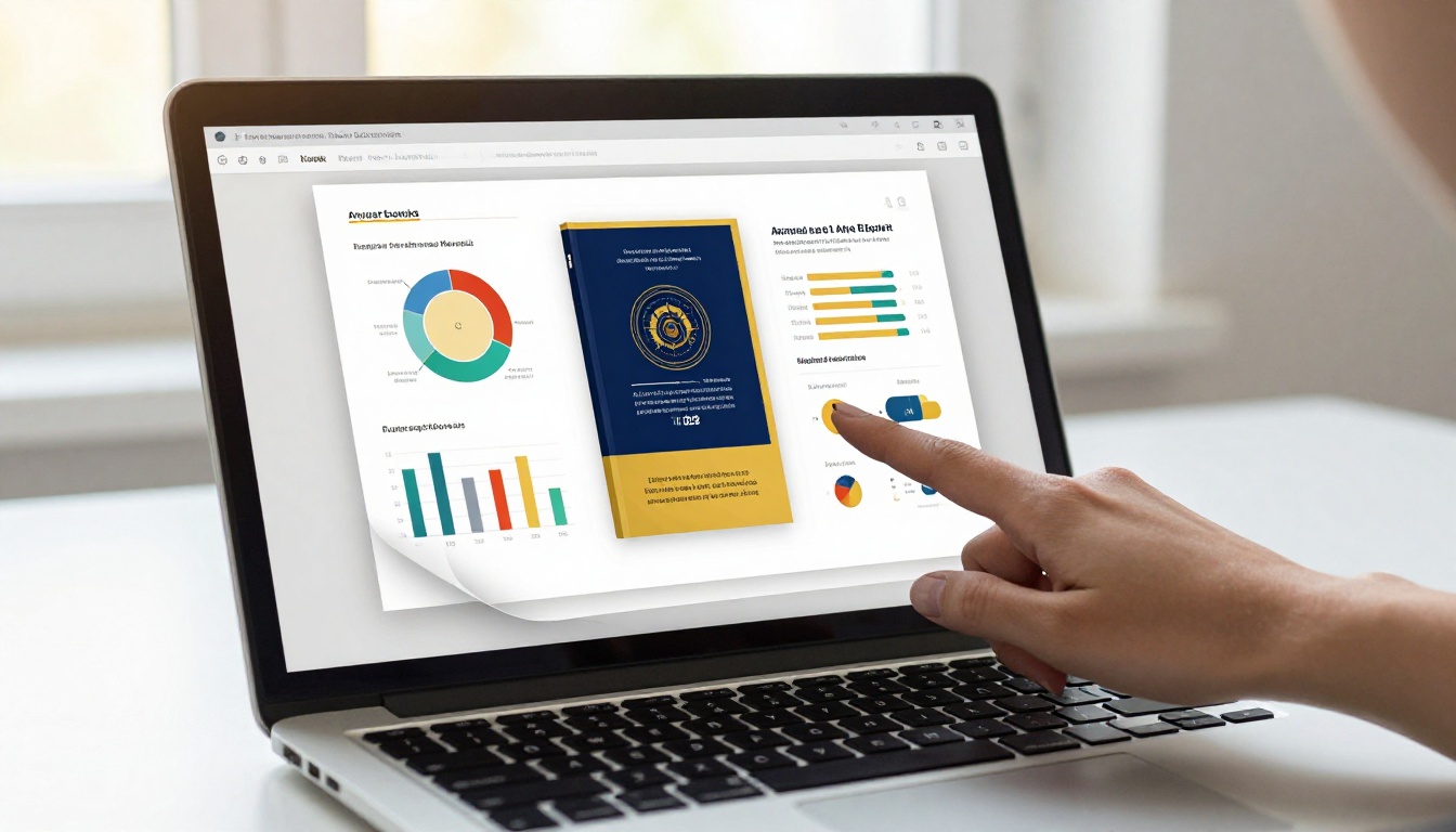
Choosing between print and digital is rarely either/or for most organizations. Both serve different purposes, and the practical approach is to design once then publish in both formats.
| Feature | Print Report | Digital Flipbook |
|---|
| Shareability | Limited to physical copies | Instant link, embed code, QR code |
| Cost | High (design + print + shipping) | Low (one-time design cost) |
| Readership tracking | None | Page views, time on page, clicks |
| Interactivity | Static only | Embedded video, audio, live links |
| Accessibility | Fixed format | Mobile-responsive, resizable |
| Updates after publishing | Requires full reprint | Edit and republish instantly |
| Password protection | Not available | Available on Professional plan |
| Offline access | Always available | Downloadable on supported plans |
For most teams, the smart move is to design the report once as a PDF, then publish the digital version through Flipbooks AI while printing a limited premium run for board members or major donors.
How to Create Your Year-End Report with Flipbooks AI

Once your report is designed and exported as a PDF, turning it into an interactive digital flipbook takes only a few minutes on Flipbooks AI.
Step 1: Create your account
Head to flipbooksai.com and sign up. No watermarks on any plan, and the Standard plan and above includes unlimited flipbooks with no publishing caps.
Step 2: Upload your PDF
Drag and drop your finished PDF into the upload interface. The platform automatically converts each page into a high-resolution flipbook spread with smooth page-turn animation. What you designed is exactly what your readers will see.
Step 3: Customize your branding
Apply your brand colors, upload your logo, and set a custom domain if needed. The Report Flipbook Creator and Corporate Report Maker tools include templates optimized specifically for professional business reports.
Step 4: Add interactive elements
Embed video links, hyperlink statistics to source documents, and add a clickable table of contents that lets readers jump directly to any section. If your report includes a multimedia section, video and audio can be embedded directly into the pages without leaving the flipbook experience.
Step 5: Set access controls and share
For internal board reports, enable password protection to restrict access. For public-facing reports, generate a shareable link, embed code for your website, or a QR code for printed materials. The Embed Flipbook on Website tool handles the technical setup in seconds.
Step 6: Track readership with analytics
On the Professional plan, see exactly how many people opened your report, which pages they spent the most time on, and whether they clicked through to any linked resources. This data is invaluable for understanding what content your audience actually values and what to double down on next year.
Report Structures Worth Borrowing From
Looking at strong examples before designing your own accelerates the process significantly. The most-read annual reports share a handful of structural traits worth adopting.
The three-act structure: Setup (where we were at the start of the year), conflict (what we faced and what challenged us), resolution (what we built, fixed, or achieved). This is the same structure that makes stories compelling, and it works just as well for business data.
One bold idea per spread: Never cram two major messages onto one page. Readers can hold one idea clearly. Two ideas compete. Three ideas result in nothing being remembered.
Photos with captions that add information: Not "Team members at work" but "The team that reduced response time by 40% in Q3." Captions are among the most-read elements on any page. Use them to carry real information.
Numbers bigger than the surrounding text: Your most important statistics should be the largest visual element on the page. If a stat fits naturally into a sentence, it is not important enough to be a feature number.
The Sales Presentation and Press Kit Designer tools on Flipbooks AI also offer formats that borrow these principles and can be adapted for year-end reporting with minimal rework.
The Difference Between a Report That Gets Filed and One That Gets Shared
The gap between a year-end report people file away and one people actually share comes down to three decisions: a clear story that pulls the reader forward, visual design that makes data feel effortless, and a format that meets your audience wherever they are.
Start with one compelling stat or story. Build outward from there. Use comparison tables and visual data instead of text-heavy blocks wherever possible. And when it comes to distribution, give your audience a digital experience they can access on any device, at any time, without downloading a file.
Flipbooks AI makes it straightforward to turn your finished PDF into a professional, interactive digital report that looks polished and works flawlessly on mobile. No watermarks, no complicated setup, no print budget required.
Ready to build a year-end report people actually read? Create your first flipbook for free and see how fast it comes together. Browse pricing plans to find what fits your organization, or check out all available report and presentation tools to match the right format to your next project.



